

1. 安装matplotlib
pip3 install matplotlib
1.1 matplotlib中常用方法


 1 # 绘制折线图
 2 pyplot.plot(x,y)
 3
 4 # 绘制散点图
 5 pyplot.scatter(x,y)
 6
 7 # 绘制竖向条形图
 8 pyplot.bar(x,y,width=0.4)
 9     width 指定条形图的宽度
10
11 # 绘制横向条形图
12 pyplot.barh(x,y,height=0.4)
13     height 指定条形图的长度
14
15 # 绘制直方图
16 pyplot.hist(a,num_bins)
17     a 指当前被统计的值
18     num_bins 指被分的组数
19
20 其他图形绘制详情到 matplotlib官网 https://matplotlib.org/gallery/index.html 或 https://matplotlib.org/ 转 examples
21
22 # 设置图形大小,(长25,宽15)
23 pyplot.figure(figsize=(25,15),dpi=80)
24
25 # 保存图片
26 pyplot.savefig('图片路径')
27
28 # 自己定义的x轴
29 pyplot.xticks(x,x轴的描述)
30     rotation=90 描述信息旋转度数
31     fontproperties=my_font    设置字体
32
33 # 自己定义y轴
34 pyplot.yticks(y,y轴的描述)
35     rotation=90 描述信息旋转度数
36     fontproperties=my_font    设置字体
37
38 # 绘制网格
39 pyplot.grid(alpha=0.3)
40     alpha 指定透明度
41
42 # 指定图形代表内容
43 pyplot.legend(loc=1)
44     loc 指定显示的位置
45     prop 指定设置的字体
2. matplotlib的使用
 1 import random
 2 from matplotlib import pyplot
 3
 4 # 定义x轴和y轴,且长度必须是一样的
 5 x = range(2,30,2)
 6 y = [10,12,12.5,13,14,16,18,21,21.5,20,17,15,13,11]
 7
 8 # 设置图形大小,(长25,宽15)
 9 pyplot.figure(figsize=(25,15),dpi=80)
10
11 # 绘制图形
12 pyplot.plot(x,y)
13
14 # 保存图片
15 # pyplot.savefig('d.jpg')
16
17 # 自己定义的x轴
18 pyplot.xticks(range(2,30))
19
20 # 自己定义y轴
21 pyplot.yticks(range(2,30))
22
23 # 展示图形
24 pyplot.show()
2.1 绘制基本图形和调整
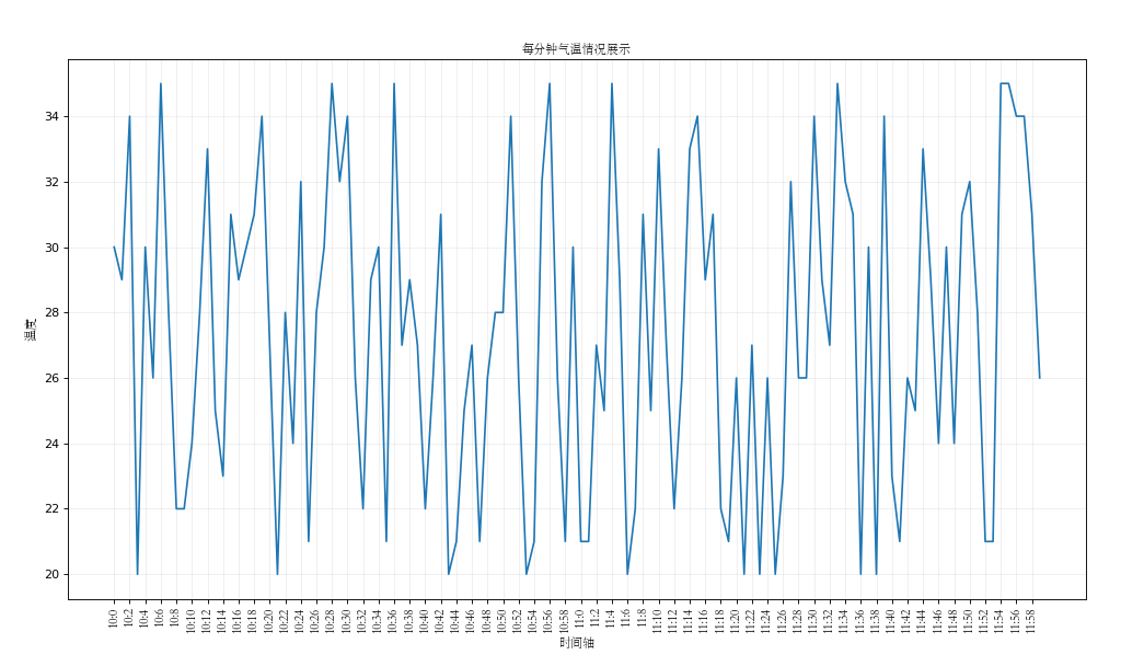
小练习1:如果列表a表示10点到12点的每一分钟的气温,如何绘制折线图观察每分钟气温的变化情况
View Code
2.2 绘制多次折线图
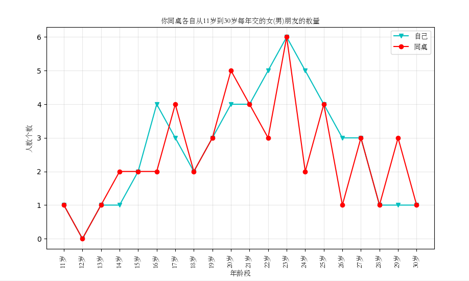
小练习2:统计出来你和你同桌各自从11岁到30岁每年交的女(男)朋友的数量,如列表a和b,请在途中绘制出该数据的折线图,一边比较自己和同桌20年之间的差异,同时分析每年交男女朋友的数量走势
 1 from matplotlib import pyplot
 2 # y_1表示自己
 3 y_1 = [1, 0, 1, 1, 2, 4, 3, 2, 3, 4, 4, 5, 6, 5, 4, 3, 3, 1, 1, 1]
 4
 5 # y_2表示同桌
 6 y_2 = [1, 0, 1, 2, 2, 2, 4, 2, 3, 5, 4, 3, 6, 2, 4, 1, 3, 1, 3, 1]
 7
 8 # x代表年龄段
 9 x = range(11, 31)
10
11 # 设置字体,绘制图形时可以显示中文
12 from matplotlib import font_manager
13
14 my_font = font_manager.FontProperties(fname='STSONG.TTF')
15
16 # 绘制图形(分别绘制,会自动整合到一张图上),label表示哪条线代表什么
17 pyplot.plot(x, y_1, label='自己', marker='v', color='c')
18 pyplot.plot(x, y_2, label='同桌', color='r', marker='o')
19
20 # 设置x轴上的显示单位
21 _x = ['%s岁' % i for i in x]
22 pyplot.xticks(x, _x, rotation=90, fontproperties=my_font)
23
24 # 设置x轴y轴以及图形名称(也可以通过fontproperties=my_font设置中文)
25 pyplot.xlabel('年龄段', fontproperties=my_font)
26 pyplot.ylabel('人数个数', fontproperties=my_font)
27 pyplot.title('你同桌各自从11岁到30岁每年交的女(男)朋友的数量', fontproperties=my_font)
28
29 # 网格,alpha表示指定透明度,网格也可以指定样式linestyle
30 pyplot.grid(alpha=0.3)
31
32 # 显示每条线对应的角色
33 pyplot.legend(loc=1, prop=my_font)
34
35 # 展示图形
36 pyplot.show()
 1 pyplot.legend(loc=1)中loc参数的用法
 2 'best':0
 3 'upper right'    :1
 4 'upper left'    :2
 5 'lower left'    :3
 6 'right'    :5
 7 'center left'    :6
 8 'center right'    :7
 9 'lower center'    :8
10 'upper center'    :9
11 'center'    :10
12
13
14 pyplot.plot方法中的参数
15 **Markers** 标记点的形状
16
17 ============= ===============================
18 character description
19 ============= ===============================
20 ``'.'`` point marker
21 ``','`` pixel marker
22 ``'o'`` circle marker
23 ``'v'`` triangle_down marker
24 ``'^'`` triangle_up marker
25 ``'<'`` triangle_left marker
26 ``'>'`` triangle_right marker
27 ``'1'`` tri_down marker
28 ``'2'`` tri_up marker
29 ``'3'`` tri_left marker
30 ``'4'`` tri_right marker
31 ``'s'`` square marker
32 ``'p'`` pentagon marker
33 ``'*'`` star marker
34 ``'h'`` hexagon1 marker
35 ``'H'`` hexagon2 marker
36 ``'+'`` plus marker
37 ``'x'`` x marker
38 ``'D'`` diamond marker
39 ``'d'`` thin_diamond marker
40 ``'|'`` vline marker
41 ``'_'`` hline marker
42 ============= ===============================
43
44
45 **Line Styles** 显示线的样式
46
47 ============= ===============================
48 character description
49 ============= ===============================
50 ``'-'`` solid line style
51 ``'--'`` dashed line style
52 ``'-.'`` dash-dot line style
53 ``':'`` dotted line style
54 ============= ===============================
55
56
57 **Colors**    显示线的颜色
58
59 The following color abbreviations are supported:
60
61 ============= ===============================
62 character color
63 ============= ===============================
64 ``'b'`` blue
65 ``'g'`` green
66 ``'r'`` red
67 ``'c'`` cyan
68 ``'m'`` magenta
69 ``'y'`` yellow
70 ``'k'`` black
71 ``'w'`` white
72 ============= ===============================
73
74 linewidth 线的宽度,用数字表示
3.绘制散点图
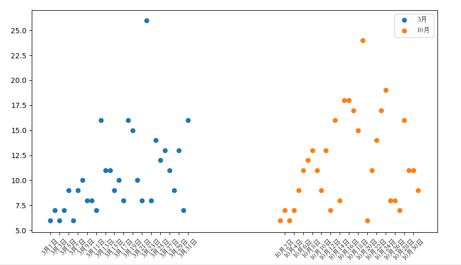
小练习3:假设通过爬虫你获取到了北京2016年3月,10月份每天白天的最高气温(分别位于a,b表),那么此时如何找出气温和随时间变化的某种规律
 1 import random
 2 from matplotlib import pyplot
 3 from matplotlib import font_manager
 4
 5 y_3 = [6, 7, 6, 7, 9, 6, 9, 10, 8, 8, 7, 16, 11, 11, 9, 10, 8, 16, 15, 10, 8, 26, 8, 14,12, 13, 11, 9, 13, 7, 16]
 6 y_10 = [6, 7, 6, 7, 9, 11, 12, 13, 11, 9, 13, 7, 16, 8, 18, 18, 17, 15, 24, 6, 11, 14, 17, 19,8, 8, 7, 16, 11, 11, 9]
 7 x_3 = range(1,32)
 8 x_10 = range(51,82)
 9
10 # 设置字体,绘制图形时可以显示中文
11 my_font = font_manager.FontProperties(fname='STSONG.TTF')
12
13 # 绘制图形
14 pyplot.scatter(x_3,y_3,label='3月')
15 pyplot.scatter(x_10,y_10,label='10月')
16
17 # 设置x轴上的显示单位
18 _x = list(x_3)+list(x_10)
19
20 _x_label = ['3月%s日' %i for i in x_3]
21 _x_label += ['10月%s日' %(i-50) for i in x_10]
22 pyplot.xticks(_x[::2],_x_label[::2],rotation=45,fontproperties=my_font)
23
24 # 网格
25 # pyplot.grid(linestyle=":")
26
27 # 显示每条线对应的角色
28 pyplot.legend(loc=1,prop=my_font)
29
30 # 展示图形
31 pyplot.show()
4.绘制条形图
4.1 绘制竖向条形图
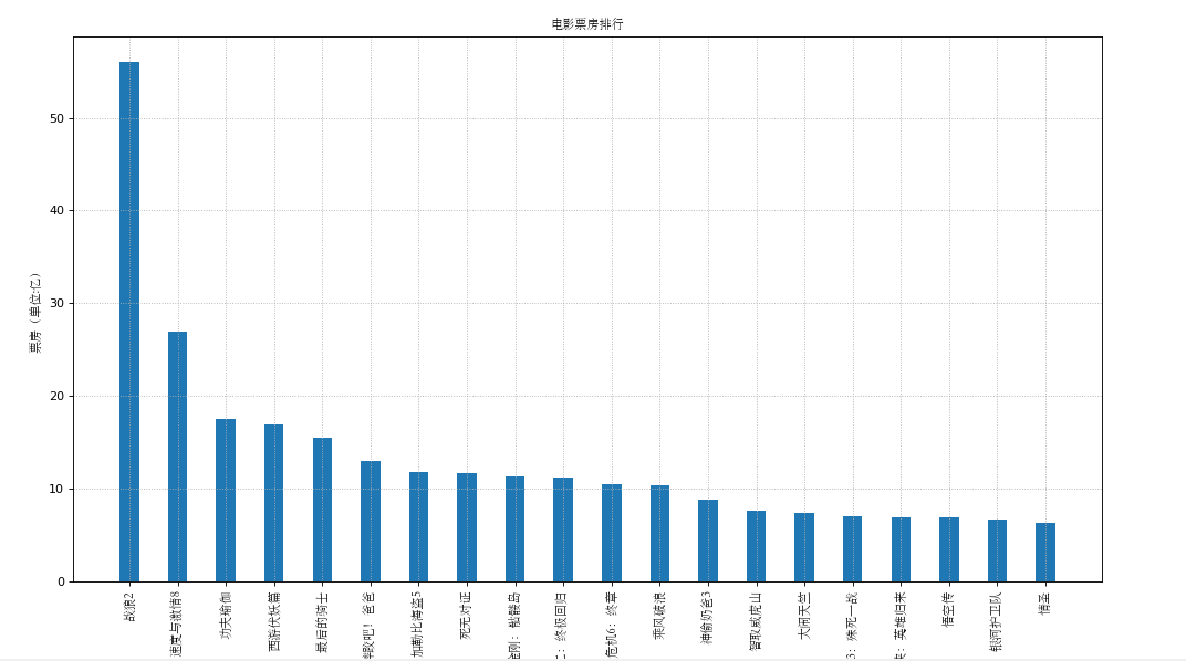
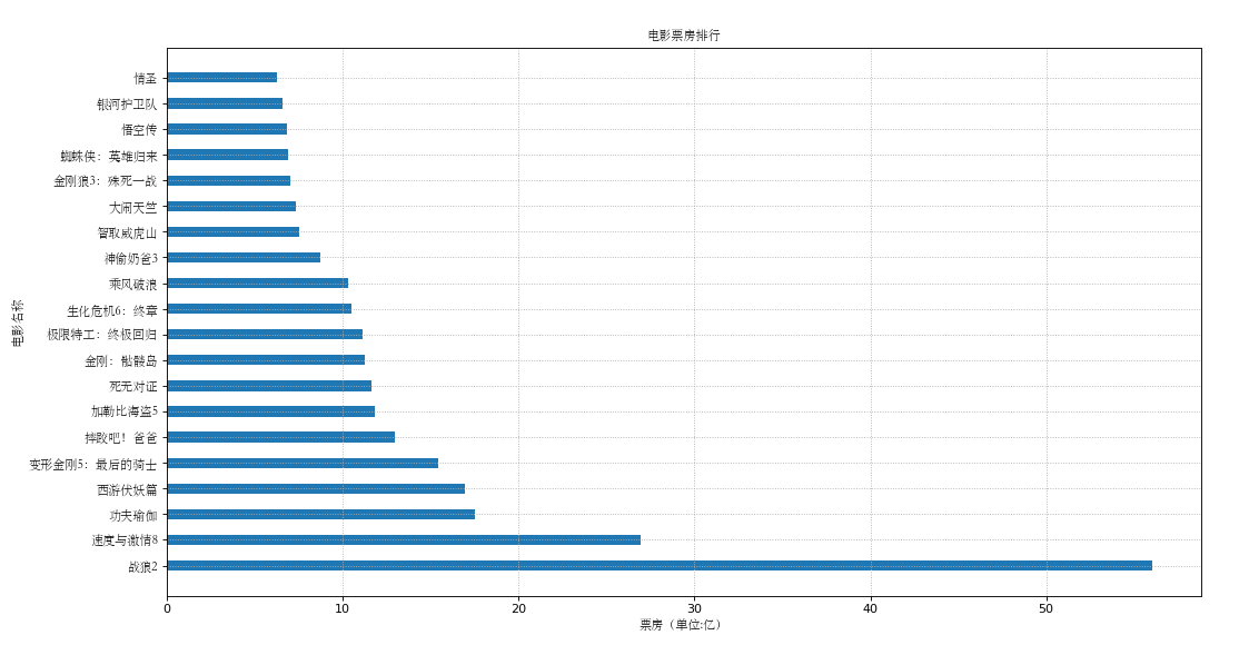
小练习4:假设你知道了列表a中电影票房前20的电影和电影票房数,那么如何更加直观的战术该数据呢
 1 import random
 2 from matplotlib import pyplot
 3 from matplotlib import font_manager
 4
 5 x = ['战狼2','速度与激情8','功夫瑜伽','西游伏妖篇','变形金刚5:最后的骑士','摔跤吧!爸爸','加勒比海盗5','死无对证','金刚:骷髅岛','极限特工:终极回归','生化危机6:终章','乘风破浪','神偷奶爸3','智取威虎山','大闹天竺','金刚狼3:殊死一战','蜘蛛侠:英雄归来','悟空传','银河护卫队','情圣']
 6
 7 y = [56.01, 26.94, 17.53, 16.94, 15.45, 12.96, 11.8, 11.61, 11.28, 11.12, 10.49, 10.3, 8.75, 7.55, 7.32, 6.99, 6.88, 6.86, 6.58, 6.23]
 8 print(len(y))
 9
10 # 设置字体,绘制图形时可以显示中文
11 my_font = font_manager.FontProperties(fname='STSONG.TTF')
12
13 # 设置图形大小
14 pyplot.figure(figsize=(18,10),dpi=80)
15
16 # 绘制图形
17 pyplot.bar(range(len(x)),y,width=0.4)
18
19 # 设置x轴上的显示单位
20 pyplot.xticks(range(len(x)),x,rotation=90,fontproperties=my_font)
21
22 # 网格
23 pyplot.grid(linestyle=":")
24
25 # 显示每条线对应的角色
26 # pyplot.legend(loc=1,prop=my_font)
27
28 # 加标注
29 pyplot.title('电影票房排行',fontproperties=my_font)
30 pyplot.ylabel('票房(单位:亿)',fontproperties=my_font)
31 pyplot.xlabel('电影名称',fontproperties=my_font)
32
33 # 保存图片
34 pyplot.savefig('./move.png')
35
36 # 展示图形
37 pyplot.show()
4.2 绘制横向条形图
小练习5:假设你知道了列表a中电影票房前20的电影和电影票房数,那么如何更加直观的战术该数据呢
 1 import random
 2 from matplotlib import pyplot
 3 from matplotlib import font_manager
 4
 5 x = ['战狼2','速度与激情8','功夫瑜伽','西游伏妖篇','变形金刚5:最后的骑士','摔跤吧!爸爸','加勒比海盗5','死无对证','金刚:骷髅岛','极限特工:终极回归','生化危机6:终章','乘风破浪','神偷奶爸3','智取威虎山','大闹天竺','金刚狼3:殊死一战','蜘蛛侠:英雄归来','悟空传','银河护卫队','情圣']
 6
 7 y = [56.01, 26.94, 17.53, 16.94, 15.45, 12.96, 11.8, 11.61, 11.28, 11.12, 10.49, 10.3, 8.75, 7.55, 7.32, 6.99, 6.88, 6.86, 6.58, 6.23]
 8 print(len(y))
 9
10 # 设置字体,绘制图形时可以显示中文
11 my_font = font_manager.FontProperties(fname='STSONG.TTF')
12
13 # 设置图形大小
14 pyplot.figure(figsize=(18,10),dpi=80)
15
16 # 绘制图形
17 pyplot.barh(range(len(x)),y,height=0.4)
18
19 # 设置x轴上的显示单位
20 pyplot.yticks(range(len(x)),x,rotation=0,fontproperties=my_font)
21
22 # 网格
23 pyplot.grid(linestyle=":")
24
25 # 加标注和标题
26 pyplot.title('电影票房排行',fontproperties=my_font)
27 pyplot.xlabel('票房(单位:亿)',fontproperties=my_font)
28 pyplot.ylabel('电影名称',fontproperties=my_font)
29
30 # 保存图片
31 pyplot.savefig('./move.png')
32
33 # 展示图形
34 pyplot.show()
4.3 竖向和横向的区别
横向的方法是barh
竖向的方法是bar
4.4 绘制多次条形图
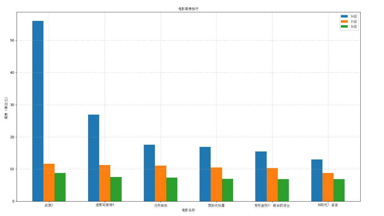
小练习6:假设你知道了列表a中电影分别在2017-09-14,2017-09-15,2017-09-16三天的票房,为了展示列表中电影本身的票房以及同其他电影的数据对比情况,应该如何更加直观的呈现数据
x = ['战狼2','速度与激情8','功夫瑜伽','西游伏妖篇','变形金刚5:最后的骑士','摔跤吧!爸爸',]
 1 #!/usr/bin/env python
 2 # -*- coding:utf8 -*-
 3 import random
 4 from matplotlib import pyplot
 5 from matplotlib import font_manager
 6
 7 x = ['战狼2','速度与激情8','功夫瑜伽','西游伏妖篇','变形金刚5:最后的骑士','摔跤吧!爸爸',]
 8
 9 y_14 = [56.01, 26.94, 17.53, 16.94, 15.45, 12.96]
10 y_15 = [11.61, 11.28, 11.12, 10.49, 10.3, 8.75]
11 y_16 = [8.75, 7.55, 7.32, 6.99, 6.88, 6.86]
12
13 bar_width = 0.2
14
15 x_14 = list(range(len(x)))
16 x_15 = [i+bar_width for i in x_14]
17 x_16 = [i+bar_width*2 for i in x_14]
18 # 设置字体,绘制图形时可以显示中文
19 my_font = font_manager.FontProperties(fname='STSONG.TTF')
20
21 # 设置图形大小
22 pyplot.figure(figsize=(18,10),dpi=80)
23
24 # 绘制图形
25 pyplot.bar(range(len(x)),y_14,width=bar_width,label='14日')
26 pyplot.bar(x_15,y_15,width=bar_width,label='15日')
27 pyplot.bar(x_16,y_16,width=bar_width,label='16日')
28
29 # 设置x轴上的显示单位
30 pyplot.xticks(x_15,x,rotation=0,fontproperties=my_font)
31
32 # 网格
33 pyplot.grid(linestyle=":")
34
35 # 显示每条线对应的角色
36 pyplot.legend(loc=1,prop=my_font)
37 pyplot.title('电影票房排行',fontproperties=my_font)
38 pyplot.ylabel('票房(单位:亿)',fontproperties=my_font)
39 pyplot.xlabel('电影名称',fontproperties=my_font)
40
41 pyplot.legend(loc=1,prop=my_font)
42
43 # pyplot.savefig('./move.png')
44
45 # 展示图形
46 pyplot.show()
5.绘制直方图
5.1 统计个数
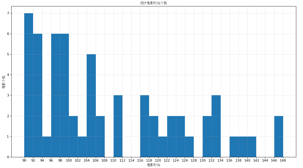
练习7 假设你获取了60部电影的时长,希望统计出这些电影时长的分布状态(比如,时长为100分钟到120分钟电影的数量,出现的频率)等信息,你应该如何呈现这些数据?
 1 from matplotlib import pyplot
 2 from matplotlib import font_manager
 3
 4 a = [90, 91, 90, 90, 90, 90, 92, 93, 97, 96, 98, 97, 102, 93, 101, 96, 106, 93, 106, 97, 90, 111, 99, 98, 110, 104, 99, 117, 116, 104, 119, 121, 116, 122, 124, 93, 105, 105, 98, 96, 127, 99, 132, 132, 133, 111, 95, 124, 118, 105, 130, 140, 130, 93, 122, 137, 138, 147, 100, 148]
 5
 6 # 设置中文显示字体
 7 my_font = font_manager.FontProperties(fname='STSONG.TTF')
 8
 9 # 计算组距
10 gd = 2
11
12 # 计算组数(一定要取整数)
13 num_bins = (max(a)-min(a))//gd
14
15 # 设置图形大小
16 pyplot.figure(figsize=(15,8),dpi=80)
17
18 # 绘制网格
19 pyplot.grid(alpha=0.3)
20
21 # 绘制图形
22 pyplot.hist(a,num_bins)
23
24 # 设置x轴的坐标
25 pyplot.xticks(range(min(a),max(a)+gd,gd))
26
27 # 设置标题
28 pyplot.title('统计电影时长个数',fontproperties=my_font)
29 pyplot.ylabel('电影个数',fontproperties=my_font)
30 pyplot.xlabel('电影时长',fontproperties=my_font)
31
32
33 # 查看图形
34 pyplot.show()
5.2 统计频率
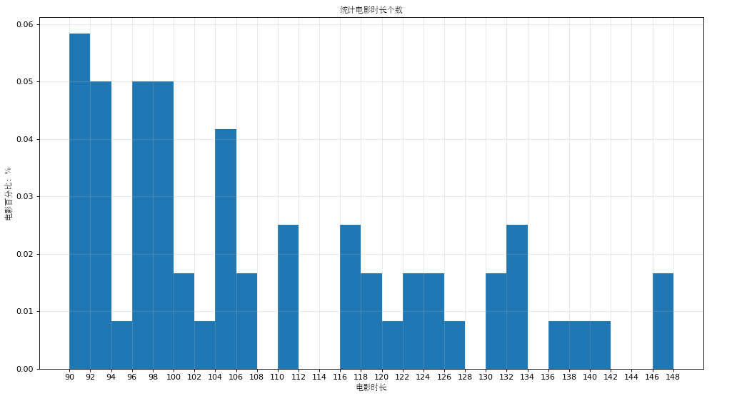
练习8 假设你获取了60部电影的时长,希望统计出这些电影时长的分布状态(比如,时长为100分钟到120分钟电影出现的频率)等信息,你应该如何呈现这些数据?
 1 from matplotlib import pyplot
 2 from matplotlib import font_manager
 3
 4 a = [90, 91, 90, 90, 90, 90, 92, 93, 97, 96, 98, 97, 102, 93, 101, 96, 106, 93, 106, 97, 90, 111, 99, 98, 110, 104, 99, 117, 116, 104, 119, 121, 116, 122, 124, 93, 105, 105, 98, 96, 127, 99, 132, 132, 133, 111, 95, 124, 118, 105, 130, 140, 130, 93, 122, 137, 138, 147, 100, 148]
 5
 6 my_font = font_manager.FontProperties(fname='STSONG.TTF')
 7
 8 # 计算组距
 9 gd = 2
10
11 # 计算组数(一定要取整数)
12 num_bins = (max(a)-min(a))//gd
13
14 # 设置图形大小
15 pyplot.figure(figsize=(15,8),dpi=80)
16
17 # 绘制网格
18 pyplot.grid(alpha=0.3 )
19
20 # 绘制图形
21 pyplot.hist(a,num_bins,normed=True)
22
23 # 设置x轴的坐标
24 pyplot.xticks(range(min(a),max(a)+gd,gd))
25
26 # 设置标题
27 pyplot.title('统计电影时长个数',fontproperties=my_font)
28 pyplot.ylabel('电影百分比:%',fontproperties=my_font)
29 pyplot.xlabel('电影时长',fontproperties=my_font)
30
31
32 # 查看图形
33 pyplot.show()

 浙公网安备 33010602011771号