

html em 和 rem
em和rem都是网页排版的相对单位
一、rem的特点
1、rem的大小是根据html根目录下的字体大小进行计算的。
2、当我们改变根目录下的字体大小的时候,下面字体都改变。
3、rem不仅可以设置字体的大小,也可以设置元素宽、高等属性。
二、em的特点
1、字体大小是根据父元素字体大小设置的
2、em的大小是根据父元素的大小变化的,如果父元素没有的话,会向上追溯。
下面主要是使用一段js代码,实现rem布局,这个方案是按照1rem = 100px的比例
实现设计图上宽为50px,高60px的按钮,,可以用代码这样实现
.myBtn {
   width: 0.55rem;
   height: 0.37rem;
}
贴出代码
<!DOCTYPE html>
<html lang="en">
<head>
    <meta charset="UTF-8">
    <title>Title</title>
    <script>
        !function(e){
            function t(a){
                if(i[a])return i[a].exports;
                var n=i[a]={exports:{},id:a,loaded:!1
                };
                return e[a].call(n.exports,n,n.exports,t),n.loaded=!0,n.exports
            }
            var i={};
            return t.m=e,t.c=i,t.p="",t(0)
        }
        ([function(e,t){
            "use strict";
            Object.defineProperty(t,"__esModule",{value:!0});
            var i=window;
            t["default"]=i.flex=function(e,t){
                var a=e||100,n=t||1,r=i.document,
                    o=navigator.userAgent,
                    d=o.match(/Android[\S\s]+AppleWebkit\/(\d{3})/i),
                    l=o.match(/U3\/((\d+|\.){5,})/i),
                    c=l&&parseInt(l[1].split(".").join(""),10)>=80,
                    p=navigator.appVersion.match(/(iphone|ipad|ipod)/gi),
                    s=i.devicePixelRatio||1;p||d&&d[1]>534||c||(s=1);
                    var u=1/s,
                        m=r.querySelector('meta[name="viewport"]');
                    m||(m=r.createElement("meta"),
                        m.setAttribute("name","viewport"),
                        r.head.appendChild(m)),
                        m.setAttribute("content","width=device-width,user-scalable=no,initial-scale="+u+",maximum-scale="+u+",minimum-scale="+u),
                        r.documentElement.style.fontSize=a/2*s*n+"px"},e.exports=t["default"]}]);
    flex(100, 1);
    </script>

    <!-- 字形图标 -->
    <script src="https://use.fontawesome.com/f47f4563cb.js"></script>
</head>
<body>
<div class="box">
    <div style="width: 100%;height:0.88rem;background-color: #17acf6;text-align: center;line-height: 0.88rem;position: fixed;top:0;left: 0">
        <span style="font-size:0.3rem;color: #fff">项目详情</span>
    </div>
    <!--<img src="http://temp.im/640x260/444/fff" class="img-responsive">-->
    <div style="width: 100%;height: 1rem;background-color: #fff;line-height: 1rem;padding-left: 0.39rem;margin-bottom: 0.15rem;margin-top: 0.88rem">
        <span style="font-size:0.25rem">项目名称:某某某项目</span>
    </div>
    <div style="width: 100%;height: 4.2rem;background-color: #fff;padding: 0.39rem;margin-bottom: 0.15rem;">
        <p style="font-size:0.25rem;">甲方负责人</p>
        <p style="font-size: 0.34rem;font-weight: bold">张某某</p>
        <p style="font-size: 0.25rem;font-weight: bold">中国石油化工集团公司   董事长</p>
        <p style="font-size:0.25rem">性别:男</p>
        <p style="font-size:0.25rem">年龄:35岁</p>
        <p style="font-size:0.25rem">电话:19809090909</p>
        <p style="font-size:0.25rem">生日:3月12号</p>
    </div>
    <div style="width: 100%;height: 4.2rem;background-color: #fff;padding: 0.39rem;margin-bottom:0.15rem;">
        <div style="width: 100%;">
            <p style="font-size:0.25rem;float: left">最新进展</p>
            <p style="font-size:0.25rem;float: right">技术交流--客户说下个月签单</p>
        </div>
        <div style="width: 100%;clear: both">
            <p style="font-size:0.25rem;float: left">下一步计划</p>
            <p style="font-size:0.25rem;float: right">技术交流--客户说下个月签单</p>
        </div>

    </div>
    <div class="navRoot">
        <a href="#" class="navLink active">
            <i class="fa fa-home navLinkIco" aria-hidden="true"></i>
            <span class="navLinkText">首页</span>
        </a>
        <a href="#" class="navLink">
            <i class="fa fa-home navLinkIco" aria-hidden="true"></i>
            <span class="navLinkText">好店</span>
        </a>
        <a href="#" class="navLink">
            <i class="fa fa-home navLinkIco" aria-hidden="true"></i>
            <span class="navLinkText">简单</span>
        </a>
        <a href="#" class="navLink">
            <i class="fa fa-home navLinkIco" aria-hidden="true"></i>
            <span class="navLinkText">复杂</span>
        </a>
        <!--<a href="#" class="navLink">-->
            <!--<i class="fa fa-home navLinkIco" aria-hidden="true"></i>-->
            <!--<span class="navLinkText">异步</span>-->
        <!--</a>-->
    </div>
</div>
</body>
<style>
    * {
        box-sizing: border-box;
        /* 在X5新内核Blink中,在排版页面的时候,会主动对字体进行放大,会检测页面中的主字体,当某一块字体在我们的判定规则中,认为字号较小,并且是页面中的主要字体,就会采取主动放大的操作。然而这不是我们想要的,可以采取给最大高度解决 */
        max-height: 100000px;
        /*background-color: #eee;*/
    }

    *:before, *:after {
        box-sizing: border-box;
        max-height: 100000px;
    }

    *, *:before, *:after {
        -webkit-tap-highlight-color: rgba(0, 0, 0, 0);
    }

    html, body, div, span, object, iframe, h1, h2, h3, h4, h5, h6, p, blockquote, pre, a, abbr, address, cite, code, del, dfn, em, img, ins, kbd, q, samp, small, strong, sub, sup, var, b, i, dl, dt, dd, ol, ul, li, fieldset, form, label, legend, table, caption, tbody, tfoot, thead, tr, th,textarea, td {
        border: 0 none;
        font-size: inherit;
        color: inherit;
        margin: 0;
        padding: 0;
        vertical-align: baseline;
        line-height: 2.0;
    }

    h1, h2, h3, h4, h5, h6 {
        font-weight: normal;
    }

    em, strong {
        font-style: normal;
    }

    ul, ol, li {
        list-style: none;
    }

    body {
        font-family: "Helvetica Neue",Helvetica,"PingFang SC","Hiragino Sans GB","Microsoft YaHei","\5FAE\8F6F\96C5\9ED1",Arial,sans-serif;
        line-height: 1.5;
        color: #333;
        background-color: #f2f2f2;
        font-size: 0.24rem;
    }

    a {
        text-decoration: none;
    }
    .box {
        position: relative;
        max-width: 10rem;
        margin: 0 auto;
    }
    .navRoot {
        position: fixed;
        z-index: 50;
        bottom: 0;
        left:0;
        width: 100%;
        height: 1rem;
        display: -webkit-box;
        display: -ms-flexbox;
        display: flex;
        border-top: 0.01rem solid #ccc;
        background:#f2f2f2;
    }

    .navLink {
        font-size: 0.42rem;
        -webkit-box-flex: 1;
        -ms-flex: auto;
        flex: auto;
        display: -webkit-box;
        display: -ms-flexbox;
        display: flex;
        -webkit-box-orient: vertical;
        -webkit-box-direction: normal;
        -ms-flex-direction: column;
        flex-direction: column;
        -ms-flex-wrap: wrap;
        flex-wrap: wrap;
        -webkit-box-pack: center;
        -ms-flex-pack: center;
        justify-content: center;
        -webkit-box-align: center;
        -ms-flex-align: center;
        align-items: center;
        line-height: 1;
        color: #666;
    }
    .navLink.active {
        color: #1abc9c
    }
    .navLinkIco {
        display: block;
        margin-bottom: 0.1rem;
    }

    .navLinkText {
        display: block;
        line-height: 1;
        font-size: 0.24rem;
    }

    .img-responsive {
        width: 100%;
    }
</style>
</html>
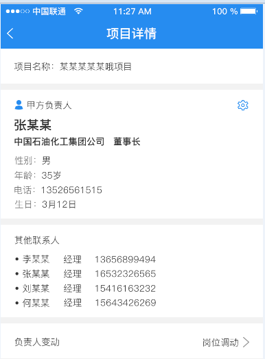
效果展示
UI给出的效果图
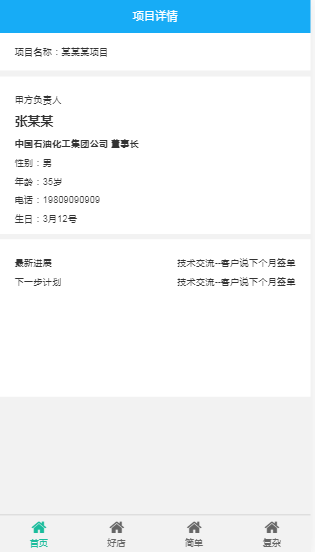
下面是这段代码运行在iphone5和iphone6plus上的效果

参考链接:https://www.jianshu.com/p/985d26b40199 手机端页面自适应解决方案

 浙公网安备 33010602011771号