


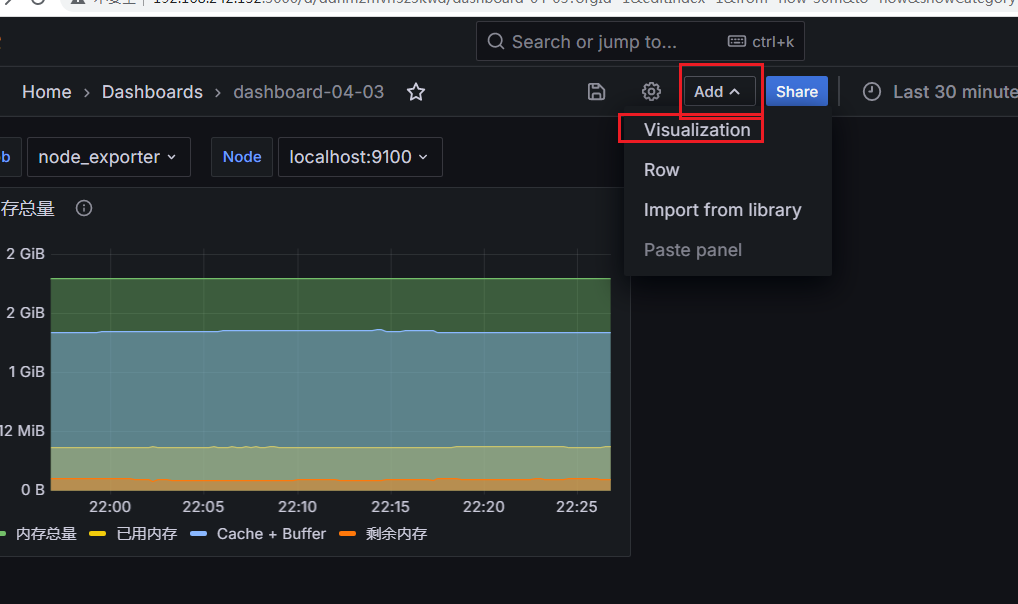
Grafana上添加表格面板
添加表格面板
1、Add->Visualization
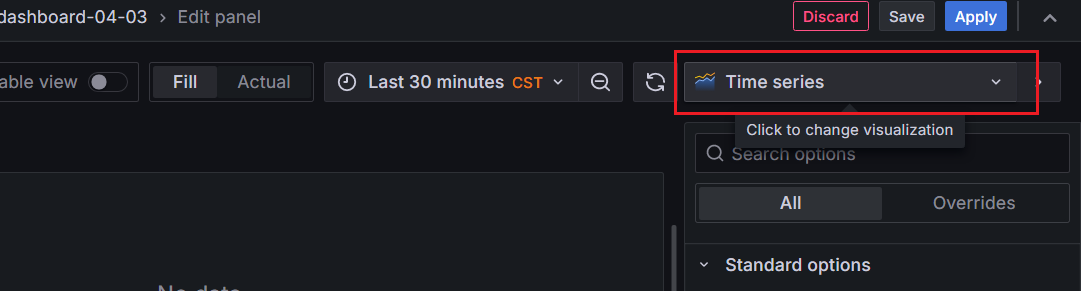
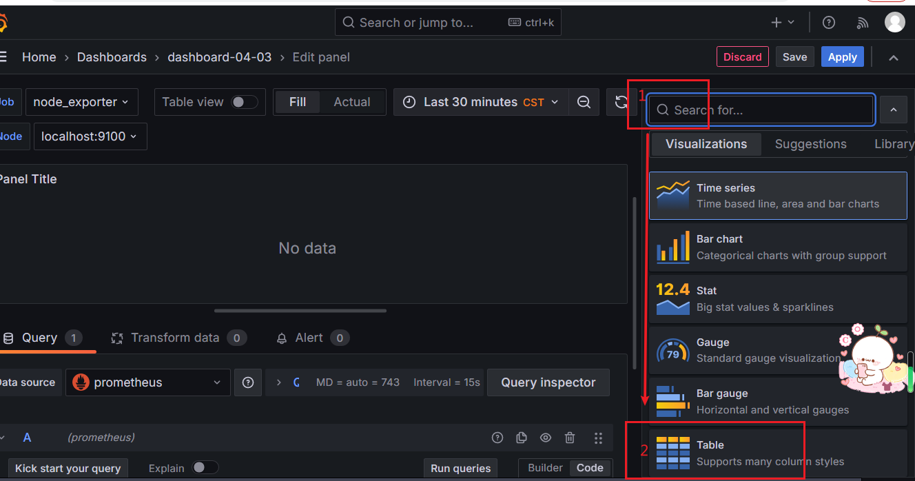
2、点击Visualization后再点击右侧的Time series->下拉项中选择Table
添加一条折线图数据
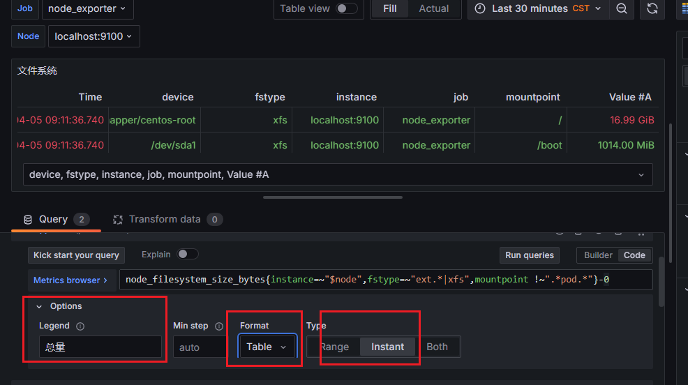
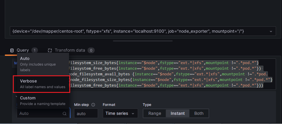
Format->Table 选择Table

经过上面Option的操作配置后可以发现这时候折线图变成了下图所示的表格的形式

更改图表表格样式
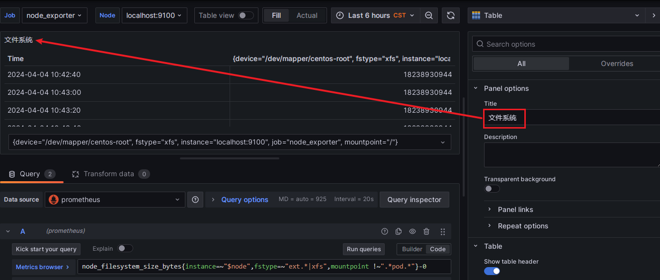
更改Panel options->Title图表标题
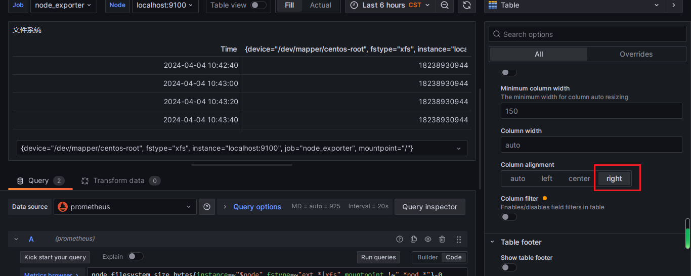
更改图表内容为右对齐
Cell options->Cell type选择字体颜色
更改单位、保留值的小数位

可以看到经过设置后value的格式发生了改变

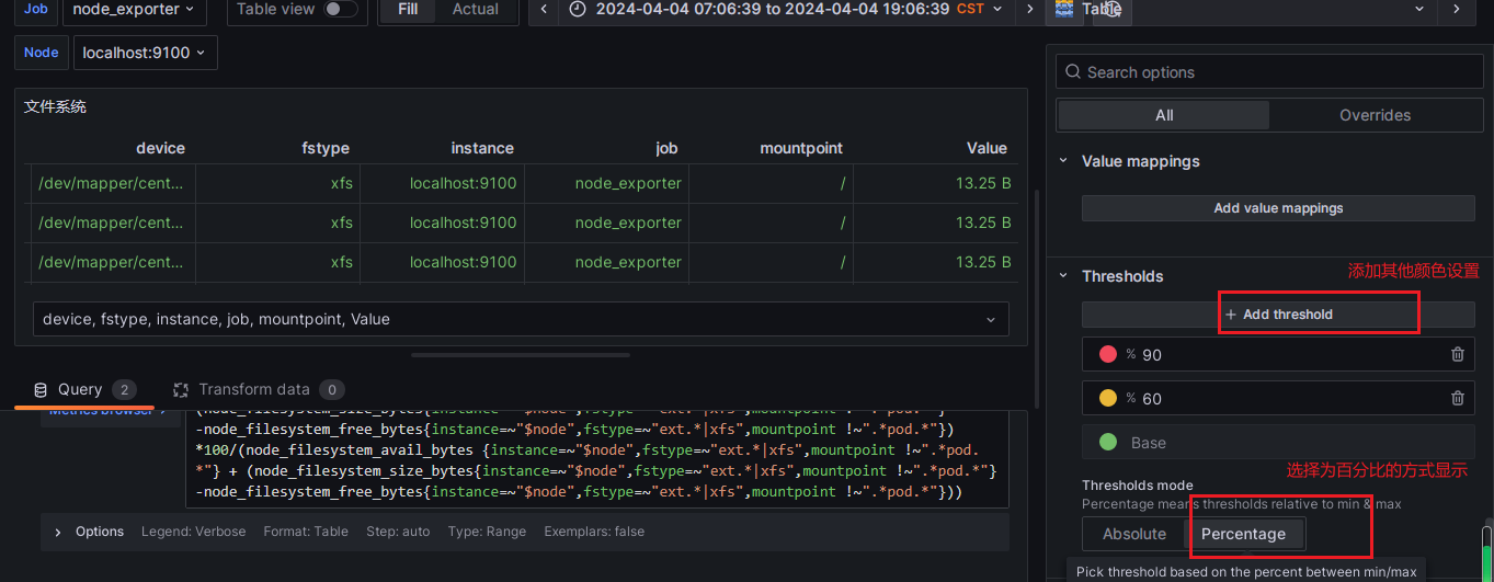
设置字体颜色的阈值
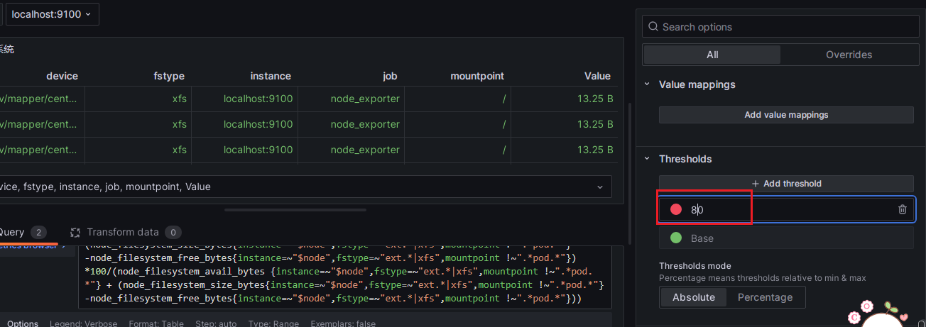
如下图设置达到90%变为红色、达到60%变为黄色
Thresholds mode->Percettage设置为百分比显示
更改列名
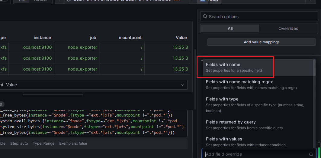
1、点击Add field override

2、下拉列表选择->Fields with name
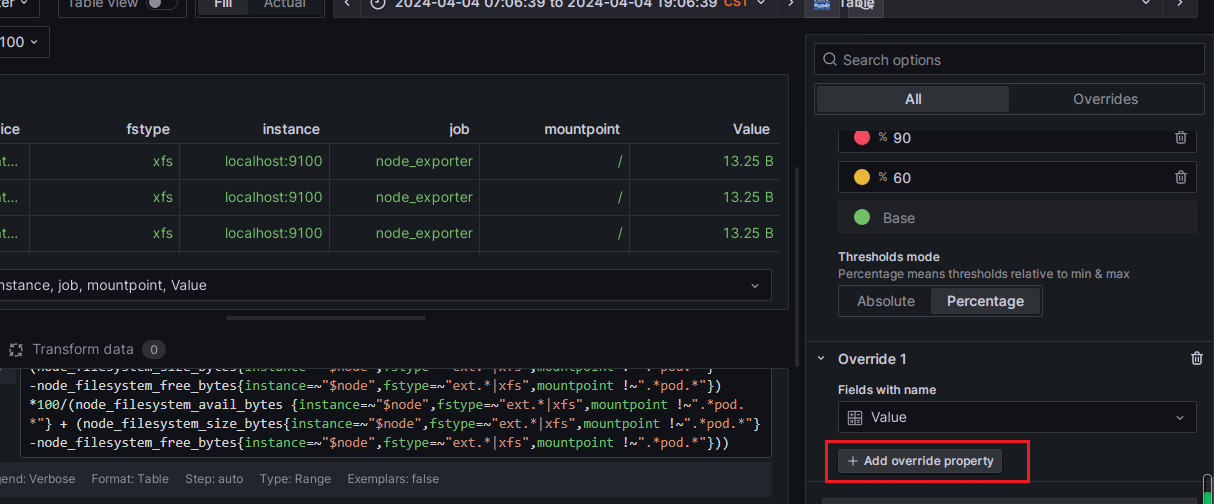
3、选择需要设置的列名

4、点击Add override property
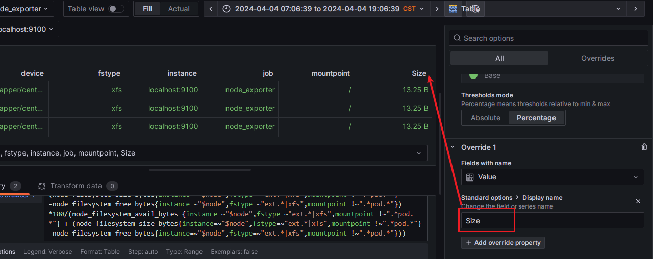
选择Standard optionsDisplay > name

完成对Value列名值的更改
还可以点击Add override property -> Standard options > Unit
针对上面的Value单独列名进行单位设置
5、再点击Add field override (编辑Value #B)
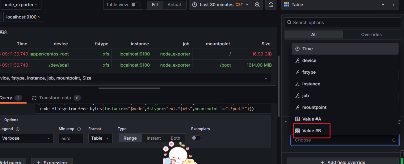
6、Standard optionsDisplay > name
更改为Used
更改Value # B的单位
1、根据观察表达式可以看到数据有乘以100说明用百分比显示合适
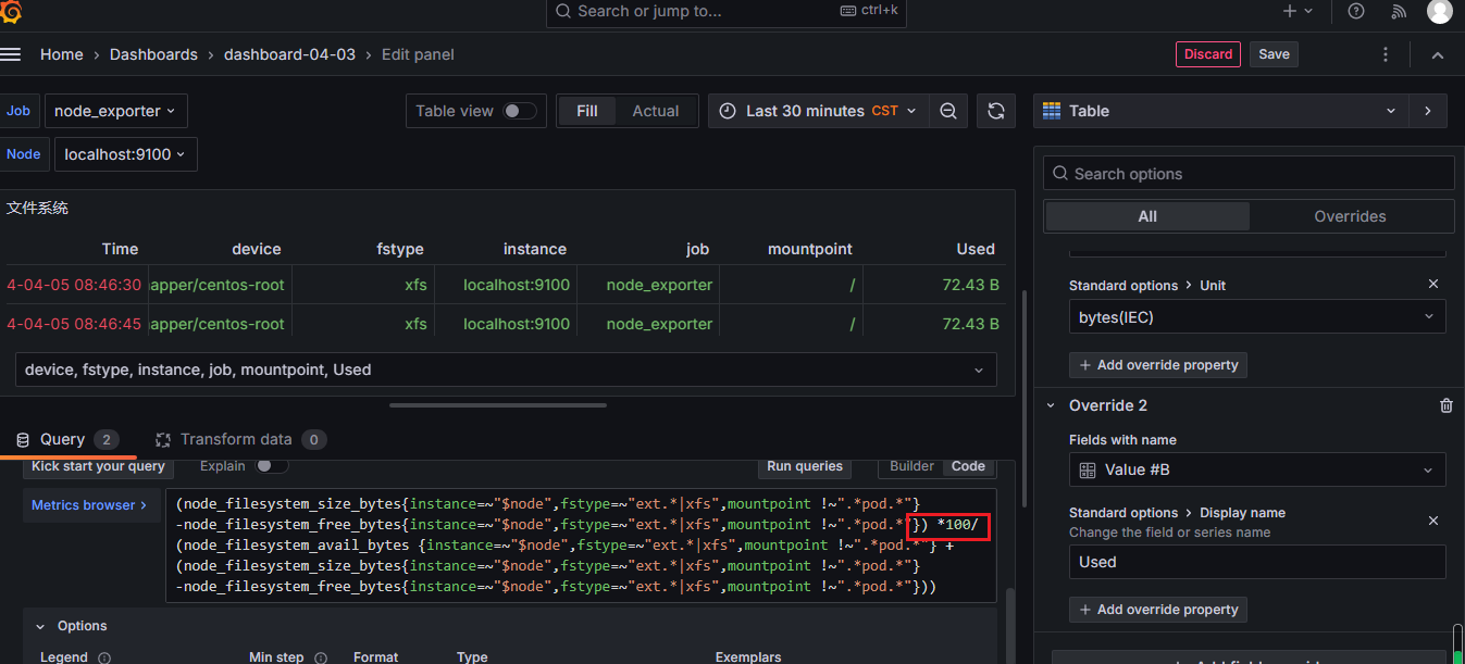
2、点击Add override property -> Standard options > Unit

2、选择Misc->Percent (0-100)

同样还可以针对Value # B这个列添加背景色
点击Add override property->Cell optionsCell type
设置字体颜色的阈值
Add override property->Thresholds
整合图表数据
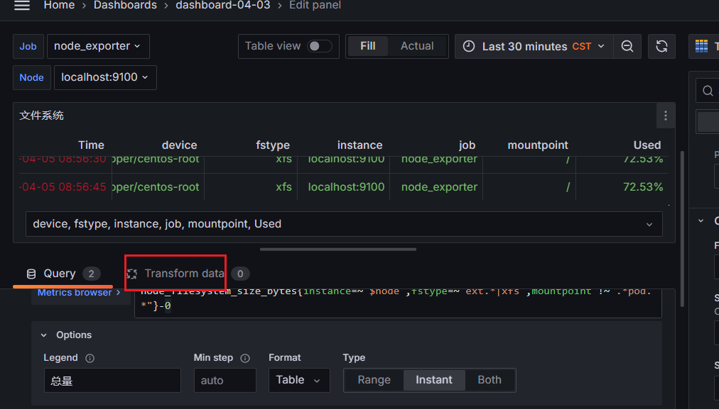
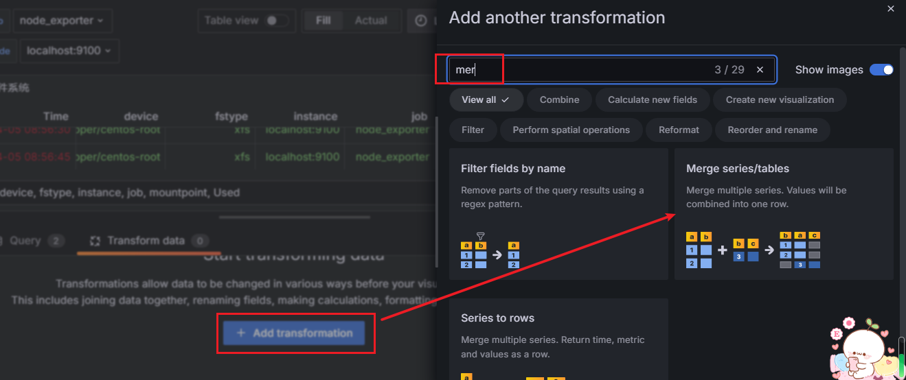
点击 Add transformation

选择Merge series/tables方式
选择Merge series/tables方式后相对于之前来说图表下面没有了下拉列表的显示


 浙公网安备 33010602011771号