
css_渐变_多种颜色/stop-colors/纯色区域和渐变区域
codes
preview
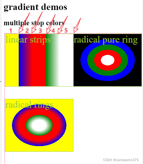
- 色带
1,3,5分别为黄,红,白的纯色带 - 色带
2,4分为为蓝-红,绿-白渐变色带 - radial-gradient 于linear-gradient 在颜色上有类似的规律
![在这里插入图片描述]()
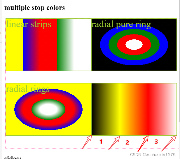
- 图4 中由4种(
黑黄红白)颜色构成三条渐变色带(黑黄,黄红,红白)
html
<!DOCTYPE html>
<html lang="en">

<head>
    <meta charset="UTF-8">
    <meta http-equiv="X-UA-Compatible" content="IE=edge">
    <meta name="viewport" content="width=device-width, initial-scale=1.0">
    <title>Document</title>
    <style>
    </style>
    <link rel="stylesheet" href="styles/radical-gradient.css">

</head>

<body>
    <h1>gradient demos</h1>
    <h2>multiple stop colors</h2>
    <div class="box">
        <div class="multiple-color-linear">linear strips</div>
        <div class="multiple-color">radical pure ring</div>
        <div class="multiple-color-tester">radical rings</div>
    </div>
    <h2>sides:</h2>
    <div class="box">
        <!-- <div>test</div> -->
        <div class="closest-side-ellipse">
            <div class="offset_40_50"></div>
        </div>
        <div class="farthest-side-ellipse">
            <div></div>
        </div>
        <div class="closest-side-circle">
            <div></div>
        </div>
        <div class="farthest-side-circle">
            <div></div>
        </div>
        <!-- <div class="radial_gradient_variants">ter</div> -->

    </div>
    <h2>corners</h2>
    <div class="box">
        <!-- <div>test</div> -->
        <div class="closest-corner-ellipse">
            <div class="offset_40_50"></div>
        </div>
        <div class="farthest-corner-ellipse">
            <div></div>
        </div>
        <div class="closest-corner-circle">
            <div></div>
        </div>
        <div class="farthest-corner-circle">
            <div></div>
        </div>
        <!-- <div class="radial_gradient_variants">ter</div> -->

    </div>

    <!-- <h2>test</h2>
    <div class="box">
        <div class="radial-gradient-sizes"></div>
        <div class="radial-gradient">e1</div>
        <div class="radial-gradient_blue"></div>
        <div class="radial_gradient_variants">ter</div>

    </div> -->
</body>

</html>
css
html,
body {
    width: 100%;
    height: 100%;
}

.box {
    border: dotted 2px hotpink;
    margin: 3px;
    display: block;
    width: 100%;
    height: 50%;

    display: flex;
    flex-flow: wrap;
}

.radial-gradient {
    /* display: inline; */
    background: radial-gradient(red, yellow, rgb(30, 144, 255));
}

.radial-gradient_blue {
    background: rgb(9, 121, 57);
    background: radial-gradient(circle,
            rgb(39, 91, 233) 26%,
            rgba(2, 0, 36, 1) 100%,
            rgba(0, 212, 255, 1) 100%);
}

.radial_gradient_variants {
    /* 一下三个值的效果一致 */
    background-image: radial-gradient(yellow, blue);
    background-image: radial-gradient(ellipse at center, yellow 0%, blue 100%);
    background-image: radial-gradient(farthest-corner at 50% 50%, yellow, blue);
    /* background-image: radial-gradient(circle, yellow, blue); */
    background-image: radial-gradient(farthest-side at left bottom,
            #fff133 50%,
            #16d611 100px,
            #00a3ef 50%);
    background-image: radial-gradient(closest-side at 40px 50px,
            #fff133 50%,
            #00a3ef 50%);
    background-image: radial-gradient(farthest-side,
            #fff133 50% 70%,
            #00a3ef 50% 100%);
    background-image: radial-gradient(farthest-corner,
            #fff133 50% 99%,
            #00a3ef 50% 100%);
    background-image: radial-gradient(farthest-side,
            #fff133 50% 99%,
            #00a3ef 50% 100%);
    background-image: radial-gradient(closest-side,
            #fff133 50% 100%,
            #00a3ef 50% 100%);
}

/* 语法大致分为两部分,第一部分较为灵活(存在较多简写形式) */
/* radial-gradient (
            [
                (comment:形状/大小/位置;从优先级低的开始看起,划分长句(从`|`互斥符到`[]`以及`||`,`&&`))
                [
                    [ <shape> || <size> ] [[ at <position> ] ? ],
                        | [at <position>] ,
                ] ?
                (comment:由于<color-stop>将重复多次,且需要以`,`分割,故而将`,`纳入到后面的`[]`比较合适)
            ] <color-stop> [ , <color-stop> ] +
        ) */

.radial-gradient-sizes {
    background-image: radial-gradient(farthest-side at left bottom,
            #fff133 50%,
            #16d611 100px,
            #00a3ef 50%);
}

/* The following examples set the center of the gradient at 40px from the left side of the gradient box and 50px from the top side of the gradient box.  */
/* ellipse shapes:(default shape) */
/* sides:ellipse */
.multiple-color-noPercents {
    background: radial-gradient(closest-side,
            /* white, */
            green,
            red
            /* blue */
        );
    background: linear-gradient(to left,
            /* green, */
            white 0%,
            black 100%);
    background: linear-gradient(to left,
            /*  */
            white 0%,
            red 50%,
            black 100%);
    /* 四色三带 */
    background: linear-gradient(to left,
            /*  */
            white,
            red,
            yellow,
            black
            /*  */
        );
    background: linear-gradient(to left,
            /*  */
            white 0%,
            red 33.3%,
            yellow 66.6%,
            black 100%
            /*  */
        );


}

.multiple-color {


    background: radial-gradient(closest-side,
            /* white block */
            white 0%,
            white 20%,
            /* red ring */

            red 20%,
            red 40%,
            /* green ring */
            green 40%,
            green 60%,
            /* blue ring */
            blue 60%,
            blue 80%,
            /* black block */
            black 80%,
            black 100%);
}

.multiple-color-tester {
    background: radial-gradient(closest-side,
            #1bf2dd 20%,
            /* f2ea73 */
            #f2ea7e 20%,
            #f2ea7e 40%,
            /* #f2ba52 */
            #f2ba52 40%,
            #f2ba52 60%,
            /*  */
            #f2994b 60%,
            #f2994b 80%,
            #f23e2e 80%,
            #f23e2e 100%);
    background-image: radial-gradient(closest-side,
            /* 下面的stop-colors 参数展示了多重颜色的径向渐变以及特殊的纯色环情况 */
            /* 其实,不管是纯色环还是渐变色环,都可以理解为渐变(纯色环可以理解为是渐变色环的一种特例,
        即,对于纯色环,该色环的start-color 和end-color是一致的,那么浏览器构建的填充色环的的曲线将没有颜色梯度编号(该区间内所有线条的颜色都是一致的,形成纯色圆环的效果 */
            /* core block */
            white 0%,
            white 20%,
            /* white-green gradient ring(gradient ring with the different color and value tuples) */
            white 20%,
            green 40%,
            /* red-red ring(pure color ring with the same color but different value tuples */
            red 40%,
            red 60%,
            /* red-blue gradient ring */
            red 60%,
            blue 80%,
            yellow 80%,
            yellow 99%);
}

.multiple-color-linear {

    background: radial-linear(
            /* f2ea73 */
            #f2ea7e 20%,
            #f2ea7e 40%,
            /* #f2ba52 */
            #f2ba52 40%,
            #f2ba52 60%,
            /*  */
            #f2994b 60%,
            #f2994b 80%,
            #f23e2e 80%,
            #f23e2e 100%);
    background-image: linear-gradient(
            /* 45deg, */
            to left,
            /* core block */
            white 0%,
            white 20%,
            /* white-green gradient ring(gradient ring with the different color and value tuples) */
            white 20%,
            green 40%,
            /* red-red ring(pure color ring with the same color but different value tuples */
            red 40%,
            red 60%,
            /* red-blue gradient ring */
            red 60%,
            blue 80%,
            yellow 80%,
            yellow 99%);
}


.closest-side-ellipse {
    /*
            The first example uses closest-side, so the ending shape of the gradient is defined by the closest sides of the gradient box—namely, the top and left sides. */

    background-image: radial-gradient(closest-side at 40px 50px,
            #fff133 50%,
            #00a3ef 50%);
}

.farthest-side-ellipse {
    /* The second example uses farthest-side, so the ending shape of the gradient is defined the farthest sides of the gradient box—namely, the right and bottom sides. */

    background-image: radial-gradient(farthest-side at 40px 50px,
            #fff133 50%,
            #00a3ef 50%);
}

/* corners:ellipse */
.closest-corner-ellipse {
    background-image: radial-gradient(closest-corner at 40px 50px,
            #fff133 50%,
            #00a3ef 50%);
}

.farthest-corner-ellipse {
    background-image: radial-gradient(farthest-corner at 40px 50px,
            #fff133 50%,
            #00a3ef 50%);
}

/* circle shapes: */

/* sides:circle */
.closest-side-circle {
    /* If you use closest-side or farthest-side with circular gradients, the size is determined by the closest side of the gradient box. For the following closest-side example, that side is the left side. */

    background-image: radial-gradient(closest-side circle at 40px 50px,
            #fff133 50%,
            #00a3ef 50%);
}

.farthest-side-circle {
    /* For the following farthest-side example, the size of the circle gradient is determined by the right side of the gradient box. */

    background-image: radial-gradient(farthest-side circle at 40px 50px,
            #fff133 50%,
            #00a3ef 50%);
}

/* corners:circle */
.closest-corner-circle {
    background-image: radial-gradient(closest-corner circle at 40px 50px,
            #fff133 50% 50%,
            #00a3ef 50% 50%);
}

.farthest-corner-circle {
    background-image: radial-gradient(farthest-corner circle at 40px 50px,
            #fff133 50%,
            #00a3ef 50%);
}

div>div>div,
.offset_40_50 {
    border: dotted 2px;
    /* border-width: 0px 1px 1px 0px; */
    border-left-width: 0;
    border-top-width: 0;
    width: 40px;
    height: 50px;
}

/*
        background-image: radial-gradient(yellow, blue);
        background-image: radial-gradient(ellipse at center, yellow 0%, blue 100%);
        background-image: radial-gradient(farthest-corner at 50% 50%, yellow, blue); */
div {
    display: flex;
    flex-flow: wrap;
}

div>div {
    /* display: inline-flex; */
    height: 40%;
    width: 48%;
    border: solid 1px;
    font-size: 2em;
    color: yellowgreen;
}

 浙公网安备 33010602011771号