css-table属性运用
最近在工作中遇到了一些不常用的布局,很多使用 CSS table 属性,并结合 ::before,::after 伪元素完成了,使得 HTML 的结构相对更简单,更具有语义性。当 HTML 结构越清晰,越有规律时,便于阅读,循环套数据时也可以少很多的判断。
一、有下面这样一个设计,上面是标题,中间是流程图,下面是电话。
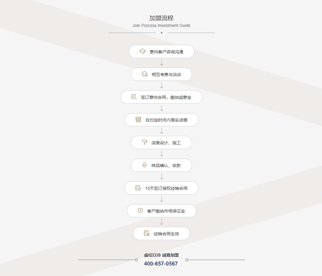
很明显:
1. 这个设计图中的所有内容都是居中显示的;
2. 标题部分,分为了中文和英文,下面有两条线,还有一个菱形;
3. 中间部分,流程的每一项,除了最后一项外,每一项下面都有一个箭头指向;
4. 电话部分,左右两边各有一条线,且各有一个菱形;
这个设计图的实现中,现在我们不使用图片,依靠 CSS 中 table,定位,伪元素来完成。
- 首先,根据效果图写出没有多余的标签的 HTML 结构:
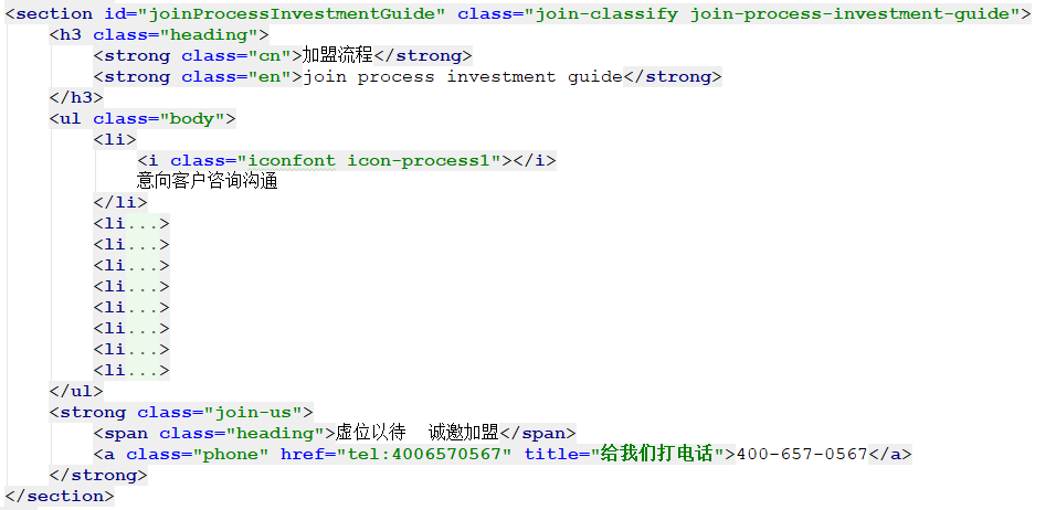
注:其它 li 标签和第一个 li 标签的结构一致,只是 icon 类名和文本不同。
- 思考:
.heading 的布局
1. 宽度不能固定,得根据文本内容来适应;2. 在父容器中需要水平居中; 3. 线的宽度可以根据内容的宽度来确定; 4. 菱形可以通过正方形顺时针或者逆时针旋转 45° 获得。
.heading {
  position: relative;
  display: table;
  margin: 0 auto 40px;
  padding: 0 80px 18px;
  color: #333;
  &::before,
  &::after {
    content: "";
    position: absolute;
    bottom: 0;
    width: calc(50% - 20px);
    height: 1px;
    background-color: #999;
  }
  &::before {
    left: 0;
  }
  &::after {
    right: 0;
  }
  strong {
    display: block;
    text-align: center;
  }
  .cn {
    color: #333;
    line-height: .9;
    font-family: "webfont", Arial, sans-serif;  // 这里使用的网络安全字体
    font-weight: normal;
    font-size: 20px;
    margin-bottom: 10px;
  }
  .en {
    color: #666;
    font-family: "webfont", Arial, sans-serif;
    font-weight: lighter;
    text-transform: capitalize;
    font-size: 14px;
    line-height: 1;
    &::after {
      content: "";
      position: absolute;  // 这里的布局定位已祖先元素含有非 static 定位的元素进行绝对定位
      bottom: -2px;
      left: 50%;
      width: 5px;
      height: 5px;
      background-color: #999;
      transform: translateX(-50%) rotate(45deg);
    }
  }
}
注:
1. .heading 使用 table 显示,不同于 block 显示的元素宽度跟随父元素默认 100%。也不同于 inline-block 显示不能通过设置 margin 实现水平居中。
2. .heading 的 padding-right 和 padding-left 使用 80px,这个 。heading 的宽度就会比内容宽度多出 160px,左右两条线通过定位 left: 0 和 right: 0 不必计算。
3. 左右的两条线宽度使用 (50% - 20px) 留出了 40px 的空白,菱形需要占位。
4. strong 设置为 block 显示,它的宽度就与父元素 .heading 一样,父元素和其两个子元素中宽度较大的那个一样。
5. 在第二个 strong 的伪元素 ::after 中设置了绝对定位,它会相对于祖先元素中(从父元素一层一层往上找)非 static 定位的元素进行定位,这里是相对于 .heading 进行定位。并且设置 left: 50%, transform:translateX(-50%) rotate(46deg) 让其在水平位置上居中,并且旋转 45°。
2. .body 的布局
1. 流程图每一项宽度不能固定,得根据文本内容来适应;2. 在父容器中需要水平居中; 3. 箭头可以根据一条竖线加上一个箭头来合成。
li {
  position: relative;
  display: table;
  margin-right: auto;
  margin-left: auto;
  height: 40px;
  line-height: 38px;
  padding-right: 35px;
  padding-left: 35px;
  background-color: #fff;
  border: 1px solid #ccc;
  border-radius: 20px;
  font-size: 14px;
  color: #333;
  &:not(:last-of-type) {
    margin-bottom: 32px;
    &::before {  // 箭头的竖线
      content: "";
      position: absolute;
      bottom: -26px;
      left: 50%;
      transform: translateX(-50%);
      width: 1px;
      height: 20px;
      background-color: #999;
    }
    &::after { // 箭头
      content: "";
      position: absolute;
      bottom: -26px;
      left: 50%;
      transform: rotate(-45deg);
      transform-origin: left bottom;
      width: 7px;
      height: 7px;
      border-bottom: 1px solid #999;
      border-left: 1px solid #999;
    }
  }
  i {
    font-size: 1.3em;
    color: #a57e60;
    margin-right: 10px;
  }
}
3. .join-us 的布局同 .heading 相似。
拓展:
table 属性的用法远不止这些
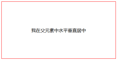
我们最常用到水平垂直布局也可以通过设置元素为单元格样式来实现:
<div class="parent">
  <div class="child">我在父元素中水平垂直居中</div>
</div>
.parent {
  width: 400px;
  height: 200px;
  border: 1px solid #f00;
  display: table-cell;
  text-align: center;
  vertical-align: middle;
}

 浙公网安备 33010602011771号