

CSS网页布局速成
1.CSS教程:CSS 教程 | 菜鸟教程 (runoob.com)
2.CSS布局思路
2.1 盒子模型
2.1.1 外边距 margin 上右下左
2.1.2 内边距 padding 上右下左
2.1.3 边框 border 上右下左 (solid实线 dashed虚线)border: 1px solid black
2.1.4 阴影 box-shadow: h-shadow v-shadow blur spread color inset; ( box-shadow: 0 0 10px -2px rgba(0,0,0,5);)
2.1.5 边角 border-radius 上右下左
2.1.6 内容
css换行:word-wrap: break-word;
2.1.7
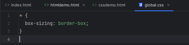
* {
box-sizing: border-box;(设置width和height包括了padding内边距和border边框,即width就是盒子总的宽度,如果不设置,width就不包括padding内边距和border边框)
}
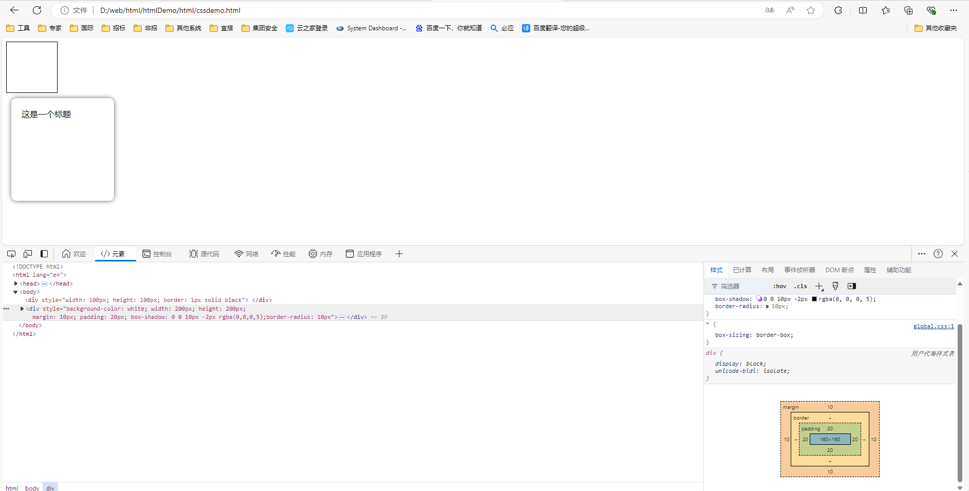
效果1:
<!DOCTYPE html>
<html lang="en">
<head>
  <meta charset="UTF-8">
  <title>CSSDemo</title>
  <link href="../css/global.css" rel="stylesheet">
</head>
<body>
  <div style="width: 100px; height: 100px; border: 1px solid black">

  </div>
  <div style="background-color: white; width: 200px; height: 200px;
  margin: 10px; padding: 20px; box-shadow: 0 0 10px -2px rgba(0,0,0,5);border-radius: 10px">
    <div>这是一个内容</div>
  </div>
</body>
</html>
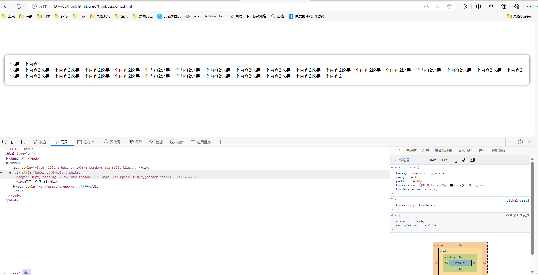
效果2:没有设置宽高width: 200px; height: 200px;,盒子自动宽变成整个屏幕宽度,高度按照内容自适应
<!DOCTYPE html>
<html lang="en">
<head>
  <meta charset="UTF-8">
  <title>CSSDemo</title>
  <link href="../css/global.css" rel="stylesheet">
</head>
<body>
  <div style="width: 100px; height: 100px; border: 1px solid black">

  </div>
  <div style="background-color: white;
  margin: 10px; padding: 20px; box-shadow: 0 0 10px -2px rgba(0,0,0,5);border-radius: 10px">
    <div>这是一个内容1</div>
    <div style="word-wrap: break-word;">这是一个内容2这是一个内容2这是一个内容2这是一个内容2这是一个内容2这是一个内容2这是一个内容2这是一个内容2这是一个内容2这是一个内容2这是一个内容2这是一个内容2这是一个内容2这是一个内容2这是一个内容2这是一个内容2这是一个内容2这是一个内容2这是一个内容2这是一个内容2这是一个内容2这是一个内容2这是一个内容2这是一个内容2这是一个内容2这是一个内容2这是一个内容2这是一个内容2</div>
  </div>
</body>
</html>
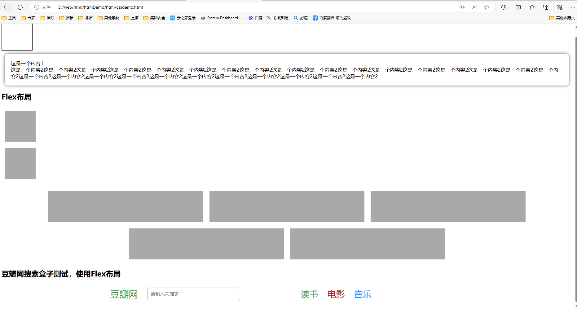
2.2 Flex布局 https://www.runoob.com/w3cnote/flex-grammar.html
2.2.1 flex-direction: row(水平排列) column(垂直排列)(控制盒子左右排列、上下排列)
2.2.2 flex-wrap: wrap(控制盒子换行,默认不换行,超出最大宽度会自适应改变盒子宽度)
2.2.3 justify-content(横轴): flex-start(默认) | flex-end | center | space-between(2端对齐) | space-around(等分间距)
2.2.4 align-items(纵轴): flex-start| flex-end | center | baseline | stretch
测试效果:
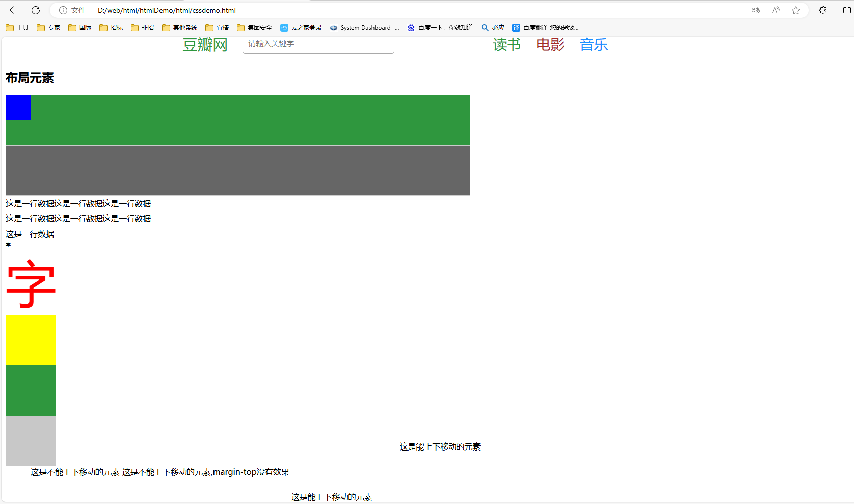
<!DOCTYPE html>
<html lang="en">
<head>
  <meta charset="UTF-8">
  <title>CSSDemo</title>
  <link href="../css/global.css" rel="stylesheet">
</head>
<body>
  <div style="width: 100px; height: 100px; border: 1px solid black">

  </div>
  <div style="background-color: white;
  margin: 10px; padding: 20px; box-shadow: 0 0 10px -2px rgba(0,0,0,5);border-radius: 10px">
    <div>这是一个内容1</div>
    <div style="word-wrap: break-word;">这是一个内容2这是一个内容2这是一个内容2这是一个内容2这是一个内容2这是一个内容2这是一个内容2这是一个内容2这是一个内容2这是一个内容2这是一个内容2这是一个内容2这是一个内容2这是一个内容2这是一个内容2这是一个内容2这是一个内容2这是一个内容2这是一个内容2这是一个内容2这是一个内容2这是一个内容2这是一个内容2这是一个内容2这是一个内容2这是一个内容2这是一个内容2这是一个内容2</div>
  </div>

  <h2>Flex布局</h2>
  <div style="margin: 20px 0; display: flex; flex-direction: column">
    <div style="width: 100px; height: 100px; margin:10px; background-color: darkgray"></div>
    <div style="width: 100px; height: 100px; margin:10px; background-color: darkgray"></div>
  </div>
  <div style="margin: 20px 0; display: flex; flex-direction: row; flex-wrap: wrap; justify-content: center">
    <div style="width: 500px; height: 100px; margin:10px; background-color: darkgray"></div>
    <div style="width: 500px; height: 100px; margin:10px; background-color: darkgray"></div>
    <div style="width: 500px; height: 100px; margin:10px; background-color: darkgray"></div>
    <div style="width: 500px; height: 100px; margin:10px; background-color: darkgray"></div>
    <div style="width: 500px; height: 100px; margin:10px; background-color: darkgray"></div>
  </div>
  <h2>豆瓣网搜索盒子测试,使用Flex布局</h2>
  <div style="display: flex;margin: 30px auto">
    <div style="display: flex; flex: 1; justify-content: center;">
      <div style="font-size: 30px; color: #2f973e; padding-left: 200px">豆瓣网</div>
      <div style="padding-left: 30px;">
        <input type="text" placeholder="请输入关键字" style="font-size: 15px; width: 300px; height: 40px;
               border: 1px solid darkgray; padding: 10px; border-radius: 5px; outline: none">
      </div>
    </div>
    <div style="width:500px; display: flex; flex: 1; font-size: 28px">
      <div style="margin: auto 15px; color: #2f973e; padding-left: 30px">读书</div>
      <div style="margin: auto 15px; color: brown">电影</div>
      <div style="margin: auto 15px; color: dodgerblue">音乐</div>
    </div>
  </div>
</body>
</html>
3.CSS布局元素
3.1 宽度 width
3.1.1 固定宽度 百分比宽度
3.1.2 最大宽度
3.1.3 最小宽度
3.1.4 水平居中 margin: auto
3.2 高度 height
3.2.1 固定宽度
3.2.2 最大宽度
3.2.3 最小宽度
3.2.4 行高对齐 line-height
3.3 字体
3.3.1 颜色 color 十六进制、rgb、英文
3.3.2 大小 font-size
3.3.3 粗细 font-weight blod
3.4 背景
3.4.1 颜色 background0color
3.4.2 图片 background-img:url()
3.5 定位position
3.5.1 absolute 生成绝对定位的元素,相对于static定位以外的第一个父元素进行定位
3.5.2 relative 生成相对定位的元素,相对于其正常位置进行定位(上下移动行内元素最简单的方式)
3.5.3 fixed 生成固定定位的元素,相对于浏览器窗口进行定位
3.6 overflow:hidden scroll
测试效果:
<!DOCTYPE html>
<html lang="en">
<head>
  <meta charset="UTF-8">
  <title>CSSDemo</title>
  <link href="../css/global.css" rel="stylesheet">
</head>
<body>
  <h2>布局元素</h2>
  <div style="width: 50%; height: 100px; background-color: #2f973e">
    <div style="width: 50px; height: 50%; background-color: blue"></div>
  </div>
  <div style="max-width: 50%; max-height: 100px; border: 1px solid #ccc; overflow: hidden">
    <div style="width: 1000px; height: 200px; background-color: #666666"></div>
  </div>
  <div style="width: 300px;line-height: 30px">这是一行数据这是一行数据这是一行数据这是一行数据这是一行数据这是一行数据这是一行数据</div>
  <div style="font-size: 10px">字</div>
  <div style="font-size: 100px; color: red; font-weight: normal">字</div>
  <div style="width: 100px; height: 100px;background-color: yellow"></div>
  <div style="width: 100px; height: 100px;background-color: #2f973e"></div>
  <div style="width: 100px; height: 100px;background-color: rgb(200, 200, 200)"></div>
  <div>
    <span style="margin-left: 50px;">这是不能上下移动的元素</span>
    <span style="margin-top: 50px;">这是不能上下移动的元素,margin-top没有效果</span>
    <span style="position: relative; top: 50px">这是能上下移动的元素</span>
    <span style="position: relative; bottom: 50px; left: 50px">这是能上下移动的元素</span>
  </div>
</body>
</html>

 浙公网安备 33010602011771号