SvelteUI:运用svelte3构建的网页版UI组件库(升级版)
距离上次分享的svelte-ui 1.0已经一月有余,这次带来全新升级完整版svelte-ui 2.0。
这次优化并新增15+个组件,重新规划整理版面及备注。由于在开发之初借鉴了element-ui组件库,所以在组件结构及语法上比较类似,这样使用起来就比较容易。
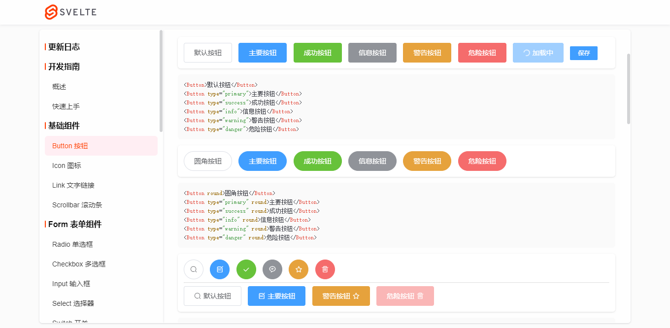
svelte.js前端新框架在国内逐步累积了一批开发者,可是基于svelte组件库却没有几个用的比较顺手,所以干脆开干一番,就开发了这个svelte-ui组件库。一来为了学习累积新技术,而来检验下svelte框架到底如何。方便在以后的开发中快速提高工作效率!


◆ 引入组件
引入组件的方式没变,还是和之前一样。
import {
    Button,
    Input,
    Switch,
    Select,
    Form,
    ...
} from 'svelte-ui'
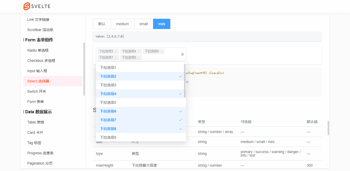
<Select bind:value={selectVal} size="small">
    <Option label="Option1" value="a1"></Option>
    <Option label="Option2" value="a2"></Option>
    <Option label="Option3" value="a3"></Option>
</Select>
<Form bind:model={formObj} labelWidth="80px" size="small" labelPosition="right">
    <FormItem label="活动名称">
        <Input bind:value={formObj.name} />
    </FormItem>
    <FormItem label="活动区域">
        <Select bind:value={formObj.region} clearable>
            <Option label="区域1" value="beijing" />
            <Option label="区域2" value="shanghai" />
        </Select>
    </FormItem>
    <FormItem label="即时配送">
        <Switch bind:checked={formObj.delivery} />
    </FormItem>
    <FormItem label="活动性质">
        <CheckboxGroup bind:checked={formObj.type}>
            <Checkbox label="美食/餐厅线上活动" border />
            <Checkbox label="亲子主题" border />
            <Checkbox label="品牌推广" border />
        </CheckboxGroup>
    </FormItem>
    <FormItem label="特殊资源">
        <RadioGroup bind:checked={formObj.resource}>
            <Radio label="线上品牌商赞助" button />
            <Radio label="线下场地免费" button />
        </RadioGroup>
    </FormItem>
    <FormItem label="活动详情">
        <Input bind:value={formObj.summary} type="textarea" rows={3} />
    </FormItem>
    <FormItem>
        <Button type="primary">立即创建</Button>
        <Button>取消</Button>
    </FormItem>
</Form>
- Select下拉框组件还支持多选/清除/合并等功能。
- Form组件支持提交表单rule验证及自定义验证规则。目前有input / textarea / switch / radio / checkbox等组件支持组合验证。
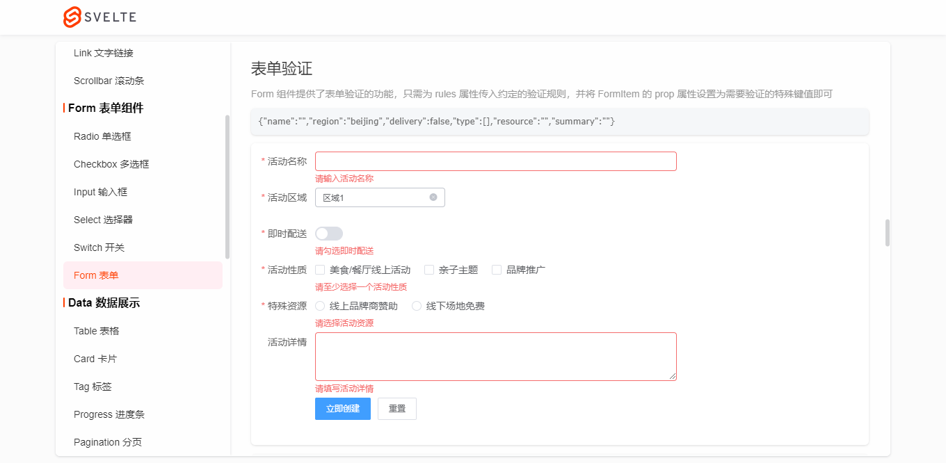
let ruleFormDom
let formRules = {
    name: '',
    region: '',
    delivery: false,
    type: [],
    resource: '',
    summary: '',
}
let rules = {
    name: [
        { required: true, message: '请输入活动名称', trigger: 'blur' },
        { min: 3, max: 5, message: '长度在 3 到 5 个字符', trigger: 'change' }
    ],
    region: [
        { required: true, message: '请选择活动区域', trigger: 'change' }
    ],
    type: [
        { type: 'array', required: true, message: '请至少选择一个活动性质', trigger: 'change' }
    ],
    resource: [
        { required: true, message: '请选择活动资源', trigger: 'change' }
    ],
    // summary: [
    //     { required: true, message: '请填写活动详情', trigger: 'blur' }
    // ]
}
function onSubmitRules() {
    ruleFormDom.validate((valid) => {
        if(valid) {
            console.log('submit!')
        }else {
            console.log('error submit!')
            return false
        }
    })
}
function onResetRules() {
    formRules = {
        name: '',
        region: '',
        delivery: false,
        type: [],
        resource: '',
        summary: '',
    }
    ruleFormDom.resetFields()
}

<Form bind:model={formRules} rules={rules} bind:this={ruleFormDom}>
    <FormItem label="活动名称" prop="name">
        <Input bind:value={formRules.name} />
    </FormItem>
    <FormItem label="活动区域" prop="region">
        <Select bind:value={formRules.region} clearable>
            <Option label="区域1" value="beijing" />
            <Option label="区域2" value="shanghai" />
        </Select>
    </FormItem>
    <FormItem label="即时配送" prop="delivery" required message="请勾选即时配送" trigger="change">
        <Switch bind:checked={formRules.delivery} />
    </FormItem>
    <FormItem label="活动性质" prop="type">
        <CheckboxGroup bind:checked={formRules.type}>
            <Checkbox label="美食/餐厅线上活动" />
            <Checkbox label="亲子主题" />
            <Checkbox label="品牌推广" />
        </CheckboxGroup>
    </FormItem>
    <FormItem label="特殊资源" prop="resource">
        <RadioGroup bind:checked={formRules.resource}>
            <Radio label="线上品牌商赞助" />
            <Radio label="线下场地免费" />
        </RadioGroup>
    </FormItem>
    <FormItem label="活动详情" prop="summary" rules={[{ required: true, message: '请填写活动详情', trigger: 'blur' }]}>
        <Input bind:value={formRules.summary} type="textarea" rows={3} />
    </FormItem>
    <FormItem>
        <Button type="primary" on:click={onSubmitRules}>立即创建</Button>
        <Button on:click={onResetRules}>重置</Button>
    </FormItem>
</Form>
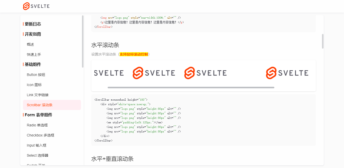
- Table表格组件新增了诸多特性,固定表头/列、水平/垂直滚动条、单选/多选、尺寸/边框/隔行换色、自定义样式等功能。
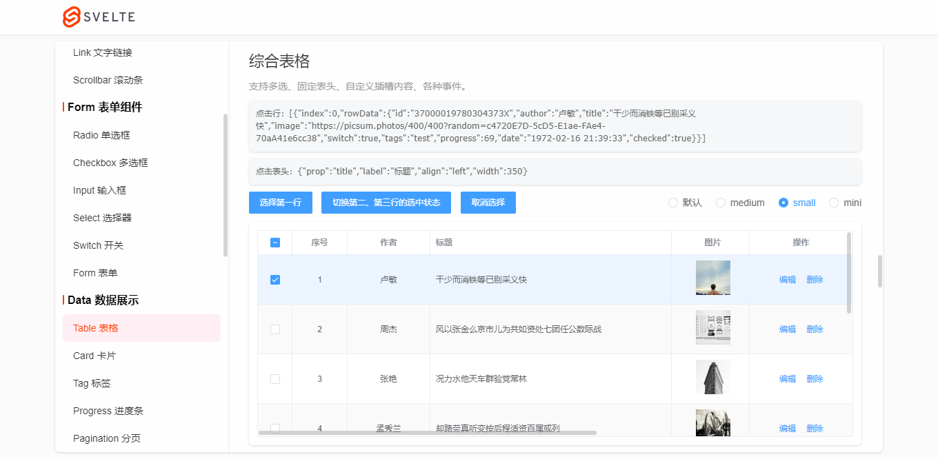
let tableData3 = Mock.mock({
    total: 100,
    page: 1,
    pagesize: 5,
    'list|10': [
        {
            id: '@id()',
            author: '@cname()',
            title: '@ctitle(10, 20)',
            image: 'https://picsum.photos/400/400?random=' + '@guid()',
            switch: '@boolean()',
            'tags|1': ['admin', 'test', 'dev'],
            progress: '@integer(30, 90)',
            date: '@datetime()'
        }
    ]
})
let tableColumns3 = [
    {type: 'selection', align: 'center', width: 50, fixed: true}, // 多选
    {type: 'index', align: 'center', width: 80}, // 索引序号
    {prop: 'author', label: '作者', align: 'center', width: 120},
    {prop: 'title', label: '标题', align: 'left', width: 350},
    {slot: 'image', label: '图片', align: 'center', width: 120},
    {slot: 'switch', label: '推荐', align: 'center', width: 100},
    {slot: 'tags', label: '标签', align: 'center', width: 100},
    {slot: 'progress', label: '热度', align: 'center', width: 150},
    {prop: 'date', label: '发布时间', align: 'left', width: 300}, // 时间
    {slot: 'btns', label: '操作', align: 'center', width: 150, fixed: 'right'}, // 操作
]
let tableEl
let selectionData = []
let headerData = []
function handleSelectRow(rowIndex) {
    tableEl.setCurrent(rowIndex)
}
function handleClearSelect() {
    tableEl.setCurrent()
}
function handleSelectionChange(e) {
    console.log('selection change选中行数据>>:', e.detail)
    selectionData = e.detail
}
function handleHeaderClick(e) {
    console.log('header click选中表头数据>>:', e.detail)
    headerData = e.detail
}

<Button type="primary" size="small" on:click={()=>handleSelectRow(0)}>选择第一行</Button>
<Button type="primary" size="small" on:click={()=>handleSelectRow([1,2])}>切换第二、第三行的选中状态</Button>
<Button type="primary" size="small" on:click={handleClearSelect}>取消选择</Button>

<Table
    dataSource={tableData3.list}
    columns={tableColumns3}
    stripe
    border
    highlightCurrentRow
    let:row
    let:col
    let:index
    on:selectionChange={handleSelectionChange}
    on:headerClick={handleHeaderClick}
    style="height: 300px;"
    bind:this={tableEl}
>
    {#if col.slot == 'image'}
        <img src={row.image} style="height: 50px; width: 50px;" alt="" />
    {:else if col.slot == 'switch'}
        <Switch checked={row.switch} />
    {:else if col.slot == 'tags'}
        <Tag type="warning" effect="dark" size="mini">{row.tags}</Tag>
    {:else if col.slot == 'progress'}
        <Progress percent={row.progress} color="#1fb925" showtext="false" strokeWidth={6} style="width: 100px;" />
    {:else if col.slot == 'btns'}
        <Button type="text">编辑</Button>
        <Button type="text">删除</Button>
    {/if}
</Table>

<Progress percent={50} insidetext strokeWidth={30} />
<Progress percent={100} insidetext strokeWidth={25} status="success" />
<Progress percent={80} insidetext strokeWidth={20} status="warning" />
<Progress percent={30} insidetext strokeWidth={15} status="exception" />
<Progress percent={60} color="#ff3e00" background="#fcc" strokeWidth={20} />
- Pagination分页功能搭配Table表格,使用起来比较高效。
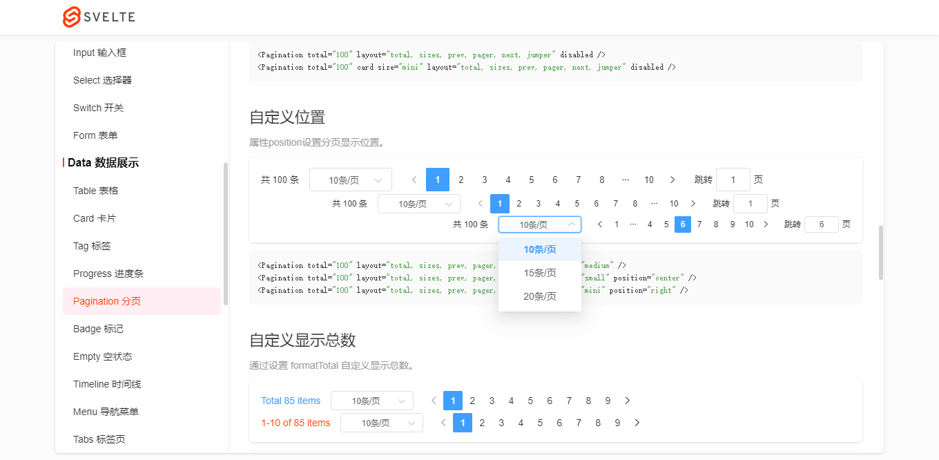
<Pagination total="100" layout="total, sizes, prev, pager, next, jumper" size="medium" />
<Pagination total="100" layout="total, sizes, prev, pager, next, jumper" size="small" position="center" />
<Pagination total="100" layout="total, sizes, prev, pager, next, jumper" size="mini" position="right" />
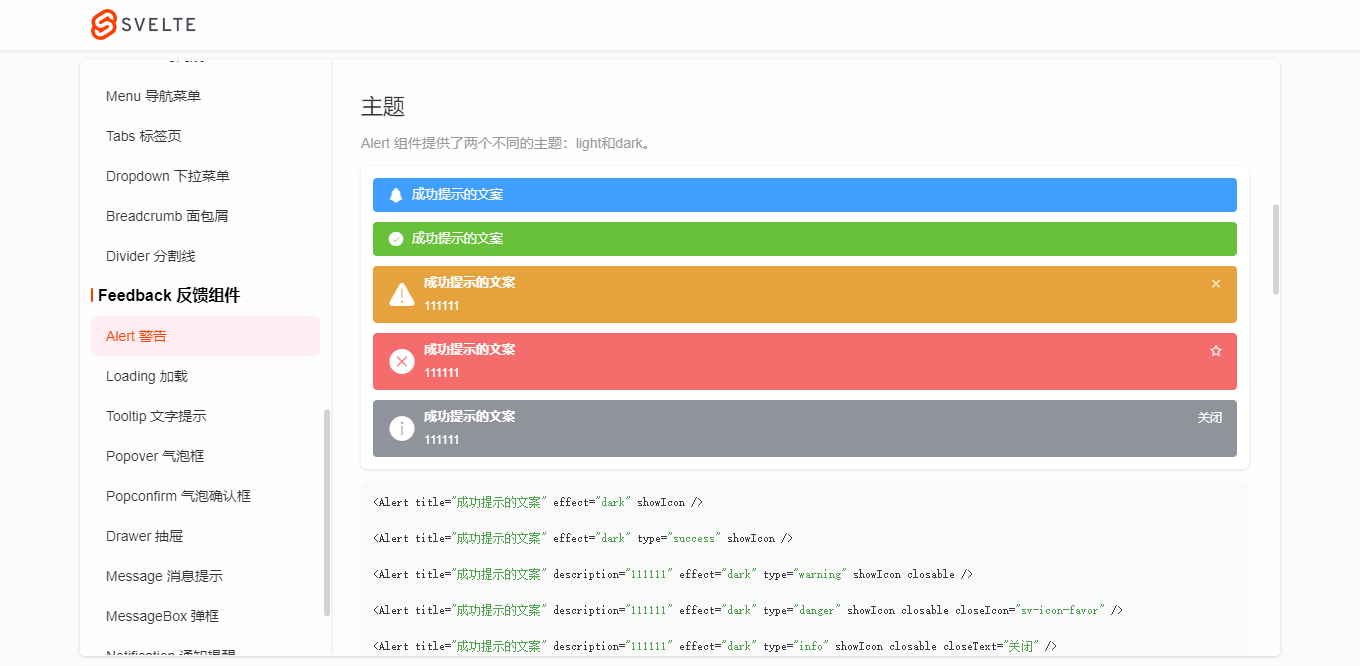


- Message消息提示,不一样的UI体验。

Message('这是一条默认提示信息')

Message.success('恭喜你,这是一条成功消息', 10) // 10s后关闭

Message({
    type: 'warning',
    title: '警告哦,这是一条警告消息'
})

Message({
    type: 'danger',
    title: '错了哦,这是一条错误消息',
    description: '这是一段描述性文字提示',
    effect: 'dark'
})

Message.info('这是一条消息提示')
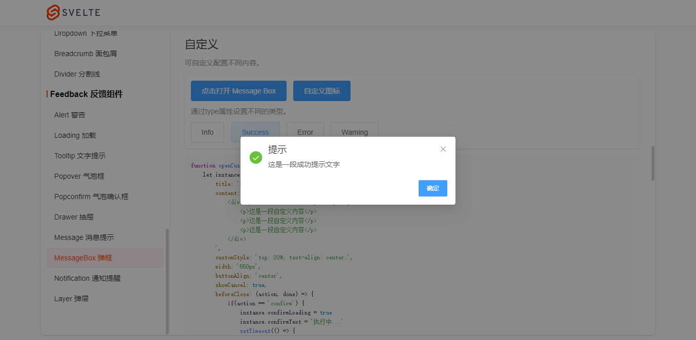
MessageBox.alert('提示', '这是一段提示信息', {
    callback: action => {
        Message.info(`action: ${ action }`)
    }
})

MessageBox.confirm('温馨提示', '此操作将永久删除该文件, 是否继续?', {
    type: 'warning',
    cancelText: '关闭',
    confirmText: '删除',
    confirmType: 'danger',
    callback: action => {
        if(action == 'confirm') {
            Message.success('删除成功!')
        }else if(action == 'cancel') {
            Message.info('您已取消删除!')
        }
    }
})
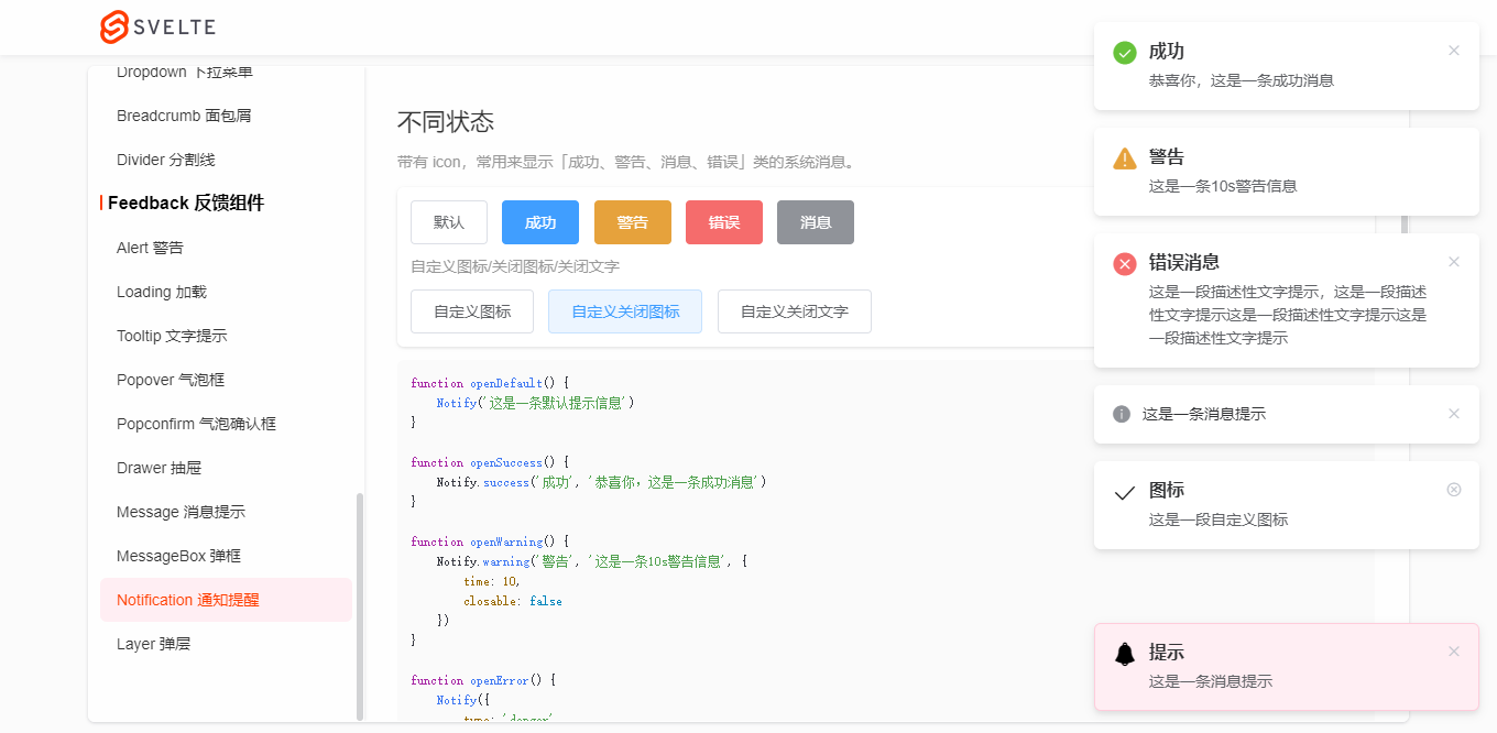
Notify('这是一条默认提示信息')

Notify.success('成功', '恭喜你,这是一条成功消息')

Notify.warning('警告', '这是一条10s警告信息', {
    time: 10,
    closable: false
})

Notify({
    type: 'danger',
    title: '错误消息',
    description: '这是一段描述性文字提示,这是一段描述性文字提示'
})

Notify.info('这是一条消息提示')

Notify({
    title: '图标',
    description: '这是一段自定义图标',
    icon: 'sv-icon-emojifill'
})

Notify({
    title: '图标',
    description: '这是一段自定义图标',
    icon: 'sv-icon-check',
    closeIcon: 'sv-icon-roundclose'
})

Notify({
    title: '图标',
    description: '这是一段自定义图标',
    icon: 'sv-icon-search',
    closeText: '知道了'
})
使用语法都比较接近element-ui,降低了学习使用成本。

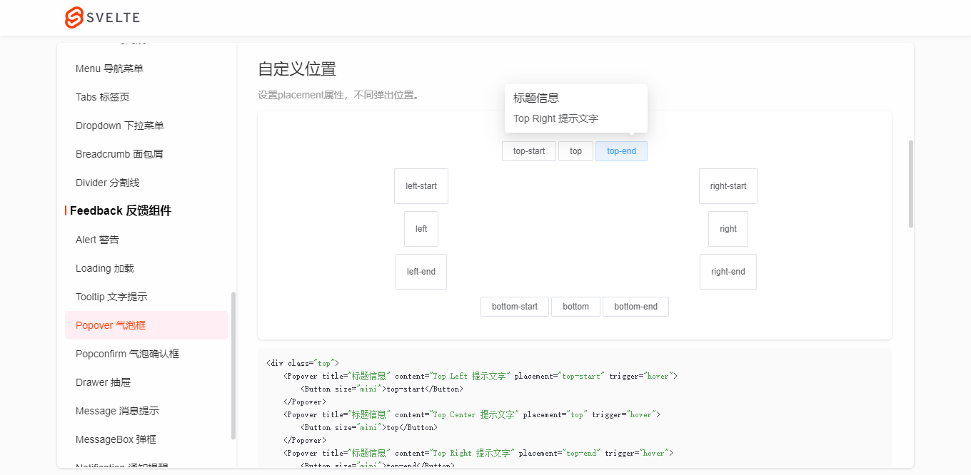
另外,更加高级一些的Layer弹窗组件也整合到了组件库中,助力实现不同的开发需求。
OK,目前就分享这么多。后面还会基于这个svelte-ui组件库开发一个后台管理系统,到时也会分享出来。

本文为博主原创文章,未经博主允许不得转载,欢迎大家一起交流 QQ(282310962) wx(xy190310)

 浙公网安备 33010602011771号
 UP主小店
UP主小店