

WPF常用控件应用demo
WPF常用控件应用demo
一、Demo
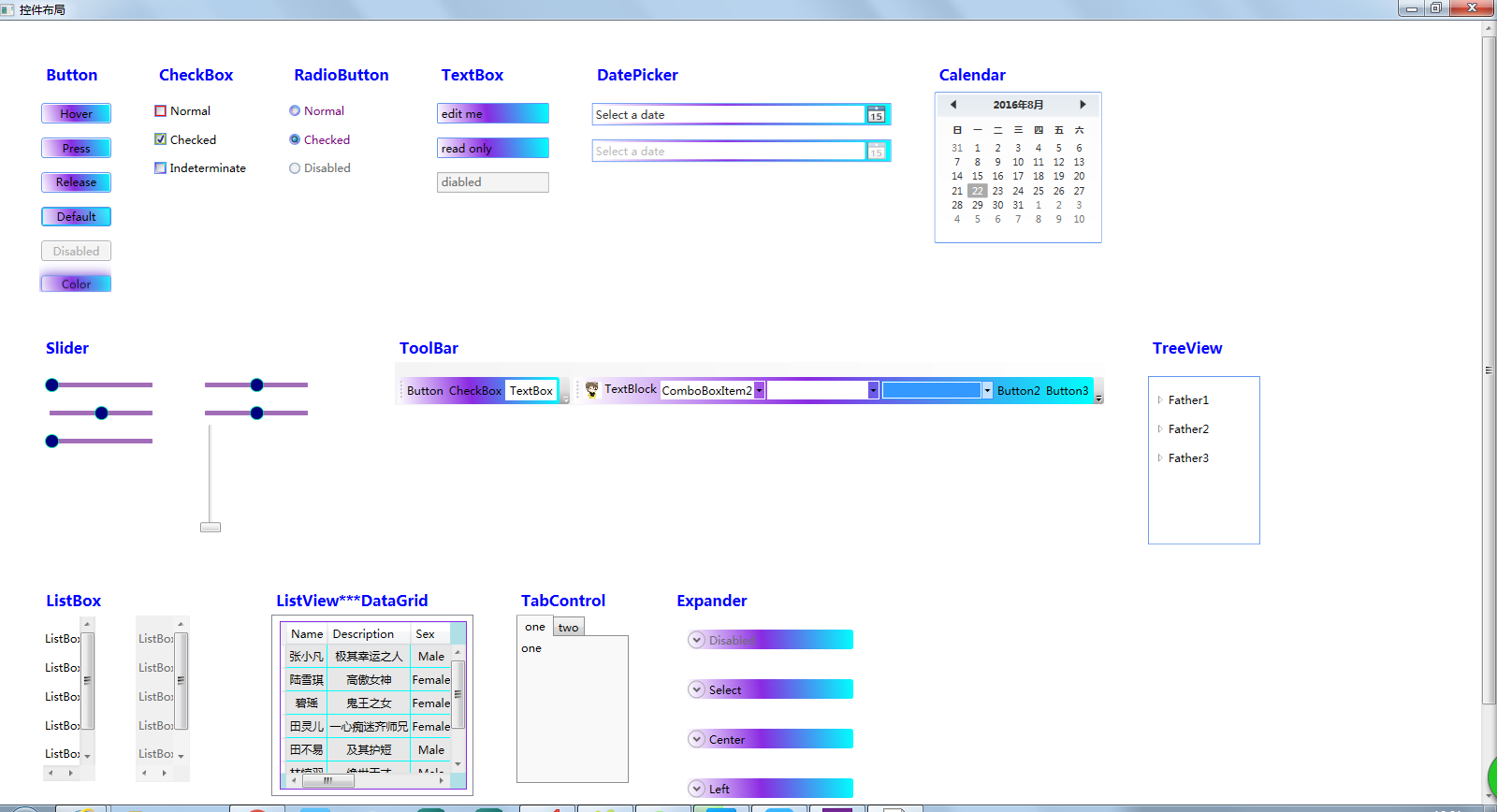
1、Demo截图如下:
2、demo实现过程
- 总体布局:因放大缩小窗体,控件很根据空间是否足够改变布局,故用WrapPanel布局。
![]() View Code
View Code1 <ScrollViewer BorderBrush="BlueViolet"> 2 <WrapPanel Margin="40,0,0,40"> 3 </WrapPanel> 4 </ScrollViewer>


- 窗体资源:同一种控件多处使用会有重复代码,为减少代码冗余,在窗体资源中设置控件Style。在这里给出demo中的Button和ListBox控件的Style。
![]() View Code
View Code1 <Window.Resources> 2 <Style TargetType="Button" 3 x:Key="ButtonStyle"> 4 <Setter Property="Width" 5 Value="75" /> 6 <Setter Property="Margin" 7 Value="0,15,0,0" /> 8 <Setter Property="BorderBrush" 9 Value="CornflowerBlue" /> 10 <Setter Property="Background"> 11 <Setter.Value> 12 <LinearGradientBrush StartPoint="1,0" 13 EndPoint="0,1"> 14 <GradientStop Color="Aqua" 15 Offset="0.0" /> 16 <GradientStop Color="BlueViolet" 17 Offset="0.55" /> 18 <GradientStop Color="White" 19 Offset="1.0" /> 20 </LinearGradientBrush> 21 </Setter.Value> 22 </Setter> 23 </Style> 24 <Style x:Key="ButtonColorStyle" 25 TargetType="Button" 26 BasedOn="{StaticResource ButtonStyle}"> 27 <!--修改模板属性--> 28 <Setter Property="Template"> 29 <Setter.Value> 30 <!--控件模板--> 31 <ControlTemplate TargetType="Button"> 32 <Border x:Name="back" 33 Opacity="0.8" 34 CornerRadius="3" 35 Background="{TemplateBinding Background}" 36 BorderBrush="{TemplateBinding BorderBrush}" 37 BorderThickness="{TemplateBinding BorderThickness}"> 38 <!--控件阴影效果--> 39 <Border.BitmapEffect> 40 <DropShadowBitmapEffect Color="BlueViolet" 41 ShadowDepth="0" 42 Softness="0.8" 43 Noise="0" 44 Opacity="1" 45 Direction="315" /> 46 </Border.BitmapEffect> 47 <Border x:Name="fore" 48 BorderThickness="0" 49 CornerRadius="3"> 50 <!--按钮内容--> 51 <ContentPresenter x:Name="content" 52 HorizontalAlignment="Center" 53 VerticalAlignment="Center" 54 Content="{TemplateBinding Content}"> 55 <ContentPresenter.BitmapEffect> 56 <DropShadowBitmapEffect Color="Blue" 57 Direction="90" 58 ShadowDepth="2" 59 Softness="0.1" 60 Opacity="0.3" /> 61 </ContentPresenter.BitmapEffect> 62 </ContentPresenter> 63 </Border> 64 </Border> 65 <!--触发器--> 66 <ControlTemplate.Triggers> 67 <!--鼠标移入移出--> 68 <Trigger Property="IsMouseOver" 69 Value="True"> 70 <Trigger.EnterActions> 71 <BeginStoryboard HandoffBehavior="Compose"> 72 <Storyboard> 73 <DoubleAnimation To="1" 74 Duration="0:0:0.1" 75 Storyboard.TargetName="back" 76 Storyboard.TargetProperty="Opacity" /> 77 <ColorAnimation To="LawnGreen" 78 BeginTime="0:0:0.2" 79 Duration="0:0:0.2" 80 Storyboard.TargetName="back" 81 Storyboard.TargetProperty="(Border.BitmapEffect).(DropShadowBitmapEffect.Color)" /> 82 <DoubleAnimation To="0.4" 83 Duration="0:0:0.2" 84 Storyboard.TargetName="back" 85 Storyboard.TargetProperty="(Border.BitmapEffect).(DropShadowBitmapEffect.Softness)" /> 86 </Storyboard> 87 </BeginStoryboard> 88 </Trigger.EnterActions> 89 </Trigger> 90 <!--按钮按下弹起--> 91 <Trigger Property="IsPressed" 92 Value="True"> 93 <Trigger.EnterActions> 94 <BeginStoryboard> 95 <Storyboard> 96 <DoubleAnimation To="0.6" 97 Duration="0:0:0.3" 98 Storyboard.TargetName="back" 99 Storyboard.TargetProperty="Opacity" /> 100 <ColorAnimation To="Red" 101 Duration="0:0:0.1" 102 Storyboard.TargetName="back" 103 Storyboard.TargetProperty="(Border.BitmapEffect).(DropShadowBitmapEffect.Color)" /> 104 <DoubleAnimation To="0.2" 105 Duration="0:0:0.1" 106 Storyboard.TargetName="back" 107 Storyboard.TargetProperty="(Border.BitmapEffect).(DropShadowBitmapEffect.Softness)" /> 108 </Storyboard> 109 </BeginStoryboard> 110 </Trigger.EnterActions> 111 </Trigger> 112 </ControlTemplate.Triggers> 113 </ControlTemplate> 114 </Setter.Value> 115 </Setter> 116 </Style> 117 118 <Style TargetType="ListBox" 119 x:Key="ListBoxStyle"> 120 <Setter Property="Margin" 121 Value="0,0,40,0" /> 122 <Setter Property="BorderBrush" 123 Value="White" /> 124 </Style> 125 </Window.Resources>
- 控件使用,调用资源。在此只给出Button、ListView和DataGrid结合使用的代码,Button控件是包含在ListBox里面的。
![]() View Code
View Code1 <ListBox Style="{StaticResource ListBoxStyle}"> 2 <Label Style="{StaticResource LableStyle}" 3 Content="Button" /> 4 <Button Content="Hover" 5 Click="BtnHover" 6 ClickMode="Hover" 7 Command="{Binding HoverCommand}" 8 Style="{StaticResource ButtonStyle}"></Button> 9 <Button Content="Press" 10 Click="BtnPress" 11 ClickMode="Press" 12 Command="{Binding PressCommand}" 13 Style="{StaticResource ButtonStyle}"></Button> 14 <Button Content="Release" 15 Click="BtnRelease" 16 ClickMode="Release" 17 Command="{Binding ReleaseCommand}" 18 Style="{StaticResource ButtonStyle}"></Button> 19 <Button IsDefault="True" 20 Content="Default" 21 Style="{StaticResource ButtonStyle}"></Button> 22 <Button IsEnabled="False" 23 Content="Disabled" 24 Style="{StaticResource ButtonStyle}"></Button> 25 <Button Content="Color" 26 Style="{StaticResource ButtonColorStyle}"></Button> 27 </ListBox> 28 29 <ListBox Style="{StaticResource ListBoxStyle}"> 30 <Label Style="{StaticResource LableStyle}" 31 Content="ListView***DataGrid" /> 32 <ListView> 33 <Grid> 34 <DataGrid Name="Data" 35 Width="200" 36 Height="180" 37 Margin="5" 38 CanUserAddRows="False" 39 AutoGenerateColumns="False" 40 Style="{StaticResource DataGridStyle}" 41 ItemsSource="{Binding}"> 42 <DataGrid.Columns> 43 <DataGridTextColumn Header="Name" 44 Binding="{Binding Name}" /> 45 <DataGridTextColumn Header="Description" 46 Binding="{Binding Description}" /> 47 <DataGridComboBoxColumn Header="Sex" 48 SelectedItemBinding="{Binding Sex}" 49 ItemsSource="{Binding Source={StaticResource sexEnum}}" /> 50 <DataGridCheckBoxColumn Header="CheckBox" 51 Binding="{Binding CheckBox}" /> 52 <DataGridHyperlinkColumn Header="Email" 53 Binding="{Binding Email}" /> 54 </DataGrid.Columns> 55 <DataGrid.CellStyle> 56 <Style TargetType="DataGridCell"> 57 <Setter Property="Template"> 58 <Setter.Value> 59 <ControlTemplate TargetType="DataGridCell"> 60 <TextBlock TextAlignment="Center" 61 VerticalAlignment="Center"> 62 <ContentPresenter /> 63 </TextBlock> 64 </ControlTemplate> 65 </Setter.Value> 66 </Setter> 67 <Style.Triggers> 68 <Trigger Property="IsSelected" 69 Value="True"> 70 <Setter Property="Foreground" 71 Value="Black" /> 72 </Trigger> 73 </Style.Triggers> 74 </Style> 75 </DataGrid.CellStyle> 76 <DataGrid.RowStyle> 77 <Style TargetType="{x:Type DataGridRow}"> 78 <Setter Property="Background" 79 Value="#F2F2F2" /> 80 <Setter Property="Height" 81 Value="25" /> 82 <Setter Property="Foreground" 83 Value="Black" /> 84 <Style.Triggers> 85 <!--隔行换色--> 86 <Trigger Property="AlternationIndex" 87 Value="0"> 88 <Setter Property="Background" 89 Value="#e7e7e7" /> 90 </Trigger> 91 <Trigger Property="AlternationIndex" 92 Value="1"> 93 <Setter Property="Background" 94 Value="#f2f2f2" /> 95 </Trigger> 96 <Trigger Property="IsMouseOver" 97 Value="True"> 98 <Setter Property="Background" 99 Value="LightGray" /> 100 </Trigger> 101 <Trigger Property="IsSelected" 102 Value="True"> 103 <Setter Property="Foreground" 104 Value="Black" /> 105 </Trigger> 106 </Style.Triggers> 107 </Style> 108 </DataGrid.RowStyle> 109 </DataGrid> 110 </Grid> 111 </ListView> 112 </ListBox>
二、控件
1、WrapPanel布局控件:可以实现当空间不足时子控件自动往下一行布局,空间充足时又会自动调整行布局。常用布局控件还有StackPanel(设置其子元素是垂直排列还是水平排列)、Grid(通过定义行和列来绘制出一个表格)、Canvas(通过指定相对于其的坐标来指定子控件的位置)、DockPanel(设置其子元素如何停靠,DockPanel.Left、DockPanel.Right、DockPanel.Top、DockPanel.Bottom)。
2、ScrollViewer:滚动条,当内容显示不完整时可以通过滚动条查看余下内容。
3、ListBox:队列布局控件,可在其中添加队列内容,绑定数据,也可实现分页效果,也可添加其余控件。
4、Label:文本显示控件,快速获取少量数据。
5、Button:按钮控件,四种状态ClickMode:Hover:鼠标悬停在按钮上方引发单击事件;
Press:当单击按钮时引发单击事件;
Release:被按下然后松开时发生单击事件,默认为此。
6、CheckBox:bool,选择按钮,默认不选择,通过IsChecked="True"使其默认选择,Indeterminate达到选择按钮模糊。
7、RadioButton:与CheckBox类似,一般用于单选。
8、TextBox:文本显示,与Lable类似,但Lable不可用户不可在界面编辑,TextBox默认用户可编辑,也可设置为只读。
9、Password:密码显示框,输入字符后默认显示“*”。
10、DatePicker:日期控件,选择日期。
11、Calendar:日历控件,选择日期。
12、Slider:滑块,Slider控件继承自RangeBase类型,同继承自RangeBase的控件还有ProgressBar和ScrollBar,这类控件都是在一定数值范围内表示一个值的用途。
13、ToolBar:工具条,是一组通常在功能上相关的命令或控件的容器,在ToolBar中可添加button、textbox、image、comboBox等等控件。
14、TreeViewStyle:树形控件,可在其中添加节点。
15、DataGrid:数据表控件,表头数据类型有DataGridTextColumn、DataGridComboBoxColumn、DataGridCheckBoxColumn、DataGridHyperlinkColumn,其属性设置比较多,如SelectionUnit:包含Cell、FullRow 和CellOrRowHeader 三种单元选择模式。 Cell:选择单元格;FullRow:选择全行;CellOrRowHeader:可选择单元格,也可以通过点击行首选择全行。
16、Style:风格,可以使用Style来设置控件的某些属性值,并使该设置影响到指定范围内的所有该类控件或影响指定的某一控件。
附上控件之间继承关系图一张:

- 小结:Style、Template结合的灵活使用可以很好的改变控件样式,而变成你想要的样式。控件与控件之间的合理搭配是为了更好地展现界面。鄙人因初学WPF,不足之处请批评指正。

 浙公网安备 33010602011771号