多列布局
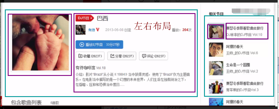
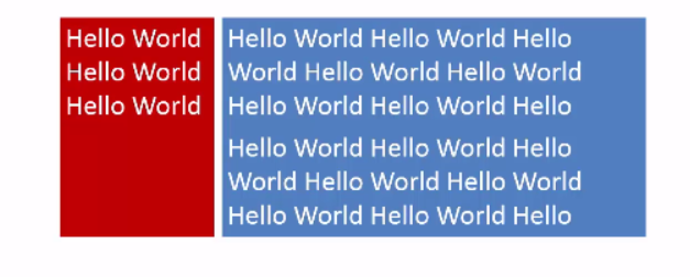
上例的图,就是左右布局
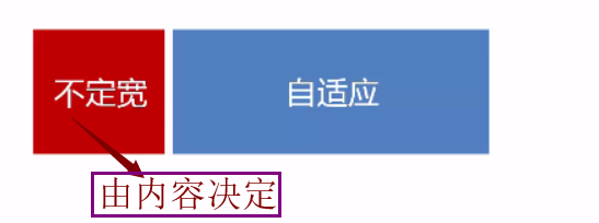
1.定宽 + 自适应

1.1、float + margin
<div class="parent">
<div class="left">
<p>left</p>
</div>
<div class="right">
<p>riht</p>
<p>right</p>
</div>
</div>
p{
background: #666;
}
.right p{
background: #999;
}
.left{
float: left;
width: 100px;
}
.right{
margin-left: 100px;
}
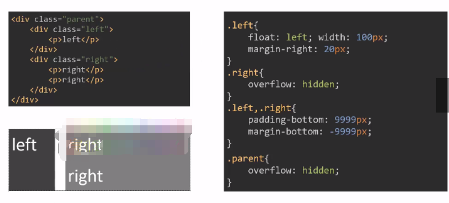
1.2、float + overflow:hiden
p{
background: #666;
}
.right p{
background: #999;
}
.left{
float: left;
width: 100px;
}
.right{
overflow: hidden;
/*bfc原理*/
}
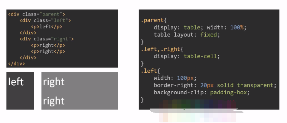
1.3、table
相同结构,用table 去模拟
.parent{
display: table;
width: 500px;
/*table-layout: fixed;*/
}
.left{
/*width: 100px;*/
}
.left, .right{
display: table-cell;
}
1.4、flex
.parent{
display: flex;
}
.left{
width: 100px;
}
.left, .right{
flex: 1;
}
2.两列定宽

<div class="parent">
<div class="left">
<p>left</p>
</div>
<div class="center"><p>center</p></div>
<div class="right">
<p>riht</p>
<p>right</p>
</div>
</div>
p {
background: #666;
}
.right p{
background: #999;
}
.left,.center{
float:left;
width:100px;
margin-right: 20px;
}
.right{
overflow: hidden;
}
3.不定宽 + 自适应
4.不定宽 + 不定宽 + 自适应
(同理)
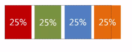
5.等宽
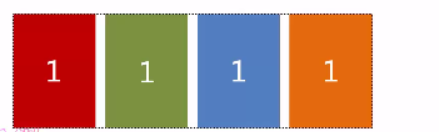
多列等宽,一般这么写
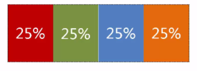
但是如果要给外边距呢。。。。。。。。

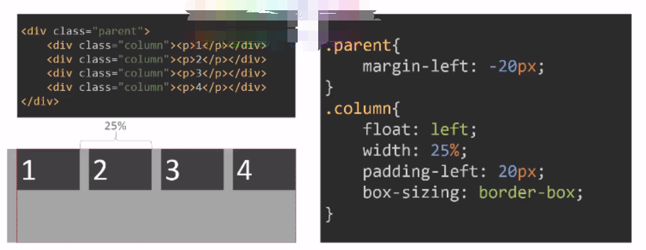
5.2、table
<div class="parent-fix">
<div class="parent">
<div class="colum">
<p>1</p>
</div>
<div class="colum">
<p>2</p>
</div>
<div class="colum">
<p>3</p>
</div>
<div class="colum">
<p>4</p>
</div>
</div>
</div>
.parent-fix{
margin-left:-20px ;
}
.parent{
display: table;
width: 100%;
}
.colum{
display: table-cell;
padding-left: 20px;
}
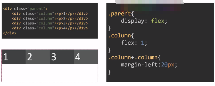
5.3 flex
6.等高布局


 浙公网安备 33010602011771号