

图解Matplotlib和Seaborn入门 - 实践
欢迎来到数据分析的世界
博客主页:卿云阁欢迎关注点赞收藏⭐️留言
本文由卿云阁原创!
首发时间:2025年9月30日
✉️希望可以和大家一起完成进阶之路!
作者水平很有限,如果发现错误,请留言轰炸哦!万分感谢!
目录

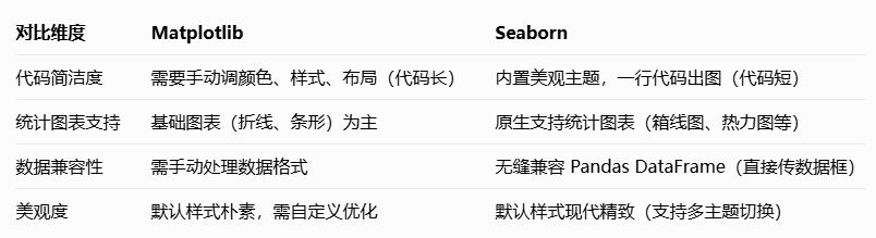
简单介绍
它是 Python 的 “万能绘图工具”—— 能把 Excel、Pandas 里的数字,变成折线图、柱状图、
散点图等直观图形,小到临时看数据趋势,大到学术论文配图,都能搞定。(配一张 “Matplotlib
在 Python 数据生态中的位置图”:NumPy/Pandas(处理数据)→ Matplotlib(绘图)→
Seaborn(美化),用箭头体现依赖关系)。

Seaborn 是基于 Matplotlib 开发的 Python 可视化库,核心优势是用更简洁的代码,画出更美
观、更具统计意义的图表。很多人会问:“已经会用 Matplotlib 了,为什么还要学 Seaborn?” 看这
组对比就懂了:
Matplotlib2个简单的例子
第一个例子
流程:
1️⃣准备数据 ➡ 2️⃣创建画布 ➡ 3️⃣绘制图像 ➡ 4️⃣添加细节(标题、x轴/y轴标签、坐标轴
范围、网格线,图例) ➡ 5️⃣调整布局 ➡ 6️⃣保存图片 ➡ 7️⃣图片展示
# 导入Matplotlib绘图模块,约定简写为plt
import matplotlib.pyplot as plt
# 设置中文字体,解决负号显示乱码问题
plt.rcParams["font.family"] = ["SimHei"]
plt.rcParams['axes.unicode_minus'] = False
# 准备散点图数据:身高(x轴)与体重(y轴),数据长度需一致
height = [160, 165, 170, 175, 180]  # 身高(cm)
weight = [50, 55, 62, 68, 75]       # 对应体重(kg)
# 创建画布,尺寸6×4英寸(1英寸≈2.54cm),设置分辨率为100
plt.figure(figsize=(6, 4), dpi=100)
# 绘制散点图:橙色(#FF9F43)、大小80、透明度0.8,添加边框
plt.scatter(height, weight,
            color='#FF9F43',
            s=80,
            alpha=0.8,
            label='学生数据',
            edgecolors='#E67E22',  # 散点边框颜色
            linewidth=1)           # 散点边框宽度
# 添加图表标题、x轴/y轴标签,优化字体样式
plt.title('身高与体重关系', fontsize=14, pad=15, fontweight='bold')
plt.xlabel('身高(cm)', fontsize=12, labelpad=8)
plt.ylabel('体重(kg)', fontsize=12, labelpad=8)
# 优化坐标轴范围,使数据点更居中
plt.xlim(155, 185)
plt.ylim(45, 80)
# 添加浅灰色网格线(透明度0.3),辅助读数据
plt.grid(alpha=0.3, linestyle='--')   # 使用虚线网格
# 在右上角显示半透明边框的图例,优化图例文字大小
plt.legend(loc='upper right', framealpha=0.1, fontsize=10)
# 调整布局,避免元素重叠
plt.tight_layout()
# 保存图片(高分辨率,裁剪空白)
#plt.savefig('height_weight.png', dpi=300, bbox_inches='tight')
# 弹出窗口展示图表
plt.show()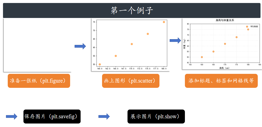
第二个例子
流程:
1️⃣准备数据 ➡ 2️⃣创建画布 ➖ 定义子图 ➡ 3️⃣绘制图像 ➡ 4️⃣添加细节(标题、x轴/y
轴标签、坐标轴范围、网格线,图例) ➡ 5️⃣调整布局 ➡ 6️⃣保存图片 ➡ 7️⃣图片展示
import matplotlib.pyplot as plt
# 设置中文字体,确保中文正常显示
plt.rcParams["font.family"] = ["SimHei"]
plt.rcParams['axes.unicode_minus'] = False  # 解决负号显示问题
# Step 1: 准备数据
x = [1, 2, 3, 4]
y = [10, 20, 25, 30]
scatter_x = [2, 4, 6]
scatter_y = [5, 15, 25]
# Step 2: 创建图形(画布)
fig = plt.figure(figsize=(12, 5))  # 加宽画布以容纳两个子图
# Step 3: 使用add_subplot定义子图(1行2列布局)
ax1 = fig.add_subplot(121)  # 1行2列的第1个子图(左侧)
ax2 = fig.add_subplot(122)  # 1行2列的第2个子图(右侧)
# 第一个子图:绘制折线图
ax1.plot(x, y, color='lightblue', linewidth=3, label='折线图')
ax1.set_xlim(1, 6.5)
ax1.set_ylim(0, 35)
ax1.set_xlabel('X轴')
ax1.set_ylabel('Y轴')
ax1.set_title('折线图示例')
ax1.legend()
ax1.grid(alpha=0.3)
# 第二个子图:绘制散点图
ax2.scatter(scatter_x, scatter_y, color='darkgreen', marker='^', label='散点图')
ax2.set_xlim(1, 6.5)  # 保持x轴范围一致
ax2.set_ylim(0, 35)   # 保持y轴范围一致
ax2.set_xlabel('X轴')
ax2.set_ylabel('Y轴')
ax2.set_title('散点图示例')
ax2.legend()
ax2.grid(alpha=0.3)
# 调整布局,避免标签重叠
plt.tight_layout()
# 保存图形(可选), transparent=True 透明画布
# plt.savefig('add_subplot_example.png', dpi=300, bbox_inches='tight')
# 显示图形
plt.show()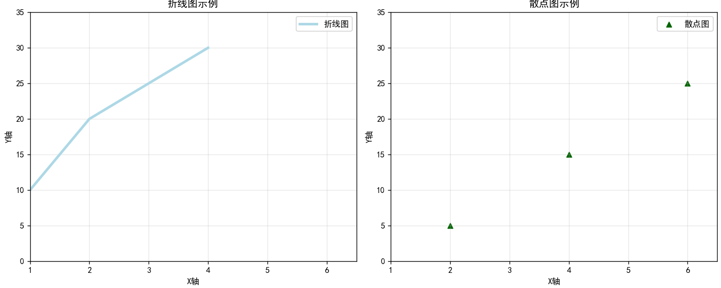
Matplotlib细节介绍
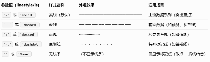
线条样式
核心作用是区分不同数据系列(比如用实线表示 “实际销量”,虚线表示 “预测销量”)
import matplotlib.pyplot as plt
import numpy as np
# 中文设置
plt.rcParams["font.family"] = ["SimHei"]
plt.rcParams['axes.unicode_minus'] = False
# 数据:x为0-10的连续值,y1-y4为不同数据系列
x = np.linspace(0, 10, 50)
y1 = x  # 实线(默认)
y2 = x + 1  # 虚线
y3 = x + 2  # 点线
y4 = x + 3  # 点划线
# 创建画布和子图
fig, ax = plt.subplots(figsize=(8, 5))
# 绘制4条不同样式的线,标注清晰
ax.plot(x, y1, linestyle='-', linewidth=2, label='实线(默认,solid)')
ax.plot(x, y2, linestyle='--', linewidth=2, label='虚线(dashed)')
ax.plot(x, y3, linestyle=':', linewidth=2, label='点线(dotted)')
ax.plot(x, y4, linestyle='-.', linewidth=2, label='点划线(dashdot)')
# 装饰:让图表更易读
ax.set_title('不同线条样式对比', fontsize=14)
ax.set_xlabel('X轴', fontsize=12)
ax.set_ylabel('Y轴', fontsize=12)
ax.legend()  # 显示图例,对应线条样式
ax.grid(linestyle=':', alpha=0.3)  # 网格线用点线,避免干扰主线条
plt.show()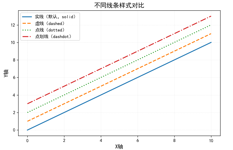
线条颜色
方式 1:预设色名
Matplotlib 支持 140 + 预设色名(如 'red'、'blue'),涵盖常见颜色,直接输入名称即可使用,
适合快速绘图。
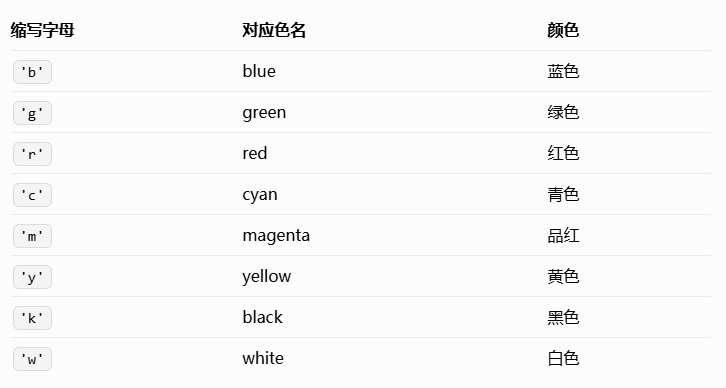
方式 2:缩写色码(快速输入)
将常用颜色缩写为单个字母,适合高效写代码,仅支持 8 种基础颜色:
方式 3:十六进制色码(精准控色)
通过 '#RRGGBB' 格式设置颜色(RR、GG、BB 分别代表红、绿、蓝通道,取值 00-FF),可从设
计工具(如 PS、Figma)或配色网站(如Coolors)获取,适合需要统一图表配色风格的场景(如
公司品牌色)。示例:'#FF6B6B'(珊瑚红)、'#4ECDC4'(薄荷绿)、'#45B7D1'(天空蓝)
方式 4:RGB/RGBA 色值(透明度可控)
通过 (R, G, B) 或 (R, G, B, A) 元组设置颜色,其中 R、G、B 取值范围为 0-1(表示颜色强
度),A 为透明度(0 = 完全透明,1 = 完全不透明),适合需要精细调整透明度的场景(如重叠
线条)。示例:(1, 0, 0)(纯红)、(0, 0.8, 0, 0.5)(半透明绿)
import matplotlib.pyplot as plt
import numpy as np
# 中文设置
plt.rcParams["font.family"] = ["SimHei"]
plt.rcParams['axes.unicode_minus'] = False
# 数据:x为0-10,y为x的不同偏移
x = np.linspace(0, 10, 50)
y1 = x  # 预设色名
y2 = x + 1  # 缩写色码
y3 = x + 2  # 十六进制色码
y4 = x + 3  # RGBA色值
# 创建画布
fig, ax = plt.subplots(figsize=(8, 5))
# 4种颜色设置方式
ax.plot(x, y1, color='orange', linewidth=3, label='预设色名(orange)')
ax.plot(x, y2, color='r', linewidth=3, label='缩写色码(r=red)')
ax.plot(x, y3, color='#4ECDC4', linewidth=3, label='十六进制(#4ECDC4=薄荷绿)')
ax.plot(x, y4, color=(0, 0.6, 0.8, 0.7), linewidth=3, label='RGBA(半透明蓝,A=0.7)')
# 装饰
ax.set_title('4种颜色设置方式对比', fontsize=14)
ax.set_xlabel('X轴', fontsize=12)
ax.set_ylabel('Y轴', fontsize=12)
ax.legend()
ax.grid(alpha=0.3)
plt.show()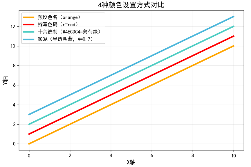
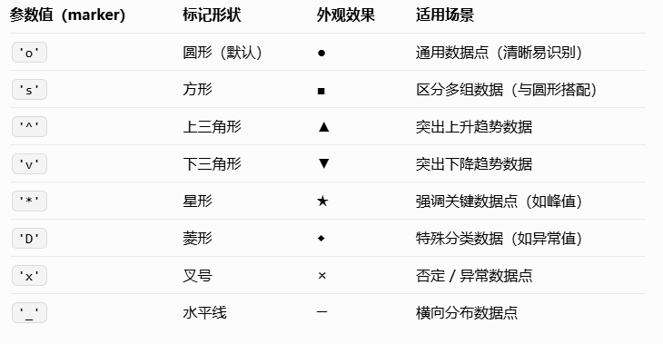
标记(marker)
标记是折线图中 “数据点的符号”,核心作用是突出实际数据位置(比如用圆形标记 “每日销量”
的具体数值,避免读者只能看到线条趋势而找不到原始数据)。
通过 marker 参数设置标记样式,markersize(简写 ms)设置标记大小,markeredgecolor(简
写 mec)设置标记边框颜色,markerfacecolor(简写 mfc)设置标记填充颜色
import matplotlib.pyplot as plt
import numpy as np
# 中文设置
plt.rcParams["font.family"] = ["SimHei"]
plt.rcParams['axes.unicode_minus'] = False
# 数据:模拟5个时间点的销量(离散数据,适合加标记)
x = [1, 2, 3, 4, 5]  # 天数
y = [120, 180, 150, 220, 190]  # 销量
# 创建画布
fig, ax = plt.subplots(figsize=(8, 5))
# 绘制带标记的折线:自定义标记样式、大小、颜色
ax.plot(x, y,
        linewidth=2,  # 线条粗细
        color='#FF6B6B',  # 线条颜色(珊瑚红)
        marker='o',  # 标记为圆形
        markersize=8,  # 标记大小
        markeredgecolor='white',  # 标记边框为白色(突出立体感)
        markerfacecolor='#45B7D1',  # 标记填充色(天空蓝)
        label='每日销量')
# 进阶:给标记添加数值标签(让数据更直观)
for i in range(len(x)):
    ax.text(x[i], y[i] + 5,  # 标签位置(在标记上方5个单位)
            str(y[i]),  # 标签内容(销量数值)
            ha='center', va='bottom',  # 水平/垂直居中
            fontsize=10, color='black')
# 装饰
ax.set_title('标记样式自定义与数值标注', fontsize=14)
ax.set_xlabel('天数', fontsize=12)
ax.set_ylabel('销量(件)', fontsize=12)
ax.set_ylim(100, 240)  # 调整y轴范围,避免数值标签超出
ax.legend()
ax.grid(alpha=0.3)
plt.show()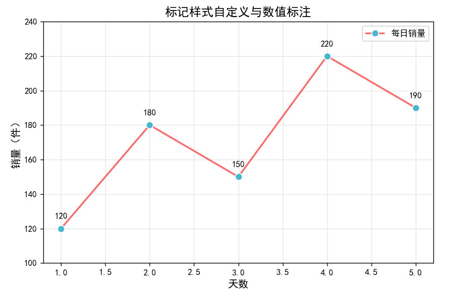
组合实战:用 “样式 + 颜色 + 标记” 画专业图表
实际绘图中,三者通常结合使用,以下以 “对比‘实际销量’与‘预测销量’” 为例,展示如何通过组
合设置让图表清晰、专业:
import matplotlib.pyplot as plt
import numpy as np
# 中文设置
plt.rcParams["font.family"] = ["SimHei"]
plt.rcParams['axes.unicode_minus'] = False
# 数据:实际销量(离散) vs 预测销量(连续)
x_actual = [1, 2, 3, 4, 5, 6, 7]  # 一周7天(实际数据)
y_actual = [120, 180, 150, 220, 190, 250, 230]
x_pred = np.linspace(0.5, 7.5, 50)  # 连续x值(预测曲线)
y_pred = 100 + 20 * x_pred  # 预测销量(线性拟合)
# 创建画布
fig, ax = plt.subplots(figsize=(10, 6))
# 1. 绘制实际销量:突出数据点(大标记+实线条)
ax.plot(x_actual, y_actual,
        color='#FF6B6B', linewidth=3, linestyle='-',
        marker='o', markersize=10, markeredgecolor='white', markerfacecolor='#FF6B6B',
        label='实际销量')
# 2. 绘制预测销量:辅助线条(无标记+虚线条)
ax.plot(x_pred, y_pred,
        color='#45B7D1', linewidth=2, linestyle='--',
        marker='None',  # 无标记(预测是连续曲线,无需数据点)
        label='预测销量(线性拟合)')
# 3. 标注关键数据点(如最高销量)
max_idx = y_actual.index(max(y_actual))  # 找到最高销量的索引
ax.annotate(f'最高销量:{y_actual[max_idx]}件',  # 标注内容
            xy=(x_actual[max_idx], y_actual[max_idx]),  # 标注目标点
            xytext=(x_actual[max_idx]+0.5, y_actual[max_idx]+20),  # 标注文字位置
            arrowprops=dict(arrowstyle='->', color='gray'),  # 箭头样式
            fontsize=11, color='darkred')
# 装饰
ax.set_title('一周销量:实际 vs 预测', fontsize=16, pad=20)
ax.set_xlabel('天数', fontsize=12)
ax.set_ylabel('销量(件)', fontsize=12)
ax.set_xlim(0.5, 7.5)
ax.set_ylim(80, 300)
ax.legend(loc='best',fontsize=11)
ax.grid(linestyle=':', alpha=0.3)
# 保存高清图片(适合报告/论文)
#plt.savefig('销量对比图.png', dpi=300, bbox_inches='tight')
plt.show()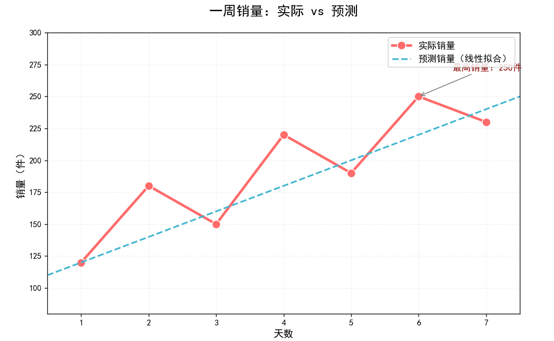
Seaborn绘图基本步骤与示例
使用 Seaborn 创建图形的基本步骤:
- Step 1 准备数据
- Step 2 设定画布外观
- Step 3 使用 Seaborn 绘图
- Step 4 自定义图形
- Step 5 展示结果图
# 导入Matplotlib的pyplot模块(用于基础绘图和显示图表)
import matplotlib.pyplot as plt
# 导入Seaborn库(用于绘制更美观的统计图表,基于Matplotlib)
import seaborn as sns
# 导入 warnings 模块(用于控制警告信息的显示)
import warnings
# 忽略所有警告信息(避免因版本兼容等问题输出冗余警告,不影响代码功能)
warnings.filterwarnings('ignore')
# Step 1:加载Seaborn内置的"小费数据集"
# 该数据集包含餐厅消费金额、小费、顾客性别、用餐时间等信息
tips = sns.load_dataset("tips")
# Step 2:设置Seaborn的图表主题
# "whitegrid"表示白色背景+灰色网格线(适合大多数场景,清晰且不干扰数据)
sns.set_style("whitegrid")
# Step 3:绘制带回归线的散点图(lmplot = linear model plot,线性模型图)
# 参数解析:
# - x="tip":x轴数据为"小费金额"(数据集的列名)
# - y="total_bill":y轴数据为"总账单金额"(数据集的列名)
# - data=tips:使用的数据集(之前加载的tips)
# - aspect=2:图表的宽高比(宽度是高度的2倍,让图表更舒展)
# 返回值g是一个FacetGrid对象(用于后续调整图表细节)
g = sns.lmplot(x="tip", y="total_bill", data=tips, aspect=2)
# 对返回的图表对象g进行细节调整:
# - set_axis_labels("Tip", "Total bill(USD)"):设置x轴和y轴的标签文本
# - set(xlim=(0, 10), ylim=(0, 100)):设置x轴范围为0-10,y轴范围为0-100
g = (g.set_axis_labels("Tip", "Total bill(USD)").set(xlim=(0, 10), ylim=(0, 100)))
# Step 4:添加图表标题(使用Matplotlib的plt.title()函数,Seaborn兼容Matplotlib的操作)
plt.title("title")  # 实际使用时可替换为有意义的标题,如"小费金额与总账单的关系"
# Step 5:显示图表(虽然传入了g,但plt.show()可以直接显示当前画布内容,参数可省略)
plt.show(g)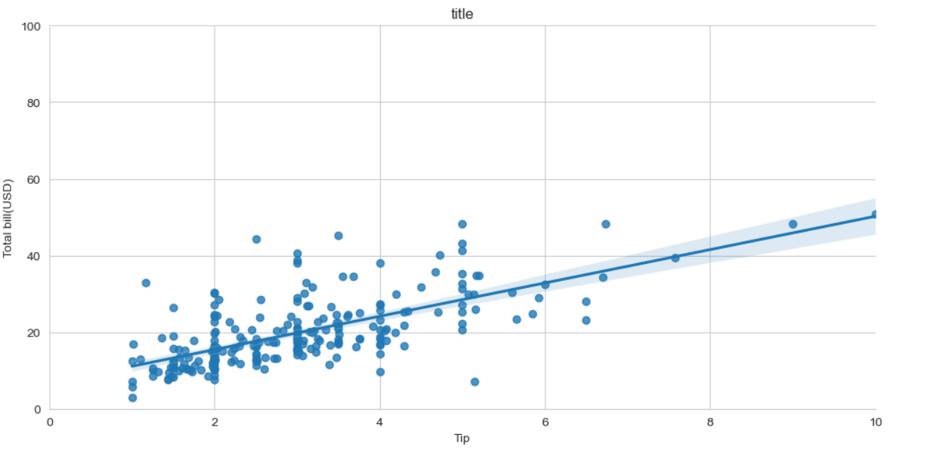
图标样式
# 设置Seaborn全局图表样式,所有后续绘制的图表会默认遵循这些配置
sns.set_theme(
    context='notebook',  # 控制图表元素(字体、线条)的整体大小
    # context可选值:'paper'(最小,适合论文)、'notebook'(中等,默认,适合笔记本)
    # 'talk'(较大,适合幻灯片)、'poster'(最大,适合海报)
    style='whitegrid',  # 定义图表基础风格(背景、网格线等)
    # style可选值:'whitegrid'(白背景+灰网格,默认)、'darkgrid'(深灰背景+白网格)
    # 'white'(纯白背景,无网格)、'dark'(纯深灰背景,无网格)
    palette='Set2',  # 设置全局默认配色方案,控制不同类别数据的颜色
    # palette常用值:'Set2'(柔和对比色)、'Pastel1'(马卡龙色系)
    # 'husl'(高饱和均匀色)、'coolwarm'(冷暖渐变)、'viridis'(色盲友好渐变)
    font='sans-serif',  # 指定图表中所有文本的字体类型
    # font可选值:'sans-serif'(无衬线字体,如Arial,默认,易读)
    # 'serif'(衬线字体,如Times New Roman,适合论文)
    # 'monospace'(等宽字体,如Courier,适合代码)
    # 中文支持可改为:'SimHei'、'WenQuanYi Micro Hei'(需系统安装)
    font_scale=1,  # 文本大小缩放比例(基于context的基准尺寸)
    # 例:font_scale=1.2(放大20%)、font_scale=0.8(缩小20%)
    color_codes=False  # 是否启用颜色代码缩写(如'b'代表蓝色)
    # True:允许简写(如color='b');False(默认):需写完整名称(如color='blue')
)
Seaborn核心绘图函数与方法
- 关联图——relplot
- 类别图——catplot
- 分布图——distplot、kdeplot、jointplot、pairplot
- 回归图——regplot、lmplot
- 矩阵图——heatmap、clustermap
- 组合图
导入数据集:
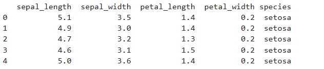
下面我们会使用 iris 鸢尾花数据集完成后续的绘图
数据集总共 150 行,由 5 列组成。分别代表:萼片长度、萼片宽度、花瓣长度、花瓣宽度、
花的类别。其中,前四列均为数值型数据,最后一列花的分类为三种,分别是:Iris Setosa、Iris
Versicolour、Iris Virginica。
关联图
当我们需要对数据进行关联性分析时,可能会用到 Seaborn 提供的以下几个 API。
| API层级 | 关联性分析 | 介绍 |
|---|---|---|
| Figure-level | relplot | 绘制关系图 |
| Axes-level | scatterplot | 多维度分析散点图 |
| lineplot | 多维度分析线形图 |
relplot 是 relational plots 的缩写,用于呈现数据之后的关系。relplot 主要有散点图和线形图2种
样式,适用于不同类型的数据。
散点图
指定x和y的特征,默认可以绘制出散点图。
sns.relplot(x="sepal_length", y="sepal_width", hue="species", style="species", data=iris)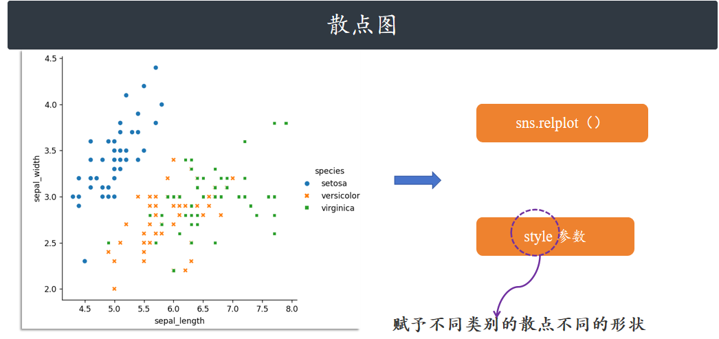
线形图
relplot 方法还支持线形图,此时只需要指定 kind=”line” 参数即可。图中阴影部分是自动给出的
95%的置信区间。(如果我们重复做 100 次相同的实验 / 数据采集,会得到 100 组 “花萼长度 - 花
瓣长度” 的趋势线,其中有 95 条线会落在这个浅色阴影范围内。换个更直白的说法:我们基于当
前的鸢尾花数据集(150 个样本),计算出 “花瓣长度随花萼长度变化的趋势线”(图中的彩色实
线),但这个趋势线只是 “基于现有样本的估计值”—— 如果换一批新的鸢尾花样本(同样 150
个),重新画趋势线,线的位置可能会轻微偏移。而 95% 置信区间就是告诉我们:新趋势线 “大
概率(95% 的概率)” 会落在的范围,阴影越窄,说明这个趋势的 “稳定性越强”。)
阴影越窄→趋势越稳定,阴影越宽→趋势的不确定性越高
sns.relplot(x="sepal_length", y="petal_length", hue="species", style="species", kind="line", data=iris)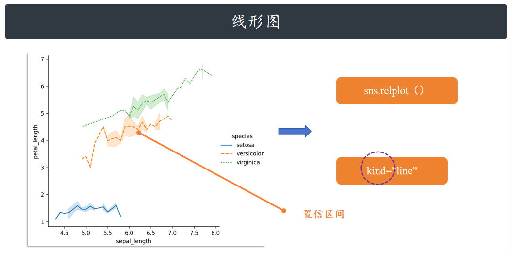
API 层级:Axes-level 和 Figure-level
想快速出图、少写代码?用 Figure-level 的 relplot(通过 kind 切换散点 / 折线)。想精细控制图表
(比如多子图布局、复杂样式)?用 Axes-level 的 scatterplot 或 lineplot,搭配 Matplotlib 更灵
活。
上方 relplot 绘制的图也可以使用 lineplot 函数绘制,只要取消 relplot 中的 kind 参数即可。
sns.lineplot(x="sepal_length", y="petal_length", hue="species", style="species", data=iris)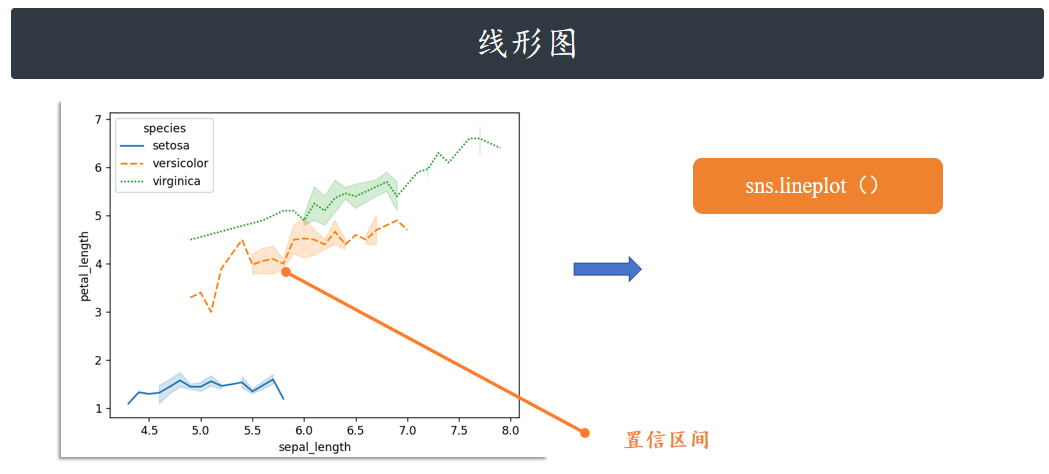
类别图
与关联图相似,类别图的 Figure-level 接口是 catplot,其为 categorical plots 的缩写。而 catplot 实际上是如下 Axes-level 绘图 API 的集合:
| API层级 | 函数 | 介绍 |
|---|---|---|
| Figure-level | catplot | |
| Axes-level | stripplot() (kind=”strip”) swarmplot() (kind=”swarm”) | 分类散点图 |
| boxplot() (kind=”box”) boxenplot() (kind=”boxen”) violinplot() (kind=”violin”) | 分类分布图 | |
| pointplot() (kind=”point”) barplot() (kind=”bar”) countplot() (kind=”count”) | 分类估计图 |
散点图 strip / swarm
下面,我们看一下 catplot 绘图效果。该方法默认是绘制 kind="strip" 散点图。
sns.catplot(x="sepal_length", y="species", data=iris)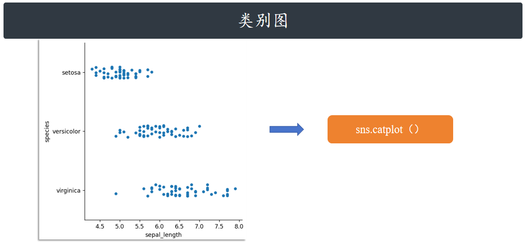
kind="swarm" 可以让散点按照 beeswarm 的方式防止重叠,可以更好地观测数据分布。
sns.catplot(x="sepal_length", y="species", kind="swarm", data=iris)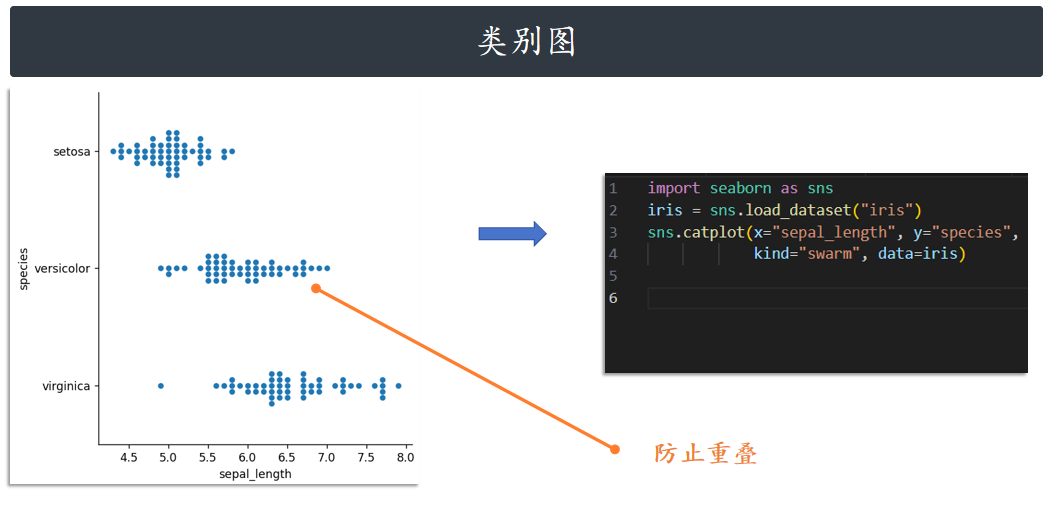
同理,hue=参数可以给图像引入另一个维度,由于 iris 数据集只有一个类别列,我们这里就不再添
加 hue=参数了。如果一个数据集有多个类别,hue=参数就可以让数据点有更好的区分。
箱线图 box
接下来,我们依次尝试其他几种图形的绘制效果。绘制箱线图:
# 导入相关库
import matplotlib.pyplot as plt
import seaborn as sns
import warnings
warnings.filterwarnings('ignore')
# 设置主题,重点修改palette参数更换配色
sns.set_theme(
    context='notebook',
    style='whitegrid',
    palette='Set2',  # 可替换为'Pastel1'、'husl'、'coolwarm'等
    font='sans-serif',
    font_scale=1,
    color_codes=False
)
# 加载数据
iris = sns.load_dataset("iris")
# 绘制箱线图,通过palette参数单独设置当前图表配色(优先级高于全局设置)
g = sns.catplot(
    x="sepal_length",
    y="species",
    kind="box",
    data=iris,
    palette='Pastel1'  # 此处配色会覆盖全局的palette设置
)
# 去除网格线
for ax in g.axes.flat:
    ax.grid(False)
plt.show()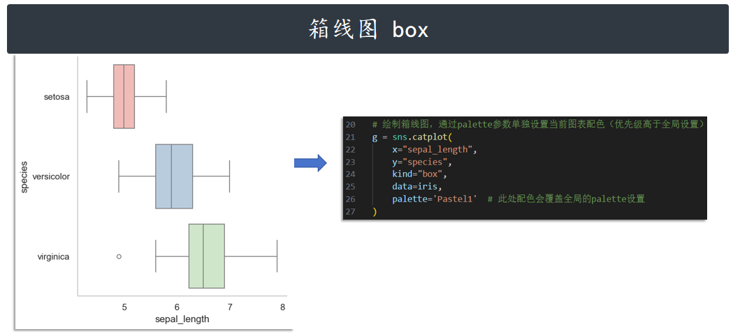
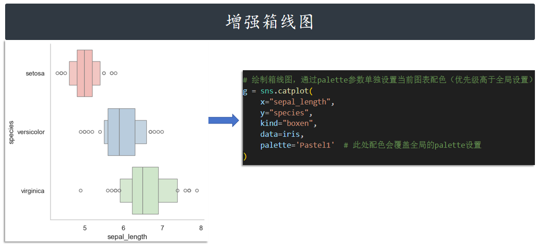
增强箱线图 boxen
g = sns.catplot(
    x="sepal_length",
    y="species",
    kind="boxen",
    data=iris,
    palette='Pastel1'  # 此处配色会覆盖全局的palette设置
)
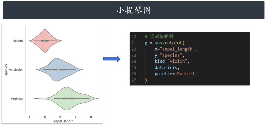
小提琴图 violin
# 绘制箱线图
g = sns.catplot(
    x="sepal_length",
    y="species",
    kind="violin",
    data=iris,
    palette='Pastel1'
)
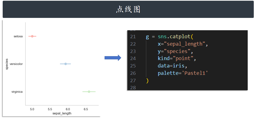
点线图 point
g = sns.catplot(
    x="sepal_length",
    y="species",
    kind="point",
    data=iris,
    palette='Pastel1'
)
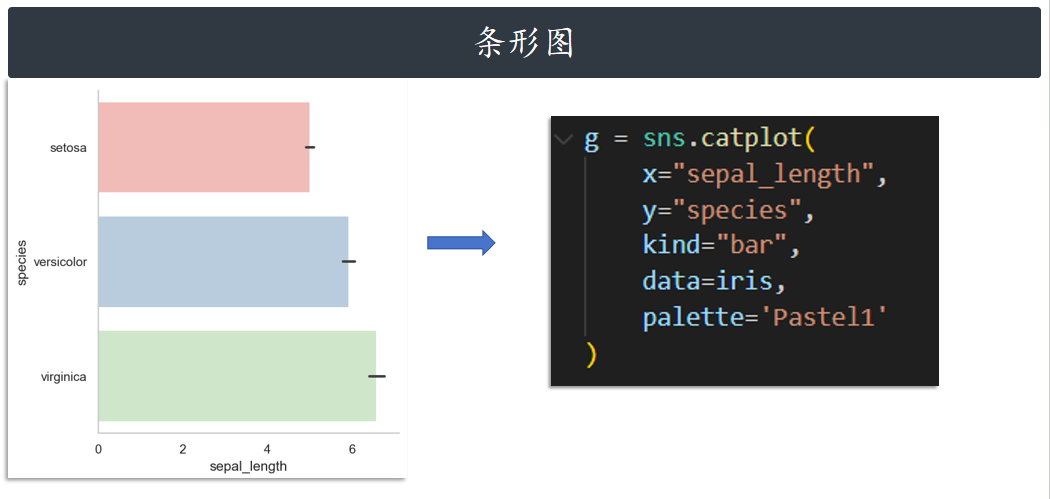
条形图 bar
g = sns.catplot(
    x="sepal_length",
    y="species",
    kind="bar",
    data=iris,
    palette='Pastel1'
)
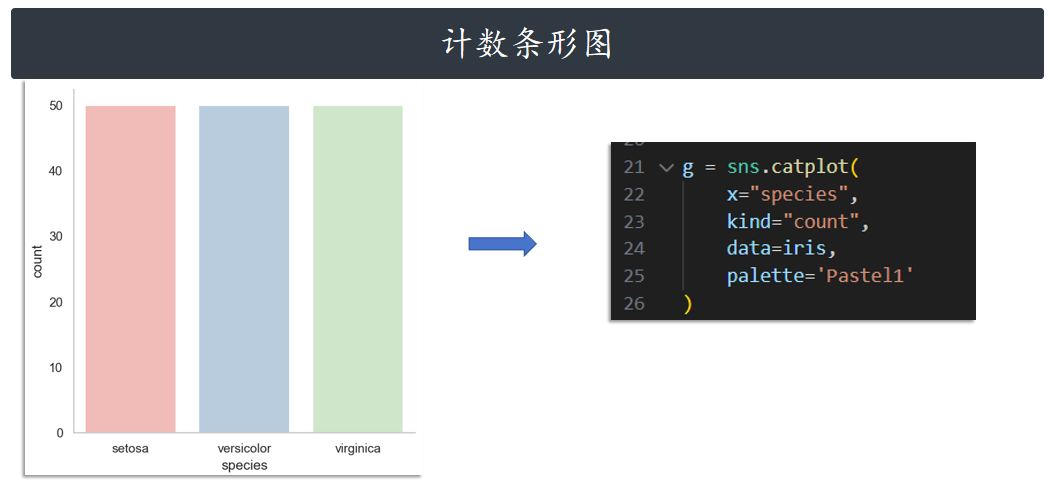
计数条形图 count
g = sns.catplot(
    x="species",
    kind="count",
    data=iris,
    palette='Pastel1'
)
分布图
分布图主要是用于可视化变量的分布情况,一般分为单变量分布和多变量分布(多指二元变
量)。Seaborn 提供的分布图绘制方法一般有这几个:distplot、kdeplot、jointplot、pairplot。接
下来,我们依次来看一下这些绘图方法的使用。
| API层级 | 函数 | 介绍 |
|---|---|---|
| Axes-level | distplot | 绘制直方图并拟合核密度估计图 |
| Axes-level | kdeplot | 专门用于绘制核密度估计图 |
| Axes-level | jointplot | 支持 kind= 参数指定绘制出不同样式的分布图 |
| Axes-level | pairplot | 一次性将数据集中的特征变量两两对比绘图 |
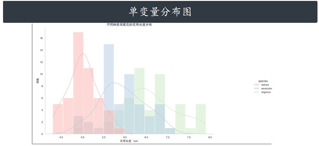
单变量分布图 distplot
Seaborn 快速查看单变量分布的方法是 displot。默认情况下,该方法将绘制直方图并拟合核密度
估计图。
# 导入相关库
import matplotlib.pyplot as plt
import seaborn as sns
import matplotlib.font_manager as fm
import warnings
warnings.filterwarnings('ignore')
# 强制设置中文字体(尝试多种常见字体,确保兼容性)
try:
    # 尝试加载系统中的中文字体
    font_names = ["SimHei", "WenQuanYi Micro Hei", "Heiti TC", "Microsoft YaHei"]
    font = None
    for name in font_names:
        try:
            font = fm.FontProperties(family=name)
            # 测试字体是否可用
            if font.get_name() in font_names:
                break
        except:
            continue
    # 全局字体设置
    plt.rcParams["font.family"] = [font.get_name()] if font else ["sans-serif"]
except:
    #  fallback方案:使用支持中文的默认配置
    plt.rcParams["font.family"] = ["Arial Unicode MS", "sans-serif"]
# 确保负号正确显示
plt.rcParams['axes.unicode_minus'] = False
# 设置主题(不指定字体,使用全局设置)
sns.set_theme(
    context='notebook',
    style='whitegrid',
    palette='Set2',
    font_scale=1,
    color_codes=False
)
# 加载数据
iris = sns.load_dataset("iris")
# 绘制直方图并拟合核密度估计图
g = sns.displot(
    data=iris,
    x="sepal_length",
    hue="species",
    kind="hist",
    kde=True,
    bins=15,
    palette='Pastel1'
)
# 去除网格线
for ax in g.axes.flat:
    ax.grid(False)
    # 为坐标轴标签单独设置字体(确保中文显示)
    ax.set_xlabel("花萼长度 (cm)", fontproperties=font, fontsize=12)
    ax.set_ylabel("频数", fontproperties=font, fontsize=12)
# 为标题单独设置字体
plt.title("不同种类鸢尾花的花萼长度分布", fontproperties=font, fontsize=14)
plt.show()
# 使用displot函数,kind="hist"指定直方图,kde=True添加核密度曲线
g = sns.displot(
data=iris,
x="sepal_length", # 选择要展示分布的变量(这里用花萼长度)
hue="species", # 按鸢尾花种类分组显示
kind="hist", # 图表类型为直方图
kde=True, # 添加核密度估计曲线
bins=15, # 直方图的分箱数量,控制精度
palette='Pastel1' # 配色方案
)
核密度估计图 kdeplot
当然,kdeplot 可以专门用于绘制核密度估计图,其效果和 distplot(hist=False) 一致,但 kdeplot 拥有更多的自定义设置。
# 导入相关库
import matplotlib.pyplot as plt
import seaborn as sns
import matplotlib.font_manager as fm
import warnings
warnings.filterwarnings('ignore')
# 1. 手动指定中文字体文件(关键步骤,根据系统修改)
# Windows: "C:/Windows/Fonts/simhei.ttf"(黑体)
# macOS: "/System/Library/Fonts/PingFang.ttc"(苹方)
# Linux: "/usr/share/fonts/opentype/noto/NotoSansCJK-Regular.ttc"
font_path = "C:/Windows/Fonts/simhei.ttf"
# 加载字体并创建字体属性对象
try:
    chinese_font = fm.FontProperties(fname=font_path)
except FileNotFoundError:
    # 如果指定字体不存在,使用系统默认中文字体
    chinese_font = fm.FontProperties(family=["SimHei", "WenQuanYi Micro Hei", "Heiti TC"])
# 2. 全局字体配置
plt.rcParams.update({
    "font.family": chinese_font.get_name(),
    "axes.unicode_minus": False,  # 解决负号显示问题
})
# 3. 设置Seaborn主题
sns.set_theme(
    context='notebook',
    style='white',
    palette='Set2',
    font_scale=1,
    color_codes=False
)
# 4. 加载数据
iris = sns.load_dataset("iris")
# 5. 创建画布并绘制核密度图
plt.figure(figsize=(10, 6))
for species in iris["species"].unique():
    subset = iris[iris["species"] == species]
    sns.kdeplot(
        data=subset,
        x="sepal_length",
        label=species,
        fill=True,
        alpha=0.3,
        linewidth=2
    )
# 6. 添加标题和轴标签(明确指定字体)
plt.title("不同种类鸢尾花的花萼长度核密度分布", fontproperties=chinese_font, fontsize=14)
plt.xlabel("花萼长度 (cm)", fontproperties=chinese_font, fontsize=12)
plt.ylabel("密度", fontproperties=chinese_font, fontsize=12)
# 7. 单独设置图例(重点解决"鸢尾花种类"标题显示问题)
legend = plt.legend(
    title="鸢尾花种类",  # 图例标题
    prop=chinese_font,  # 图例内容字体
    title_fontproperties=chinese_font  # 图例标题字体(关键设置)
)
plt.grid(axis="y", alpha=0.2)
plt.show()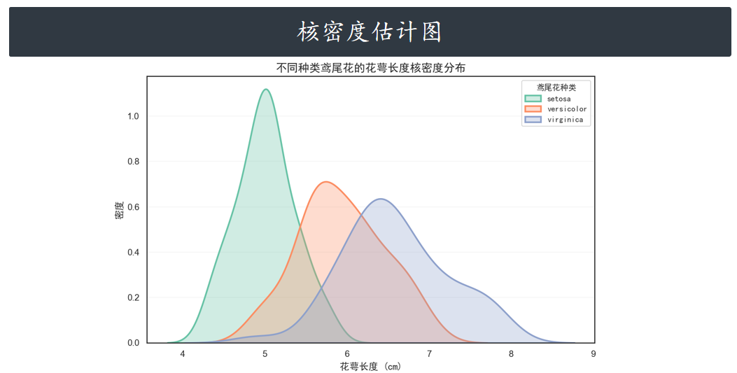
二元变量分布图 jointplot
jointplot 主要是用于绘制二元变量分布图。例如,我们探寻 sepal_length 和 sepal_width 二元特征变量之间的关系。
# 导入相关库
import matplotlib.pyplot as plt
import seaborn as sns
import matplotlib.font_manager as fm
import warnings
warnings.filterwarnings('ignore')
# 中文显示设置(指定字体文件路径)
font_path = "C:/Windows/Fonts/simhei.ttf"  # Windows系统
# font_path = "/System/Library/Fonts/PingFang.ttc"  # macOS系统
chinese_font = fm.FontProperties(fname=font_path)
# 全局字体配置
plt.rcParams.update({
    "font.family": chinese_font.get_name(),
    "axes.unicode_minus": False
})
# 加载数据
iris = sns.load_dataset("iris")
# 绘制二元变量分布图
g = sns.jointplot(
    data=iris,
    x="sepal_length",  # x轴:花萼长度
    y="petal_length",  # y轴:花瓣长度
    hue="species",     # 按种类分组
    kind="scatter",    # 中心为散点图
    palette="Set2",    # 配色方案
    height=8           # 图表大小
)
# 调整标题位置和布局(解决显示不完全问题)
# 1. 增加顶部边距,为标题留出空间
plt.subplots_adjust(top=0.9)
# 2. 设置标题,y参数控制与图表的距离(值越小越靠下)
g.fig.suptitle(
    "花萼长度与花瓣长度的关系分布",
    fontproperties=chinese_font,
    y=0.98,  # 调整此值(0-1之间)控制标题位置
    fontsize=14
)
# 设置轴标签
g.ax_joint.set_xlabel("花萼长度 (cm)", fontproperties=chinese_font, fontsize=12)
g.ax_joint.set_ylabel("花瓣长度 (cm)", fontproperties=chinese_font, fontsize=12)
# 设置图例字体
plt.legend(title="鸢尾花种类", prop=chinese_font, title_fontproperties=chinese_font)
plt.show()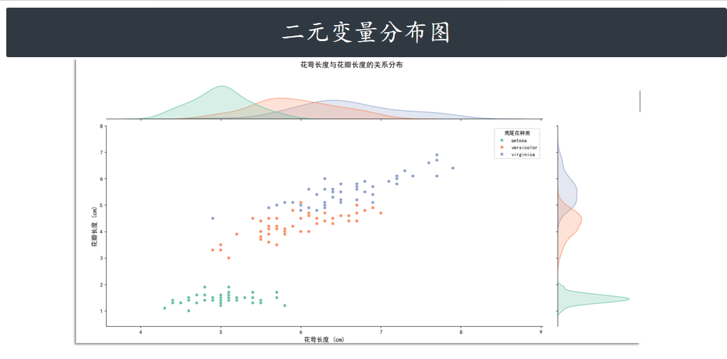
jointplot 并不是一个 Figure-level 接口,但其支持 kind= 参数 指定绘制出不同样式的分布图。
例如,绘制出核密度估计对比图 kde
# 导入相关库
import matplotlib.pyplot as plt
import seaborn as sns
import matplotlib.font_manager as fm
import warnings
warnings.filterwarnings('ignore')
# 中文显示设置(指定字体文件路径)
font_path = "C:/Windows/Fonts/simhei.ttf"  # Windows系统
# font_path = "/System/Library/Fonts/PingFang.ttc"  # macOS系统
chinese_font = fm.FontProperties(fname=font_path)
# 全局字体配置
plt.rcParams.update({
    "font.family": chinese_font.get_name(),
    "axes.unicode_minus": False
})
# 加载数据
iris = sns.load_dataset("iris")
# 绘制核密度联合分布图(kind="kde")
g = sns.jointplot(
    x="sepal_length",  # x轴:花萼长度
    y="sepal_width",   # y轴:花萼宽度
    data=iris,
    kind="kde",        # 图表类型:核密度图(展示数据密度分布)
    cmap="viridis",    # 颜色映射(核密度图常用渐变色系)
    height=8           # 图表大小
)
# 调整布局,确保标题完整显示
plt.subplots_adjust(top=0.9)  # 增加顶部边距
# 设置标题
g.fig.suptitle(
    "花萼长度与花萼宽度的核密度分布",
    fontproperties=chinese_font,
    y=0.98,  # 标题位置(靠近顶部但不超出)
    fontsize=14
)
# 设置轴标签
g.ax_joint.set_xlabel("花萼长度 (cm)", fontproperties=chinese_font, fontsize=12)
g.ax_joint.set_ylabel("花萼宽度 (cm)", fontproperties=chinese_font, fontsize=12)
plt.show()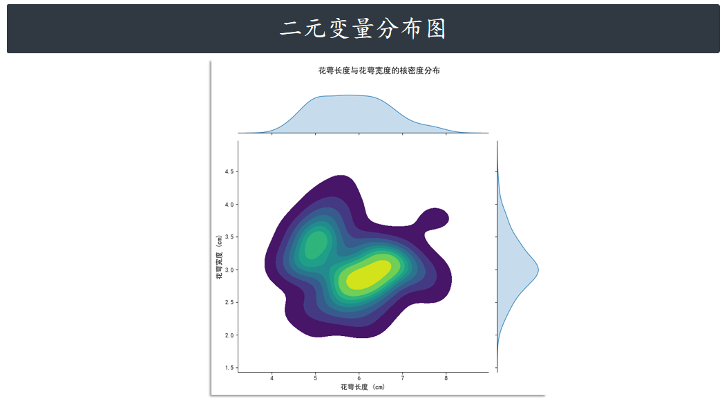
绘制六边形计数图 hex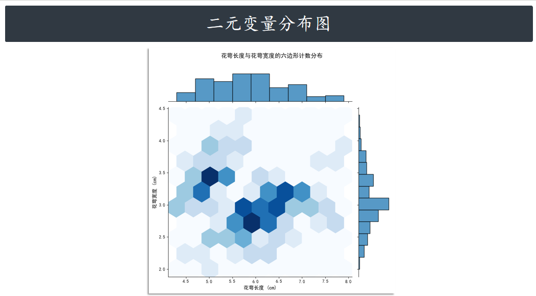
绘制回归拟合图
# 导入相关库
import matplotlib.pyplot as plt
import seaborn as sns
import matplotlib.font_manager as fm
import warnings
warnings.filterwarnings('ignore')
# 中文显示设置(指定字体文件路径)
# 假设字体路径已设置
font_path = "C:/Windows/Fonts/simhei.ttf"
chinese_font = fm.FontProperties(fname=font_path)
# 全局字体配置
plt.rcParams.update({
"font.family": chinese_font.get_name(),
"axes.unicode_minus": False
})
# 加载数据
iris = sns.load_dataset("iris")
# 绘制回归拟合联合分布图(kind="reg")
g = sns.jointplot(
x="sepal_length", # x轴:花萼长度
y="sepal_width", # y轴:花萼宽度
data=iris,
kind="reg", # 核心参数:指定为回归拟合图
color="g", # 设置散点和回归线的颜色为绿色
scatter_kws={'alpha': 0.6}, # 设置散点图透明度,避免重叠
line_kws={'color': 'red', 'linewidth': 2}, # 设置回归线的颜色和粗细
height=8 # 图表大小
)
# 调整布局,确保标题完整显示
plt.subplots_adjust(top=0.9)
# 设置标题
g.fig.suptitle(
"花萼长度与花萼宽度的回归拟合",
fontproperties=chinese_font,
y=0.98,
fontsize=14
)
# 设置轴标签
g.ax_joint.set_xlabel("花萼长度 (cm)", fontproperties=chinese_font, fontsize=12)
g.ax_joint.set_ylabel("花萼宽度 (cm)", fontproperties=chinese_font, fontsize=12)
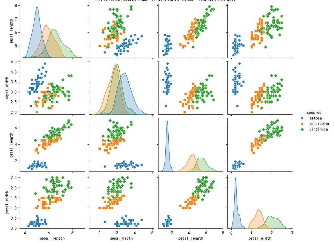
plt.show()变量两两对比图 pairplot
最后要介绍的 pairplot 更加强大,其支持一次性将数据集中的特征变量两两对比绘图。默认情况
下,对角线上是单变量分布图,而其他则是二元变量分布图。
回归图
接下来,我们继续介绍回归图,回归图的绘制函数主要有:lmplot 和 regplot。
| API层级 | 函数 | 介绍 |
|---|---|---|
| Axes-level | regplot | 自动完成线性回归拟合 |
| Axes-level | lmplot | 支持引入第三维度进行对比 |
regplot
regplot 绘制回归图时,只需要指定自变量和因变量即可,regplot 会自动完成线性回归拟合。
# 导入相关库
import matplotlib.pyplot as plt
import seaborn as sns
import matplotlib.font_manager as fm
import warnings
warnings.filterwarnings('ignore')
# 中文显示设置(指定字体文件路径)
# 假设字体路径已设置
font_path = "C:/Windows/Fonts/simhei.ttf"
chinese_font = fm.FontProperties(fname=font_path)
# 全局字体配置
plt.rcParams.update({
    "font.family": chinese_font.get_name(),
    "axes.unicode_minus": False
})
# 加载数据
iris = sns.load_dataset("iris")
# 创建一个 matplotlib Figure 和 Axes
plt.figure(figsize=(10, 6))
# 使用 regplot 绘制线性回归拟合图
sns.regplot(
    x="sepal_length",  # 自变量(花萼长度)
    y="sepal_width",   # 因变量(花萼宽度)
    data=iris,
    color="darkorange", # 设置散点和回归线的颜色
    scatter_kws={'alpha': 0.7}, # 设置散点透明度
    line_kws={'color': 'black', 'linewidth': 2} # 设置回归线的颜色和粗细
)
# 设置标题和轴标签
plt.title(
    "花萼长度与花萼宽度的线性回归拟合图",
    fontproperties=chinese_font,
    fontsize=16
)
plt.xlabel("花萼长度 (cm)", fontproperties=chinese_font, fontsize=12)
plt.ylabel("花萼宽度 (cm)", fontproperties=chinese_font, fontsize=12)
# 显示网格线,增强可读性
#plt.grid(True, linestyle='--', alpha=0.6)
plt.show()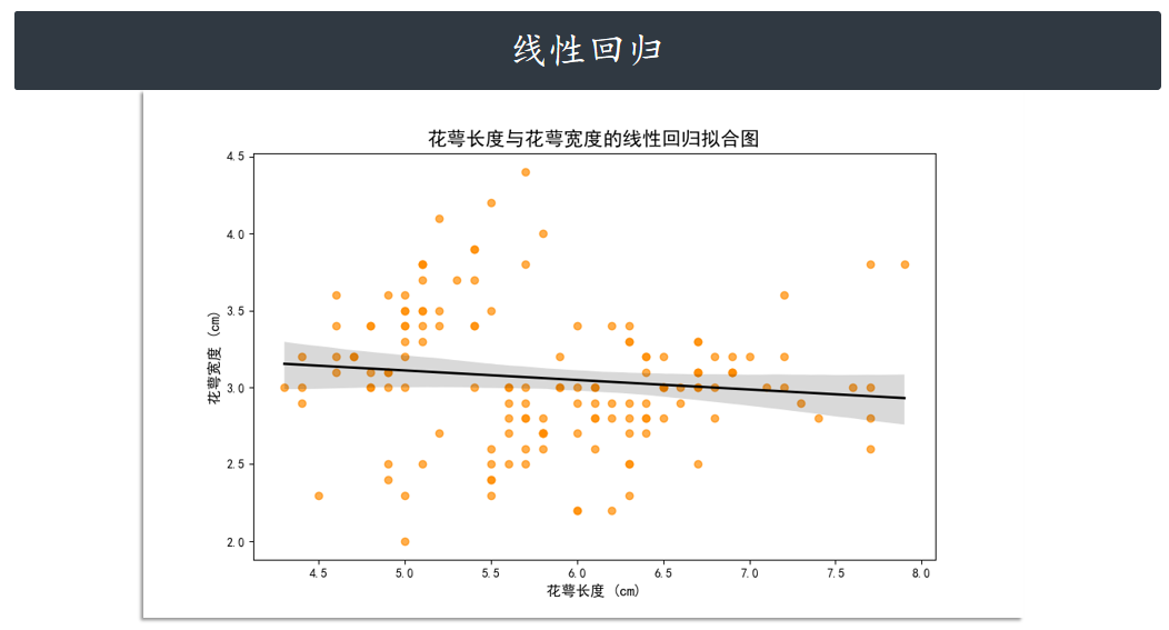
lmplot
lmplot 同样是用于绘制回归图,但 lmplot 支持引入第三维度进行对比,例如我们设
置 hue="species"。
# 导入相关库
import matplotlib.pyplot as plt
import seaborn as sns
import matplotlib.font_manager as fm
import warnings
warnings.filterwarnings('ignore')
# 中文显示设置(指定字体文件路径)
# 假设字体路径已设置
font_path = "C:/Windows/Fonts/simhei.ttf"
chinese_font = fm.FontProperties(fname=font_path)
# 全局字体配置
plt.rcParams.update({
    "font.family": chinese_font.get_name(),
    "axes.unicode_minus": False
})
# 加载数据
iris = sns.load_dataset("iris")
# 使用 lmplot 绘制分组线性回归拟合图
g = sns.lmplot(
    x="sepal_length",  # 自变量
    y="sepal_width",   # 因变量
    data=iris,
    hue="species",     # 按物种分组,计算独立的回归线
    height=7,          # 图表高度
    aspect=1.2,        # 宽高比
    palette="deep"
)
# 【关键步骤】调整子图布局,增加顶部边距
# 默认的 top 值接近 0.9,我们将其增加到 0.94 或更高,以确保标题有足够空间
g.fig.subplots_adjust(top=0.94)
# 调整图表标题
g.fig.suptitle(
    "花萼长度与花萼宽度的分组线性回归拟合图",
    fontproperties=chinese_font,
    y=1.0,  # y=1.0 意味着将标题放在 figure 的顶部边缘
    fontsize=16
)
# 设置轴标签
g.set_axis_labels("花萼长度 (cm)", "花萼宽度 (cm)", fontproperties=chinese_font, fontsize=12)
plt.show()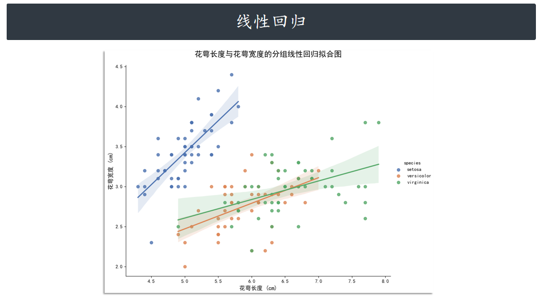
矩阵图
矩阵图中最常用的就只有 2 个,分别是:heatmap 和 clustermap。
| API层级 | 函数 | 介绍 |
|---|---|---|
| Axes-level | heatmap | 绘制热力图 |
| Axes-level | clustermap | 层次聚类结构图 |
热力图 heatmap
意如其名,heatmap 主要用于绘制热力图。热力图在某些场景下非常实用,例如绘制出变量相关
性系数热力图。
# 导入相关库
import matplotlib.pyplot as plt
import seaborn as sns
import matplotlib.font_manager as fm
import warnings
import pandas as pd # 需要用到 pandas 来计算相关系数
warnings.filterwarnings('ignore')
# 中文显示设置(指定字体文件路径)
# 假设字体路径已设置
font_path = "C:/Windows/Fonts/simhei.ttf"
chinese_font = fm.FontProperties(fname=font_path)
# 全局字体配置
plt.rcParams.update({
    "font.family": chinese_font.get_name(),
    "axes.unicode_minus": False
})
# 加载数据
iris = sns.load_dataset("iris")
# 1. 计算相关性矩阵
# drop("species", axis=1) 排除非数值的 "species" 列
correlation_matrix = iris.drop("species", axis=1).corr()
# 2. 创建 Figure 和 Axes
plt.figure(figsize=(8, 7))
# 3. 绘制热力图
sns.heatmap(
    correlation_matrix,
    annot=True,         # 在单元格内显示相关性数值
    cmap="coolwarm",    # 使用 coolwarm 颜色映射,方便区分正负相关
    fmt=".2f",          # 将数值格式化为两位小数
    linewidths=.5,      # 单元格之间的线条宽度
    linecolor='black',  # 单元格边框颜色
    cbar=True           # 显示颜色条
)
# 设置标题
plt.title(
    "鸢尾花数据集特征相关性系数热力图",
    fontproperties=chinese_font,
    fontsize=16,
    pad=20
)
plt.show()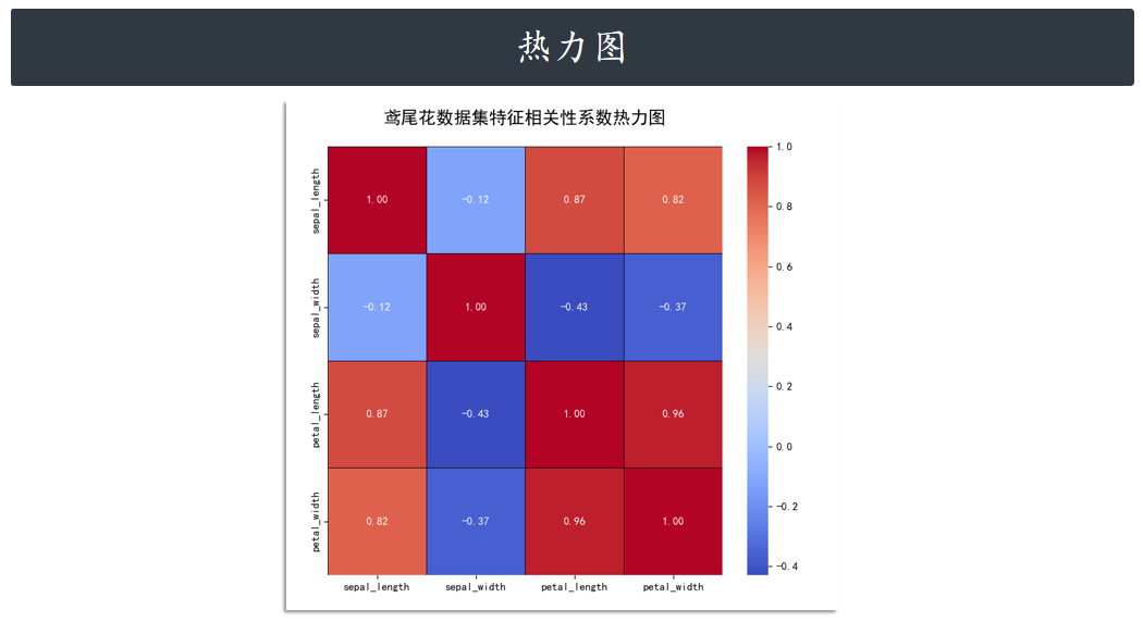
层次聚类结构图clustermap
除此之外,clustermap 支持绘制层次聚类结构图。如下所示,我们先去掉原数据集中最后一个目
标列,传入特征数据即可。
# 导入相关库
import matplotlib.pyplot as plt
import seaborn as sns
import matplotlib.font_manager as fm
import warnings
import pandas as pd
warnings.filterwarnings('ignore')
# 字体设置保持不变
font_path = "C:/Windows/Fonts/simhei.ttf"
chinese_font = fm.FontProperties(fname=font_path)
plt.rcParams.update({"font.family": chinese_font.get_name(), "axes.unicode_minus": False})
# 加载数据并移除非数值列
iris = sns.load_dataset("iris")
iris_features = iris.drop("species", axis=1)
# 绘制层次聚类结构图
g = sns.clustermap(
    iris_features,
    cmap="rocket",         # 假设我们使用 'rocket' 配色
    z_score=0,             # 沿列标准化
    figsize=(8, 10),       # 增加 figsize 的高度(例如到 10)也有帮助
    linewidths=0.5,
    linecolor='white'
)
# 【核心修改 1】设置标题并使用稍高的 y 值 (1.02)
plt.suptitle(
    "鸢尾花特征数据的层次聚类结构图 (rocket 配色,超长标题测试)",
    fontproperties=chinese_font,
    y=1.02, # 将标题设置在 Figure 顶部边缘之上
    fontsize=16
)
# 【核心修改 2】增加顶部边距,确保标题不被截断
# 增加 top 参数的值(例如 0.9 或 0.95),将图表主体向下推
plt.subplots_adjust(top=0.9)
plt.show()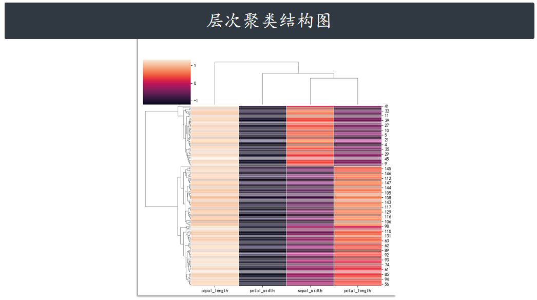
参考:系列教程


 浙公网安备 33010602011771号