数据准备
import matplotlib.pyplot as plt
import tushare as ts
import pandas as pd
import datetime
%matplotlib inline
plt.rcParams['font.sans-serif'] = ['Arial Unicode MS']
plt.rcParams['axes.unicode_minus'] = False # 解决负数无法正常显示的问题
plt.style.use('ggplot') # 修改图表样式
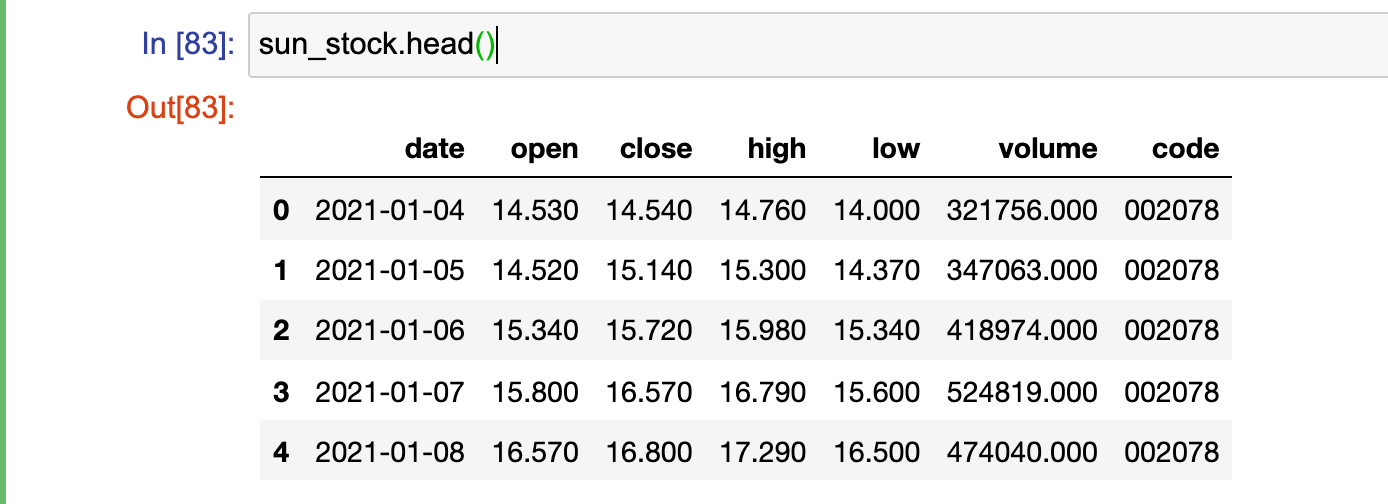
# 获取2021-01-01至今的股票数据
sun_stock = ts.get_k_data(code='002078', start='2021-01-01', end=datetime.datetime.now().strftime('%Y-%m-%d'))
sun_stock.head()
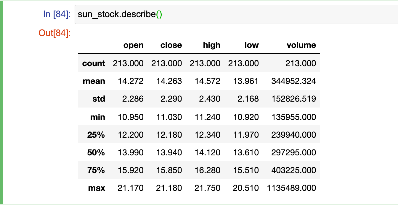
sun_stock.describe()
# 将date设置为数据的index
sun_stock.set_index('date',inplace=True)
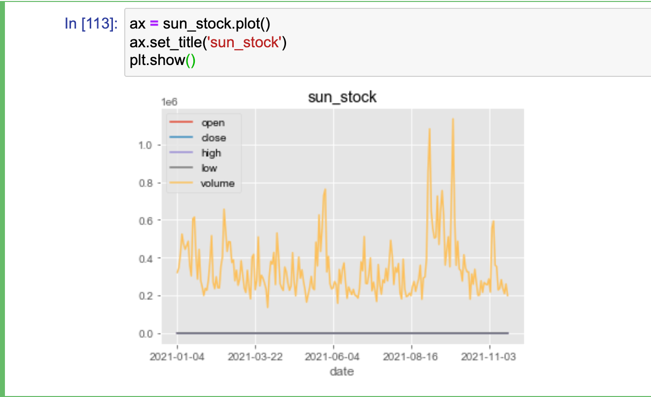
绘制折线图
# 绘图
ax = sun_stock.plot()
ax.set_title('sun_stock')
plt.show()
拆分显示多个子图
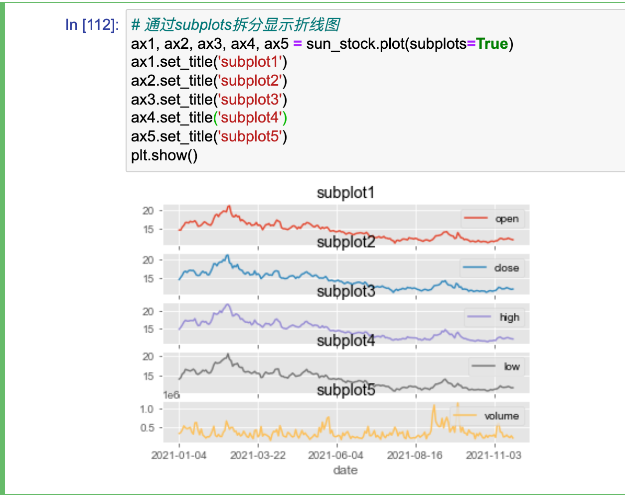
# 通过subplots拆分显示折线图
ax1, ax2, ax3, ax4, ax5 = sun_stock.plot(subplots=True)
ax1.set_title('subplot1')
ax2.set_title('subplot2')
ax3.set_title('subplot3')
ax4.set_title('subplot4')
ax5.set_title('subplot5')
plt.show()
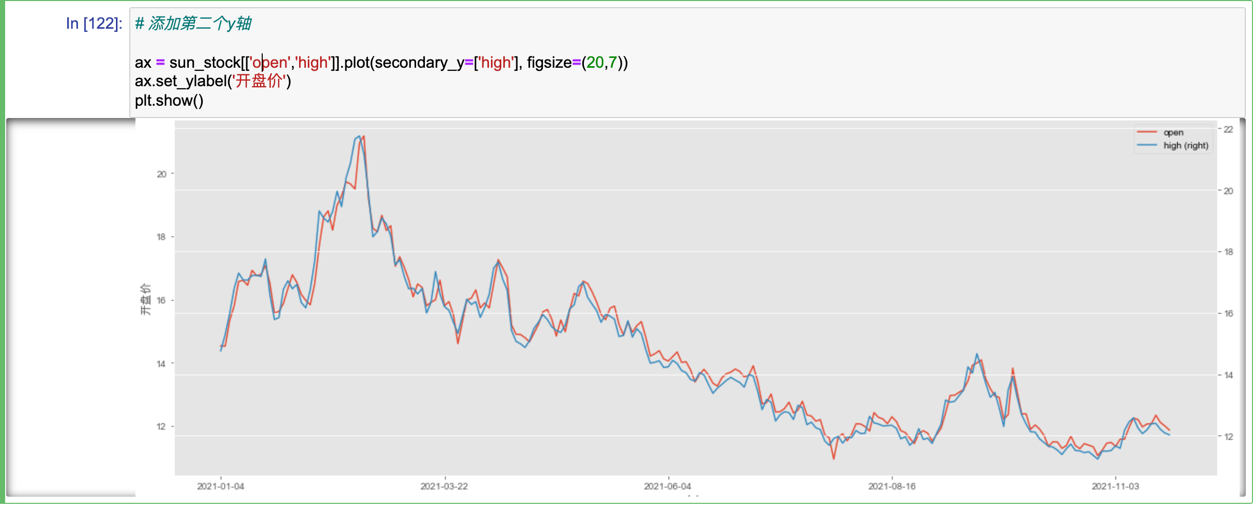
# 添加第二个y轴,如何给第二个y轴set_ylabel ???
ax = sun_stock[['open','high']].plot(secondary_y=['high'], figsize=(20,7))
ax.set_ylabel('开盘价')
plt.show()
绘制柱状图
# 创建数据
boolean=[True,False]
gender=["男","女"]
color=["white","black","yellow"]
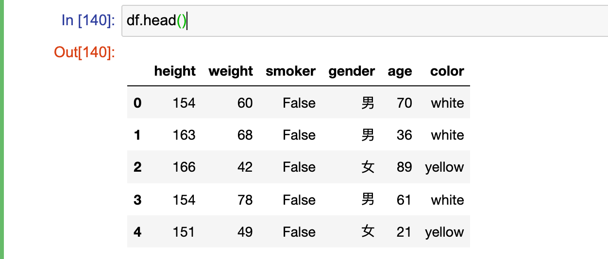
df=pd.DataFrame({
"height":np.random.randint(150,190,100),
"weight":np.random.randint(40,90,100),
"smoker":[boolean[x] for x in np.random.randint(0,2,100)],
"gender":[gender[x] for x in np.random.randint(0,2,100)],
"age":np.random.randint(15,90,100),
"color":[color[x] for x in np.random.randint(0,len(color),100) ]
}
)
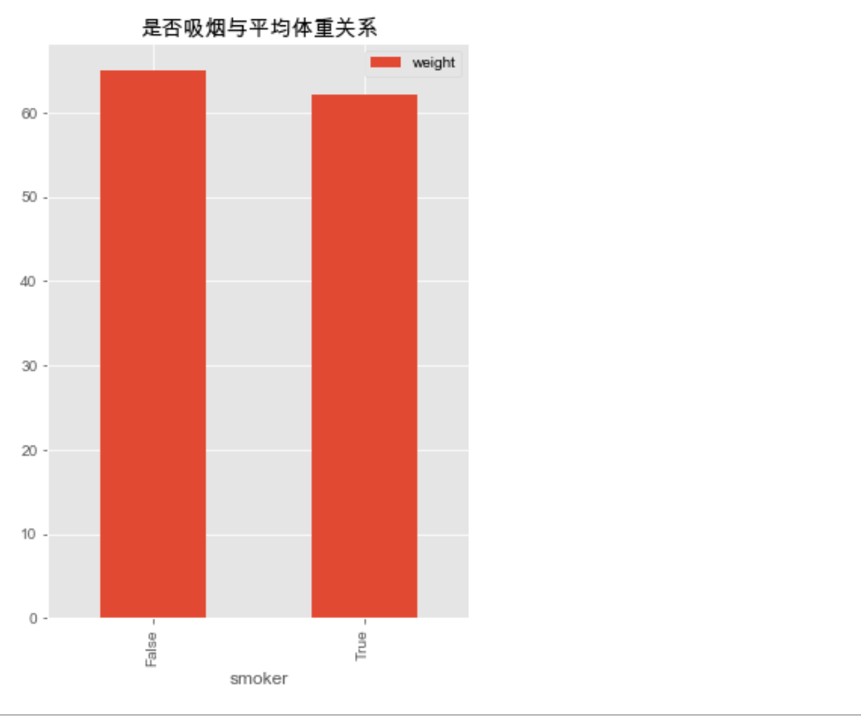
ax = df[['smoker','weight']].groupby(['smoker']).mean().plot.bar(figsize=(5,7), title='是否吸烟与平均体重关系')
ax.legend(bbox_to_anchor=(1,1))
# ax.set_title('是否吸烟与平均体重关系')
plt.show()
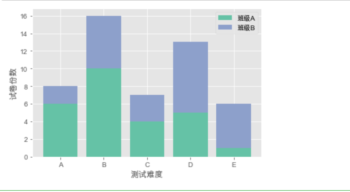
绘制累积柱形图
import matplotlib.pyplot as plt

x = [1, 2, 3, 4, 5]
y = [6, 10, 4, 5, 1]
y1 = [2, 6, 3, 8, 5]

plt.bar(x, y, align="center", color="#66c2a5", tick_label=["A", "B", "C", "D", "E"], label="班级A")
plt.bar(x, y1, align="center", bottom=y, color="#8da0cb", label="班级B")

plt.xlabel("测试难度")
plt.ylabel("试卷份数")

plt.legend()

plt.show()

 浙公网安备 33010602011771号