


ggplot2绘制概率密度图
以下绘图以Weibull分布(韦伯分布、威布尔分布)为例
关于Weibull分布(韦伯分布、威布尔分布),请参考本人博客http://www.cnblogs.com/wwxbi/p/6141501.html
library(ggplot2)
# 这里的d和y都有大小顺序
d<- seq(0, 5, length.out=10000)
y<-dweibull(d, shape=5, scale=1, log = FALSE)
df<-data.frame(x=d,y)
ggplot(df,aes(x=d,y))+
  geom_line(colour="green")+
  ggtitle("Weibull distribution \n 概率密度图")

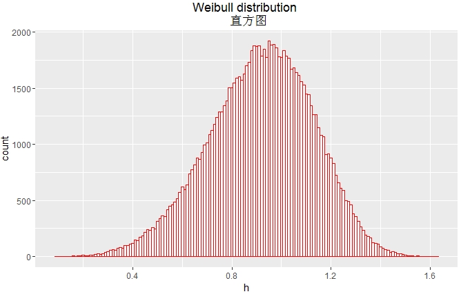
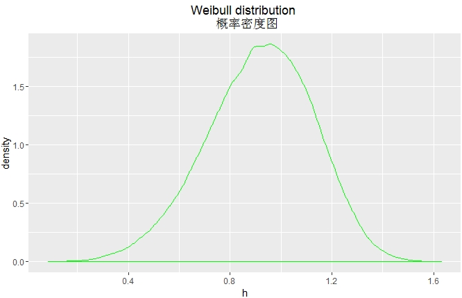
# 这里的h没有大小顺序
h <- rweibull(100000, shape=5, scale=1)
ggplot(NULL,aes(x=h))+
  geom_histogram(binwidth = 0.01,fill="white",colour="red")+
  ggtitle("Weibull distribution \n 直方图")
ggplot(NULL,aes(x=h))+
  geom_density(colour="green")+
  ggtitle("Weibull distribution \n 概率密度图")

ggplot(NULL,aes(x=h))+
  geom_line(stat="density",colour="green")+
  ggtitle("Weibull distribution \n 概率密度图")
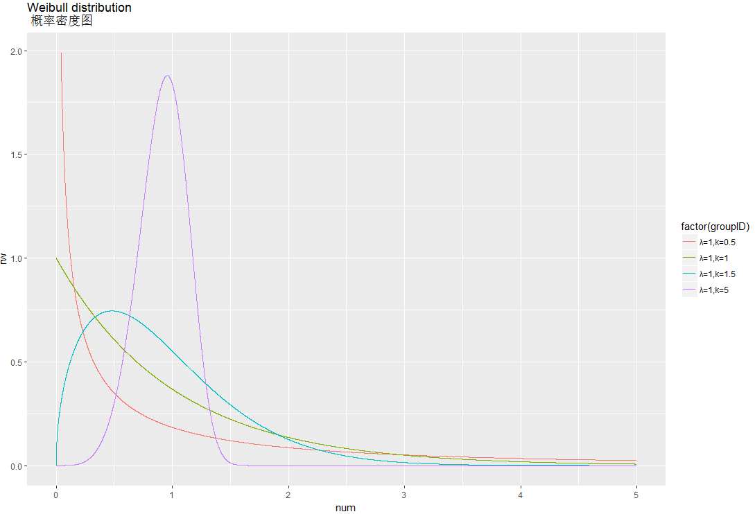
library(sqldf)
library(ggplot2)

d<- seq(0, 5, length.out=10000)
df1<-data.frame(num=seq(0,5,length=10000),groupID="λ=1,k=0.5",rw=dweibull(d, scale=1,shape=0.5 ))
df2<-data.frame(num=seq(0,5,length=10000),groupID="λ=1,k=1",rw=dweibull(d, scale=1,shape=1 ))
df3<-data.frame(num=seq(0,5,length=10000),groupID="λ=1,k=1.5",rw=dweibull(d, scale=1,shape=1.5 ))
df4<-data.frame(num=seq(0,5,length=10000),groupID="λ=1,k=5",rw=dweibull(d, scale=1,shape=5 ))


df5<-sqldf("
           select num,groupID,rw from df1
           union all
           select num,groupID,rw from df2
           union all
           select num,groupID,rw from df3
           union all
           select num,groupID,rw from df4 ")

df<-subset(df5, rw <2 )

ggplot(df,aes(x=num,y=rw,group=factor(groupID),colour=factor(groupID)))+
  geom_line()+
  ggtitle("Weibull distribution \n 概率密度图")
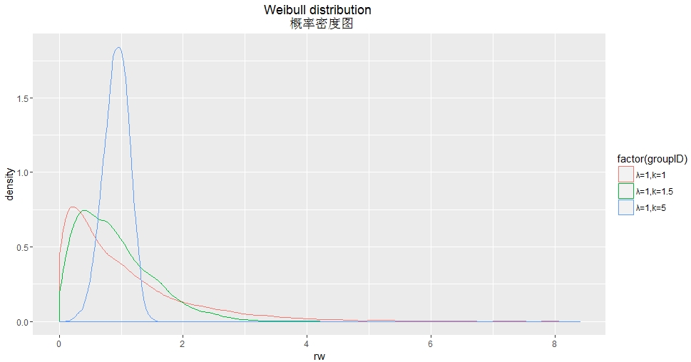
library(sqldf)
library(ggplot2)
df2<-data.frame(num=seq(0,5,length=10000),groupID="λ=1,k=1",rw=rweibull(10000, scale=1,shape=1 ))
df3<-data.frame(num=seq(0,5,length=10000),groupID="λ=1,k=1.5",rw=rweibull(10000, scale=1,shape=1.5 ))
df4<-data.frame(num=seq(0,5,length=10000),groupID="λ=1,k=5",rw=rweibull(10000, scale=1,shape=5 ))


df<-sqldf("
          select num,groupID,rw from df2
          union all
          select num,groupID,rw from df3
          union all
          select num,groupID,rw from df4 ")

ggplot(df,aes(x=rw,group=factor(groupID),colour=factor(groupID)))+
  geom_density()+
  ggtitle("Weibull distribution \n 概率密度图")
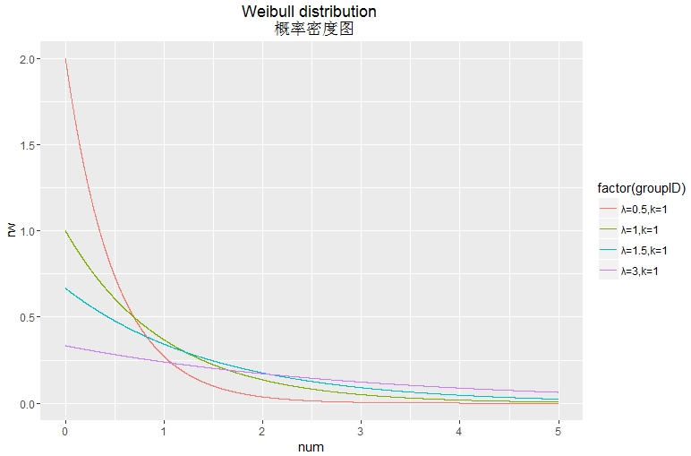
library(sqldf)
library(ggplot2)

d<- seq(0, 5, length.out=10000)
df1<-data.frame(num=seq(0,5,length=10000),groupID="λ=0.5,k=1",rw=dweibull(d, scale=0.5,shape=1 ))
df2<-data.frame(num=seq(0,5,length=10000),groupID="λ=1,k=1",rw=dweibull(d, scale=1,shape=1 ))
df3<-data.frame(num=seq(0,5,length=10000),groupID="λ=1.5,k=1",rw=dweibull(d, scale=1.5,shape=1 ))
df4<-data.frame(num=seq(0,5,length=10000),groupID="λ=3,k=1",rw=dweibull(d, scale=3,shape=1 ))


df5<-sqldf("
           select num,groupID,rw from df1
           union all
           select num,groupID,rw from df2
           union all
           select num,groupID,rw from df3
           union all
           select num,groupID,rw from df4 ")

df<-df5

ggplot(df,aes(x=num,y=rw,group=factor(groupID),colour=factor(groupID)))+
  geom_line()+
  ggtitle("Weibull distribution \n 概率密度图")

 浙公网安备 33010602011771号