css book
css特效网站
$$$$$CSS 分页实例
参考: CSS 分页实例==>http://www.runoob.com/css3/css3-pagination.html
让div带滚动条


<!-- 样式中的 自动溢出 配置成 自动后 就可以让div有滚动条 overflow:auto -->
<div id="mydiv"  style="overflow:auto;width:100%;height:200;background-color: green">
        line<br>
        line<br>
        line<br>
        line<br>
        line<br>
        line<br>
        line<br>
        line<br>
        line<br>
        line<br>
        line<br>
        line<br>
        line<br>
        line<br>
        line<br>
        line<br>
        line<br>
        line<br>
        line<br>
     </div>
padding,margin顺序,上右下左 (顺时针)
#4种可能的情况,举例说明:
padding:10px;                           #四个内边距都是10px
padding:5px 10px;                  #上下5px 左右10px
padding:5px 10px 15px;             #上5px 右10px 下15px   左因为缺省与右相等,则为10px
padding:5px 10px 15px 20px;     #上5px 右10px 下15px  左20px
表格TD超出长度自动隐藏/溢出自动隐藏,并加省略号...
<HTML>
<HEAD>
    <meta http-equiv="content-Type"content="text/html;charset=utf-8">
    <TITLE>表格TD超出长度隐藏</TITLE>
    <STYLE type="text/css">

    /* 让所有th,td等宽 */
    .tableLayoutFixed {
        width: 600px;/* 最好指定宽度 */
        table-layout: fixed; /* 默认automatic/fixed  */
    }

    .overflow_hidden{
        width:300px;
        white-space:nowrap;
        overflow:hidden;
        text-overflow:ellipsis;
    }

    </STYLE>

</HEAD>
<BODY>

    <table  class='tableLayoutFixed'>
      <tr>
        <td class='overflow_hidden'>秋兰兮麋芜,罗生兮堂下;绿叶兮素华,芳菲菲兮袭予;</td>
        <td class='overflow_hidden'>夫人自有兮美子,荪[sūn]何以兮愁苦;</td>
      </tr>
        <tr>
        <td class='overflow_hidden'>秋兰兮青青,绿叶兮紫茎;满堂兮美人,忽独与余兮目成;</td>
        <td class='overflow_hidden'>入不言兮出不辞,乘回风兮载云旗;悲莫悲兮生别离,乐莫乐兮新相知;</td>
      </tr>
        <tr>
        <td class='overflow_hidden'>荷衣兮蕙带,倏[shū]而来兮忽而逝;夕宿兮帝郊,君谁须兮云之际;与女沐兮咸池,晞女发兮阳之阿;望美人兮未来,临风怳兮浩歌;</td>
        <td class='overflow_hidden'>孔盖兮翠旍[jīng],登九天兮抚彗星;竦长剑兮拥幼艾,荪[sūn]独宜兮为民正。</td>
      </tr>

    </table>


</BODY>
</HTML>
效果图: 
css文档流
block块级元素:<div> <p>
inline内联元素:<img> <span> 在内联元素中回车符会被显示成为一个空格
css如下
.inline{
border:1px solid green;
display:inline;
}

.block{
display:block;
border:1px solid red;
}
块级和内联元素相互转换,只需要把上面的display对换一下就行
脱离文档流:
position:absolute
position:fixed
float
引用自: 一篇文章了解HTML文档流(normal flow)==>https://segmentfault.com/a/1190000012425858#articleHeader2
css float浮动问题
5星好文: 经验分享:CSS浮动(float,clear)通俗讲解==>https://www.cnblogs.com/iyangyuan/archive/2013/03/27/2983813.html
浮动的框可以向左或向右移动,直到它的外边缘碰到包含框或另一个浮动框的边框为止。
由于浮动框不在文档的普通流中,所以文档的普通流中的块框表现得就像浮动框不存在一样。
CSS 浮动
请看下图,当把框 1 向右浮动时,它脱离文档流并且向右移动,直到它的右边缘碰到包含框的右边缘:

再请看下图,当框 1 向左浮动时,它脱离文档流并且向左移动,直到它的左边缘碰到包含框的左边缘。因为它不再处于文档流中,所以它不占据空间,实际上覆盖住了框 2,使框 2 从视图中消失。
如果把所有三个框都向左移动,那么框 1 向左浮动直到碰到包含框,另外两个框向左浮动直到碰到前一个浮动框。

如下图所示,如果包含框太窄,无法容纳水平排列的三个浮动元素,那么其它浮动块向下移动,直到有足够的空间。如果浮动元素的高度不同,那么当它们向下移动时可能被其它浮动元素“卡住”:

HTML页面的标准文档流(默认布局)是:从上到下,从左到右,遇块(块级元素)换行。浮动层:给元素的float属性赋值后,就是脱离文档流,进行左右浮动,紧贴着父元素(默认为body文本区域)的左右边框。而此浮动元素在文档流空出的位置,由后续的(非浮动)元素填充上去:块级元素直接填充上去,若跟浮动元素的范围发生重叠,浮动元素覆盖块级元素。
Float有4个值:
left :元素向左浮动。
right :元素向右浮动。
none :默认值。
inherit :从父元素继承float属性。
浮动后的div宽度会变成0,但是其内边框可能撑起它的宽和高。
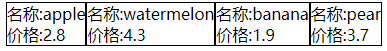
html样例代码(vue风格)
        <div v-for="(item ,index) in fruits" style="float:left;border:1px solid black">
            <div>
                名称:{{item.name}}
            </div>
            <div>
                价格:{{item.price}}
            </div>
        </div>

        <div style="clear:left">
水位 , 充电css3效果
https://blog.csdn.net/weixin_43951592/article/details/114241040
https://wow.techbrood.com/fiddle/14595
<!DOCTYPE html>
<html>
	<head>
		<meta charset="gb2312" />
		<style>
			html,body {
			    width: 100%;
			    height: 100%;
			    display: flex;
			    background: #ceb68b;
			}

			.a {
			    position: relative;
			    width: 540px;
			    margin: auto;
			}
			.b {
			    position: relative;
			    height: 220px;
			    box-sizing: border-box;
			    border-radius: 15px 15px 5px 5px;
			    box-shadow: 0 0 5px 2px rgba(255, 255, 255, 0.22);
			    background: #fff;
			    z-index: 1;
			}
			.b::before {
			    content: "";
			    position: absolute;
			    left: 0;
			    right: 0;
			    bottom: 0;
			    top: 80%;
			    background: linear-gradient(to bottom, #7abcff 0%, #00BCD4 44%, #2196F3 100%);
			    border-radius: 0px 0px 5px 5px;
			    box-shadow: 0 14px 28px rgba(33, 150, 243, 0), 0 10px 10px rgba(9, 188, 215, 0.08);
			    animation: charging 10s linear infinite;
			    filter: hue-rotate(90deg);
			}
			.w {
			    position: absolute;
			    top: 0;
			    left: 0;
			    height: 220px;
			    width: 540px;
			    border-radius: 15px 15px 5px 5px;
			    overflow: hidden;
			}

			.wave {
			    position: absolute;
			    width: 1540px;
			    height: 1540px;
			    background: rgba(255, 255, 255, .8);
			    border-radius: 45% 47% 44% 42%;
			    bottom: 25px;
			    left: 50%;
			    transform: translate(-50%, 0);
			    z-index: 1;
			    animation: move 10s linear infinite;
			}

			.wave:nth-child(2) {
			    border-radius: 38% 46% 43% 47%;
			    transform: translate(-50%, 0) rotate(-135deg);
			}

			.wave:nth-child(3) {
			    border-radius: 42% 46% 37% 40%;
			    transform: translate(-50%, 0) rotate(135deg);
			}

			@keyframes charging {
				50% {
			        box-shadow: 0 14px 28px rgba(0, 150, 136, 0.83), 0px 4px 10px rgba(9, 188, 215, 0.4);
			    }

			    95% {
			        top: 5%;
			        filter: hue-rotate(0deg);
			        border-radius: 0 0 5px 5px;
			        box-shadow: 0 14px 28px rgba(4, 188, 213, .2), 0 10px 10px rgba(9, 188, 215, 0.08);
			    }
			    100% {
			        top: 0%;
			        filter: hue-rotate(0deg);
			        border-radius: 15px 15px 5px 5px;
			        box-shadow: 0 14px 28px rgba(4, 188, 213, 0), 0 10px 10px rgba(9, 188, 215, 0.4);
			    }
			}

			@keyframes move {
			    100% {
			        transform: translate(-50%, -160px) rotate(720deg);
			    }
			}

		</style>
	</head>
	<body>
		<div class="a">
		    <div class="b"></div>
		    <div class="w">
		        <div class="wave"></div>
		        <div class="wave"></div>
		        <div class="wave"></div>
		    </div>
		</div>
	</body>
</html>

 浙公网安备 33010602011771号