
css 实现 focus 时 placeholder 文字会显示到边框上方的效果
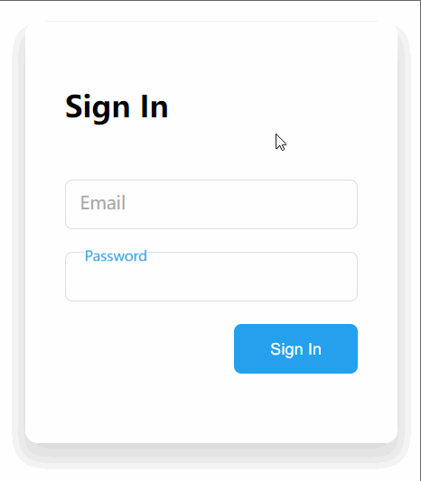
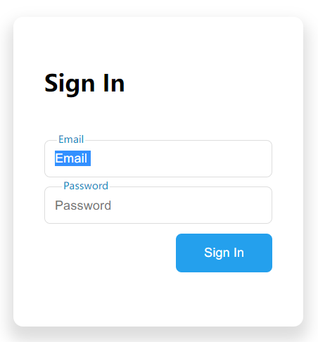
实现一个输入框 focus 状态下,placeholder 文字会显示到边框上方,且输入框有文字时会停留在上方的效果,如下图:
源代码见 仓库地址
思路1:用消失/显示效果
使用 input 自带的 placeholder 属性。
非 focus 时:显示 placeholder 属性中的文字
focus 时:隐藏placeholder 属性的文字,显示输入框顶部的绝对定位的文字。
实现了一下效果不好,第 2 种用动画的思路更好。
思路2:用动画
html:
<div class="input-wrapper">
  <input type="email" class="text-input email" placeholder=" ">
  <label class="input-label">Email</label>
</div>
思路:
- 将表单的
<label>标签用作 placeholder,将<input>自带的 placeholder 属性值设为一个空格。 <input>与<label>皆相对容器绝对定位<input>focus 时,修改<label>的top与left属性改变其位置- 输入框有文字时,使
<label>维持 3 中的状态。
1-3 使用绝对定位。问题在第4点,css 中如果获取输入框文字,且没有 focus 的状态?
换一种角度:获取没有 placeholder 且没有 focus 的状态,这是将 <input> 自带的 placeholder 属性值设为一个空格的原因:
/* placeholder 没有显示状态下,且没有focus的 text-input 的相邻兄弟选择器 input-label */
.text-input:not(:placeholder-shown).text-input:not(:focus) + .input-label {

}
完整 css:
.input-wrapper {
  position: relative;
}

.text-input {
  border: 1px solid #ddd;
  border-radius: 6px;
  padding: 10px;
  outline: none;

  position: absolute;
  background-color: transparent;
  z-index: 1;
}

.text-input:focus {
  border: 1.5px solid #24a0ed;
}

.input-label {
  background-color: white;
  position: absolute;
  color: #aaa;

  top: 0.55rem;
  left: 0.75rem;
  font-size: 0.9rem;

  z-index: 2;

  transition: .3s;
  pointer-events: none;
}

.text-input:focus + .input-label {
  top: -0.55rem;
  left: 0.5rem;

  transform: scale(0.75);
  color: #24a0ed;
  font-weight: 500;
}

/* placeholder 没有显示状态下,且没有focus的 text-input */
.text-input:not(:placeholder-shown).text-input:not(:focus) + .input-label {
  top: -0.55rem;
  left: 0.5rem;

  transform: scale(0.75);
  color: #aaa;
  font-weight: 500;
}
其他:实现按钮居右
第一种:设置按钮所在的容器设为 displaye: flex + justify-content: flex-end :
.sign-btn-wrapper {
  margin-left: auto;
  display: block;
}
第二种,设置按钮本身,联合使用 displaye: block 和 margin-left: auto:
.sign-btn-wrapper .sign-btn {
  margin-left: auto;
  display: block;
}

 浙公网安备 33010602011771号