css设置多列等高布局
初始时,多个列内容大小不同,高度不同。现在需要设置不同的背景来显示,而且各个列的高度需要保持一致。那么这就需要利用到多列等高布局。
最终需要的效果:
1. 真实等高布局 flex
技术点:弹性盒子布局flex,默认值就是自带等高布局的特点。
定义flex布局的时候,有一些默认值。
flex-direction 属性定义主轴的方向。默认值为row,一般是水平显示。flex容器的主轴被定义为与文本方向相同。 主轴起点和主轴终点与内容方向相同。
align-item属性定义flex子项在flex容器的当前行的侧轴(纵轴 或者说 交叉轴)方向上的对齐方式。默认值为 stretch,元素被拉伸以适应容器。
<div class="box">

  <div class="left"></div>

  <div class="center"></div>

  <div class="right"></div>

</div>
css
.box {

  display: flex;

}

.left {

  width: 300px;

  background-color: grey;

}

.center {

  flex: 1;

  background: red;

}

.right {

  width: 500px;

  background: yellow;

}
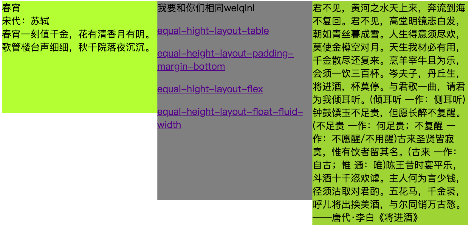
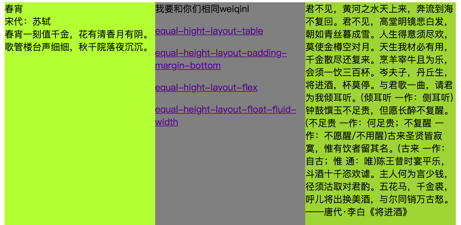
See the Pen equal-hight-layout-flex by weiqinl (@weiqinl) on CodePen.
2. 真实等高布局 table-cell
技术点:table布局天然就具有等高的特性。
display设置为table-cell,则此元素会作为一个表格单元格显示。类似于使用标签<td>或者<th>。
HTML结构
<div class="box">

  <div class="left"></div>

  <div class="center"></div>

  <div class="right"></div>

</div>
CSS样式
.left {

  display: table-cell;

  width:30%;

  background-color: greenyellow;

}

.center {

  display: table-cell;

  width:30%;

  background-color: gray;

}

.right {

  display: table-cell;

  width:30%;

  background-color: yellowgreen;

}
See the Pen equal-hight-layout-table by weiqinl(@weiqinl) on CodePen.
3. 假等高列布局 内外边距底部正负值
实现:设置父容器的overflow属性为hidden。给每列设置比较大的底内边距,然后用数值相似的负外边距消除这个高度。
-
不考虑可扩展性,只需要将padding-bottom/margin-bottom ,设置为最高列与最低列相差高度值,就可以得到等高效果。
-
考虑扩展性,为了防止将来可能某列高度大量的增加或减少,所有,我们设置了一个比较大的值。
技术点
-
background 会填充内边距 padding,而不会填充外边距 margin 。margin具有坍塌性,可以设置负值。
-
float:left。使用float,元素会脱离文档流,使其浮动至最近的文档流元素。在这里的作用是,将三个div元素并排。
-
overflow:hidden; 设置overflow属性为hidden,这样会让父容器产生BFC(Block Fromatting Context块级格式化上下文)效果,消除float带来的影响。同时,根据需要,会截取内容以适应填充框,将超出容器的部分隐藏。
HTML结构
<div class="box">

  <div class="left"></div>

  <div class="center"></div>

  <div class="right"></div>

</div>
CSS
.box {

  overflow: hidden;

}

.box > div{

  /**

  * padding-bottom 设置比较大的正值。

  * margin-bottom 设置绝对值大的负值。

  **/

  padding-bottom: 10000px;

  margin-bottom: -10000px;

  float:left;

  width:30%;

}

.left {

  background-color: greenyellow;

}

.center {

  background-color: gray;

}

.right {

  background-color: yellowgreen;

}
See the Pen equal-height-layout-padding-margin-bottom by weiqinl(@weiqinl) on CodePen.
4. 假等高布局,背景视觉效果
技术点: float浮动,并设置每一列的宽度。设置父元素为行内块级元素,之后再利用线性渐变的图片来设置父元素的背景凸显等高的效果。
CSS linear-gradient函数用于创建一个表示两种或多种颜色线性渐变的图片。
display: inline-block,设置为行内块级元素。
  <div class="box five-columns">

    <div class="col"></div>

    <div class="col"></div>

    <div class="col"></div>


    <div class="col"></div>

    <div class="col"></div>

</div>
css
/** 需要自己算出平均每列的宽度 */

.box {

  display: inline-block;

  background: linear-gradient(

    to right,

    red,

    red 20%,

    blue 20%,

    blue 40%,

    yellow 40%,

    yellow 60%,

    orange 60%,

    orange 80%,

    grey 80%,

    grey);

}

.col {

  float: left;

  width: 16%;

  padding: 2%;

}
See the Pen equal-height-layout-float-fluid-width by weiqinl (@weiqinl) on CodePen.
github源码
[完]
出处:http://www.cnblogs.com/weiqinl
个人主页http://weiqinl.com
github: weiqinl
简书:weiqinl
您的留言讨论是对博主最大的支持!
本文版权归作者所有,欢迎转载,但未经作者同意必须保留此段声明,且在文章页面明显位置给出原文连接,否则保留追究法律责任的权利。

 浙公网安备 33010602011771号