css3三角形冒泡泡图形制作
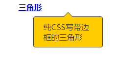
图一:
图二:

<!DOCTYPE html>
<html>
<head>
    <title>css 三角形</title>
    <style type="text/css">
        .test_triangle_border {
            width: 200px;
            margin: 0 auto 20px;
            position: relative;
        }
        .test_triangle_border a {
            colro: #333;
            font-weight: bold;
            tex-decoration: none;
        }
        .test_triangle_border .popup {
            width: 100px;
            background: #fc0;
            padding: 10px 20px;
            color: #333;
            border-radius: 4px;
            position: absolute;
            top: 30px;
            left: 30px;
            border: 1px solid #333;
        }
        .test_triangle_border .popup span {
            display: block;
            width: 0;
            height: 0;
            border-width: 0px 10px 10px;
            border-style: solid;
            border-color: transparent transparent #333;
            position: absolute;
            top: -10px;
            left: 50%;
            margin-left: -10px;
        }
        .test_triangle_border .popup em {
            display: block;
            width: 0;
            height: 0;
            border-width: 0px 10px 10px;
            border-style: solid;
            border-color: transparent transparent #fc0;
            position: absolute;
            /* 注销之后,变成图二 */
            top: 1px;
            left: -10px;
            /* 注销之后,变成图二 */
        }
    </style>
</head>
<body>
    <div class="test_triangle_border">
        <a href="#">三角形</a>
        <div class="popup">
            <span><em></em></span>纯CSS写带边框的三角形
        </div>
    </div>
</body>
</html>
感谢您的认真阅读,更多内容请查看:
出处:http://www.cnblogs.com/weiqinl
个人主页http://weiqinl.com
github: weiqinl
简书:weiqinl
您的留言讨论是对博主最大的支持!
本文版权归作者所有,欢迎转载,但未经作者同意必须保留此段声明,且在文章页面明显位置给出原文连接,否则保留追究法律责任的权利。
出处:http://www.cnblogs.com/weiqinl
个人主页http://weiqinl.com
github: weiqinl
简书:weiqinl
您的留言讨论是对博主最大的支持!
本文版权归作者所有,欢迎转载,但未经作者同意必须保留此段声明,且在文章页面明显位置给出原文连接,否则保留追究法律责任的权利。

 浙公网安备 33010602011771号