matplotlib散点图
 matplotlib绘制散点图
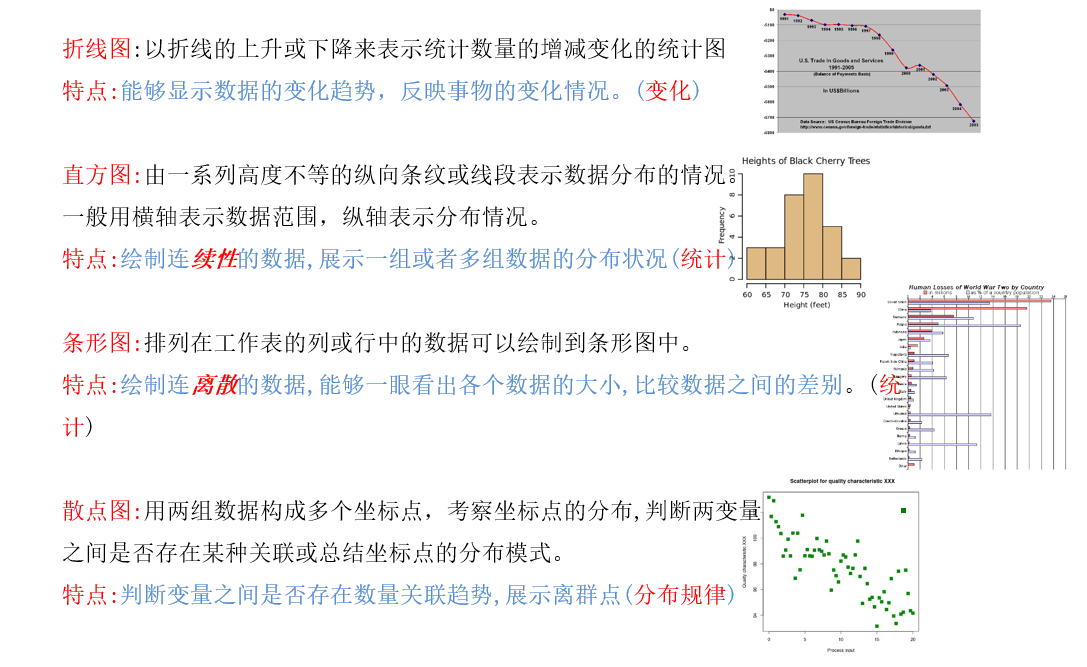
我们常用的统计图如下:
1、学会绘制散点图
一个小demo:
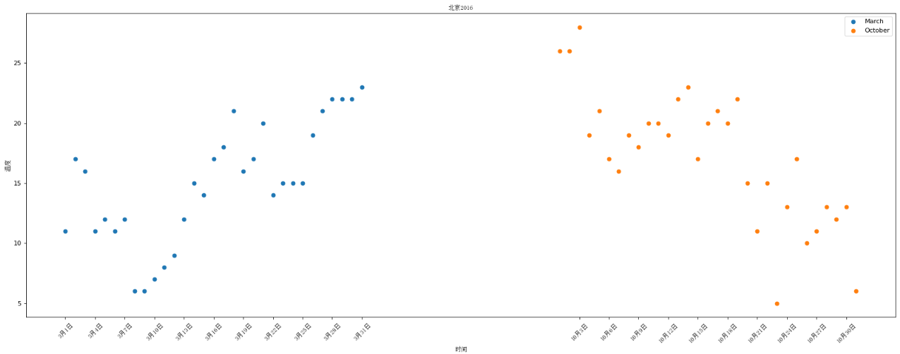
假设通过爬虫你获取到了北京2016年3,10月份每天白天的最高气温(分别位于列表a,b),那么此时如何寻找出气温和随时间(天)变化的某种规律?
a = [11,17,16,11,12,11,12,6,6,7,8,9,12,15,14,17,18,21,16,17,20,14,15,15,15,19,21,22,22,22,23]
b = [26,26,28,19,21,17,16,19,18,20,20,19,22,23,17,20,21,20,22,15,11,15,5,13,17,10,11,13,12,13,6]
数据来源: http://lishi.tianqi.com/beijing/index.html
import matplotlib.pyplot as plt

# 3月份
y_3 = [11, 17, 16, 11, 12, 11, 12, 6, 6, 7, 8, 9, 12, 15, 14, 17, 18, 21, 16, 17, 20,
       14, 15, 15, 15, 19, 21, 22, 22, 22, 23]
x_3 = range(1, 32)

# 10月份
y_10 = [26, 26, 28, 19, 21, 17, 16, 19, 18, 20, 20, 19, 22, 23, 17,
        20, 21, 20, 22, 15, 11, 15, 5, 13, 17, 10, 11, 13, 12, 13, 6]
x_10 = range(51, 82)

# 设置图形大小
plt.figure(figsize=(20, 8), dpi=80)

# 使用scatter绘制散点图
plt.scatter(x_3, y_3, label="March")
plt.scatter(x_10, y_10, label="October")

# 调整x轴
x = list(x_3)+list(x_10)
_xtick_label = ["3月{}日".format(i) for i in x_3]
_xtick_label += ["10月{}日".format(i-50) for i in x_10]
plt.xticks(x[::3], _xtick_label[::3], fontproperties="SimSun", rotation=45)

# 添加描述信息
plt.xlabel("时间", fontproperties="SimSun")
plt.ylabel("温度", fontproperties="SimSun")
plt.title("北京2016", fontproperties="SimSun")

# 添加图例
plt.legend()

# 展示
plt.show()
使用散点图的场景:
- 不同条件(维度)之间的内在关联关系
- 观察数据的离散聚合程度

 浙公网安备 33010602011771号