移动端webapp自适应实践(css雪碧图制作小工具实践)图文并茂
为什么要写这个
以前写过关于webapp自适应屏幕的文章(链接),不过写的大多数群众看不懂,所以来个图文并茂的版本。虽然只是一个简单的页面,不过在做的过程中也遇到了一些问题,也算是好事吧!
该示例github地址:https://github.com/iwangx/WebApp
访问地址:https://csssprite.herokuapp.com/
准备
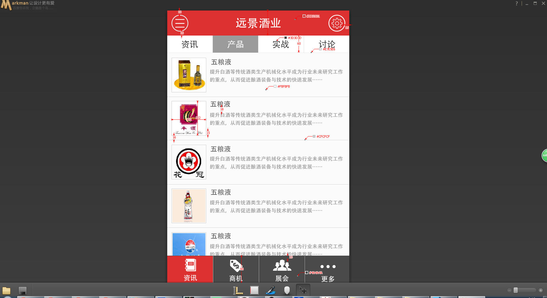
psd:这个是最重要的东西,用于测量尺寸,以及切图,我是不太同意切图的工作交给ui,自己切比较好,psd的分辨率我做的是640px的宽度,当然这个psd是网上下的
css雪碧图制作工具:最新版(v4.3)能够将多张图片拼接成一张图片并且生成代码的小程序(本人自主研发)
webstorm:前端开发利器
马克曼:前端尺寸颜色测量工具
photoshop:切图利器
sass:css预编译工具
第一步、切图
我用的是photoshop切的图,切图如下:
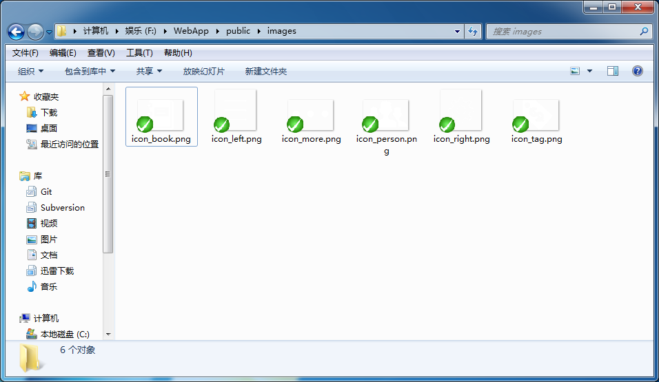
当然可能看不太清楚,毕竟是白色的图
第二步、搭建框架
大体结构就是这个,地址:https://github.com/iwangx/WebApp
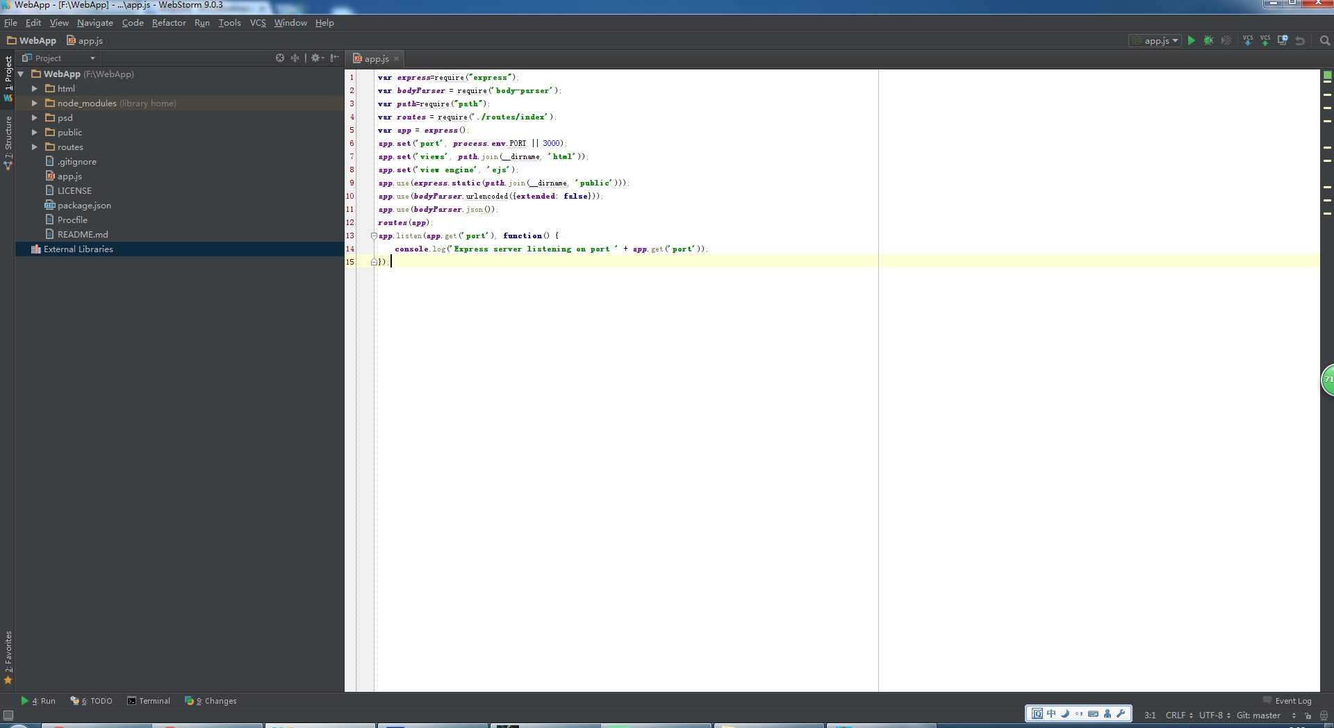
第二部、css结构
css主要采用sass作于预编译的工具,结构如下:
reset.scss文件主要是对于元素样式的重置
app.scss文件是对单个页面样式
size.scss文件里面包含了手机端自适应1-400尺寸的变量
第二步、js结构
js中最重要的是自适应的的代码,地址:移动端自适应,zepto这些都没有引入,因为只是个简单的示例
第三步、html页面机构
页面结构如下图:

header:头部标题
nav:头部的导航
controller:中间列表
footer:底部导航
第四步、生成雪碧图
利用雪碧图生成工具:生成雪碧图,并且生成代码:
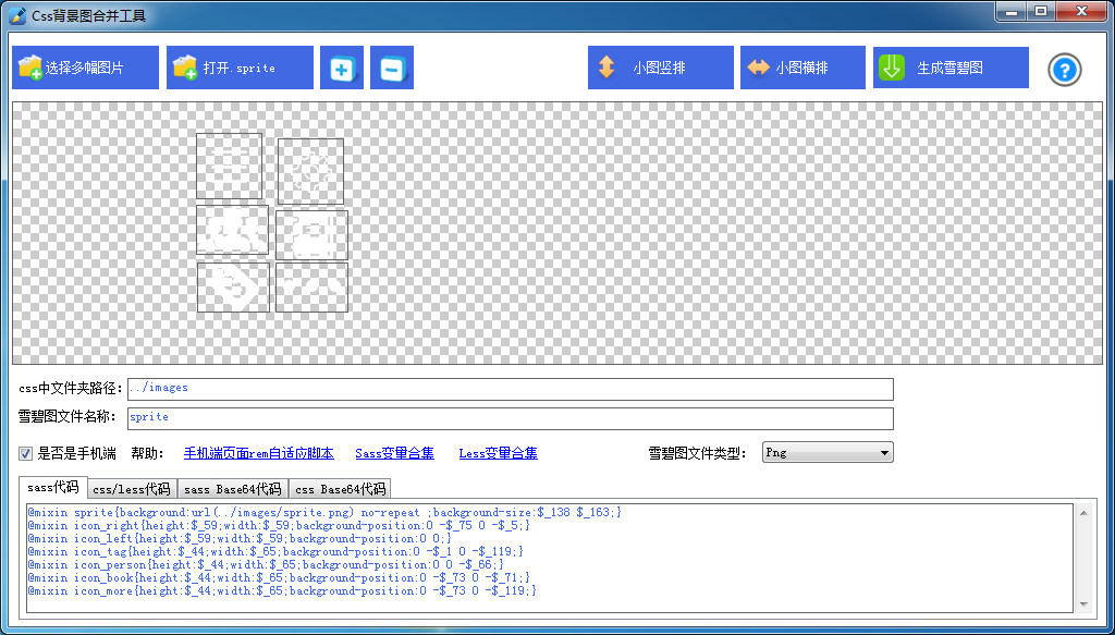
将代码copy到css目录中的app.scss目录下

当然前提是要引入size这个里面方面变量的文件,要不然$_*就没法识别而报错了
第五步、页面以及css编码
css代码:


@import "size";
//所有图片变量
@mixin sprite{background:url(../images/sprite.png) no-repeat ;background-size:$_138 $_163;}
@mixin icon_right{height:$_59;width:$_59;background-position:0 -$_75 0 -$_5;}
@mixin icon_left{height:$_59;width:$_59;background-position:0 0;}
@mixin icon_tag{height:$_44;width:$_65;background-position:0 -$_1 0 -$_119;}
@mixin icon_person{height:$_44;width:$_65;background-position:0 0 -$_66;}
@mixin icon_book{height:$_44;width:$_65;background-position:0 -$_73 0 -$_71;}
@mixin icon_more{height:$_44;width:$_65;background-position:0 -$_73 0 -$_119;}

body{background: #fbfbfb}
.sprite{@include sprite;}
.header{position: fixed;background: #dd3131;height: $_90;line-height: $_90;;width: 100%;left: 0;top: 0;font-size: $_40;color: #fff;text-align: center;
  button{position: absolute;top: $_16;border: $_2 solid #fff;border-radius: 50%;box-sizing: content-box}
}
.btn-left{@include icon_left;left: $_16;}
.btn-right{@include icon_right;right: $_16;}
.nav{display: -webkit-box;position: fixed;left: 0;top: $_90;color: #3d3d3d;font-size: $_30;width: 100%;border-bottom: $_1 solid #e7e5e6;
  a{display: block;height: $_60;line-height: $_60;text-align: center;background: #fff;-webkit-box-flex: 1;border-right: $_1 solid #e7e5e6;box-sizing: border-box;}
}
.controller{padding: $_151 0 $_100 0;}
.list{
  li{border-bottom:$_1 solid #cfcfcf }
  a{display: -webkit-box;padding: $_16;}
  img{height: $_122;width: $_122;display: block}
}
.list-right{-webkit-box-flex: 1;padding-left: $_15;
  h1{color: #555;font-size: $_24;}
  p{color: #878787;font-size: $_18;margin-top: $_15;line-height: 1.5}
}
.footer{height: $_100;position: fixed;left: 0;bottom: 0;width: 100%;display: -webkit-box;background: #4a4a4a;text-align: center;
  a{display: block;-webkit-box-flex: 1;box-sizing: border-box;padding-top: $_10;border-right: $_1 solid #fff;
    &:last-child{border-right: none}
  }
  i{display: block;margin: 0 auto}
  span{color: #fff;font-size: $_24;display: block;margin-top: $_5;}
}
.icon_book{@include icon_book}
.icon_tag{@include icon_tag}
.icon_person{@include icon_person}
.icon_more{@include icon_more}
html代码:
<!DOCTYPE html>
<html>
<head>
    <meta charset="UTF-8">
    <meta name="viewport" content="initial-scale=0.5,minimum-scale=0.5, maximum-scale=0.5,user-scalable=no,minimal-ui">
    <meta name="author" content="wangxing">
    <meta name="screen-orientation" content="portrait">
    <meta name="x5-orientation" content="portrait">
    <meta name="format-detection" content="telephone=no">
    <title>app自适应</title>
    <link rel="stylesheet" href="/css/reset.css">
    <link rel="stylesheet" href="/css/app.css">
    <script src="/js/lib/resize.js"></script>
</head>
<body>
    <header class="header">
        <button class="sprite btn-left"></button>
        <span>远程酒业</span>
        <button class="sprite btn-right"></button>
    </header>
    <nav class="nav">
        <a href="javascript:;">资讯</a>
        <a href="javascript:;">产品</a>
        <a href="javascript:;">实战</a>
        <a href="javascript:;">讨论</a>
    </nav>
    <section class="controller">
        <ul class="list">
            <li>
                <a href="#">
                    <img src="src" alt="图片">
                    <div class="list-right">
                        <h1>酒名字</h1>
                        <p>提升白酒等传统酒类生产机械化水平成为行业未来研究工作的重点,从而促进酿酒装备与技术的快速发展……</p>
                    </div>
                </a>
            </li>
        </ul>
    </section>
    <footer class="footer">
        <a href="#">
            <i class="sprite icon_book"></i>
            <span>资讯</span>
        </a>
        <a href="#">
            <i class="sprite icon_tag"></i>
            <span>产品</span>
        </a>
        <a href="#">
            <i class="sprite icon_person"></i>
            <span>实战</span>
        </a>
        <a href="#">
            <i class="sprite icon_more"></i>
            <span>讨论</span>
        </a>
    </footer>
</body>
</html>
用到图片的地方,主要有两个class,一个是雪碧图的class,一个就是他本事引用的class,二者结合
大家可以看到css代码中的大小全都是$_*,也就是测量出来的大小,包括字号也是
这样就构成了我们的webapp
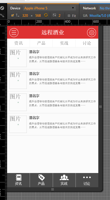
iphone5上是这样
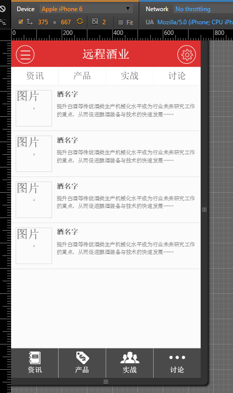
iphone6上是这样
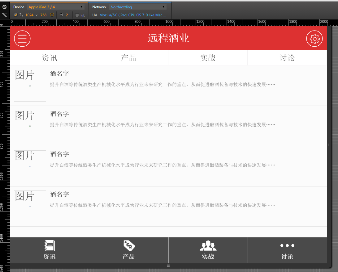
平板上是这样
结语
希望这个博客对大家有帮助,尤其是新手,也希望大家多提意见

 浙公网安备 33010602011771号