
今天遇到一行代码: border-radius: 50% 50% 50% 50%/ 0% 0% 100% 100%;
初看很熟悉,但看到后面“/”,又十分模糊,下面仔细研究下
border-radius: 20px;

border-radius: 20px 40px; (上左 下右)
border-radius: 20px 40px 10px; (上左,上右和下左,下右)

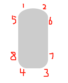
border-radius: 20px 40px 10px 5px;(上左,上右,下右,下左)
border-radius: 20px 40px 10px 5px / 60px 60px 60px 60px; (左边是四个圆角的水平半径,右边是四个圆角的垂直半径)
实现一个椭圆:border-radius: 100px 100px 100px 100px / 150px 150px 150px 150px;

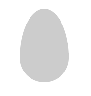
实现一个鸡蛋:border-radius: 100px 100px 100px 100px / 200px 200px 100px 100px;
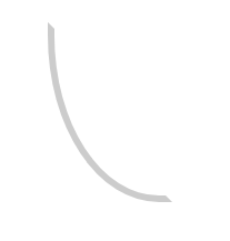
实现圆弧:
width: 100px;
height: 150px;
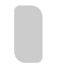
border-radius: 0 0 100px 100px / 0 0 150px 150px;
border:6px solid #ccc;
border-top-color: transparent;

width: 100px;
height: 150px;
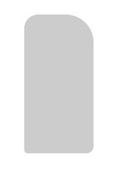
border-radius: 0 0 0 100px / 0 0 0 150px;
border:6px solid #ccc;
border-top-color: transparent;
border-right-color: transparent;

 浙公网安备 33010602011771号