par(ask=TRUE)
opar <- par(no.readonly=TRUE) # save original parameter settings

library(vcd)
counts <- table(Arthritis$Improved)
counts
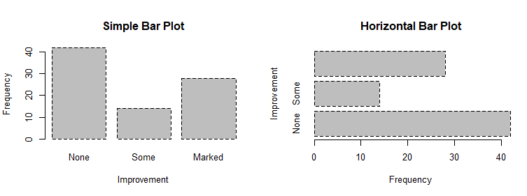
# Listing 6.1 - Simple bar plot
# vertical barplot
barplot(counts,
main="Simple Bar Plot",
xlab="Improvement", ylab="Frequency")
# horizontal bar plot
barplot(counts,
main="Horizontal Bar Plot",
xlab="Frequency", ylab="Improvement",
horiz=TRUE)

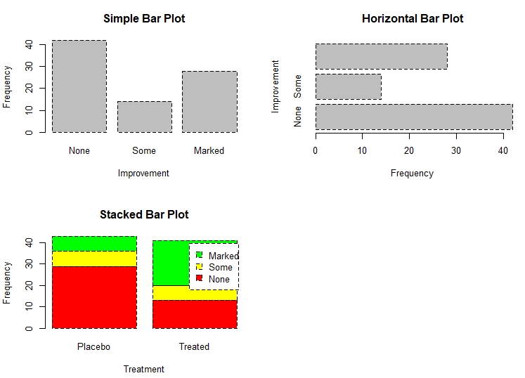
# obtain 2-way frequency table
library(vcd)
counts <- table(Arthritis$Improved, Arthritis$Treatment)
counts


# Listing 6.2 - Stacked and grouped bar plots
# stacked barplot
barplot(counts,
        main="Stacked Bar Plot",
        xlab="Treatment", ylab="Frequency",
        col=c("red", "yellow","green"),
        legend=rownames(counts))
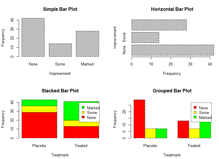
# grouped barplot
barplot(counts,
        main="Grouped Bar Plot",
        xlab="Treatment", ylab="Frequency",
        col=c("red", "yellow", "green"),
        legend=rownames(counts), beside=TRUE)
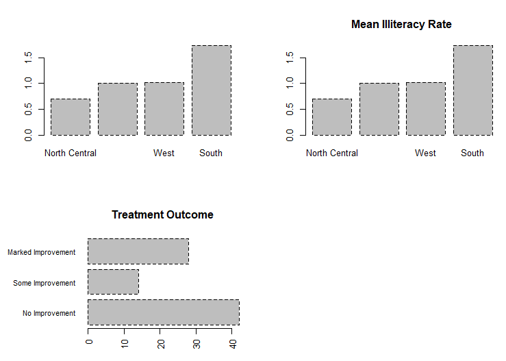
# Listing 6.3 - Bar plot for sorted mean values
states <- data.frame(state.region, state.x77)
means <- aggregate(states$Illiteracy, by=list(state.region), FUN=mean)
means

means <- means[order(means$x),]
means

barplot(means$x, names.arg=means$Group.1)
title("Mean Illiteracy Rate")

# Listing 6.3 - Bar plot for sorted mean values
states <- data.frame(state.region, state.x77)
means <- aggregate(states$Illiteracy, by=list(state.region), FUN=mean)
means

means <- means[order(means$x),]
means

barplot(means$x, names.arg=means$Group.1)
title("Mean Illiteracy Rate")

# Listing 6.4 - Fitting labels in bar plots
par(las=2)                # set label text perpendicular to the axis
par(mar=c(5,8,4,2))       # increase the y-axis margin
counts <- table(Arthritis$Improved) # get the data for the bars

# produce the graph
barplot(counts,
        main="Treatment Outcome", horiz=TRUE, cex.names=0.8,
        names.arg=c("No Improvement", "Some Improvement", "Marked Improvement")
)
par(opar)
# Spinograms
library(vcd)
attach(Arthritis)
counts <- table(Treatment,Improved)
spine(counts, main="Spinogram Example")
detach(Arthritis)

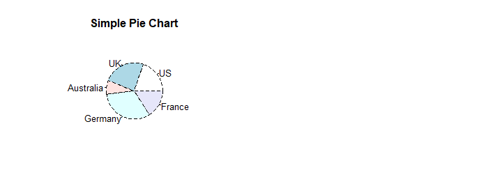
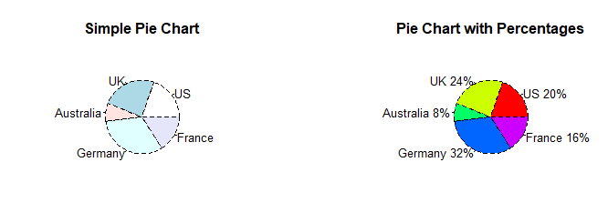
# Listing 6.5 - Pie charts
par(mfrow=c(2,2))
slices <- c(10, 12,4, 16, 8)
lbls <- c("US", "UK", "Australia", "Germany", "France")

pie(slices, labels = lbls,
    main="Simple Pie Chart")
pct <- round(slices/sum(slices)*100)
lbls <- paste(lbls, pct)
lbls <- paste(lbls,"%",sep="")
pie(slices,labels = lbls, col=rainbow(length(lbls)),
    main="Pie Chart with Percentages")
library(plotrix)
pie3D(slices, labels=lbls,explode=0.1,
      main="3D Pie Chart ")

mytable <- table(state.region)
lbls <- paste(names(mytable), "\n", mytable, sep="")
pie(mytable, labels = lbls,
    main="Pie Chart from a dataframe\n (with sample sizes)")

par(opar)
mytable <- table(state.region)
lbls <- paste(names(mytable), "\n", mytable, sep="")
pie(mytable, labels = lbls,
    main="Pie Chart from a dataframe\n (with sample sizes)")

par(opar)

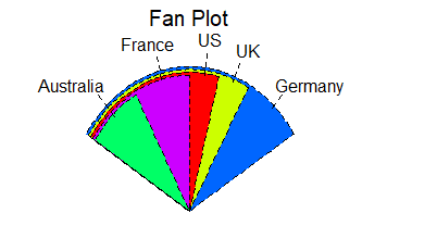
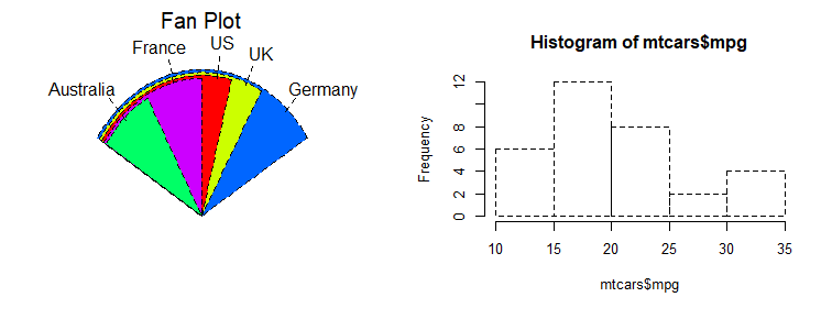
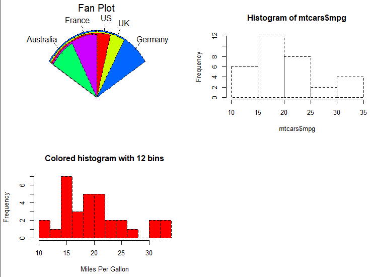
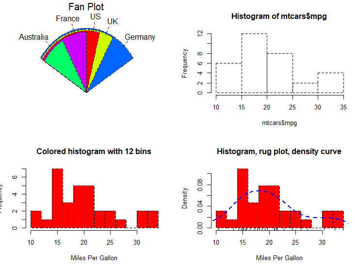
# Fan plots
library(plotrix)
slices <- c(10, 12,4, 16, 8)
lbls <- c("US", "UK", "Australia", "Germany", "France")
fan.plot(slices, labels = lbls, main="Fan Plot")
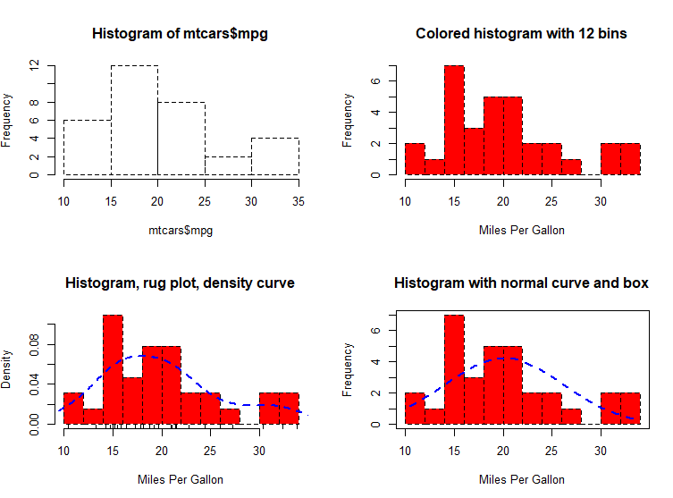
# Listing 6.6 - Histograms
# simple histogram                                                        1
hist(mtcars$mpg)
# colored histogram with specified number of bins
hist(mtcars$mpg,
     breaks=12,
     col="red",
     xlab="Miles Per Gallon",
     main="Colored histogram with 12 bins")
# colored histogram with rug plot, frame, and specified number of bins
hist(mtcars$mpg,
     freq=FALSE,
     breaks=12,
     col="red",
     xlab="Miles Per Gallon",
     main="Histogram, rug plot, density curve")
rug(jitter(mtcars$mpg))
lines(density(mtcars$mpg), col="blue", lwd=2)
# histogram with superimposed normal curve (Thanks to Peter Dalgaard)
x <- mtcars$mpg
h<-hist(x,
        breaks=12,
        col="red",
        xlab="Miles Per Gallon",
        main="Histogram with normal curve and box")
xfit<-seq(min(x),max(x),length=40)
yfit<-dnorm(xfit,mean=mean(x),sd=sd(x))
yfit <- yfit*diff(h$mids[1:2])*length(x)
lines(xfit, yfit, col="blue", lwd=2)
box()
# Listing 6.6 - Histograms
# simple histogram                                                        1
hist(mtcars$mpg)

# colored histogram with specified number of bins
hist(mtcars$mpg,
     breaks=12,
     col="red",
     xlab="Miles Per Gallon",
     main="Colored histogram with 12 bins")

# colored histogram with rug plot, frame, and specified number of bins
hist(mtcars$mpg,
     freq=FALSE,
     breaks=12,
     col="red",
     xlab="Miles Per Gallon",
     main="Histogram, rug plot, density curve")
rug(jitter(mtcars$mpg))
lines(density(mtcars$mpg), col="blue", lwd=2)

# histogram with superimposed normal curve (Thanks to Peter Dalgaard)
x <- mtcars$mpg
h<-hist(x,
        breaks=12,
        col="red",
        xlab="Miles Per Gallon",
        main="Histogram with normal curve and box")

xfit<-seq(min(x),max(x),length=40)
yfit<-dnorm(xfit,mean=mean(x),sd=sd(x))
yfit <- yfit*diff(h$mids[1:2])*length(x)
lines(xfit, yfit, col="blue", lwd=2)
box()
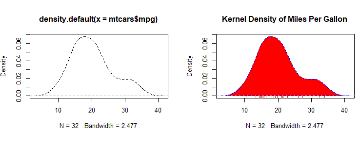
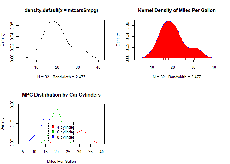
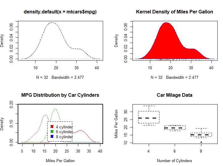
# Listing 6.7 - Kernel density plot
d <- density(mtcars$mpg) # returns the density data
plot(d) # plots the results

d <- density(mtcars$mpg)
plot(d, main="Kernel Density of Miles Per Gallon")
polygon(d, col="red", border="blue")
rug(mtcars$mpg, col="brown")
# Listing 6.8 - Comparing kernel density plots
par(lwd=2)
library(sm)
attach(mtcars)

# create value labels
cyl.f <- factor(cyl, levels= c(4, 6, 8),
                labels = c("4 cylinder", "6 cylinder", "8 cylinder"))

# plot densities
sm.density.compare(mpg, cyl, xlab="Miles Per Gallon")
title(main="MPG Distribution by Car Cylinders")

# add legend via mouse click
colfill<-c(2:(2+length(levels(cyl.f))))
cat("Use mouse to place legend...","\n\n")
legend(locator(1), levels(cyl.f), fill=colfill)
detach(mtcars)
par(lwd=1)
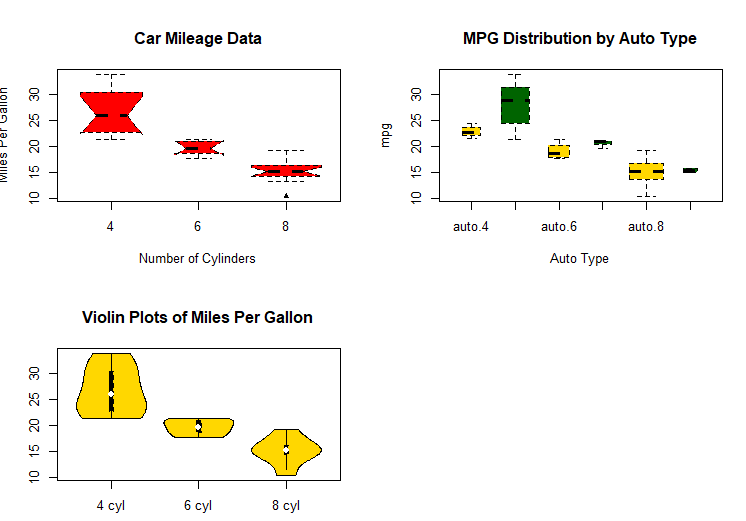
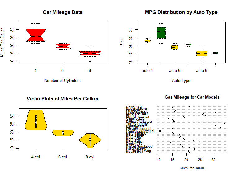
# parallel box plots
boxplot(mpg~cyl,data=mtcars,
        main="Car Milage Data",
        xlab="Number of Cylinders",
        ylab="Miles Per Gallon")
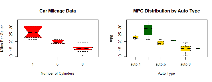
# notched box plots
boxplot(mpg~cyl,data=mtcars,
        notch=TRUE,
        varwidth=TRUE,
        col="red",
        main="Car Mileage Data",
        xlab="Number of Cylinders",
        ylab="Miles Per Gallon")

# Listing 6.9 - Box plots for two crossed factors
# create a factor for number of cylinders
mtcars$cyl.f <- factor(mtcars$cyl,
levels=c(4,6,8),
labels=c("4","6","8"))
# create a factor for transmission type
mtcars$am.f <- factor(mtcars$am,
levels=c(0,1),
labels=c("auto","standard"))
# generate boxplot
boxplot(mpg ~ am.f *cyl.f,
data=mtcars,
varwidth=TRUE,
col=c("gold", "darkgreen"),
main="MPG Distribution by Auto Type",
xlab="Auto Type")
# Listing 6.10 - Violin plots

library(vioplot)
x1 <- mtcars$mpg[mtcars$cyl==4]
x2 <- mtcars$mpg[mtcars$cyl==6]
x3 <- mtcars$mpg[mtcars$cyl==8]
vioplot(x1, x2, x3,
        names=c("4 cyl", "6 cyl", "8 cyl"),
        col="gold")
title("Violin Plots of Miles Per Gallon")
# dot chart
dotchart(mtcars$mpg,labels=row.names(mtcars),cex=.7,
         main="Gas Mileage for Car Models",
         xlab="Miles Per Gallon")
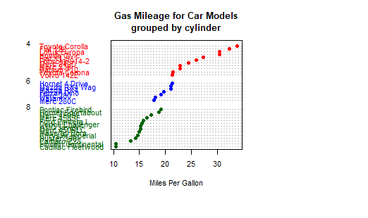
# Listing 6.11 - Dot plot grouped, sorted, and colored
x <- mtcars[order(mtcars$mpg),]
x$cyl <- factor(x$cyl)
x$color[x$cyl==4] <- "red"
x$color[x$cyl==6] <- "blue"
x$color[x$cyl==8] <- "darkgreen"
dotchart(x$mpg,
         labels = row.names(x),
         cex=.7,
         pch=19,
         groups = x$cyl,
         gcolor = "black",
         color = x$color,
         main = "Gas Mileage for Car Models\ngrouped by cylinder",
         xlab = "Miles Per Gallon")