第五模块·WEB开发基础-第3章jQuery&Bootstrap
-
01-jQuery介绍
-
02-如何使用jQuery
-
03-jQuery的入口函数
-
04-jQuery对象和JS对象的相互转换
-
05-jQuery如何操作DOM
-
06-底层选择器
-
07-基本过滤器
-
08-属性选择器
-
09-过滤器选择方法
-
10-siblings选择器方法的基本使用
-
11-jQuery操作选项卡深入
-
12-index()索引的选取
-
13-基本的动画
-
14-卷帘门的动画效果
-
15-淡入淡出的自定义动画
-
16-二级菜单动画的使用
-
17-jQuery的标签属性操作
-
18-jQuery对DOM对象属性操作
-
19-jQuery对类样式的操作
-
20-jQuery对值的操作
-
21-父子之间插入操作一
-
22-父子之间插入操作二
-
23-兄弟之间插入操作
-
24-替换操作
-
25-删除和清空操作
-
26-操作input的value值
-
27-jQuery的位置信息
-
28-JS的事件流
-
29-事件冒泡的处理
-
30-抽屉评论简易布局
-
31-抽屉评论收起操作实现
-
32-事件对象
-
33-jQuery的单双击事件
-
34-jQuery的鼠标移入和移出事件
-
35-jQuery的移入和移出事件
-
36-jQuery的表单事件
-
37-jQuery的聚焦、失焦和键盘事件
-
38-事件委托
-
39-BS端那点儿事
-
40-什么是Ajax
-
41-MVC思想和jQuery的ajax_GET请求
-
42-jQuery的POST请求
-
43-POST请求的Bug修复
-
44-和风天气API接口文档介绍
-
45-jQuery插件库介绍
-
46-jQuery总结和作业分析(必看)
-
47-响应式介绍
-
48-@media媒体查询
-
49-Bootstrap介绍
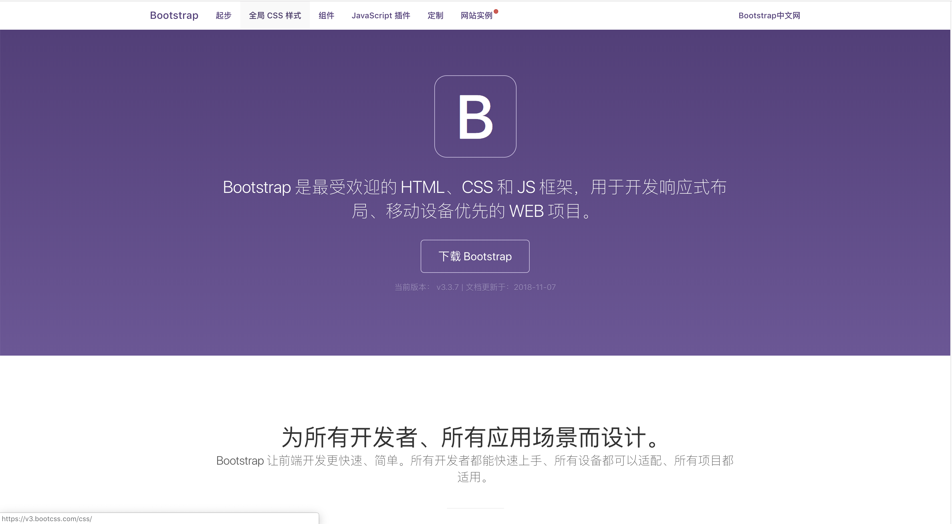
-
50-Boostrap的下载和基本使用
-
51-Bootstrap的布局容器
-
52-Bootstrap的栅格系统
-
53-Bootstrap栅格的实现原理
-
54-Boostrap的列偏移
-
55-Boostrap的排版
-
56-Bootstrap的表格
-
57-Boostrap的表单
-
58-全局CSS样式
-
59-导航条
-
60-面板和下拉菜单
-
61-按钮组和按钮式的下拉菜单
-
62-分页、路径导航、徽章
-
63-警告框和进度条
-
64-Boostrap的插件
-
65-个人经历分享
01-jQuery介绍
02-如何使用jQuery
03-jQuery的入口函数
04-jQuery对象和JS对象的相互转换
05-jQuery如何操作DOM
06-底层选择器
07-基本过滤器
08-属性选择器
09-过滤器选择方法
10-siblings选择器方法的基本使用
11-jQuery操作选项卡深入
12-index()索引的选取
13-基本的动画
14-卷帘门的动画效果
15-淡入淡出的自定义动画
16-二级菜单动画的使用
17-jQuery的标签属性操作
18-jQuery对DOM对象属性操作
19-jQuery对类样式的操作
20-jQuery对值的操作
21-父子之间插入操作一
22-父子之间插入操作二
23-兄弟之间插入操作
24-替换操作
25-删除和清空操作
26-操作input的value值
27-jQuery的位置信息
28-JS的事件流
29-事件冒泡的处理
30-抽屉评论简易布局
31-抽屉评论收起操作实现
32-事件对象
33-jQuery的单双击事件
34-jQuery的鼠标移入和移出事件
35-jQuery的移入和移出事件
36-jQuery的表单事件
37-jQuery的聚焦、失焦和键盘事件
38-事件委托
39-BS端那点儿事
40-什么是Ajax
41-MVC思想和jQuery的ajax_GET请求
42-jQuery的POST请求
43-POST请求的Bug修复
44-和风天气API接口文档介绍
45-jQuery插件库介绍
46-jQuery总结和作业分析(必看)
47-响应式介绍
48-@media媒体查询
49-Bootstrap介绍
- 49.1 Boostrap的基本使用
- 49.2 Bootstrap的栅格系统
- 49.3 Boostrap的全局CSS样式
- 49.4 Boostrap的组件
使用Boostrap开发的优秀站点:http://www.youzhan.org/
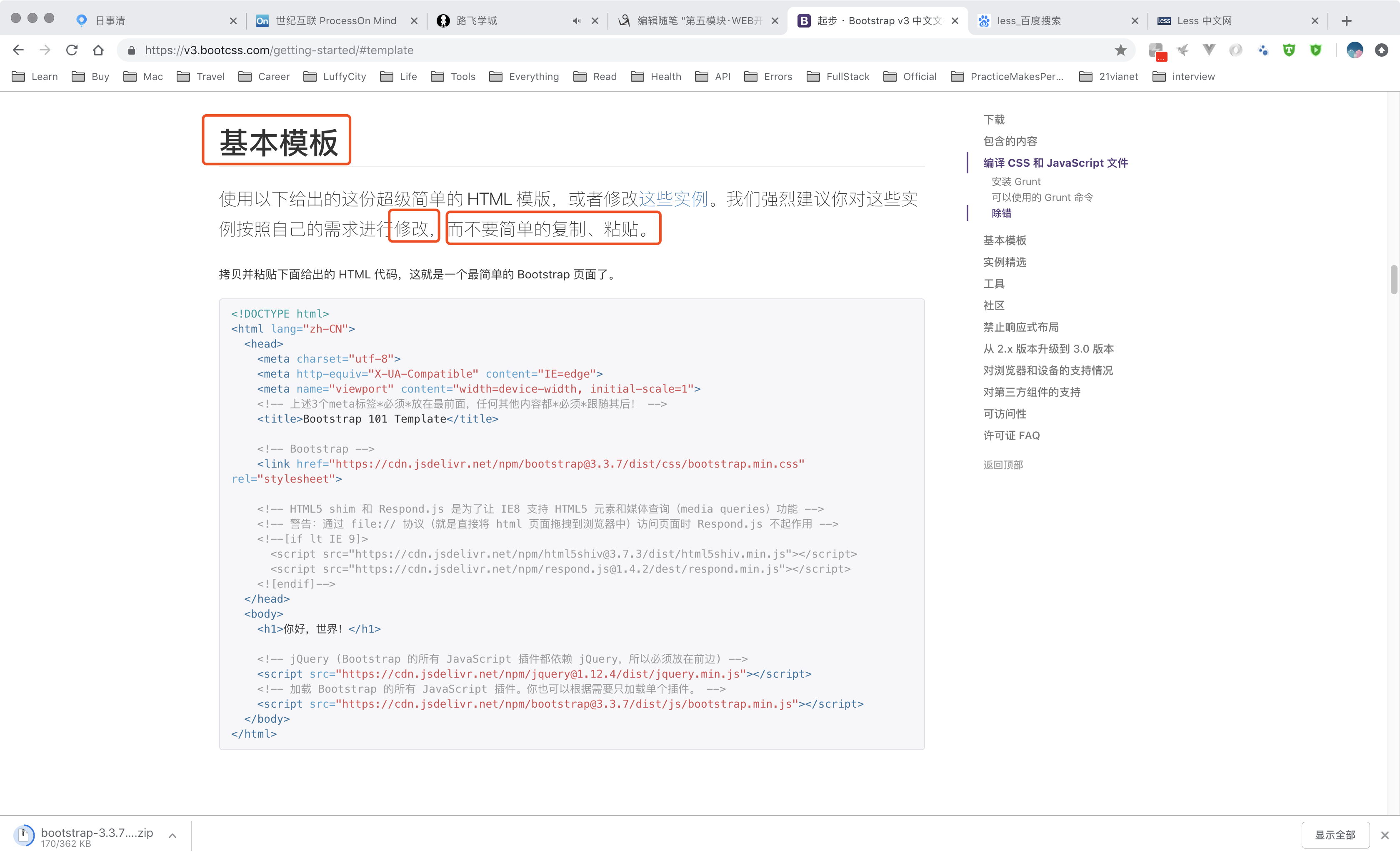
50-Boostrap的下载和基本使用
50.1 Boostrap的基础介绍及使用;
https://v3.bootcss.com/getting-started/#template
less介绍:http://lesscss.cn/
<!DOCTYPE html>
<html lang="zh-CN">
<head>
    <meta charset="utf-8">
    <meta http-equiv="X-UA-Compatible" content="IE=edge">
    <!--媒体查询,视口设置-->
    <meta name="viewport" content="width=device-width, initial-scale=1">
    <!-- 上述3个meta标签*必须*放在最前面,任何其他内容都*必须*跟随其后! -->
    <title>Bootstrap 101 Template</title>

    <!-- Bootstrap -->
    <link href="https://cdn.jsdelivr.net/npm/bootstrap@3.3.7/dist/css/bootstrap.min.css" rel="stylesheet">

    <!-- HTML5 shim 和 Respond.js 是为了让 IE8 支持 HTML5 元素和媒体查询(media queries)功能 -->
    <!-- 警告:通过 file:// 协议(就是直接将 html 页面拖拽到浏览器中)访问页面时 Respond.js 不起作用 -->
    <!--[if lt IE 9]>
    <script src="https://cdn.jsdelivr.net/npm/html5shiv@3.7.3/dist/html5shiv.min.js"></script>
    <script src="https://cdn.jsdelivr.net/npm/respond.js@1.4.2/dest/respond.min.js"></script>
    <![endif]-->
</head>
<body>
<h1>你好,世界!</h1>

<!-- jQuery (Bootstrap 的所有 JavaScript 插件都依赖 jQuery,所以必须放在前边) -->
<script src="https://cdn.jsdelivr.net/npm/jquery@1.12.4/dist/jquery.min.js"></script>
<!-- 加载 Bootstrap 的所有 JavaScript 插件。你也可以根据需要只加载单个插件。 -->
<script src="https://cdn.jsdelivr.net/npm/bootstrap@3.3.7/dist/js/bootstrap.min.js"></script>
</body>
</html>
51-Bootstrap的布局容器
51.1 Boostrap中的布局容器初识;
<div class="container">
  ...
</div>
//几乎是全局的;
<div class="container-fluid">
  ...
</div>
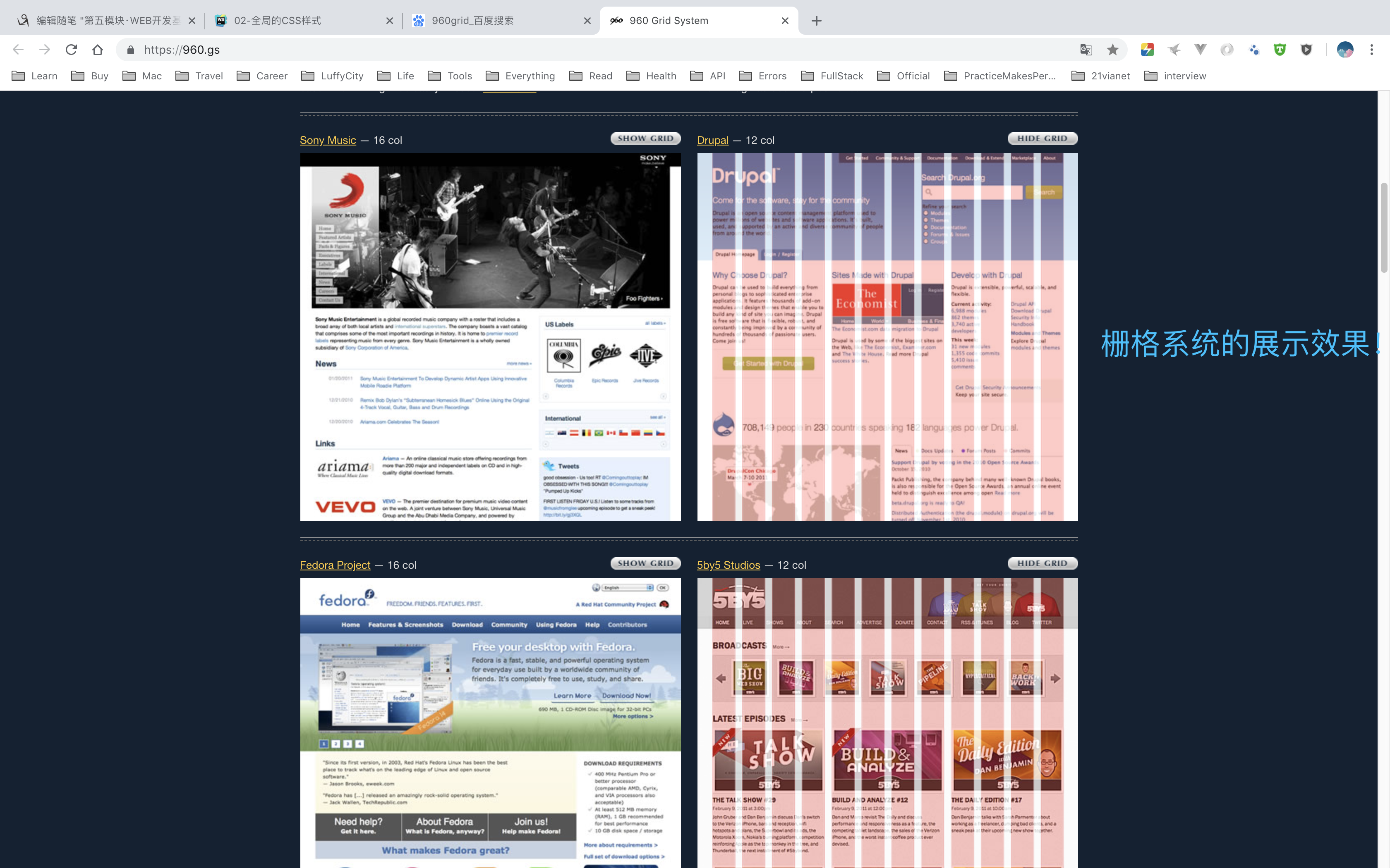
52-Bootstrap的栅格系统
52.1 栅格系统初识;
52.2 鼻祖是960grid;https://960.gs/
<!DOCTYPE html>
<html lang="en">
<head>
    <meta charset="utf-8">
    <meta http-equiv="X-UA-Compatible" content="IE=edge">
    <meta name="viewport" content="width=device-width, initial-scale=1.0">
    <link rel="stylesheet" href="../bootstrap-3.3.7-dist/css/bootstrap.css">
    <title>03-栅格系统</title>
</head>
<body>
<div class="container">
    <div class="row">
        <div class="col-lg-3">
            Bootstrap 提供了一套响应式、移动设备优先的流式栅格系统,随着屏幕或视口(viewport)尺寸的增加,系统会自动分为最多12列。它包含了易于使用的预定义类,还有强大的mixin 用于生成更具语义的布局。
            在 Bootstrap 2 中,我们对框架中的某些关键部分增加了对移动设备友好的样式。而在 Bootstrap 3
            中,我们重写了整个框架,使其一开始就是对移动设备友好的。这次不是简单的增加一些可选的针对移动设备的样式,而是直接融合进了框架的内核中。也就是说,Bootstrap
            是移动设备优先的。针对移动设备的样式融合进了框架的每个角落,而不是增加一个额外的文件。
        </div>
    </div>
</div>
</body>
</html>
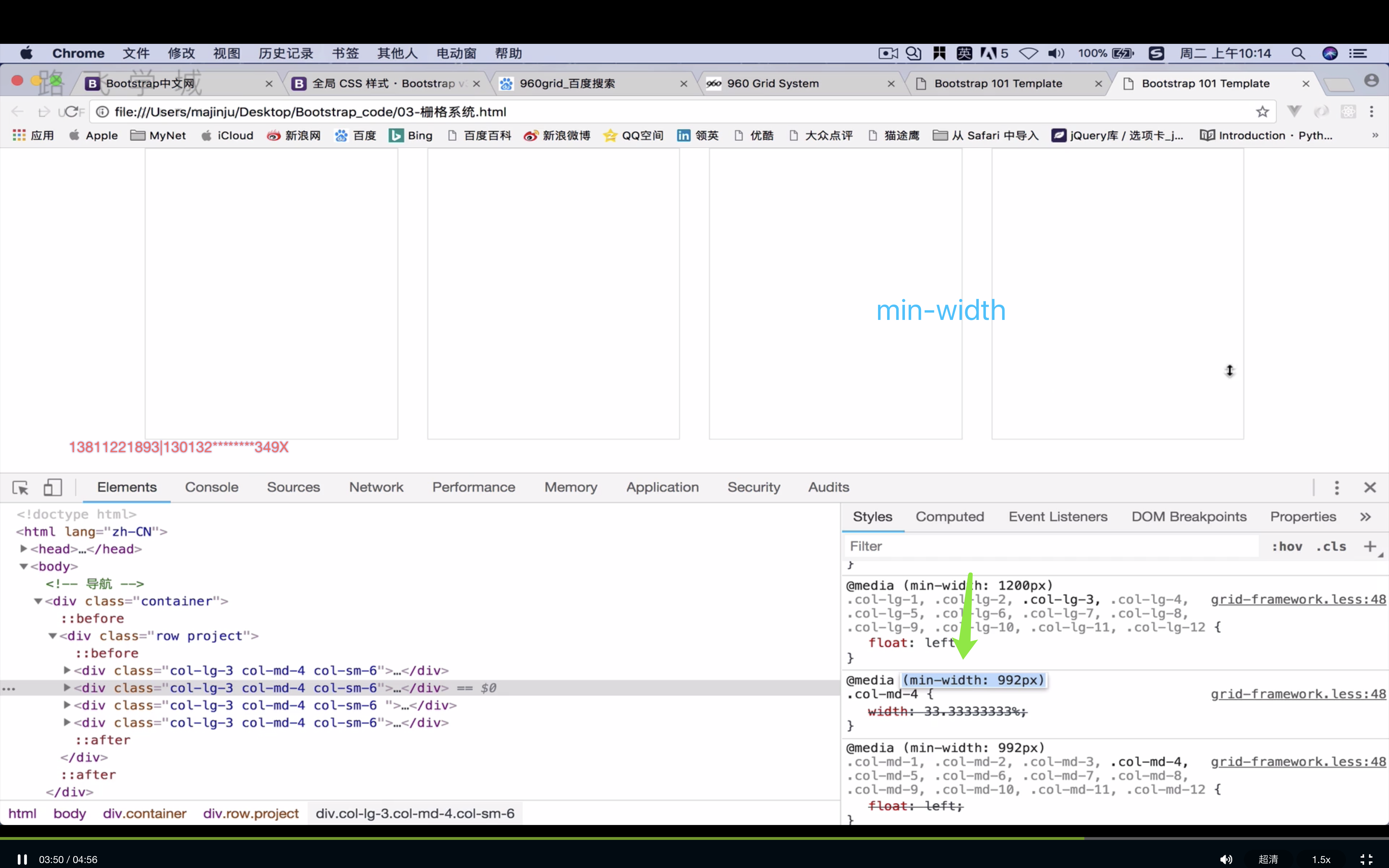
53-Bootstrap栅格的实现原理
53.1 12栅格系统的实现原理是因为使用了媒体查询;
54-Boostrap的列偏移
54.1 col-md-offset-4
<!DOCTYPE html>
<html lang="en">
<head>
    <meta charset="utf-8">
    <meta http-equiv="X-UA-Compatible" content="IE=edge">
    <meta name="viewport" content="width=device-width, initial-scale=1.0">
    <link rel="stylesheet" href="../bootstrap-3.3.7-dist/css/bootstrap.css">
    <title>05-栅格系统中的列偏移</title>
</head>
<body>
<div class="container">
    <div class="row">
        <div class="col-md-4">.col-md-4</div>
        <div class="col-md-4 col-md-offset-4">.col-md-4 .col-md-offset-4</div>
    </div>
    <div class="row">
        <div class="col-md-3 col-md-offset-3">.col-md-3 .col-md-offset-3</div>
        <div class="col-md-3 col-md-offset-3">.col-md-3 .col-md-offset-3</div>
    </div>
    <div class="row">
        <div class="col-md-6 col-md-offset-3">.col-md-6 .col-md-offset-3</div>
    </div>
</div>

</body>
</html>
55-Boostrap的排版
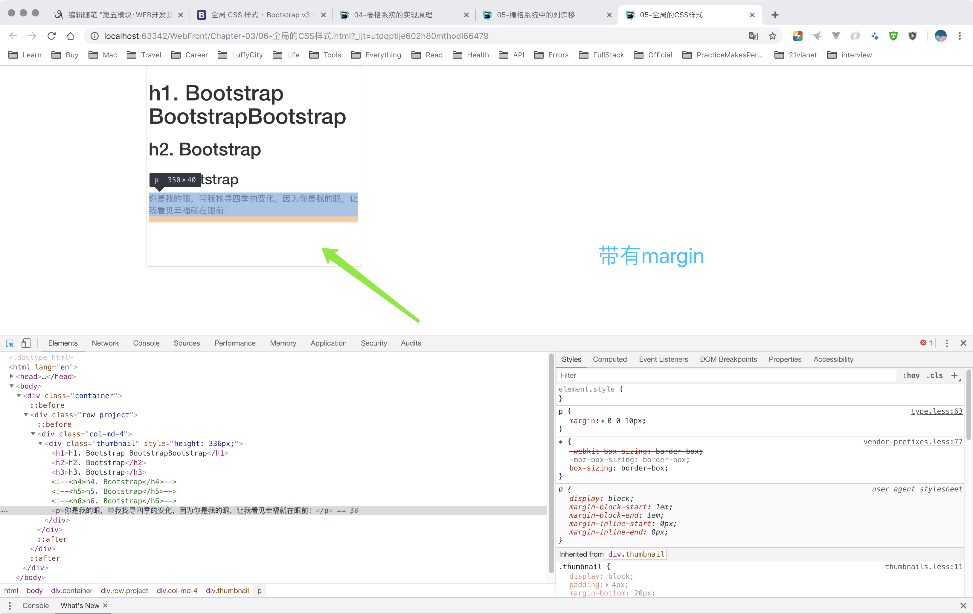
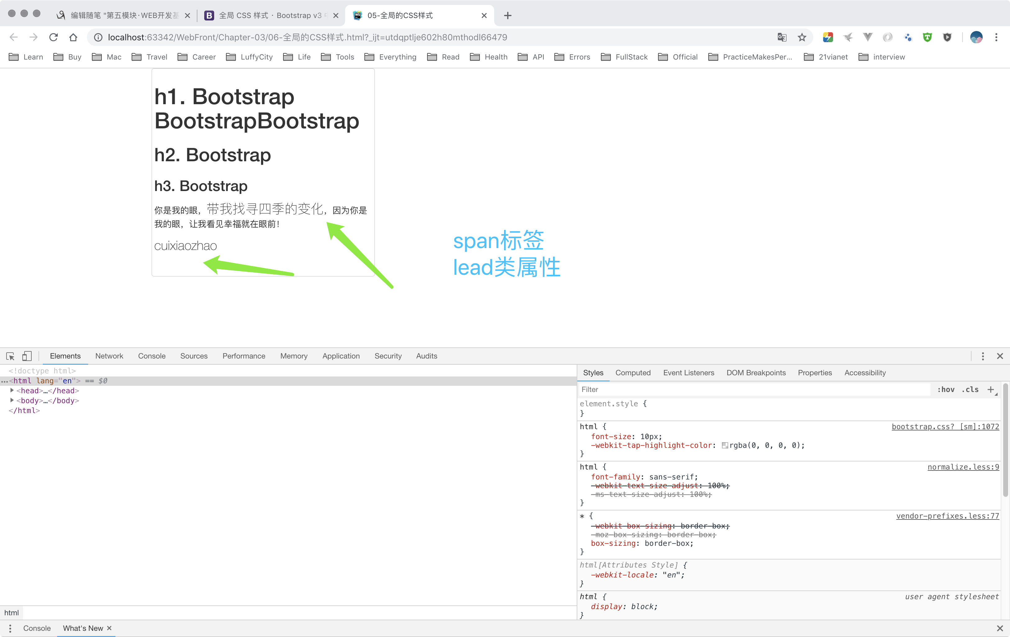
<!DOCTYPE html>
<html lang="en">
<head>
    <meta charset="utf-8">
    <meta http-equiv="X-UA-Compatible" content="IE=edge">
    <meta name="viewport" content="width=device-width, initial-scale=1.0">
    <link rel="stylesheet" href="../bootstrap-3.3.7-dist/css/bootstrap.css">
    <title>05-全局的CSS样式</title>
    <style type="text/css">
        .thumbnail .project {
            /*display: block;*/
            /*margin-left: auto;*/
            /*margin-right: auto;*/
            /*text-align: center;*/
            /*max-width: 310px;*/
            /*margin-bottom: 30px;*/
            /*border-radius: 0;*/
        }
    </style>
</head>
<body>
<div class="container">
    <div class="row project">
        <div class="col-md-4">
            <div class="thumbnail" style="height: 536px;">
                <h1>h1. Bootstrap BootstrapBootstrap</h1>
                <h2>h2. Bootstrap</h2>
                <h3>h3. Bootstrap</h3>
                <!--<h4>h4. Bootstrap</h4>-->
                <!--<h5>h5. Bootstrap</h5>-->
                <!--<h6>h6. Bootstrap</h6>-->
                <p>你是我的眼,<span class="lead">带我找寻<mark>四季</mark>的变化</span>,因为你是我的眼,让我看见幸福就在眼前!</p>
                <p class="lead">cuixiaozhao</p>
                <p>
                    <del>我这里是删除线</del>
                </p>
                <p><s>我这里是无用的文本</s></p>
                <p>
                    <small>我这里是small</small>
                </p>
            </div>


            <div class="thumbnail" style="height: 336px;">
                <p class="text-left">我这里是左对齐</p>
                <p class="text-right">我这里是右对齐</p>
                <p class="text-center">我这里是中心对齐</p>
                <p class="text-justify">这里是两端对齐,应用于英文!</p>
                <p class="text-nowrap">这里是不对齐!</p>
                <p class="text-lowercase">LOWERcased,全部变为小写</p>
                <p class="text-uppercase">Uppercased,全部变为大写</p>
                <p class="text-capitalize">capitalized,首字母大写</p>
            </div>
            <div class="thumbnail" style="height: 333px;">
                <addr>
                    <strong>北京市朝阳区<br>
                        崔各庄镇奶东村<br>
                        11排19号201室<br></strong>
                    <abbr title="Phone">P:</abbr>138-1122-1893
                    <a href="mailto:#">tqtl@tqtl.org</a>
                </addr>
                <blockquote>
                    <p>这里是Bootstrap中的引用!</p>
                </blockquote>
            </div>
        </div>
    </div>
</body>
</html>
56-Bootstrap的表格
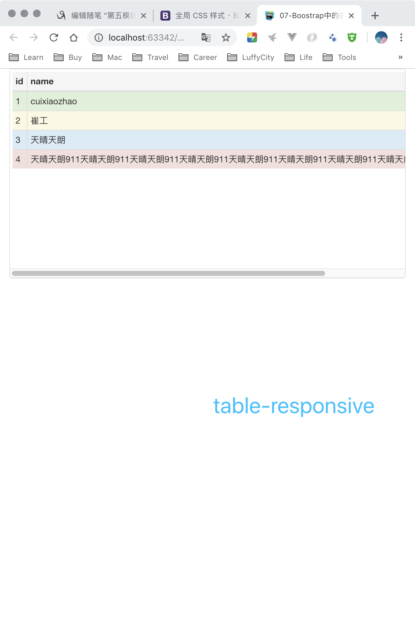
56.1 Bootstrap中的表格;
<!DOCTYPE html>
<html lang="en">
<head>
    <meta charset="utf-8">
    <meta http-equiv="X-UA-Compatible" content="IE=edge">
    <meta name="viewport" content="width=device-width, initial-scale=1.0">
    <link rel="stylesheet" href="../bootstrap-3.3.7-dist/css/bootstrap.css">
    <title>07-Boostrap中的表格</title>
</head>
<body>

<div class="container">
    <div class="row">
        <div class="col-md-4">
            <div class="thumbnail table-responsive" style="height: 336px;">
                <table class="table table-striped table-bordered table-hover table-condensed ">
                    <thead>
                    <tr class="active">
                        <th>id</th>
                        <th>name</th>
                        <th>age</th>
                    </tr>
                    </thead>
                    <tbody>
                    <tr class="success">
                        <td>1</td>
                        <td>cuixiaozhao</td>
                        <td>18</td>
                    </tr>
                    <tr class="warning">
                        <td>2</td>
                        <td>崔工</td>
                        <td>28</td>
                    </tr>
                    <tr class="info">
                        <td>3</td>
                        <td>天晴天朗</td>
                        <td>38</td>
                    </tr>
                    <tr class="danger">
                        <td>4</td>
                        <td>天晴天朗911天晴天朗911天晴天朗911天晴天朗911天晴天朗911天晴天朗911天晴天朗911天晴天朗911天晴天朗911</td>
                        <td>58</td>
                    </tr>
                    </tbody>
                </table>

            </div>

        </div>

    </div>

</div>
</body>
</html>
57-Boostrap的表单
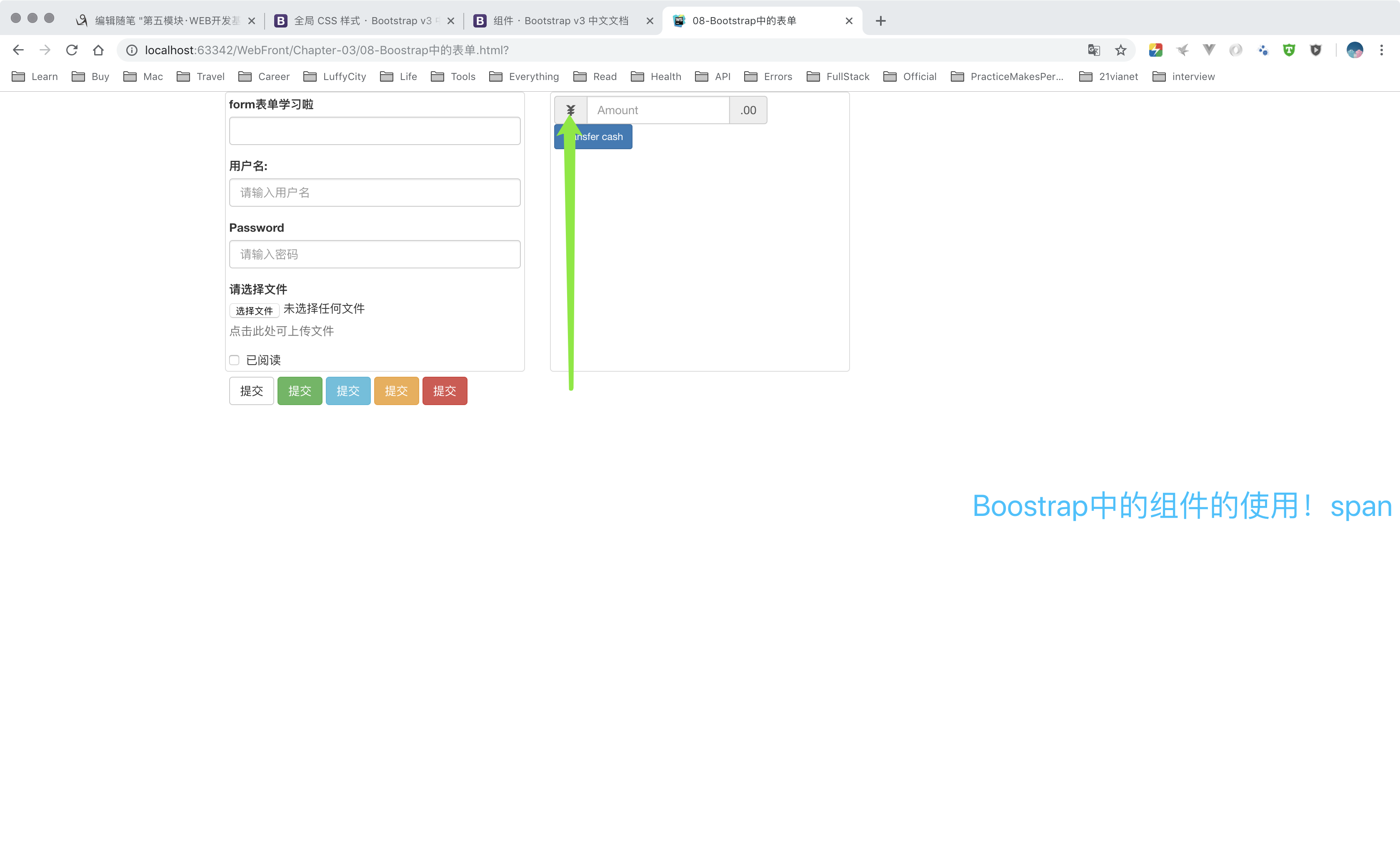
57.1 Boostrap中的form表单;
<!DOCTYPE html>
<html lang="en">
<head>
    <meta charset="utf-8">
    <meta http-equiv="X-UA-Compatible" content="IE=edge">
    <meta name="viewport" content="width=device-width, initial-scale=1.0">
    <link rel="stylesheet" href="../bootstrap-3.3.7-dist/css/bootstrap.css">
    <title>08-Bootstrap中的表单</title>
</head>
<body>
<div class="container">
    <div class="row">
        <div class="col-md-4">
            <div class="thumbnail" style="height: 336px;">
                <form action="">
                    <div class="form-group">
                        <label for="user">form表单学习啦</label>
                        <input class="form-control" type="text" name="user" id="user">
                    </div>
                </form>


                <form>
                    <div class="form-group">
                        <label for="username">用户名:</label>
                        <input type="text" class="form-control" id="username" placeholder="请输入用户名">
                    </div>
                    <div class="form-group">
                        <label for="password">Password</label>
                        <input type="password" class="form-control" id="password" placeholder="请输入密码">
                    </div>
                    <div class="form-group">
                        <label for="file">请选择文件</label>
                        <input type="file" id="file">
                        <p class="help-block">点击此处可上传文件</p>
                    </div>
                    <div class="checkbox">
                        <label>
                            <input type="checkbox"> 已阅读
                        </label>
                    </div>
                    <button type="submit" class="btn btn-default">提交</button>
                    <button type="submit" class="btn btn-success">提交</button>
                    <button type="submit" class="btn btn-info">提交</button>
                    <button type="submit" class="btn btn-warning">提交</button>
                    <button type="submit" class="btn btn-danger">提交</button>
                </form>
            </div>

        </div>
        <div class="col-md-4">
            <div class="thumbnail" style="height: 336px;">
                <form class="form-inline">
                    <div class="form-group">
                        <label class="sr-only" for="exampleInputAmount">Amount (in dollars)</label>
                        <div class="input-group">
                            <div class="input-group-addon"><span class="glyphicon glyphicon-jpy"></span></div>
                            <input type="text" class="form-control" id="exampleInputAmount" placeholder="Amount">
                            <div class="input-group-addon">.00</div>
                        </div>
                    </div>
                    <button type="submit" class="btn btn-primary btn-sm">Transfer cash</button>
                </form>
            </div>

        </div>
    </div>

</div>
</body>
</html>
58-全局CSS样式
58.1 全局CSS样式内容较多,请参考Boostrap官网说明; https://v3.bootcss.com/css/
59-导航条
60-面板和下拉菜单
61-按钮组和按钮式的下拉菜单
62-分页、路径导航、徽章
63-警告框和进度条
64-Boostrap的插件
65-个人经历分享
“终身”学习,生活充满诗意!

 浙公网安备 33010602011771号