04-弹性盒子布局
Flex是Flexible Box的缩写,意为”弹性布局”,用来为盒状模型提供最大的灵活性。
1 .box{
2     display: flex;
3 }
容器的属性
1 flex-direction
2 flex-wrap
3 justify-content
4 align-items
lex-direction属性
flex-direction属性决定主轴的方向
1 .box {
2     flex-direction: row | row-reverse | column | column-reverse;
3 }
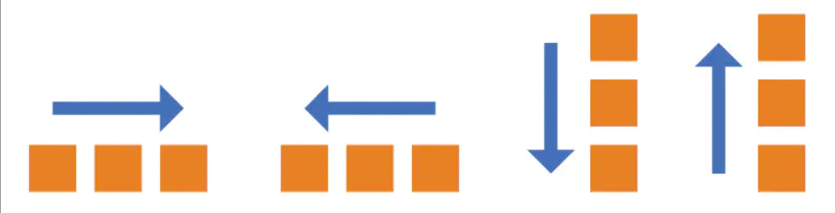
属性值
| 值 | 描述 |
|---|---|
| row | 默认值。元素将水平显示,从左到右 |
| row-reverse | 与 row 相同,但是以相反的顺序 |
| column | 元素将垂直显示,从上到下 |
| column-reverse | 与 column 相同,但是以相反的顺序 |
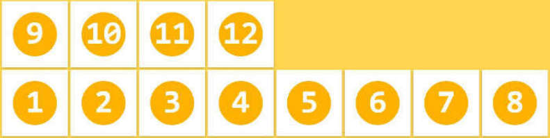
flex-wrap属性
flex-wrap 属性规定flex容器是单行或者多行,同时横轴的方向决定了新行堆叠的方向。
默认情况下,项目都排在一条线(又称”轴线”)上。
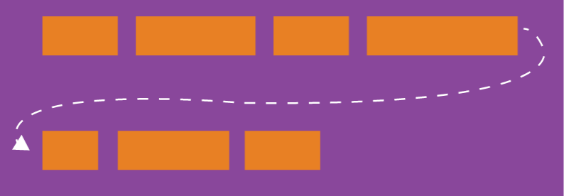
| 值 | 描述 |
|---|---|
| nowrap | 不换行 |
| wrap | 换行,第一行在上方。 |
| wrap-reverse | 换行,第一行在下方 |
-
nowrap
![]()
-
wrap
![]()
-
wrap-reverse
flex-flow 属性
flex-flow属性是flex-direction属性和flex-wrap属性的简写形式,默认值为row nowrap;即水平不换行。
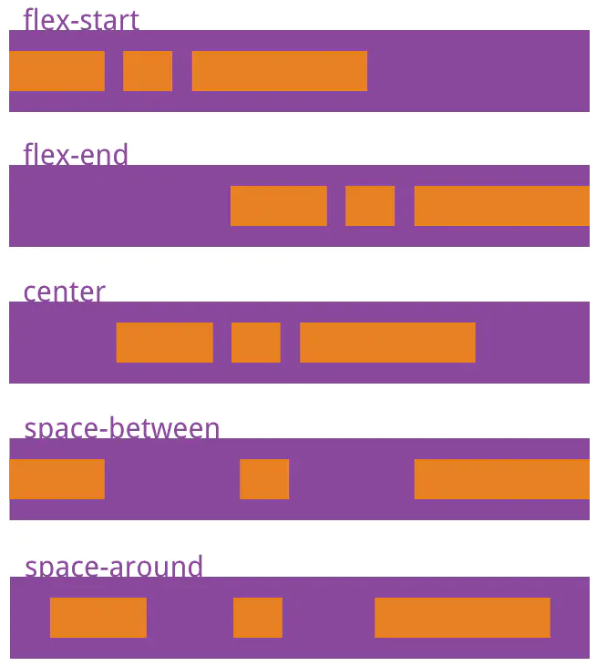
justify-content属性
justify-content属性定义了项目在主轴上的对齐方式。
1 .box {
2     justify-content: flex-start | flex-end | center | space-between | space-around;
3 }
-
flex-start(默认值):左对齐
-
flex-end:右对齐
-
center: 居中
-
space-between:两端对齐,项目之间的间隔都相等。
-
space-around:每个项目两侧的间隔相等。所以,项目之间的间隔比项目与边框的间隔大一倍。
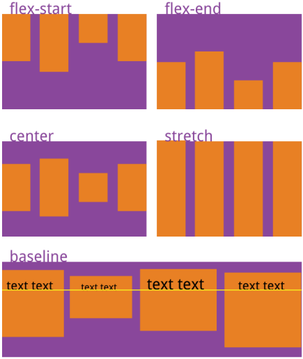
align-items属性
align-items属性定义项目在交叉轴上如何对齐
1 .box {
2     align-items: flex-start | flex-end | center | baseline | stretch;
3 }
-
flex-start:交叉轴的起点对齐。
-
flex-end:交叉轴的终点对齐。
-
center:交叉轴的中点对齐。
-
baseline: 项目的第一行文字的基线对齐。
-
stretch(默认值):如果项目未设置高度或设为auto,将占满整个容器的高度。

 浙公网安备 33010602011771号