
Css3实现波浪效果2
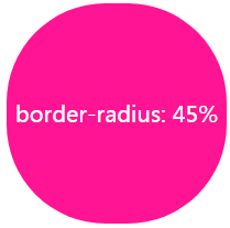
一、不规则圆,旋转实现波浪效果
  .info {
            width: 200px;
            height: 200px;
            ;
            background: #009A61;
            border-radius: 45%;
            color: white;
            text-align: center;
            line-height: 200px;

            animation: roateOne 2s linear infinite;
        }

        @keyframes roateOne {
            from {
                transform: rotate(0);
            }

            to {
                transform: rotate(180deg);
            }
        }
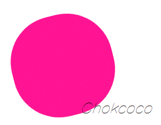
二、2个大圆的旋转
.info {
    height: 100vh;
    align-items: center;
    position: relative;
    border: 1px solid red;
    background-color: rgb(118, 218, 255);
    overflow: hidden;
}

.info::before,
.info::after {
    content: "";
    position: absolute;
    left: 50%;
    min-width: 300vw;
    min-height: 300vw;
    background: #fff;
    animation: roateOne 10s linear infinite;
}

.info::before {
    bottom: 15vh;
    border-radius: 45%;
}

.info::after {
    bottom: 12vh;
    opacity: 0.5;
    border-radius: 47%;
}

@keyframes roateOne {
    0% {
        transform: translate(-50%, 0) rotateZ(0deg);
    }

    50% {
        transform: translate(-50%, -2%) rotateZ(180deg);
    }

    100% {
        transform: translate(-50%, 0%) rotateZ(360deg);
    }
}

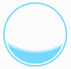
三、常见样式
.container {
    position: absolute;
    width: 200px;
    height: 200px;
    padding: 5px;
    border: 5px solid rgb(118, 218, 255);
    left: 50%;
    top: 50%;
    transform: translate(-50%, -50%);
    border-radius: 50%;
    overflow: hidden;
}

.info {
    width: 200px;
    height: 200px;
    position: relative;

    background-color: rgb(118, 218, 255);
    border-radius: 50%;
    overflow: hidden;
}

.info::before,
.info::after {
    content: "";
    position: absolute;
    left: 50%;
    min-width: 400px;
    min-height: 400px;
    background: #fff;
    animation: roateOne 10s linear infinite;
}

.info::before {
    bottom: 50px;
    border-radius: 45%;
}

.info::after {
    bottom: 40px;
    opacity: 0.5;
    border-radius: 47%;
}

@keyframes roateOne {
    0% {
        transform: translate(-50%, 0) rotateZ(0deg);
    }

    50% {
        transform: translate(-50%, -2%) rotateZ(180deg);
    }

    100% {
        transform: translate(-50%, 0%) rotateZ(360deg);
    }
}
    <div class="container">
        <div class="info">
            Wave
        </div>
    </div>
显示效果:
更多:

 浙公网安备 33010602011771号