
WPF 布局StackPanel使用案例
一、StackPanel
- 核心功能:子元素按水平(Orientation=“Horizontal”)或垂直(Orientation=“Vertical”)方向依次排列。
- 适用场景:简单线性布局(如工具栏、菜单栏)
二、使用案例:
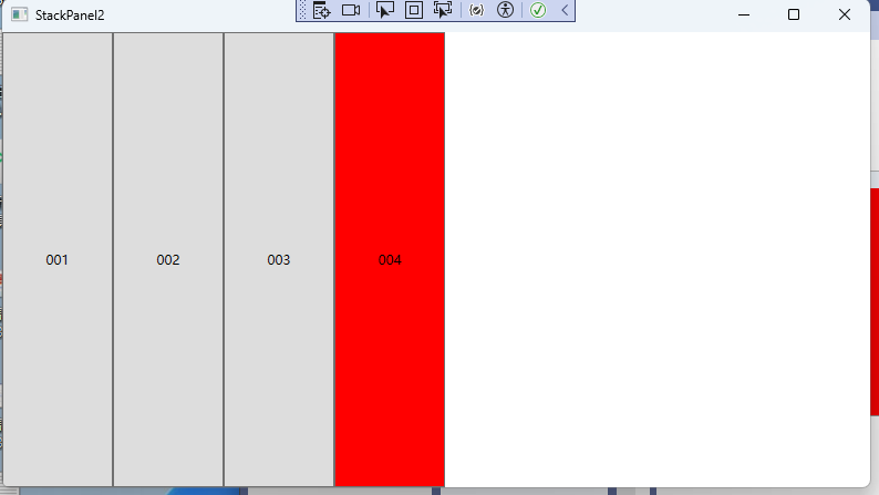
横向:
<Window x:Class="WpfAppNet8.Panel.StackPanel2"
        xmlns="http://schemas.microsoft.com/winfx/2006/xaml/presentation"
        xmlns:x="http://schemas.microsoft.com/winfx/2006/xaml"
        xmlns:d="http://schemas.microsoft.com/expression/blend/2008"
        xmlns:mc="http://schemas.openxmlformats.org/markup-compatibility/2006"
        xmlns:local="clr-namespace:WpfAppNet8.Panel"
        mc:Ignorable="d"
        Title="StackPanel2" Height="450" Width="800">

    <Window.Resources>
        <Style x:Key="btnHover" TargetType="Button">
            <Style.Setters>
                <!--Button鼠标滑过样式-->
                <Setter Property="Template">
                    <Setter.Value>
                        <ControlTemplate TargetType="{x:Type Button}">
                            <Border Background="{TemplateBinding Background}"
                     BorderBrush="{TemplateBinding BorderBrush}"
                     BorderThickness="{TemplateBinding BorderThickness}">
                                <ContentPresenter HorizontalAlignment="Center" VerticalAlignment="Center"/>
                            </Border>
                        </ControlTemplate>
                    </Setter.Value>
                </Setter>
            </Style.Setters>

            <Style.Triggers>
                <Trigger Property="IsMouseOver" Value="True">
                    <Setter Property="Background" Value="Red" ></Setter>
                </Trigger>
            </Style.Triggers>
        </Style>
    </Window.Resources>

    <StackPanel Orientation="Horizontal" >

        <Button Content="001" Width="100"></Button>
        <Button Content="002" Width="100" Style="{StaticResource btnHover}"></Button>
        <Button Content="003" Width="100"></Button>
        <Button Content="004" Width="100"  Style="{StaticResource btnHover}"></Button>
    </StackPanel>
</Window>
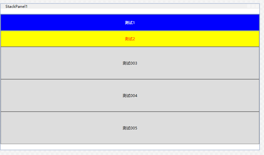
竖向:
<Window x:Class="WpfAppNet8.Panel.StackPanel1"
        xmlns="http://schemas.microsoft.com/winfx/2006/xaml/presentation"
        xmlns:x="http://schemas.microsoft.com/winfx/2006/xaml"
        xmlns:d="http://schemas.microsoft.com/expression/blend/2008"
        xmlns:mc="http://schemas.openxmlformats.org/markup-compatibility/2006"
        xmlns:local="clr-namespace:WpfAppNet8.Panel"
        mc:Ignorable="d"
        Title="StackPanel1" Height="450" Width="800">
    <Window.Resources>
        <Style x:Key="back" TargetType="Button" >
            <Style.Resources>

            </Style.Resources>
            <Style.Setters>
                <Setter Property="Background" Value="Blue"></Setter>
                <Setter Property="Foreground" Value="White"></Setter>

                <!--Button鼠标滑过样式-->
                <Setter Property="Template">
                    <Setter.Value>
                        <ControlTemplate TargetType="{x:Type Button}">
                            <Border Background="{TemplateBinding Background}"
                                    BorderBrush="{TemplateBinding BorderBrush}"
                                    BorderThickness="{TemplateBinding BorderThickness}">
                                <ContentPresenter HorizontalAlignment="Center" VerticalAlignment="Center"/>
                            </Border>
                        </ControlTemplate>
                    </Setter.Value>
                </Setter>
            </Style.Setters>

            <Style.Triggers>
                <Trigger Property="IsFocused" Value="True">
                    <Setter Property="Background" Value="Red"></Setter>
                    <Setter Property="FontSize" Value="30"></Setter>
                </Trigger>

                <Trigger Property="IsMouseOver" Value="True">
                    <Setter Property="Background" Value="Red" ></Setter>
                </Trigger>
            </Style.Triggers>
        </Style>
    </Window.Resources>

    <StackPanel Orientation="Vertical"  CanHorizontallyScroll="True" Height="400" CanVerticallyScroll="True">

        <Button Content="测试1" Height="50" Style="{StaticResource ResourceKey=back}" ></Button>

        <Button Content="测试2"  Height="50">
            <Button.Style>
                <Style TargetType="Button">
                    <Setter Property="Background" Value="Yellow"/>
                    <Setter Property="Foreground" Value="Red"/>
                    <Style.Triggers>
                        <Trigger Property="IsMouseOver" Value="True">
                            <Setter Property="Background" Value="Blue"/>
                            <Setter Property="Foreground" Value="White"/>
                        </Trigger>
                    </Style.Triggers>
                </Style>
            </Button.Style>
        </Button>

        <Button Content="测试003" Height="100"></Button>
        <Button Content="测试004" Height="100"></Button>
        <Button Content="测试005" Height="100"></Button>
        <Button Content="测试006" Height="100"></Button>
    </StackPanel>
</Window>
更多:

 浙公网安备 33010602011771号