

CSS04:盒子模型
所有HTML元素可以看作盒子,封装了周围的HTML元素,包括边距、边框、填充和实际内容。
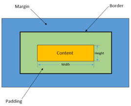
边框、内外边距
粗细、样式、颜色
总宽度=外边距+边框+内边距+内容宽度
<!DOCTYPE html>

<html lang="en">

<head>

    <meta charset="UTF-8">
    <title>我的网页</title>

    <style>

        /*默认标签如body、ul、ol、p、a等都有默认的边距值,可以手动清零(*代表所有标签)*/
        *{
            margin: 0;
            padding: 0;
            text-decoration: none;
        }

        /*将样式写进div中,全局配置*/
        /*margin:外边距,四个值分别为上右下左顺时针旋转,如果只写两个就是上下和左右
                如果将上下外边距设置为0,左右自动,div块就会居中对齐
          padding:内边距
        */
        #box{
            width: 300px;
            border: 1px solid red;
            margin: 0 auto;
        }

        h2{
            background : url("../万叶.jpg") no-repeat;
            height: 50px;
            line-height: 50px;
            text-align: center;
        }

        form{
            background: green;
        }

        /*子选择器选择form下所有div里的input*/
        form>div>input{
            border: 2px solid #11befa;
        }

        /*子选择器和伪类选择器选择form下第二个div里的input*/
        form>div:nth-of-type(2) input{
            border: 2px dashed orange;
        }

        /*子选择器和伪类选择器选择form下最后一个div里的input*/
        form>div:last-child input{
            border: 2px solid red;
        }

    </style>

</head>

<body>

<div id="box">
    <h2>欢迎登录</h2>
    <form action="" id="login">
        <div>
            <span>用户名:</span>
            <input type="text" name="username" placeholder="请输入用户名">
        </div>
        <div>
            <span>密码:</span>
            <input type="password" name="password" placeholder="请输入密码">
        </div>
        <div>
            <input type="submit" name="login" value="登录">
        </div>
    </form>
</div>

</body>

</html>
圆角边框和边框阴影
<!DOCTYPE html>

<html lang="en">

<head>

    <meta charset="UTF-8">
    <title>我的网页</title>

    <style>

        /*border-radius:圆角,顺时针旋转,对角线两两对应
            如果要变成圆,曲率半径还要加上边框宽度5px
        */
        .div1{
            border: 5px solid red;
            background: red;
            width: 100px;
            height: 50px;
            border-radius: 0px 0px 55px 55px;
        }

        .div2{
            border: 5px solid red;
            background: red;
            width: 50px;
            height: 50px;
            border-radius: 0px 0px 0px 55px;
        }

        /*box-shadow:边框阴影,水平阴影 垂直阴影 模糊距离 阴影距离 颜色
            可添加多个阴影,用","隔开
        */
        img{
            border-radius: 98px;
            box-shadow: 10px 10px 10px red, 10px 10px 10px yellow;
        }

    </style>

</head>

<body>

<div class="div1"></div>
<div class="div2"></div>

<div style="width: 500px; margin: 0 auto">
    <img src="./万叶.jpg" alt="">
</div>

</body>

</html>

 浙公网安备 33010602011771号