vue - 实战2 - 前端
vue 格式化工具 prettier
根目录下创建.prettierrc
{
    // "semi": false 表示代码语句结尾不强制要求添加分号
    "semi": false,
    // "singleQuote": true 表示字符串统一使用单引号(而非双引号)
    "singleQuote": true,
    // "trailingComma": "none" 表示对象、数组等最后一个元素后不添加 trailing 逗号
    "trailingComma": "none"
}
vue 项目 tailwindcss 安装
安装
命令
npm install -D tailwindcss@3 postcss autoprefixer
现在 版本4.1 和vue集成有问题,所有用3
2 初始化配置文件:
npx tailwindcss init -p
3 修改 tailwind.config.js 配置:
/** @type {import('tailwindcss').Config} */
module.exports = {
  content: [
    "./index.html",
    "./src/**/*.{vue,js,ts,jsx,tsx}",
  ],
  theme: {
    extend: {},
  },
  plugins: [],
}
4 建 Tailwind 样式文件
在 src/styles 目录下创建 tailwind.css 文件:
@tailwind base;
@tailwind components;
@tailwind utilities;
在 main.js (或 main.ts) 中导入刚才创建的 CSS 文件:
import { createApp } from 'vue'
import App from './App.vue'
import './assets/css/tailwind.css'  // 引入 Tailwind

createApp(App).mount('#app')
设置HTML的基准值REM和xl,sm,base等的大小
https://tailwindcss.com/docs/font-size 版本4
https://tailwind-v3.nodejs.cn/docs/font-size 版本3
手机端,根据浏览器的宽度,设置字体大小
1 根据 (浏览器可视窗口宽度/10),设置 html 的 fontsize,最大不能过40
export const useREM = () => {

  const MAX_FONT_SIZE = 40
  document.addEventListener('DOMContentLoaded', function () {
    // 拿到html的
    const html = document.querySelector('html')
    // 拿到窗口的宽度除以10
    let fontsize = windowWidth.value / 10
    fontsize = fontsize > MAX_FONT_SIZE ? MAX_FONT_SIZE : fontsize
    // 设置html的字体大小
    html.style.fontSize = fontsize + 'px'
  })

}
2 导入main.js
import { createApp } from 'vue'
import { createPinia } from 'pinia'
import App from './App.vue'
import '@/styles/index.scss'
import { useREM } from '@/utils/flexble.js'
import router from '@/routers/index.js'

const app = createApp(App)
app.use(createPinia())
app.use(router)
useREM()

app.mount('#app')
3 tailwind.config.js
/** @type {import('tailwindcss').Config} */
export default {
  content: ['./index.html', './src/**/*.{vue,js,ts,jsx,tsx}'],
  theme: {
    extend: {
      fontSize: {
        xs: ['0.375rem', '0.5rem'],
        sm: ['0.5rem', '0.625rem'],
        base: ['0.625rem', '0.75rem'],
        lg: ['0.75rem', '0.875rem'],
        xl: ['0.875rem', '1.125rem'],
      },
    },
  },
  plugins: [],
}
设置自定义的样式
例如:shadow-white-l
/** @type {import('tailwindcss').Config} */
export default {
  content: ['./index.html', './src/**/*.{vue,js,ts,jsx,tsx}'],
  theme: {
    extend: {
      fontSize: {
        xs: ['0.375rem', '0.5rem'],
        sm: ['0.5rem', '0.625rem'],
        base: ['0.625rem', '0.75rem'],
        lg: ['0.75rem', '0.875rem'],
        xl: ['0.875rem', '1.125rem'],
      },
    },
    boxShadow: {
      'white-l': '-10px 0 10px white',
    },
  },
  plugins: [],
}
vite 设置
resolve.alias 软连接 - 路径别名
- 类型:
Record<string, string> | Array<{ find: string | RegExp, replacement: string, customResolver?: ResolverFunction | ResolverObject }>
将会被传递到 @rollup/plugin-alias 作为 entries 的选项。也可以是一个对象,或一个 { find, replacement, customResolver } 的数组。
当使用文件系统路径的别名时,请始终使用绝对路径。相对路径的别名值会原封不动地被使用,因此无法被正常解析。
更高级的自定义解析方法可以通过 插件 实现。
https://cn.vitejs.dev/config/shared-options.html#resolve-alias
import { fileURLToPath, URL } from 'node:url'
// import { join } from 'node:path'

import { defineConfig } from 'vite'
import vue from '@vitejs/plugin-vue'
import vueDevTools from 'vite-plugin-vue-devtools'

// https://vite.dev/config/
export default defineConfig({
  plugins: [vue(), vueDevTools()],
  resolve: {
    alias: {
      // '@': join(__dirname, 'src'),
      '@': fileURLToPath(new URL('./src', import.meta.url)),
    },
  },
})
跨域问题 server.proxy
https://cn.vitejs.dev/config/server-options.html#server-proxy
import { fileURLToPath, URL } from 'node:url'
// import { join } from 'node:path'

import { defineConfig } from 'vite'
import vue from '@vitejs/plugin-vue'
import vueDevTools from 'vite-plugin-vue-devtools'

// https://vite.dev/config/
export default defineConfig({
  plugins: [vue(), vueDevTools()],
  resolve: {
    alias: {
      // '@': join(__dirname, 'src'),
      '@': fileURLToPath(new URL('./src', import.meta.url)),
    },
  },
  //代理配置
  server: {
    proxy: {
      // 代理所有 /api 的请求
      '/api': {
        //代理请求后的地址
        target: 'https://xxxxxxxxxxx/',
        //跨域
        changeOrigin: true,
      },
    },
  },
})
区分开发和生产环境
在 vite 中提供了 .env 文件,该文件为环境变量文件,默认提供了四种文件格式:
.env # 所有情况下都会加载

.env.local # 所有情况下都会加载,但会被 git 忽略

.env.[mode] # 只在指定模式下加载

.env.[mode].local # 只在指定模式下加载,但会被 git 忽略
其中有一种 .env.[mode] 的格式可以在不同模式下加载不同内容,这不正是我们想要的吗?
默认只有
VITE_为前缀的变量才会被 vite 处理
//文件 .env.development
# 开发环境
VITE_BASE_API='/api'
//文件 .env.production
# 生产环境
VITE_BASE_API='/prod-api'
request.js
import axios from 'axios'

//console.log(import.meta.env.VITE_BASE_API)

// 创建axios实例
const service = axios.create({
  timeout: 10000, // 请求超时时间
  baseURL: import.meta.env.VITE_BASE_API
})
功能开发
navigation-滑块 slider
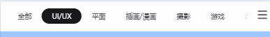
下面开始
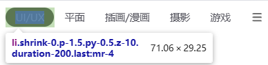
第一个item的宽度为70,和滑块的left距离为0
<template>
<div class=" bg-white position-static top-0 left-0 z-10 ">
<ul class=" flex relative overflow-x-auto text-xs p-1 text-zinc-600">
<!-- 滑块 -->
<li ref="sliderTarget" :style="sliderStyle" class=" absolute h-[28px] bg-zinc-900 rounded-lg"></li>
<!-- 右侧菜单 -->
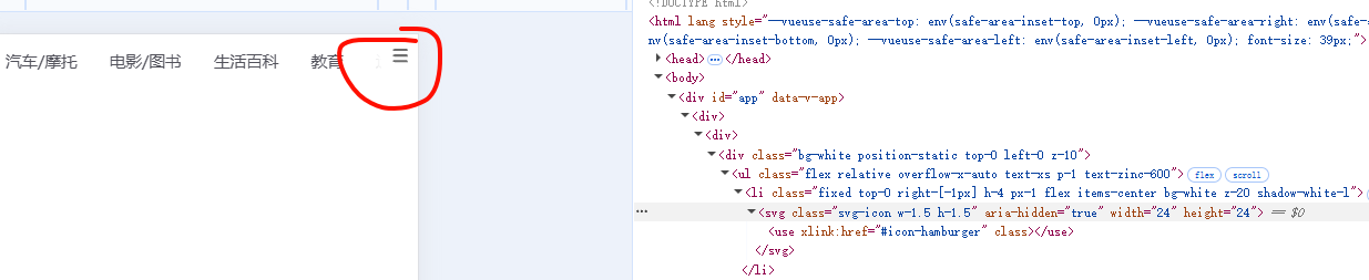
<li class=" fixed top-0 right-[-1px] h-5 px-1 flex items-center bg-white z-20 shadow-white-l"><svg-icon class="w-1.5 h-1.5" name="hamburger" size="24" /></li>
<!-- Menu Items -->
<li v-for="item in categories" :key="item.id" class=" shrink-0 p-1.5 py-0.5 z-10 duration-200 last:mr-4">{{ item.name }}</li>
</ul>
</div>
</template>
<script setup>
import { ref } from 'vue'
defineProps({
categories: {
type: Array,
default: () => [],
},
});
const sliderStyle = ref({
transform: 'translateX(0)', //滑块的left距离
width: '70px', //item的宽度
})
// 1. 选中的 item 下标: currentCategoryIndex
// 2. 所有 item 元素: itemRefs
// 3. ul 的横向滚动偏离位置: ulScrollLeft
// 4. 最后在 currentCategoryIndex 发生改变时, 获取 item 下标元素的 left 和 width, 计算 sliderStyle 即可
</script>
<style lang="scss" scoped>
</style>要实现的效果
1. 选中的 item 下标: currentCategoryIndex
2. 所有 item 元素: itemRefs
3. ul 的横向滚动偏离位置: ulScrollLeft
4. 最后在 currentCategoryIndex 发生改变时, 获取 item 下标元素的 left 和 width, 计算 sliderStyle 即可
实现代码
<template>
  <div class=" bg-white  position-static top-0 left-0 z-10 ">
    <ul ref="ulTarget" class=" flex relative overflow-x-auto text-xs p-1 text-zinc-600">
      <!-- 滑块 -->
      <li ref="sliderTarget" :style="sliderStyle" class=" absolute h-[28px] bg-zinc-900 rounded-lg  duration-200"></li>
      <!-- 右侧菜单 -->
      <li class=" fixed top-0 right-[-1px] h-5 px-1 flex items-center bg-white z-20 shadow-white-l"><svg-icon class="w-1.5 h-1.5" name="hamburger" size="24" /></li>
      <!-- Menu Items -->
      <li v-for="(item,index) in categories" :key="item.id"
      class=" shrink-0 p-1.5 py-0.5 z-10 duration-200 last:mr-4"
      :ref="el => setItemRef(el)"
      :class="{'text-zinc-100': index == currentCategoryIndex}"
      @click="currentCategoryIndex = index">{{ item.name }}</li>
    </ul>
  </div>
</template>

<script setup>
import { ref, onBeforeUpdate, watch } from 'vue'
import { useScroll } from '@vueuse/core'
defineProps({
  categories: {
    type: Array,
    default: () => [],
  },
});

const sliderStyle = ref({
  transform: 'translateX(0)', //滑块的left距离
  width: '70px', //item的宽度
})

// 1. 选中的 item 下标: currentCategoryIndex
const currentCategoryIndex = ref(0)
// 2. 所有 item 元素: itemRefs
const itemRefs = ref([])
const setItemRef = (el) => {
  if (el) {
    itemRefs.value.push(el)
  }
}
onBeforeUpdate(() => {
  //因为 ref 是响应式数据, 数据变化,就会重新push,所以需要每次更新时,清空 itemRefs 数组
  itemRefs.value = []
})

// 3. ul 的横向滚动偏离位置: ulScrollLeft
const ulTarget = ref(null)
// 获取 ul 的横向滚动偏离位置
const { x: ulScrollLeft } = useScroll(ulTarget)

// 4. 最后在 currentCategoryIndex 发生改变时, 获取 item 下标元素的 left 和 width, 计算 sliderStyle 即可
watch(currentCategoryIndex, (val) => {
  // getBoundingClientRect() 是 JavaScript 中 DOM 元素的一个方法,用于获取元素在视口(viewport)中的位置和尺寸信息。
  const {width , left} = itemRefs.value[val].getBoundingClientRect()
  // 获取 ul 的横向滚动偏离位置,然后加上 item 元素的 left 位置,再减去 10px (UL的padding-left),就是滑块的 left 位置
  sliderStyle.value = {
    transform: `translateX(${ulScrollLeft.value + left - 10}px)`,
    width: `${width}px`,
  }
})


</script>

<style lang="scss" scoped>

</style>
插件开发
统一注册
main.js
import { createApp } from 'vue'
import { createPinia } from 'pinia'
import App from './App.vue'
import '@/styles/index.scss'
import { useREM } from '@/utils/flexble.js'
import router from '@/routers/index.js'
import 'virtual:svg-icons-register' // 引入SVG注册脚本
import libs from '@/libs'

const app = createApp(App)
app.use(createPinia())
app.use(router)
app.use(libs)
useREM()

app.mount('#app')
处理自动注册 libs 下面的组件
import.meta.glob 和 defineAsyncComponent 自动注册组件
什么是 defineAsyncComponent?
defineAsyncComponent 是 Vue 3 中用来创建异步组件的函数。它允许你将组件定义为一个返回 Promise 的工厂函数,这个 Promise 会在需要渲染组件时才执行,从而实现按需加载组件。
主要用途
- 代码分割: 将大型应用拆分成小块,只在需要时加载特定组件
- 懒加载: 提高应用初始加载速度,减少首屏加载时间
- 处理动态导入: 正确处理通过
import()或import.meta.glob()导入的组件
基本使用
import { defineAsyncComponent } from 'vue'

// 简单形式
const AsyncComponent = defineAsyncComponent(() => import('./MyComponent.vue'))

// 高级形式(带选项)
const AsyncComponent = defineAsyncComponent({
  loader: () => import('./MyComponent.vue'),
  loadingComponent: LoadingComponent,
  errorComponent: ErrorComponent,
  delay: 200,
  timeout: 3000
})
import.meta.glob
const components = import.meta.glob('./**/index.vue', { eager: true })
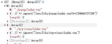
console.log(components);
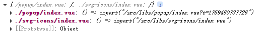
console.log(Object.entries(components));
最后完成的效果
// import SvgIcon from './svg-icons/index.vue'
// import Popup from './popup/index.vue'
import { defineAsyncComponent } from 'vue'

export default{
  //当你在 Vue 应用中使用 app.use(插件) 时,Vue 会自动调用这个 install 方法
  install(app) {
    // app.component('m-svg-icon', SvgIcon) //这行代码将 SvgIcon 组件注册为全局组件,组件的标签名为 svg-icon
    // app.component('m-popup', Popup) // 注册Popup组件为全局组件

    //1 获取当前路径下的 index.vue 文件
    const components = import.meta.glob('./**/index.vue')

    //2 遍历获取的组件模块
    for (const [path, component] of Object.entries(components)) {
      //3 在遍历里,注册组件为全局组件
      const name = path.replace('./', '').split('/')[0]
      app.component("m-" + name, defineAsyncComponent(component))
    }
  }
}
处理SVG图标
1 安装vite-plugin-svg-icons插件
yarn add vite-plugin-svg-icons -D
# or
npm i vite-plugin-svg-icons -D
# or
pnpm install vite-plugin-svg-icons -D
2 配置 vite
import { fileURLToPath, URL } from 'node:url'
import { createSvgIconsPlugin } from 'vite-plugin-svg-icons'
import path from 'path'
// import { join } from 'node:path'

import { defineConfig } from 'vite'
import vue from '@vitejs/plugin-vue'
import vueDevTools from 'vite-plugin-vue-devtools'

// https://vite.dev/config/
export default defineConfig({
  plugins: [
    vue(),
    vueDevTools(),
    createSvgIconsPlugin({
      // 指定需要缓存的图标文件夹
      // iconDirs: [path.resolve(fileURLToPath(new URL('./src/assets/icons', import.meta.url)))],
      iconDirs: [path.resolve(process.cwd(), 'src/assets/icons')],
      // 指定symbolId格式
      symbolId: 'icon-[dir]-[name]',
    }),
  ],
  resolve: {
    alias: {
      // '@': join(__dirname, 'src'),
      '@': fileURLToPath(new URL('./src', import.meta.url)),
    },
  },
  //代理配置
  server: {
    proxy: {
      // 代理所有 /api 的请求
      '/api': {
        //代理请求后的地址
        target: 'https://XXXXXXXXXXXXXX/',
        //跨域
        changeOrigin: true,
      },
    },
  },
})
3 创建svg组件
src\libs\svg-icons\index.vue
<template>
  <svg
    class="svg-icon"
    aria-hidden="true"
    :width="size"
    :height="size"
  >
    <use :xlink:href="`#icon-${name}`" :fill="color" :class="fillClass"></use>
  </svg>
</template>

<script setup>
import { defineProps } from 'vue'

defineProps({
  // 图标名称(对应svg的id)
  name: {
    type: String,
    required: true
  },
  // 图标大小
  size: {
    type: [Number, String],
    default: 24
  },
  //svg 图标颜色
  color:{
    type: String,
  },
  //tailwind 填充类
  fillClass:{
    type: String,
  },
})
</script>

<style scoped>
</style>
4 导出插件
src\libs\index.js
import SvgIcon from './svg-icons/index.vue'

export default{
  //当你在 Vue 应用中使用 app.use(插件) 时,Vue 会自动调用这个 install 方法
  install(app) {
    app.component('svg-icon', SvgIcon) //这行代码将 SvgIcon 组件注册为全局组件,组件的标签名为 svg-icon
  }
}
https://cn.vuejs.org/guide/reusability/plugins
一个插件可以是一个拥有
install()方法的对象,也可以直接是一个安装函数本身。安装函数会接收到安装它的应用实例和传递给app.use()的额外选项作为参数:const myPlugin = { install(app, options) { // 配置此应用 } }插件没有严格定义的使用范围,但是插件发挥作用的常见场景主要包括以下几种:
- 通过
app.component()和app.directive()注册一到多个全局组件或自定义指令。- 通过
app.provide()使一个资源可被注入进整个应用。- 向
app.config.globalProperties中添加一些全局实例属性或方法- 一个可能上述三种都包含了的功能库 (例如 vue-router)。
5 导入 mian.js
import { createApp } from 'vue'
import { createPinia } from 'pinia'
import App from './App.vue'
import '@/styles/index.scss'
import { useREM } from '@/utils/flexble.js'
import router from '@/routers/index.js'
import 'virtual:svg-icons-register' // 引入SVG注册脚本
import libs from '@/libs'

const app = createApp(App)
app.use(createPinia())
app.use(router)
app.use(libs)
useREM()

app.mount('#app')
6 可以使用了
<svg-icon class="w-1.5 h-1.5" name="hamburger" size="24" />
popup 弹出窗口
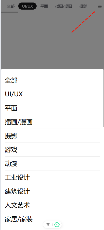
- 当 popup 展开时,内容视图应该不属于任何一个组件内部,而应该直接被插入到 body 下面
- popup 应该包含两部分内容,一部分为背景蒙版,一部分为内容的包裹容器
- popup 应该通过一个双向绑定进行控制展示和隐藏
- popup 展示时,滚动应该被锁定
- 内容区域应该接收所有的 attrs,并且应该通过插槽让调用方指定其内容
需要的VUE3内置组件
1 Teleport 组件
https://cn.vuejs.org/guide/built-ins/teleport.html
<Teleport> 是一个内置组件,它可以将一个组件内部的一部分模板“传送”到该组件的 DOM 结构外层的位置去。
<button @click="open = true">Open Modal</button>

<Teleport to="body">
  <div v-if="open" class="modal">
    <p>Hello from the modal!</p>
    <button @click="open = false">Close</button>
  </div>
</Teleport>
2 <Transition> 组件
https://cn.vuejs.org/guide/built-ins/transition.html#transition
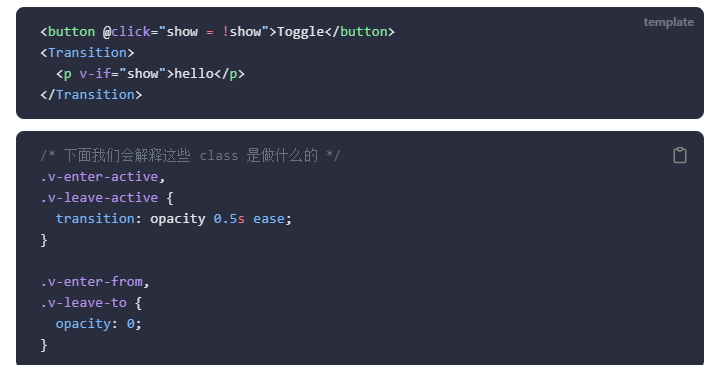
实现组件
src\libs\popup\index.vue
<template>
  <Teleport to="body">
    <Transition name="fade">
      <div v-if="modelValue" class="popup-overlay" @click.self="handleClose">
        <div :class="['popup-content']" v-bind="$attrs">
          <slot></slot>
        </div>
      </div>
    </Transition>
  </Teleport>
</template>

<script>
import { onMounted, onUnmounted, watch } from 'vue'

export default {
  name: 'Popup',
  props: {
    modelValue: {
      type: Boolean,
      default: false
    }
  },
  emits: ['update:modelValue'],
  setup(props, { emit }) {
    // 处理关闭事件
    const handleClose = () => {
      emit('update:modelValue', false)
    }

    // 监听显示状态变化,控制滚动锁定
    watch(() => props.modelValue, (newValue) => {
      if (newValue) {
        document.body.style.overflow = 'hidden'
      } else {
        document.body.style.overflow = ''
      }
    })

    // 组件卸载时恢复滚动
    onUnmounted(() => {
      document.body.style.overflow = ''
    })

    return {
      handleClose
    }
  }
}
</script>

<style scoped>
.popup-overlay {
  position: fixed;
  top: 0;
  left: 0;
  right: 0;
  bottom: 0;
  background-color: rgba(0, 0, 0, 0.5);
  display: flex;
  align-items: flex-end;
  justify-content: center;
  z-index: 2000;
}

.popup-content {
  background-color: white;
  border-radius: 4px;
  width: 100%;
  max-height: 70vh;
  overflow-y: auto;
}

/* 过渡动画 */
.fade-enter-active,
.fade-leave-active {
  transition: opacity 0.3s ease;
}

.fade-enter-from,
.fade-leave-to {
  opacity: 0;
}
</style>
注册为
import SvgIcon from './svg-icons/index.vue'
import Popup from './popup/index.vue'

export default{
  //当你在 Vue 应用中使用 app.use(插件) 时,Vue 会自动调用这个 install 方法
  install(app) {
    app.component('svg-icon', SvgIcon) //这行代码将 SvgIcon 组件注册为全局组件,组件的标签名为 svg-icon
    app.component('m-popup', Popup) // 注册Popup组件为全局组件
  }
}

// 导出单个组件供按需引入
export { SvgIcon, Popup }
使用方式
<!-- 正确的Popup使用方式 -->
  <m-popup v-model="showCategoriesPopup">
    <div class="popup-body">
      <ul class="categories-list">
        <li v-for="(item, index) in categories" :key="item.id"
            class="category-item text-base" @click="selectCategory(index)">
          {{ item.name }}
        </li>
      </ul>
    </div>
  </m-popup>

<script>
// 控制Popup显示/隐藏的状态 - 必须是布尔值
const showCategoriesPopup = ref(false)
// 选择分类并关闭弹窗
const selectCategory = (index) => {
  currentCategoryIndex.value = index
  showCategoriesPopup.value = false
}
</script>

<style  lang="scss" scoped>
.popup-body {
  padding: 16px;
}

.categories-list {
  list-style: none;
  margin: 0;
  padding: 0;
}

.category-item {
  padding: 12px 0;
  border-bottom: 1px solid #eee;
  cursor: pointer;
  transition: color 0.2s;
}

.category-item:hover {
  color: #3b82f6;
}
</style>

 浙公网安备 33010602011771号