《精通CSS第3版》(3)可见格式化模型+(4)网页排版
a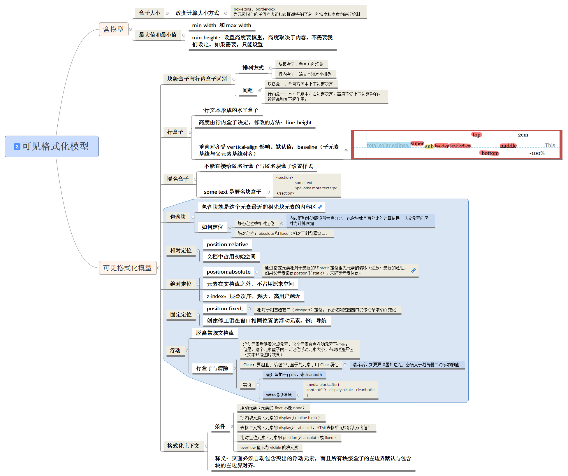
3.1 盒模型
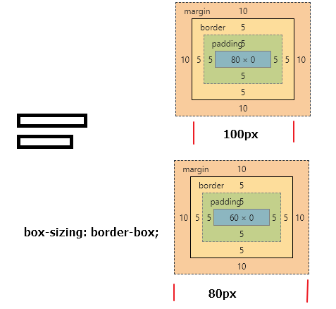
3.1.1 盒子大小
width和height指定内容盒子。
通过 box-sizing属性改变计算盒子大小的方式。设置为 border-box,那么width和height会包含内边距和边框。这种方式更加直观。
例子:如果有3栏,不管添加内边距都不会破会原有的布局。
.group .block {
width:33.333%;
box-sizing: border-box;
padding:20px;
}
<div class="group">
 <article class="block">
 </article>
</div>
  <style>
    .box {
      width: 80px;
      padding: 5px;
      border:5px solid;
      margin: 10px;
    }
    .box-sizing {
      box-sizing: border-box;
      width: 80px;
      padding: 5px;
      border:5px solid;
      margin: 10px;
    }
  </style>

  <div class="box">

  </div>
  <div class="box-sizing">

  </div>
3.2 可见格式化模型
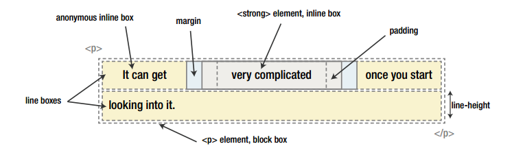
块级盒子block box会沿垂直方向堆叠
型内盒子inline box沿文本流水平排列,修改盒子大小的唯一途径是修改行高(line-heignt)
3.2.2 外边距折叠
常规块盒子有一种机制为外边距折叠。垂直方向上的两个外边距相遇时,折叠成一个外边距。折叠后高度等于两者中较大的那一个高度。
3.2.3 包含块
内边距和外边距设置为百分比,包含块就是这些百分比的计算依据。
要确定包含块,看元素如何定位。
静态定位static和相对定位relative,计算到一个最近的父元素。
绝对定位absolute和固定定位fixed,包含块是距离最近的定位祖先(position:非static),没有为根元素html。
3.2.4 相对定位
元素会呆在原来的地方,在文档流中占用初始的空间。
3.2.5 绝对定位
绝对定位会离开文档流,不占用原来的空间,其他元素各自重新定位。
绝对定位的包含块是距离最近的定位祖先,就是position:非static的祖先元素。z-index控制次序。
3.2.6 固定定位
position:fix 由决定定位衍生来的,不同在于包含块时视窗(viewport)。创建始终停留在窗口相对位置的浮动元素,例如导航。
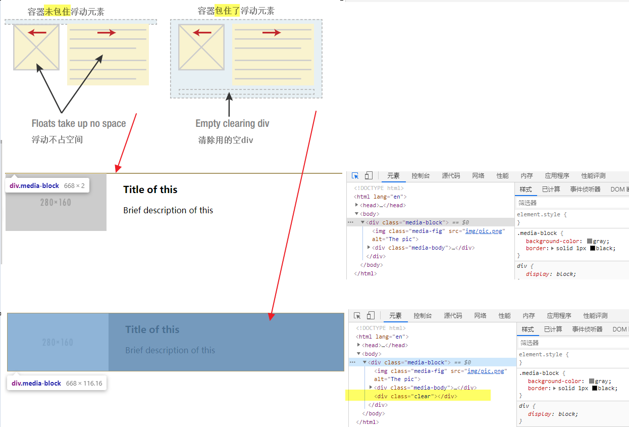
3.2.7 浮动
会脱离文档流。常规流中的其他块级元素,“几乎”当浮动盒子不存在。
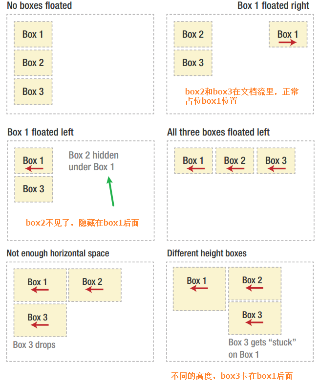
行盒子与清除:clear
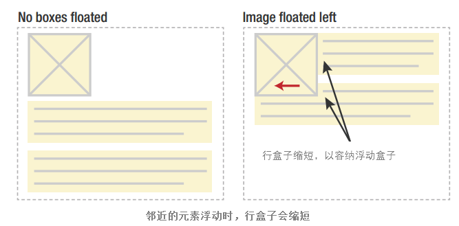
浮动盒子后面的如果是常规流中的元素,会当浮动元素不存在。
但是元素盒子中的文本内容却会记住浮动元素的大小,避开它。(就是跟在浮动元素后面的行盒子会缩短,从而为浮动元素留空,造成文本环绕的效果)
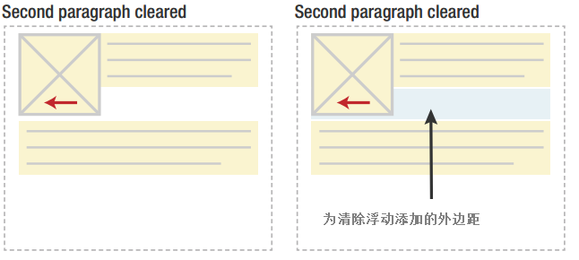
要阻止,需要给包含行盒子的元素(容器)应用clear属性。
清除浮动不仅仅抵消前面的浮动标记,浏览器会给这个元素添加足够的外边距(下图灰色部分)。
清除浮动clear例子:
<!doctype html>
<html lang="en">
<head>
  <meta charset="UTF-8">
  <title>Media Object, no clearing</title>

  <style type="text/css" media="screen">
    /**
    * 1. Notice how this will not show, as the block collapses in height.
    */
    .media-block {
      background-color: gray; /* 1 */
      border: solid 1px black;
    }
    .media-fig {
      float: left;
      width: 30%;
    }
    .media-body {
      float: right;
      width: 65%;
    }
  </style>
</head>
<body>
  <div class="media-block">
    <img class="media-fig" src="img/pic.png" alt="The pic" />
    <div class="media-body">
      <h3>Title of this</h3>
      <p>Brief description of this</p>
    </div>
  </div>
</body>
</html>
需要在浮动元素的容器(这里是.media-block)的某处应用clear,
.clear {
      clear: both;
    }

<div class="media-block">
    <img class="media-fig" src="img/pic.png" alt="The pic" />
    <div class="media-body">
      <h3>Title of this</h3>
      <p>Brief description of this</p>
    </div>
    <div class="clear"></div><!--额外添加的空div-->
  </div>
要改进这个例子,可以使用:after模拟额外的清除元素。
.media-block:after {
      content:' ';
      display:block;
      clear:both;
    }
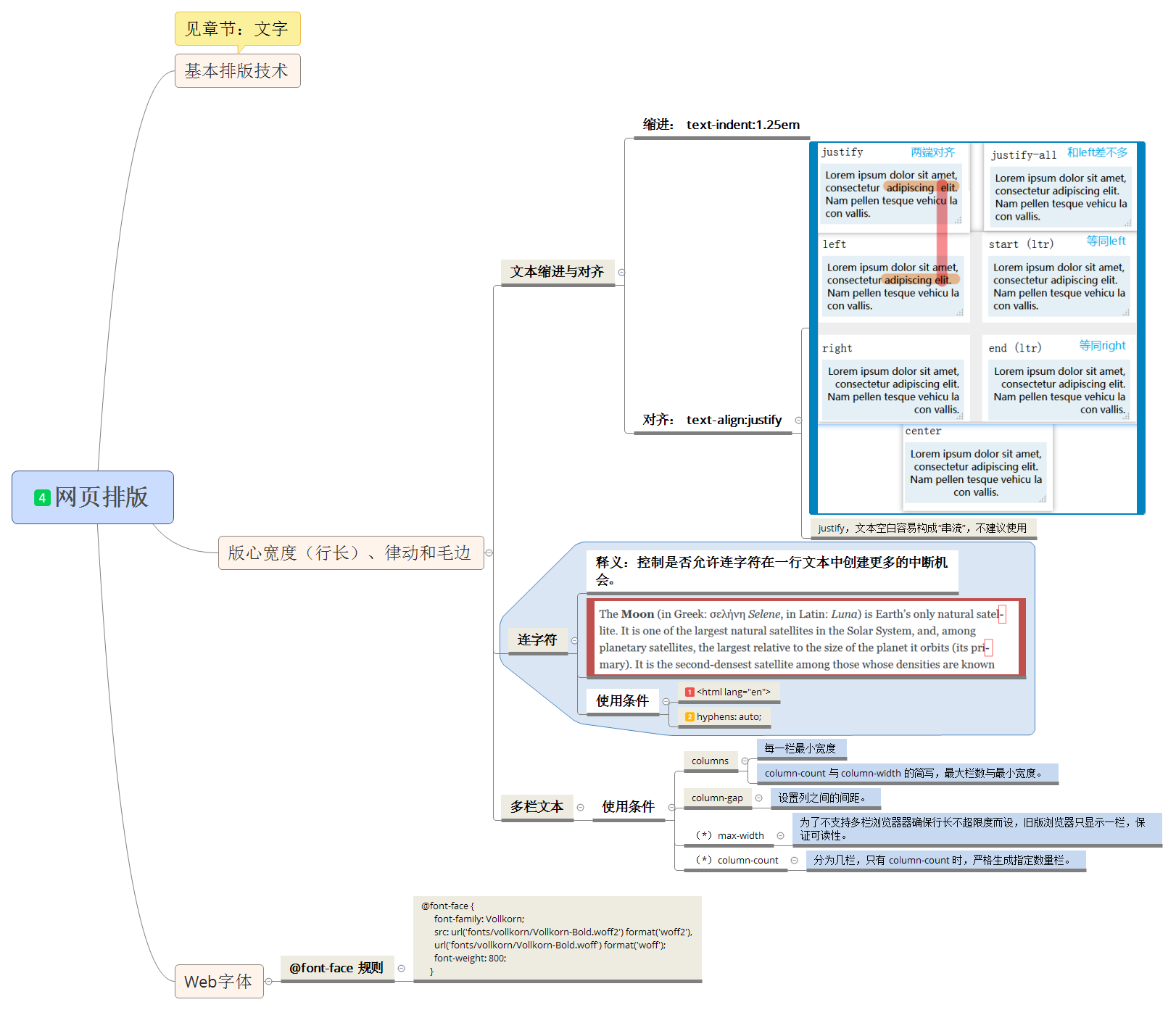
4.1 CSS的基本排版技术
4.1.4 行间距、对齐及行盒子的构造
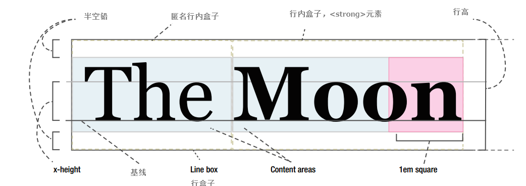
1 设置行高 line-hegint
行高需要考虑当前字体大小,一般取值 1.2 ~ 1.5范围。对于 x 高度较大,行间距要大一些。
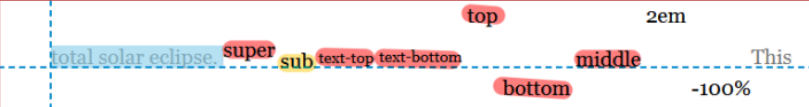
2 垂直对齐 vertical-align
除了line-hegint,行内盒子受到 vertical-align 影响。
4.1.7 大小写变化和小型大写变体
text-transform: 'uppercase'; /*大写*/
text-transform: 'lowercase'; /*小写*/
4.1.8 字母和单词间距
word-spacing	/*字母间距*/
letter-spacing /*单词间距*/
4.2 版心宽度、律动和毛边
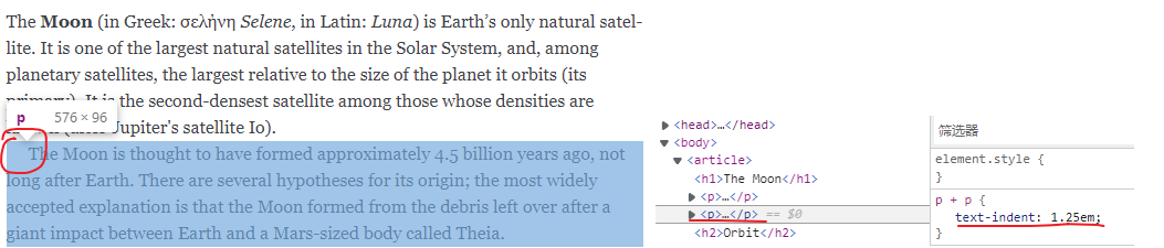
4.2.1 文本缩进与对齐
text-indent: 1.25em; /*缩进*/
text-align: center; /*对齐,justify容易引起串流*/
缩进
对齐
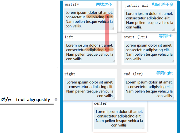
text-align: justify;
justify容易引起“串流”(river of whitespace)

4.2.2 连字符
hyphens
貌似2个条件,而且支持不好。
条件1,html:
<html lang="en">

条件2,css:
{
	hyphens:auto;
}
4.2.3 多栏文本
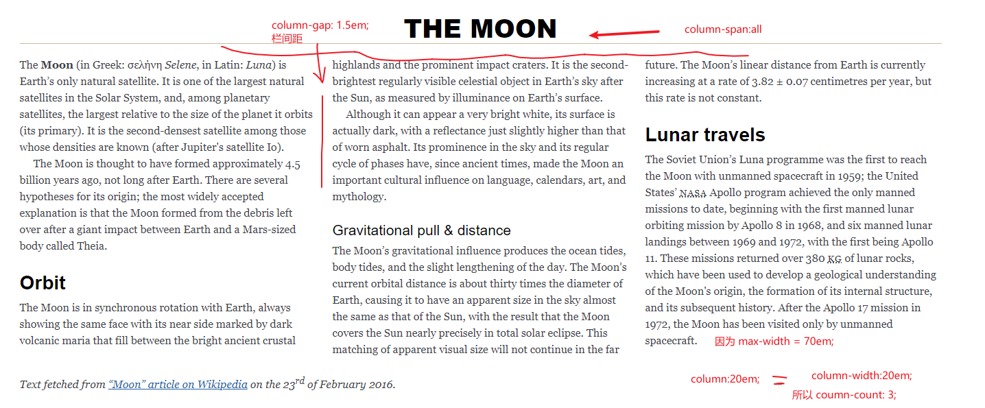
columns 属性是 column-count 和 column-width 的缩写。
columns: 20em; /* 在保证最小宽度 20em 前提下,自动设置栏数*/
column-width: 20em; /* 同上 */
columns: 3; /* creates 3 columns, with automatic width */
column-count: 3; /* 同上 */
columns: 3 20em; /* at most 3 columns, at least 20em wide each */
/* 下面2条声明,相当于上面简写: */
column-count: 3;
column-width: 20em;
1 后备宽度
不支持多栏浏览器确保不会超过限度,旧版浏览器只显示1条
article > p {
	max-width:36em;
}
2 跨栏
.h1,
.source {
column-span: all; /* or column-span: none; to explicitly turn off. */
}

 浙公网安备 33010602011771号