css3中变形与动画(三)
transform可以实现矩阵变换,transition实现属性的平滑过渡,animation意思是动画,动漫,这个属性才和真正意义的一帧一帧的动画相关。本文就介绍animation属性。
animation属性通过一些关键帧中元素属性的改变来实现动画效果。当然也可以控制动画持续时间,动画迭代次数等。
一、例子
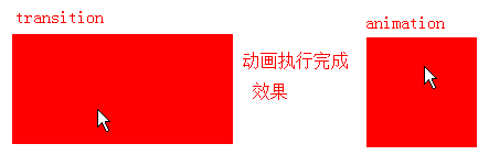
在介绍transition时开篇有一个例子就是实现鼠标放上去,div宽度从100px缓慢增大到200px。
用transition实现方法如下
div:hover{
    width: 200px;
    transition:width 5s ease-in;
}
用animation也能实现类似效果,如下:
<style type="text/css">
div {
    width: 100px;
    height: 100px;
    background-color: red;
}
@keyframes enlarge {
    0% {
        width: 100px;
    }
    50% {
        width: 150px;
    }
    100% {
        width: 200px;
    }
}
div:hover {
    /*width: 200px;    */
    /*transition:width 5s ease-in;*/
    animation: 5s enlarge;
}
}
</style>
<div></div>
鼠标悬停,动画持续5s,在时间到一半时div的宽度要从100px达到150px,5s时div宽度达到200px,动画结束。
但是transition和animation效果还是有差别的,鼠标hover上去,transition动画执行完后width保持200px;animation动画执行完后width回到100px。
当然这只是默认效果,这个动画完成时的效果也是可以修改的。
修改上面代码中animation为
animation: 5s enlarge forwards;
就可以让动画执行完后停在最后一帧。这个forwards是animation-fill-mode的值,后面会详细讲。
通过这个例子只是想说,可以理解为transition是animation的简化版,animation可以做更多的控制,也更强大。下面正式开始介绍。
二、keyframes
keyframes意思是“关键帧”,在关键帧会改变元素属性的计算值。
keyframes语法:
keyframes-rule: '@keyframes' IDENT '{' keyframes-blocks '}';
keyframes-blocks: [ keyframe-selectors block ]* ;
keyframe-selectors: [ 'from' | 'to' | PERCENTAGE ] [ ',' [ 'from' | 'to' | PERCENTAGE ] ]*;
综合写法:
 @keyframes IDENT {
     from {
       Properties:Properties value;
     }
     Percentage {
       Properties:Properties value;
     }
     to {
       Properties:Properties value;
     }
   }
   或者全部写成百分比的形式:
   @keyframes IDENT {
      0% {
         Properties:Properties value;
      }
      Percentage {
         Properties:Properties value;
      }
      100% {
         Properties:Properties value;
      }
    }
可见keyframes写法是这样的:由"@keyframes"开头,后面紧跟这个“动画的名称”加上一对花括号“{}”,括号中是一些不同时间段的样式规则,规则写法同css样式。
一个“@keyframes”中的样式规则是由多个百分比构成的,如"0%"到"100%"之间,可以在一个规则中创建多个百分比,分别在每一个百分比中给需要有动画效果的元素加上不同的属性,从而让元素达到一种不断变化的效果,比如说移动、改变元素颜色、位置、大小、形状等。
两个关键字,"from"和"to"表示一个动画从哪开始,到哪结束,也就是"from"相当于"0%",而"to"相当于"100%"。
Note:0%中的%不能省略,省略则整个keyframes语法错误,整条规则无效,因为keyframes的单位只接受百分比值。
工作中有遇到压缩工具yui compressor把css3中的0%压缩成0导致动画失效的情况。所以css如果压缩尽量写成from,to避免这种问题。【update:2016-08-02】
举例:W3C官网的实例,下面介绍animation时会用到这段代码。
 @-webkit-keyframes 'wobble' {
     0% {
        margin-left: 100px;
        background: green;
     }
     40% {
        margin-left: 150px;
        background: orange;
     }
     60% {
        margin-left: 75px;
        background: blue;
     }
     100% {
        margin-left: 100px;
        background: red;
     }
  }
keyframes定义每一帧的动画,但只写keyframes是没用的,需要调用才能生效。那怎样调用就用到animation了。
三、animation
animation没有事件触发时,在页面加载后显式的随着时间变化来改变元素css样式,从而产生动画效果。
元素是怎样调用animation和keyframes的呢?
举例:调用上面写好的wobble动画。
 .demo1 {
     width: 50px;
     height: 50px;
     margin-left: 100px;
     background: blue;
     -webkit-animation-name:'wobble';/*动画属性名,也就是我们前面keyframes定义的动画名*/
     -webkit-animation-duration: 10s;/*动画持续时间*/
     -webkit-animation-timing-function: ease-in-out; /*动画频率,和transition-timing-function是一样的*/
     -webkit-animation-delay: 2s;/*动画延迟时间*/
     -webkit-animation-iteration-count: 10;/*定义循环次数,infinite为无限次*/
     -webkit-animation-direction: alternate;/*定义动画方式*/
  }
到此,如果前面看过transition应该已经明白animation也是个复合属性。
animation包含下面属性: animation-name,animation-duration,animation-timing-function,animation-delay,animation-iteration-count,animation-direction,animation-play-state和animation-fill-mode。下面一一介绍,重点理解加粗的属性。
1、animation-name
animation-name是最关键的了,表示应用哪个帧动画。
语法:
animation-name: none | IDENT[,none | IDENT]*;
默认值:none,即默认情况没有动画效果。
animation-name属性调用@keyframes定义好的动画,必须和"@keyframes"定义的动画名称完全一致(区分大小写)。
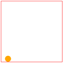
举例:animation配合矩阵变换中的平移做一个有意思的小动画。


<!DOCTYPE html>
<html>
<head>
<meta charset="utf-8">
<title>变形与动画</title>
<style type="text/css">
@keyframes around{
  0% {
    transform: translateX(0);
  }
  25%{
    transform: translateX(180px);
  }
  50%{
     transform: translate(180px, 180px);
  }
  75%{
    transform:translate(0,180px);
  }
  100%{
    transform: translateY(0);
  }
}
div {
  width: 200px;
  height: 200px;
  border: 1px solid red;
  margin: 20px auto;
}
div span {
  display: inline-block;
  width: 20px;
  height: 20px;
  background: orange;
  border-radius: 100%;
  animation-name:around;
  animation-duration: 10s;
  animation-timing-function: ease;
  animation-delay: 1s;
  animation-iteration-count:infinite;
}
</style>
</head>
<body>
    <div>
        <span></span>
    </div>

</body>
</html>
2、animation-duration
语法:
animation-duration: <time>[,<time>]*
默认值为0,意味着动画时长0,即没有动画效果(如果值为负值被视为0)。
animation-duration定义播放动画持续的时间,也就是完成从0%到100%一次动画所需要的时间。单位s。
3、animation-timing-function
语法:
animation-timing-function:ease | linear | ease-in | ease-out | ease-in-out | cubic-bezier(<number>, <number>, <number>, <number>) [, ease | linear | ease-in | ease-out | ease-in-out | cubic-bezier(<number>, <number>, <number>, <number>)]*
animation-timing-function属性用来设置动画播放方式。详情可参考css3中变形与动画(二)中的介绍。
4、animation-delay
语法:
animation-delay:<time>[,<time>]*
animation-delay定义事件触发到动画开始执行的时间,即延时。
5、animation-iteration-count
语法:
animation-iteration-count: infinite | <number> [, infinite | <number>]*
animation-iteration-count属性用来定义动画的播放次数。
默认值为1,即动画从开始到结束只播放一次。
值为infinite,动画将会无限次播放。
6、animation-direction
语法:
animation-direction:normal | alternate [, normal | alternate]*
animation-direction设置动画播放方向。
属性:
normal:默认值,如果值为normal时,动画每次循环都是向前播放。
alternate:奇数次播放动画是按顺序播放各帧动画,偶数次播放动画是按逆序播放各帧动画。
这个alternate还是很有用的,我写了一个例子,可以感受一下alternate效果。
例子:div尺寸由小到大,然后由大到小。
<style type="text/css">
 @-webkit-keyframes 'testAnimationDirection' {
     0% {
        width: 50px;
     }
     20% {
        width: 100px;
     }
     40% {
        width: 150px;
     }
     60% {
        width: 200px;
     }
     80% {
        width: 250px;
     }
     100% {
        width: 300px;
     }
  }
    div{
     width: 50px;
     height: 50px;
     border:1px solid red;
     -webkit-animation-name:'testAnimationDirection';
     -webkit-animation-duration: 10s;
     -webkit-animation-timing-function: ease-in-out;
     -webkit-animation-delay: 0s;
     -webkit-animation-iteration-count: infinite;
     -webkit-animation-direction: alternate;
     -webkit-animation-fill-mode:backwards;
  }
</style>
<div></div>
7、animation-play-state
animation-play-state用来控制元素动画的播放状态。
参数:
running:running是其默认值,作用是类似于音乐播放器一样,可以通过paused将正在播放的动画停下来,也可以通过running将暂停的动画重新播放。
Note:
这里的重新播放不一定是从元素动画的开始播放,而是从暂停的那个位置开始播放。
如果暂停了动画的播放,元素的样式将回到最原始设置状态。
paused:暂停播放。
这个很有用,让动画在鼠标悬停时暂停,离开时继续播放。
例子:还是上面的例子,加下面代码即可。
  div:hover{
      animation-play-state:paused;
  }
8、animation-fill-mode
animation-fill-mode规定当动画不播放时(当动画完成时,或当动画有一个延迟未开始播放时),要应用的样式。
有四个属性值:
none:默认值,动画执行前后不改变元素的任何样式。就是说动画在第一个关键帧播放之前不影响元素,最后一个关键帧播放完后停止影响元素。
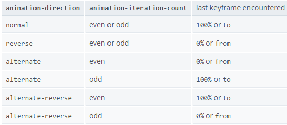
forwards:动画完成后呆在最后一帧,就是保持结束时的状态。这里的最后一帧取决于animation-direction和animation-iteration-count:
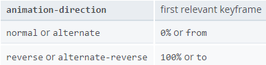
backwards:在animation-delay期间应用第一帧。保持animation-delay,第一帧取法如下:
both:根据animation-direction轮流应用forwards和backwards规则。
Note:forwards和backwards关键字都是有s的。
backwards和none的区别
还是上面的例子,只是增加了animation-fill-mode属性。
<style type="text/css">
 @-webkit-keyframes 'wobble' {
     0% {
        margin-left: 100px;
        background: green;
     }
     40% {
        margin-left: 150px;
        background: orange;
     }
     60% {
        margin-left: 75px;
        background: blue;
     }
     100% {
        margin-left: 100px;
        background: red;
     }
  }
    div{
   width: 50px;
     height: 50px;
     margin-left: 100px;
     background: blue;
     -webkit-animation-name:'wobble';
     -webkit-animation-duration: 10s;
     -webkit-animation-timing-function: ease-in-out;
     -webkit-animation-delay: 10s;
     -webkit-animation-iteration-count: 10;
     -webkit-animation-direction: alternate;
    /* -webkit-animation-fill-mode:none; /*动画开始为蓝色*/
     -webkit-animation-fill-mode:backwards; /*动画开始为绿色*/
  }
</style>
<div></div>
animation-fill-mode为none,则动画开始延时期间div为蓝色,backwards则动画开始延时期间div为绿色。
四、综合实例
【更新于2015/11/13】
举一个工作中做的例子:
效果如下,“买完回来领会员”是一个按钮,会左右晃动吸引用户注意力。用户hover上去点的时候动画停住让用户可以点击,不然点不到哈。
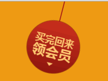
用到的图片

代码如下:
<!DOCTYPE HTML>
<html>
<head>
<meta charset="utf-8">
<title>animation by starof</title>
<style>
body{margin:0;}
.w4{
    height:200px;
    background-color:#ef9b14;
    position: relative;
}
/*绝对定位*/
.w4 .buy-icno{
    position:absolute;
    top:0;
    right:50%;
    margin-right:-472px;
    z-index:5;
}
/*infinite动画一直重复*/
.w4 .buy-icno{
    -webkit-animation:transform 2.5s linear infinite forwards;
    -moz-animation:transform 2.5s linear infinite forwards;
    -ms-animation:transform 2.5s linear infinite forwards;
    animation:transform 2.5s linear infinite forwards;
}

.w4 .buy-icno:hover{
    -webkit-animation-play-state:paused;
    -moz-animation-play-state:paused;
    -ms-animation-play-state:paused;
    animation-play-state:paused;
}
/*4个时间段,0%到25%,从最低点到左上;25%到50%,从左上到最低点;50%到70%,从最低点到右上;70%到100%,从右上到最低点*/
@-webkit-keyframes transform {
    0% {transform-origin:top center;-webkit-transform:rotate(0deg);transform:rotate(0deg);}
    25% {transform-origin:top center;-webkit-transform:rotate(20deg);transform:rotate(20deg);}
    50% {transform-origin:top center;-webkit-transform:rotate(0deg);transform:rotate(0deg);}
    75% {transform-origin:top center;-webkit-transform:rotate(-20deg);transform:rotate(-20deg);}
    100% {transform-origin:top center;-webkit-transform:rotate(0deg);transform:rotate(0deg);}
}
@keyframes transform {
    0% {-webkit-transform-origin:top center;transform-origin:top center;-webkit-transform:rotate(0deg);transform:rotate(0deg);}
    25% {-webkit-transform-origin:top center;transform-origin:top center;-webkit-transform:rotate(20deg);transform:rotate(20deg);}
    50% {-webkit-transform-origin:top center;transform-origin:top center;-webkit-transform:rotate(0deg);transform:rotate(0deg);}
    75% {-webkit-transform-origin:top center;transform-origin:top center;-webkit-transform:rotate(-20deg);transform:rotate(-20deg);}
    100% {-webkit-transform-origin:top center;transform-origin:top center;-webkit-transform:rotate(0deg);transform:rotate(0deg);}
}

</style>
</head>
<body>

<div class="w4">
<a href=""><img class="buy-icno" src="images/buy-icno1.png"></a>
</div>
</body>
</html>
原理:
- 动画分为4个时间段,0%到25%,从最低点到左上;25%到50%,从左上到最低点;50%到70%,从最低点到右上;70%到100%,从右上到最低点。
- 然后设置动画重复次数为infinite,即animation-iteration-count:infinite;一直重复。
- 鼠标hover上去设置animation-play-state:paused;动画暂停。
- 设置动画播放速度为线性animation-timing-function:linear,所以动画一直是匀速的。
- 设置animation-fill-mode:forwards;动画完成停在最后一帧,不过这个在本动画中没什么影响。
动画具体内容用的是transform变形动画,深入学习可参考css3中变形与动画(一)。
- 设置transform-origin:top center;变形的基点默认是中心点,我们需要将其设置为上面这个"绳子"不动,也就是图片的top center位置。
- 25%时到达左上;实现的时候就是顺时针旋转20度。同理75%是逆时针旋转20度。
- 0%,50%,100%时都说旋转0度,即不改变。
五、相关资源
看网上资料说做动画,尽量使用绝对定位,从而避免重绘重排问题:
动画十四原则: http://www.sunnyzhen.com/course/animation_principles/demo.html
动画十二原则:http://www.w3cplus.com/css3/animation-principles-for-the-web.html?utm_source=tuicool
传说中动画利器——css3 animation动画库,有很多基础动画
http://daneden.github.io/animate.css/
[github 地址:https://github.com/daneden/animate.css]
hover animation动画
http://leaverou.github.io/animatable/
css3 animation在线调节工具:
http://melonh.com/animationGenerator/ 基于chrome的插件,可以快速调节页面上的动画
http://isux.tencent.com/css3/tools.html 腾讯isux一款非常强大的动画工具
http://tid.tenpay.com/labs/css3_keyframes_calculator.html 财付通的帧动画调节工具
参考资源链接:
本文作者starof,因知识本身在变化,作者也在不断学习成长,文章内容也不定时更新,为避免误导读者,方便追根溯源,请诸位转载注明出处:http://www.cnblogs.com/starof/p/4585324.html有问题欢迎与我讨论,共同进步。
如果觉得本文对您有帮助~可以微信支持一下:


 浙公网安备 33010602011771号