CSS经典布局——圣杯布局
花了点力气,找到了圣杯布局的来源: https://alistapart.com/article/holygrail/
1.代码
废话不多说,先上全部的代码
<div id="header"></div>
<div id="container">
  <div id="center" class="column"></div>
  <div id="left" class="column"></div>
  <div id="right" class="column"></div>
</div>
<div id="footer"></div>
body {
  min-width: 550px;      /* 2x LC width + RC width */
}
#container {
  padding-left: 200px;   /* LC width */
  padding-right: 150px;  /* RC width */
}
#container .column {
  position: relative;
  float: left;
}
#center {
  width: 100%;
}
#left {
  width: 200px;          /* LC width */
  right: 200px;          /* LC width */
  margin-left: -100%;
}
#right {
  width: 150px;          /* RC width */
  margin-right: -150px;  /* RC width */
}
#footer {
  clear: both;
}
/*** IE6 Fix ***/
* html #left {
  left: 150px;           /* RC width */
}
-
详解
-
创建大体的布局
- 首先就是创建大体的布局,header、footer、container
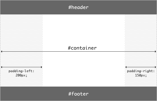
<div id="header"></div> <div id="container"></div> <div id="footer"></div>- 给 container 一个默认的padding-left 与 padding-right
#container {
  padding-left: 200px;   /* LC width */
  padding-right: 150px;  /* RC width */
}
这时候我们的网页的布局是这个样子的
-
增加左右列
<div id="header"></div>
<div id="container">
  <div id="center" class="column"></div>
  <div id="left" class="column"></div>
  <div id="right" class="column"></div>
</div>
<div id="footer"></div>
#container .column { float: left; } #center { width: 100%; } #left { width: 200px; /* LC width */ } #right { width: 150px; /* RC width */ } #footer { clear: both; }看效果图:

-
把左列放到左边合适的位置
-
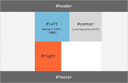
先把左边这一列浮动到center的左边
#left {
  width: 200px;        /* LC width */
  margin-left: -100%;
}
看效果图:
-
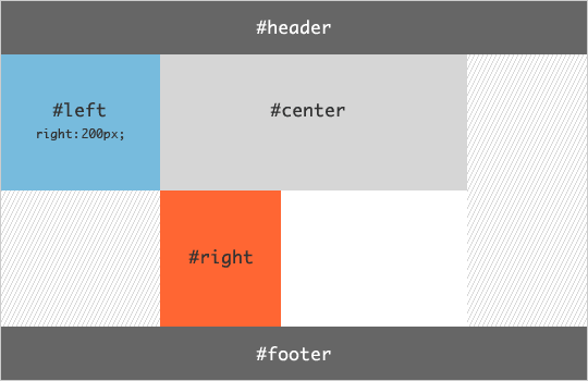
把 left 列放到最左边
#container .columns {
  float: left;
  position: relative;
}
#left {
  width: 200px;        /* LC width */
  margin-left: -100%;
  right: 200px;        /* LC width */
}
看效果图:
-
-
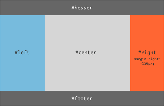
把右列放到右边合适的位置
#right {
  width: 150px;          /* RC width */
  margin-right: -150px;  /* RC width */
}
看效果图:
-
保守的设计(给 body 给一个最小值,防止浏览器调整宽度的时候变样)
body { min-width: 550px; /* 2x LC width + RC width */ } -
自己写的
<!DOCTYPE html>
<html lang="en">

<head>
  <meta charset="UTF-8">
  <meta name="viewport" content="width=device-width, initial-scale=1.0">
  <title>Document</title>
  <style>
    * {
      text-align: center;
      margin: 0;
    }

    .header {
      height: 100px;
      width: 100%;
      background: rgb(73, 196, 196);
    }

    body {
      height: 100%;
      width: 100%;
      background-color: rgb(140, 163, 163);
      min-width: 550px;
    }

    .container {
      padding-left: 250px;
      padding-right: 150px;
    }

    .left {
      right: 250px;
      width: 250px;
      height: 600px;
      background: chocolate;
      margin-left: -100%;
    }

    .right {
      width: 150px;
      height: 600px;
      background: coral;
      margin-right: -100%;
    }

    .center {
      height: 600px;
      width: 100%;
    }

    .column {
      position: relative;
      float: left;
    }

    .footer {
      clear: both;
      background-color: cornflowerblue;
      height: calc(100vh - 700px);
    }
  </style>
</head>

<body>
  <div class="header">Header</div>
  <div class="container">
    <div class="center column">Center</div>
    <div class="left column">Left</div>
    <div class="right column">Right</div>
  </div>
  <div class="footer">Footer</div>
</body>

</html>
-

 浙公网安备 33010602011771号