
效果图

练习代码
.face {
width: 600px;
height: 320px;
background: #FEE443;
position: relative;
}
.eye {
width: 60px;
height: 60px;
border-radius: 100%;
background: #222;
position: absolute;
}
.eye-l {
left: 105px;
top: 100px;
}
.eye-r {
right: 105px;
top: 100px;
}
.eye .bright {
width: 30px;
height: 30px;
position: absolute;
background: #fff;
border-radius: 50%;
}
.norse {
width: 0px;
height: 0px;
border: 18 px solid #000;
border-radius: 50%;
transform: translateX(-50%);
left: 50%;
top: 52%;
border-color: #000 #a9505000 transparent;
position: absolute;
}
.lip-l {
width: 50px;
height: 50px;
border: 4 px solid #000;
position: absolute;
background: red;
border-radius: 50%;
top: 66%;
left: 10%;
}
.lip-r {
width: 50px;
height: 50px;
border: 4 px solid #000;
position: absolute;
background: red;
border-radius: 50%;
top: 66%;
right: 10%;
}
.mouth {
overflow: hidden;
width: 150px;
height: 60px;
background: transparent;
position: absolute;
left: 50%;
bottom: 10%;
margin-left: -68px;
}
.mouth .a {
top: -30px;
position: absolute;
width: 60px;
height: 60px;
border: 6 px solid #222;
border-radius: 50%;
}
.mouth .b {
top: -30px;
position: absolute;
left: 65px;
width: 60px;
height: 60px;
border: 6 px solid #222;
border-radius: 50%;
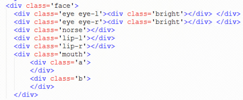
}html:
主要还是绝对定位还有圆角属性,比较基础,不喜勿喷。

 浙公网安备 33010602011771号