


数据可视化库Matplotlib的使用
1.常用函数
设置
plt.xlabel():对x轴增加文本标签
plt.ylabel():同理
plt.title(): 对图形整体增加文本标签
plt.text(): 在任意位置增加文本
绘图
plt.plot(x,y , fmt) :绘制坐标图
plt.boxplot(data, notch, position): 绘制箱形图
plt.bar(left, height, width, bottom) : 绘制条形图
plt.barh(width, bottom, left, height) : 绘制横向条形图
plt.polar(theta, r) : 绘制极坐标图
plt.pie(data, explode) : 绘制饼图
plt.scatter(x, y) :绘制散点图
plt.hist(x, bings, normed) : 绘制直方图
2.函数示例
2.1 绘制坐标图
plt.plot(x, y, format_string, **kwargs): x为x轴数据,可为列表或数组;y为y轴数据;format_string 为控制曲线的格式字符串, **kwargs 第二组或更多的(x, y, format_string)
format_string: 由 颜色字符、风格字符和标记字符组成。
颜色字符:‘b’蓝色 ;‘#008000’RGB某颜色;‘0.8’灰度值字符串
风格字符:‘-’实线;‘--’破折线; ‘-.’点划线; ‘:’虚线 ; ‘’‘’无线条
标记字符:‘.’点标记 ‘o’ 实心圈 ‘v’倒三角 ‘^’上三角
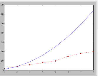
示例:plt.plot(x,x*2,'r', x,x*3,'y') 同时绘制两条曲线,一条红色,一条黄色
#绘制折线图
x=np.array([1,2,3,4,5,6,7,8])
y=np.array([2,4,6,8,10,15,18,20])
plt.plot(x,y,'r--o')  #纵坐标为上面y数组,折线格式为红色,虚线,实心点
plt.plot(x,x*x,'b-')  #纵坐标为X的平方,折线格式为蓝色,实线
plt.show()
2.2 绘制箱形图
plt.boxplot(data, notch, position):
2.3 绘制条形图
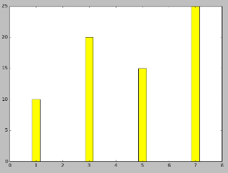
plt.bar(left, height, width, bottom) left 横坐标,height纵坐标,width为柱状图宽度,bottom值柱状图的底部起始值,默认为0
更多参数见:https://matplotlib.org/api/_as_gen/matplotlib.pyplot.bar.html
bar(left, height, width=0.8, bottom=None, hold=None, data=None, **kwargs)
#绘制条形图
x=[1,3,5,7]
y=[10,20,15,25]
plt.bar(left=x,height=y,width=0.3,color='yellow',align='center') #align='center' 横坐标值位于柱状图中间
plt.show()
2.4 绘制横向条形图
plt.barh(bottom, width, left, height) :
https://matplotlib.org/api/_as_gen/matplotlib.pyplot.barh.html#matplotlib.pyplot.barh
barh(bottom, width, height=0.8, left=None, hold=None, **kwargs):
2.5 绘制饼图
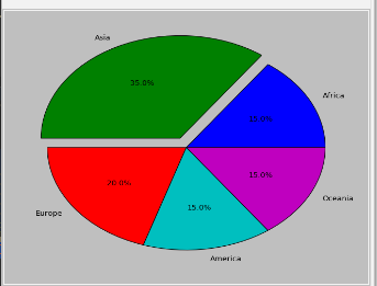
plt.pie(data, explode) : data为各项所占比例数据,explode表示突出(下面的0.1表示Asia这一块突出来0.1倍的半径)
更多参数:https://matplotlib.org/api/_as_gen/matplotlib.pyplot.pie.html
#绘制饼图
sizes=[15,35,20,15,15]
explode=(0,0.1,0,0,0)
labels=('Africa','Asia','Europe','America','Oceania')
plt.pie(sizes,explode=explode,labels=labels,autopct="%1.1f%%",shadow=False) #autopct数据显示格式,shadow为True表示二维饼图
plt.show()
2.6 绘制直方图
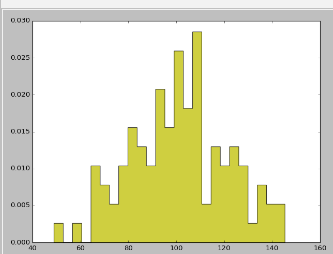
plt.hist(x, bings, normed) : bings表示直方图的个数,将取值范围划分为bings个区间;normed=1表示将出现频次进行了归一化, normed=0,则为频次;
更多参数:https://matplotlib.org/api/_as_gen/matplotlib.pyplot.hist.html
#绘制直方图

np.random.seed(0)
mu,sigma=100,20
a = np.random.normal(mu,sigma,size=100)
plt.hist(a,25,normed=1,histtype='stepfilled',facecolor='y',alpha=0.75) #histtype = ‘stepfilled’  表示去除条柱的黑色边框,alpha为透明度
plt.show()
plot 显示中文字符
pyplot并不默认支持中文显示,需要rcParams修改字体来实现
rcParams的属性:
‘font.family’ 用于显示字体的名字
‘font.style’ 字体风格,正常’normal’ 或斜体’italic’
‘font.size’ 字体大小,整数字号或者’large’ ‘x-small’
eg:
import matplotlib
matplotlib.rcParams[‘font.family’] = ‘STSong’
matplotlib.rcParams[‘font.size’] = 20
设定绘制区域的全部字体变成 华文仿宋,字体大小为20
中文显示2:只希望在某地方绘制中文字符,不改变别的地方的字体
在有中文输出的地方,增加一个属性: fontproperties
eg:
plt.xlabel(‘横轴:时间’, fontproperties = ‘simHei’, fontsize = 20)
https://matplotlib.org/3.0.2/contents.html


 浙公网安备 33010602011771号