


CSS 基础
三角形 梯形
https://www.cnblogs.com/linsinan/p/6928734.html
对齐 水平 & 垂直
div {
    width: 200px;
    height: 200px;
    text-align: center;
    align-content: center;
}
关键帧动画,过渡动画 ( 到 CSS 新值 的变化过程 )
        {
            animation: app-loading-spin 10s linear infinite;
            transition: background 10s ease, transform 10s ease;
        }

        .mydiv:hover {
            background: red;
            transform: scale(1.2);
        }

        @-webkit-keyframes app-loading-spin {
            0% {
                -webkit-transform: rotate(0deg);
                transform: rotate(0deg);
            }
            100% {
                -webkit-transform: rotate(360deg);
                transform: rotate(360deg);
            }
        }

        @keyframes app-loading-spin {
            0% {
                -webkit-transform: rotate(0deg);
                transform: rotate(0deg);
            }
            100% {
                -webkit-transform: rotate(360deg);
                transform: rotate(360deg);
            }
        }
矩阵变换
https://juejin.cn/post/7056428474021445645
各种形状
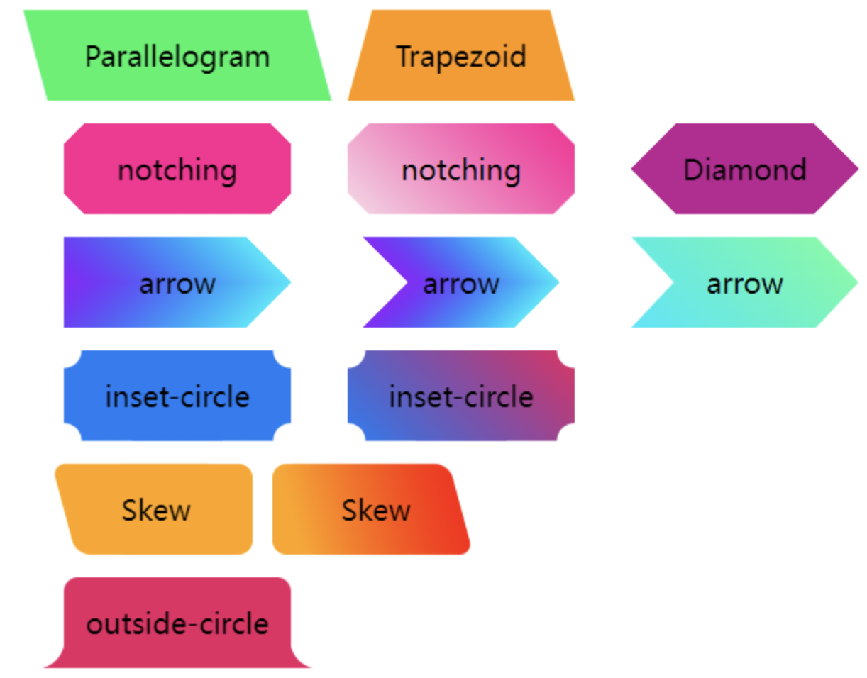
https://github.com/chokcoco/iCSS/issues/152

https://www.cnblogs.com/coco1s/p/18699898
mask: linear-gradient(45deg, #000 40%, transparent 60%)
0% ~ 40% 60% ~ 100%

 浙公网安备 33010602011771号