uniapp中自定义showModal样式,自定义弹窗
测试成功


页面中使用
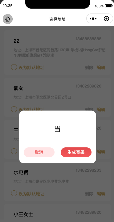
<show-modal></show-modal>
  this.$showModal({
      title: '',
      content: '当',
      cancelText:"取消",
      confirmText:"生成赛果",
      success(res) {
          if (res.confirm) {
            console.log('用户点击确定')
          } else if (res.cancel) {
            console.log('用户点击取消')
          }
      }
  })
在main.js中引入show-modal组件
import initModal from "@/components/show-modal/initModal.js"
import showModal from "@/components/show-modal/show-modal.vue"

initModal(Vue);
Vue.component('show-modal',showModal);
创建组件show-modal
组件名称show-modal.vue
<template>
    <view class="_showModal" v-show="show">
            <view class="_shade"></view>
            <view class="_modalBox">
                <view class="_modal">
                    <slot name="title">
                        <view class="title" v-show="title">{{title}}</view>
                    </slot>
                    <slot name="content">
                        <view class="content">{{content}}</view>
                    </slot>
                    <slot name="btn">
                        <view class="btnbox">
                            <view class="btn" :style="{color:cancelColor,background:cancelBackgroundColor}" @click.stop="clickBtn('cancel')">{{cancelText}}</view>
                            <view class="btn" :style="{color:confirmColor,background:confirmBackgroundColor}" @click.stop="clickBtn('confirm')">{{confirmText}}</view>
                        </view>
                    </slot>
                </view>
            </view>
    </view>
</template>

<script>
    export default {
        name:"show-modal",
        computed: {
                show(){
                    return this.$modalStore.state.show;
                },
                title(){
                    return this.$modalStore.state.title;
                },
                content(){
                    return this.$modalStore.state.content;
                },
                showCancel(){
                    return this.$modalStore.state.showCancel;
                },
                cancelText(){
                    return this.$modalStore.state.cancelText;
                },
                cancelColor(){
                    return this.$modalStore.state.cancelColor;
                },
                cancelBackgroundColor(){
                    return this.$modalStore.state.cancelBackgroundColor;
                },
                confirmText(){
                    return this.$modalStore.state.confirmText;
                },
                confirmColor(){
                    return this.$modalStore.state.confirmColor;
                },
                confirmBackgroundColor(){
                    return this.$modalStore.state.confirmBackgroundColor;
                }
        },
        methods:{
            closeModal(){
                this.$modalStore.commit('hideModal')
            },
            clickBtn(res){
                this.$modalStore.commit('hideModal')
                this.$modalStore.commit('success',res)
            }
        },
        beforeDestroy(){
            this.$modalStore.commit('hideModal')
        },
        data() {
            return {

            };
        }
    }
</script>

<style lang="scss" scoped>
._showModal{
        position: fixed;
        top: 0;
        left:0;
        width: 100%;
        height: 100%;
        z-index:10000;
        ._shade{
            width: 100%;
            height: 100%;
            position: absolute;
            top: 0;
            left: 0;
            background: #000;
            opacity: .6;
            z-index:11000;
        }
        ._modalBox{
            width: 100%;
            height: 100%;
            position: absolute;
            top: 0;
            left: 0;
            z-index:12000;
            display: flex;
            justify-content: center;
            align-items: center;
            ._modal{
                flex: none;
                width:250px;
                min-height:170px;
                background: #fff;
                border-radius: 16px;
                .title{
                    text-align: center;
                    font-size: 16px;
                    font-family: Source Han Sans CN;
                    font-weight: bold;
                    color: #333333;
                    margin-top: 20px;
                }
                .content{
                    min-height: 80px;
                    width: 86%;
                    margin:20px auto;
                    font-size: 20px;
                    font-family: Source Han Sans CN;
                    font-weight: 500;
                    color: #333333;
                    display: flex;
                    justify-content: center;
                    align-items: center;
                    text-align: center;
                }
                .btnbox{
                    display: flex;
                    width: 88%;
                    margin: auto;
                    margin-bottom: 20px;
                    flex-direction: row;
                    justify-content: space-between;
                    .btn{
                        width: 100px;
                        height: 32px;
                        border-radius: 16px;
                        display: flex;
                        justify-content: center;
                        align-items: center;
                        font-family: Source Han Sans CN;
                        font-weight: 400;
                    }
                }
            }
        }

}
</style>
创建initModal.js
import Vuex from 'vuex'
export default function initModal(v) {
  // 挂在store到全局Vue原型上
  v.prototype.$modalStore = new Vuex.Store({
    state: {
        show:false,
        title:"标题",
        content:'内容',
        showCancel:true,
        cancelText:"取消",
        cancelColor:"#ED4F4E",
        cancelBackgroundColor:"#FFE5E5",
        confirmText:"确定",
        confirmColor:"#FFFEFA",
        confirmBackgroundColor:"linear-gradient(0deg, #F65555 0%, #E54848 100%)",
        success:null,
    },
    mutations: {
        hideModal(state) {
            // 小程序导航条页面控制
            // #ifndef H5
            if(state.hideTabBar){
                wx.showTabBar();
            }
            // #endif
            state.show = false
        },
        showModal(state,data) {
            state = Object.assign(state,data)
            console.log(state);
            state.show = true
        },
        success(state,res) {
            let cb = state.success
            let resObj={
                cancel:false,
                confirm:false
            }
            res=="confirm"?resObj.confirm=true:resObj.cancel=true
            cb && cb(resObj)
        }
    }
  })
  v.prototype.$showModal = function (option) {
    if (typeof option === 'object') {
        // #ifndef H5
        if(option.hideTabBar){
            wx.hideTabBar();
        }
        // #endif

        v.prototype.$modalStore.commit('showModal', option)
    }else{
        throw "配置项必须为对象传入的值为:"+typeof option;
    }
  }
}
https://blog.csdn.net/m0_67391521/article/details/123431890
给心灵一个纯净空间,让思想,情感,飞扬!

 浙公网安备 33010602011771号