常用布局:左侧宽度固定,右侧宽度自适应
1.应用场景
左侧一个导航栏宽度固定,右侧内容根据用户浏览器窗口宽度进行自适应
2.思路
首先把这个问题分步解决,需要攻克以下两点:
1)让两个div并排到一行
2)让一个div宽度固定,另个div占据剩下宽度的空间
关于第一点,首先要明确,div属于块级元素,在文档标准流中单独占据一行。要想多个div在一行,就可以想办法让div脱离标准流,比如使用float或者absolute;
关于第二点,首先有一个宽度固定的div,另外自适应的div宽度是多少?首先这个宽度不能写“100%”,因为这里的100%是相对于第一个非静态祖先元素的,也就是说如果这样写,页面会出现整个页面宽度+左边固定列宽度的情形。那么对自适应宽度的div处理方法是不去设置它的width属性,浏览器会自动计算后让它占一行,接下来给他设置margin-left属性把左侧固定列空间空出即可。
3.实现
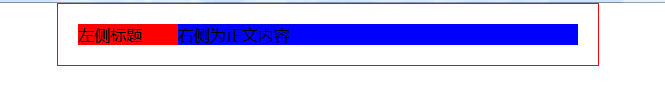
<!DOCTYPE html>
<html>
<head>
    <link rel="stylesheet" type="text/css" href="task001.css">
    <meta charset="utf-8">
    <title>左侧宽度固定,右侧宽度自适应</title>
    <style type="text/css">
    *{margin: 0; padding: 0;}
    .clearfix:after {
          clear: both;
          content: ".";
          display: block;
          height: 0;
          visibility: hidden;
        }
        .box{width: 500px; border: red 1px solid; margin: 0 auto; padding: 20px;}
    /*左固定列*/
    .fixedColumn{
        width: 100px;
        height: 100%;
        background-color: red;
        float: left;
        /*position: absolute;
        left: 0;*/
    }
    /*右自适应列*/
    .flexibleColumn{
        height: 100%;
        background-color: blue;
        margin-left: 40px;
    }
    </style>
</head>
<body>
<div class="box">
        <!-- 左侧固定列 -->
        <div class="fixedColumn">左侧标题</div>
        <!-- 右侧自适应宽度列 -->
        <div class="flexibleColumn">右侧为正文内容</div>

</body>
</html>
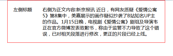
<!DOCTYPE html>
<html>
<head>
    <link rel="stylesheet" type="text/css" href="task001.css">
    <meta charset="utf-8">
    <title>左侧宽度固定,右侧宽度自适应</title>
    <style type="text/css">
    *{margin: 0; padding: 0;}
    .clearfix:after {
          clear: both;
          content: ".";
          display: block;
          height: 0;
          visibility: hidden;
        }
        .box{width: 500px; border: red 1px solid; margin: 0 auto; padding: 20px;}
    /*左固定列*/
    .fixedColumn{
        float: left; display: block; width: 100px;
        /*position: absolute;
        left: 0;*/
    }
    /*右自适应列*/
    .flexibleColumn{
         margin-left: 100px;
         display: block; margin-left:100px; *margin-left:107px;
    }
    </style>
</head>
<body>
    <div class="box">
            <!-- 左侧固定列 -->
            <div class="fixedColumn">左侧标题</div>
            <!-- 右侧自适应宽度列 -->
            <div class="flexibleColumn">右侧为正文内容:新京报讯 近日,有网友质疑《爱情公寓5》第8集中,美嘉展示的画作疑似抄袭了B站知名UP主的作品。1月15日晚,电视剧《爱情公寓》剧组及导演韦正在官方微博发表致歉书,称由于监管不力导致了这个错误,已对相关段落进行修改,更正的片段已经上线。</div>
    </div>
</body>
</html>
注:
1)fixedColumn 里注释的方法即绝对定位的实现方式,取消注释后把float那句注释掉,可以实现相同的效果
2)使用float需要注意清除浮动造成父元素塌陷的问题(这里不用清除,因为自适应列和固定列一样高,在标准流中可以撑起父元素)
4.小结
一定要自己实现试试,注意只有固定列脱离了文档流,自适应列还在文档流中!其他没什么要说的了,但是应该还有更好的方法,等我看到了一并总结过来~
七种实现左侧固定,右侧自适应两栏布局的方法http://www.imooc.com/article/24043?block_id=tuijian_wz
七种方案预览:https://zhuqingguang.github.io/vac-works/cssLayout/index1.html
给心灵一个纯净空间,让思想,情感,飞扬!

 浙公网安备 33010602011771号