CSS负边距margin的应用
原文
简书原文:https://www.jianshu.com/p/75a178e65207
相关文章
CSS负margin的影响:https://www.cnblogs.com/shcrk/p/9310834.html
大纲
1、实战:利用负边距在文档流中的作用——实现选项卡上边框消失
2、实战:利用负边距改变自身高度——实现下边框消失的效果
3、实战:利用负边距影响自身高度——实现多列等高布局
4、实战:利用负边距增加自身宽度——实现多列等宽布局
1、实战:利用负边距在文档流中的作用——实现选项卡上边框消失
<!--
第一个ul设置了margin-bottom为负值,将后一个ul往上方拉,覆盖之前的ul元素
给li设置背景色,利用背景色掩埋后一个ul的框,之所以可以这样,是因为li设置了
float,浮动在文档流上方,可以认为元素层级比后一个ul来的高,所以可以覆盖后一个ul,
并且后一个ul需得是block才可以
换句话说,后一个元素上拉,但是被前一个元素的子元素覆盖的情况,需要后一个元素
是div,前一个元素的子元素为浮动元素,这样的情况才可以实现
初始代码:
div{
width:100px;
height:100px;
vertical-align:bottom;
}
.box{
background:black;
}
.box1{
background:red;
}
.box3{
width:100%;
background:blue;
}
<div class="box">
<div class="box1">
</div>
</div>
<div class="box3">
</div>
效果代码
.box{
margin-bottom:-20px;/*将后一个div往上拉*/
}
.box1{
float:left;/*让子元素浮动,这样其背景色才可以覆盖后一个div的边框*/
}
-->
<!DOCTYPE html>
<html>
<head>
<meta http-equiv="Content-Type" content="text/html; charset=utf-8" />
<title>负margin的应用</title>
<style type="text/css">
* {padding:0;margin:0;}
li {list-style-type:none}
.demoTab{
width:400px;
margin:20px auto;
font:14px/1.5 Microsoft YaHei,verdana,Helvetica,Arial,sans-serif;
}
.demoTab .demoTabNav{
height:28px;
overflow:hidden;
*zoom:1;
margin-bottom:-1px;
border-left:1px solid red;
}
.demoTab .demoTabList{
float:left;
padding:0 22px;
line-height:28px;
border-right:1px solid red;
border-top:1px solid red;
font-weight:bold;
color:#005590;
text-align:center;
cursor:pointer;
}
.demoTab .demoTabList.current{
position:relative;
background:#EAF0FD;
}
.demoTabList:hover{
background:#EAF0FD;
}
.demoTab .demoTabBd{
border:1px solid red;
padding:15px;
}
.demoTab .demoTabContent{display:none;}
.demoTab .demoTabContent.current{display:block;}
</style>
</head>
<body>
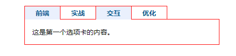
<div id="demoTab" class="demoTab">
<ul class="demoTabNav clearfix">
<li class="demoTabList current">前端</li>
<li class="demoTabList">实战</li>
<li class="demoTabList">交互</li>
<li class="demoTabList">优化</li>
</ul>
<ul class="demoTabBd">
<li class="demoTabContent current">这是第一个选项卡的内容。</li>
<li class="demoTabContent">这是第二个选项卡的内容。</li>
<li class="demoTabContent">这是第三个选项卡的内容。</li>
<li class="demoTabContent">这是第四个选项卡的内容。</li>
</ul>
</div>
</body>
</html>
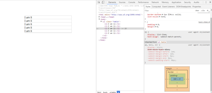
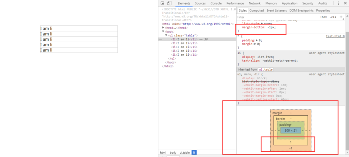
2、实战:利用负边距改变自身高度——实现下边框消失的效果
<!--
    通过添加负边距从而将盒子模型的内容的高度减少,负边距掩盖了下边框
-->
<!DOCTYPE html PUBLIC "-//W3C//DTD XHTML 1.0 Transitional//EN" "http://www.w3.org/TR/xhtml1/DTD/xhtml1-transitional.dtd">
<html xmlns="http://www.w3.org/1999/xhtml">
<head>
<meta charset="utf-8">
<meta http-equiv="X-UA-Compatible" content="IE=edge,chrome=1">
<title>负margin</title>
<style type="text/css">
*{
    padding:0;
    margin:0;
}
ul{
    margin:100px auto;
    width:300px;
}
ul.table{
        border:1px #ccc solid;
    }
    ul.table li{
        border-bottom: 1px #ccc solid;
        list-style: none;
    }

</style>
<ul class="table">
        <li>I am li</li>
        <li>I am li</li>
        <li>I am li</li>
        <li>I am li</li>
        <li>I am li</li>
    </ul>
</body>
</html>
3、实战:利用负边距影响自身高度——实现多列等高布局
<!DOCTYPE html PUBLIC "-//W3C//DTD XHTML 1.0 Transitional//EN" "http://www.w3.org/TR/xhtml1/DTD/xhtml1-transitional.dtd">
<html xmlns="http://www.w3.org/1999/xhtml">
<head>
<meta charset="utf-8">
<meta http-equiv="X-UA-Compatible" content="IE=edge,chrome=1">
<title>负margin</title>
<style type="text/css">
*{
    padding:0;
    margin:0;
}
.container{
        margin:0 auto;
        width: 100%;
        overflow: hidden;
    }
    .left{
        height: 50px;
        width: 33.33%;
        margin-bottom: -5000px;
        padding-bottom: 5000px;
        float: left;
        background-color: rgba(33, 114, 214, 0.8);
    }
    .main{
        height:100px;
        margin-bottom: -5000px;
        width: 33.33%;
        float: left;
        padding-bottom: 5000px;
        background-color: rgba(255, 82, 0, 0.8);
    }
    .right{
        height:30px;
        width: 33.33%;
        float: left;
        margin-bottom: -5000px;
        padding-bottom: 5000px;
        background-color: rgba(90, 243, 151, 0.8)
    }


</style>
<div class="container">
    <div class="left"> height:50px</div>
    <div class="main">height:100px</div>
    <div class="right">height:30px</div>
</div>
</body>
</html>

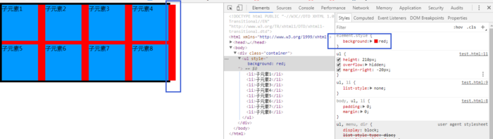
4、实战:利用负边距增加自身宽度——实现多列等宽布局
<!DOCTYPE html PUBLIC "-//W3C//DTD XHTML 1.0 Transitional//EN" "http://www.w3.org/TR/xhtml1/DTD/xhtml1-transitional.dtd">
<html xmlns="http://www.w3.org/1999/xhtml">
<head>
<meta charset="utf-8">
<meta http-equiv="X-UA-Compatible" content="IE=edge,chrome=1">
<title>负margin</title>
<style type="text/css">
body,ul,li{
    padding:0;
    margin:0;
}
ul,li{
    list-style:none;
}
.container{
    height:210px;
    width:460px;
    border:5px solid #000;
}
ul{
    height:210px;
    overflow:hidden;
    margin-right:-20px;
}/*一个负的margin-right,相当于把ul的宽度增加了20px*/
li{
    height:100px;
    width:100px;
    background:#09F;
    float:left;
    margin-right:20px;
    margin-bottom:10px;
}
</style>
<div class="container">
    <ul>
        <li>子元素1</li>
        <li>子元素2</li>
        <li>子元素3</li>
        <li>子元素4</li>
        <li>子元素5</li>
        <li>子元素6</li>
        <li>子元素7</li>
        <li>子元素8</li>
    </ul>
</div>
</body>
</html>

 浙公网安备 33010602011771号