
CSS的应用下
样式继承:
就是父类的颜色如果变了,子类下的div(或者其他属性)会继承父类的。
参考代码:
<!DOCTYPE html>
<html lang="en">
<head>
    <meta charset="UTF-8">
    <title>Title</title>

    <style>
        .c1{
            color: red;
        }

        p{
            color: green;
        }

        ul li a{
            color: RGB(200,122,111);
        }
    </style>

<body>


<div class="c1">
    DIV1
    <div class="c2">DIV2</div>
    <p>PPP</p>
    <a href="">click</a>
</div>


<ul>
    <li><a href="">11</a></li>
    <li><a href="">22</a></li>
    <li><a href="">2222</a></li>
    <li><a href="">222</a></li>
</ul>
</body>
</html>
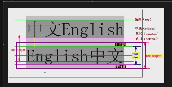
line-height:高度
文本行高,通俗地讲,文字高度加上文字上下的空白区域的高度(基于字体的高度)50%等于总高度
verticle-align属性:
设置元素内容的垂直对其方式,只对行内元素有效,对块级元素无效。
当文字和图片同时存在一行时,是利用底线来对其的,这样的话会造成对不齐的现象。
这时候需要在修改img的属性,在style里边调整:
img{
vertical-align:middle;(这里的middle也可以改为其他对齐方式)
}
也可以调像素,改为多少px就行。
其他的一些属性:
text-decoration:none       text-decoration 属性用来设置或删除文本的装饰。主要是用来删除链接的下划线

font-family: 'Lucida Bright'

font-weight: lighter/bold/border/

font-style: oblique

text-indent: 150px;      首行缩进150px

letter-spacing: 10px;  字母间距

word-spacing: 20px;  单词间距

text-transform: capitalize/uppercase/lowercase ; 文本转换,用于所有字句变成大写或小写字母,或每个单词的首字母大写
背景属性:
background-color(背景颜色)
background-image(背景图片)
background-repeat(填充方式:不填充,填充等)
background-position(定位位置)

background-color: cornflowerblue

background-image: url('1.jpg');

background-repeat: no-repeat;(repeat:平铺满)

background-position: right top(20px 20px);(距离左边多少,距离上面多少)
简写
 改变数字前面的标示符可以利用list-style:~~~;来改变
Display属性:可以把一个块级标签设置成内联标签
一共有这么几个属性:
none (常用,部分隐藏,部分显示,none的部分隐藏)
block(设置成块级,然后长宽高有效)
inline(设置成内联,设置的长宽高无效)
inline-block
css布局关键点:如何能够在一行显示多个可以调节长宽的元素。
一个标签即兼具了块级设备可以调长宽的属性,又具备了内联标签在一行显示的特性。
代码示例:
 <style>
        /*.c1{*/
            /*display: inline;*/
            /*width: 200px;*/
            /*height: 200px;*/
            /*background-color: green;*/

        /*}*/


        /*span{*/
            /*width: 200px;*/
            /*height: 200px;*/
            /*background-color: wheat;*/
            /*display: block;*/
        /*}*/


           .c1{
             width: 200px;
            height: 200px;
            background-color: wheat;
            display: inline-block;
           }

        .c2{
             width: 200px;
            height: 200px;
            background-color: goldenrod;
            display: inline-block;


           }


        .c3{
             width: 200px;
            height: 200px;
            background-color: green;
            display: inline-block;

           }

        span{
            margin-left: -4px;
        }


        .Myhide{
            display: none;
        }
     /*===========================*/

        .box{
            border:1px solid red;
        }
        .ico,.egon{
            display: inline-block;
        }


        .box:hover img{
            display: block;
        }

    </style>

</head>
<body>

<!--<div class="c1">DIV</div>-->

<!--<span>SPAN</span>-->


<span class="c1 Myhide">111</span>
<span class="c2">222</span>
<span class="c3">333</span>


<div class="box">
    <div class="text">hkjfdashfkas</div>
    <div class="text">
        <div class="ico">???????????????</div>
        <div class="egon"><img class="Myhide" src="egon.jpg" alt="" width="30px" height="30px"></div>
    </div>
</div>

</body>
图片一开始隐藏的,悬浮左边显示右边。
<style>
   .box{
            border:1px solid red;
        }
        .ico,.egon{
            display: inline-block;
        }


        .box:hover img{
            display: block;
        }

    </style>
<div class="box">
    <div class="text">hkjfdashfkas</div>
    <div class="text">
        <div class="ico">???????????????</div>
        <div class="egon"><img class="Myhide" src="egon.jpg" alt="" width="30px" height="30px"></div>
    </div>
</div>
清除浮动:
浮动元素上一个是浮动元素,紧贴着上一个。
上一个不是浮动元素,就在他的下面。


  <style>

        body{
            margin: 0;
        }
        .c1{
            width: 100px;
            height: 170px;
            background-color: #53868B;
            float: left;
            clear: left;
        }
        .c2{
            width: 200px;
            height: 70px;
            background-color: cornflowerblue;
            float: left;
            clear: both;
        }
        .c3{
            width: 300px;
            height: 120px;
            background-color: darkmagenta;
            float: left;
        }

            .c4{
            width: 300px;
            height: 300px;
            background-color: green;

        }
    </style>

</head>
<body>


<div class="c1"></div>
<div class="c2"></div>
<div class="c3"></div>
<!--<div class="c4"></div>-->


</body>
clear: both;
clear: left;
clear: right;
Position定位:
position之fix定位:做一个一直在某个位置的按钮(例如返回顶部)
代码:
   <style>
        .c1{

            width: 100%;
            height: 2000px;
            background-color: wheat;
        }
        .returnTop{
              width: 120px;
            height: 40px;
            background-color: gray;
            color: white;
            text-align: center;
            line-height: 40px;
            position: fixed;
            right: 20px;
            bottom: 20px ;
        }
    </style>

</head>
<body>

<div class="c1"></div>

<div class="returnTop">返回顶部</div>

</body>
清除浮动的应用:
float父级塌陷:
设置的子级元素不跟父级一样,然后就会出现高度不一样的情况(或其他情况)。
  <style>
        *{
            margin: 0;
        }
        .header{
            width: 100%;
            /*height: 80px;*/

            background-color: #53868B;
        }

        .header .item1,.header .item2{
            width: 60px;
            height: 80px;
            background-color: goldenrod;
            float: left;
        }

        .item2{
            background-color: green!important;
        }

        .header .item3{
            width: 60px;
            height: 50px;
            background-color: goldenrod;
            float: right;
        }
        .content{
            width: 100%;
            height: 300px;
            background-color: darkmagenta;
        }

        .clearfix:after{
            content: "";
            display: block;
            clear: both;
        }

    </style>

</head>
<body>


<div class="header clearfix">
    <div class="item1"></div>
    <div class="item2"></div>
    <div class="item3"></div>

</div>


<div class="content"></div>


</body>
relative与absolute定位:
fixed:完全脱离文档流,参照物是可视窗口,可以设置top,left,right,bottom
relative:不脱离文档流,参照物是自己原本的位置,可以设置top,left,right,bottom
absolute:完全脱离文档流,参照物已定位的父级标签,可以设置top,left,right,bottom
一般,
(1)给某些元素进行定位,设置absolute;
(2)改定位标签的父元素设置定位;
    <style>

        body{
            margin: 0;
        }
        .c1{
            width: 200px;
            height: 200px;
            background-color: #53868B;

        }
        .c2{
            width: 200px;
            height:200px;
            background-color: cornflowerblue;
            position: absolute;
            top:200px;
            left: 200px;

        }
        .c3{
            width: 200px;
            height: 200px;
            background-color: darkmagenta;

        }

        .box{
            position: relative;
        }


    </style>

</head>
<body>


<div class="c1"></div>
<div class="box"><div class="c2"></div></div>
<div class="c3"></div>
京东轮播图布局:
14

 浙公网安备 33010602011771号