烂翻译系列之MAUI——.NET MAUI Shell 浮出控件
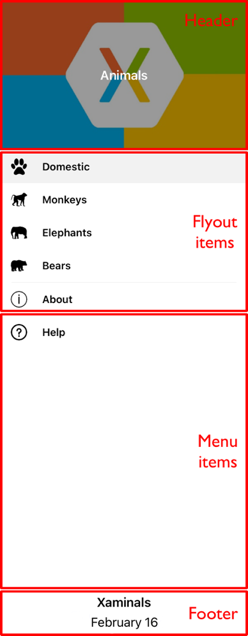
The navigation experience provided by .NET Multi-platform App UI (.NET MAUI) Shell is based on flyouts and tabs. A flyout is the optional root menu for a Shell app, and is fully customizable. It's accessible through an icon or by swiping from the side of the screen. The flyout consists of an optional header, flyout items, optional menu items, and an optional footer:
.NET 多平台应用 UI (.NET MAUI) Shell 提供的导航体验基于浮出控件和选项卡。 浮出控件是 Shell 应用的可选根菜单,可完全自定义。 可以通过图标或从屏幕的一侧轻扫来访问它。 浮出控件由可选标头、浮出控件项、可选菜单项和可选页脚组成:
Flyout items
浮出控件项
One or more flyout items can be added to the flyout, and each flyout item is represented by a FlyoutItem object. Each FlyoutItem object should be a child of the subclassed Shell object. Flyout items appear at the top of the flyout when a flyout header isn't present.
可以将一个或多个浮出控件项添加到浮出控件,每个浮出控件项都由 FlyoutItem 对象表示。 每个 FlyoutItem 对象应是 Shell 子类的对象。 当浮出控件标头不存在时,浮出控件项会显示在浮出控件顶部。
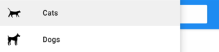
The following example creates a flyout containing two flyout items:
以下示例创建包含两个浮出控件项的浮出控件:
 1 <Shell xmlns="http://schemas.microsoft.com/dotnet/2021/maui"
 2        xmlns:x="http://schemas.microsoft.com/winfx/2009/xaml"
 3        xmlns:controls="clr-namespace:Xaminals.Controls"
 4        xmlns:views="clr-namespace:Xaminals.Views"
 5        x:Class="Xaminals.AppShell">
 6     <FlyoutItem Title="Cats"
 7                 Icon="cat.png">
 8        <Tab>
 9            <ShellContent ContentTemplate="{DataTemplate views:CatsPage}" />
10        </Tab>
11     </FlyoutItem>
12     <FlyoutItem Title="Dogs"
13                 Icon="dog.png">
14        <Tab>
15            <ShellContent ContentTemplate="{DataTemplate views:DogsPage}" />
16        </Tab>
17     </FlyoutItem>
18 </Shell>
The FlyoutItem.Title property, of type string, defines the title of the flyout item. The FlyoutItem.Icon property, of type ImageSource, defines the icon of the flyout item:
FlyoutItem.Title 属性,类型为 string,可定义浮出控件项的标题。 FlyoutItem.Icon 属性,类型为 ImageSource,可定义浮出控件项的图标:
In this example, each ShellContent object can only be accessed through flyout items, and not through tabs. This is because by default, tabs will only be displayed if the flyout item contains more than one tab.
在此示例中,只能通过浮出控件项访问每个 ShellContent,而不能通过选项卡进行访问。 这是因为默认情况下,仅当浮出控件项包含多个选项卡时才会显示选项卡。
Important 重要
In a Shell app, pages are created on demand in response to navigation. This is accomplished by using the DataTemplate markup extension to set the ContentTemplate property of each ShellContent object to a ContentPage object.
在 Shell 应用中,页面按需创建,以响应导航。 这是通过使用 DataTemplate 标记扩展将每个 ShellContent 对象的 ContentTemplate 属性设置为 ContentPage 对象来实现的。
Shell has implicit conversion operators that enable the Shell visual hierarchy to be simplified, without introducing additional views into the visual tree. This is possible because a subclassed Shell object can only ever contain FlyoutItem objects or a TabBar object, which can only ever contain Tab objects, which can only ever contain ShellContent objects. These implicit conversion operators can be used to remove the FlyoutItem and Tab objects from the previous example:
Shell 具有隐式转换运算符,可以简化 Shell 的视觉层次结构,而无需在可视化树中引入额外的视图。 这是可能的,因为Shell 子类对象只能包含 FlyoutItem 对象或 TabBar 对象,它们只能包含 Tab 对象,而此对象只能包含 ShellContent 对象。 这些隐式转换运算符可用于从前面的示例中删除 FlyoutItem 和 Tab 对象:
 1 <Shell xmlns="http://schemas.microsoft.com/dotnet/2021/maui"
 2        xmlns:x="http://schemas.microsoft.com/winfx/2009/xaml"
 3        xmlns:controls="clr-namespace:Xaminals.Controls"
 4        xmlns:views="clr-namespace:Xaminals.Views"
 5        x:Class="Xaminals.AppShell">
 6    <ShellContent Title="Cats"
 7                  Icon="cat.png"
 8                  ContentTemplate="{DataTemplate views:CatsPage}" />
 9    <ShellContent Title="Dogs"
10                  Icon="dog.png"
11                  ContentTemplate="{DataTemplate views:DogsPage}" />
12 </Shell>
This implicit conversion automatically wraps each ShellContent object in Tab objects, which are wrapped in FlyoutItem objects.
此隐式转换自动将每个 ShellContent 对象包装在 Tab 对象中,后者包装在 FlyoutItem 对象中。
Note 备注
All FlyoutItem objects in a subclassed Shell object are automatically added to the Shell.FlyoutItems collection, which defines the list of items that will be shown in the flyout.
Shell 子类对象中的所有 FlyoutItem 对象都会自动添加到 Shell.FlyoutItems 集合,该集合定义将在浮出控件中显示的项的列表。
Flyout display options
浮出控件显示选项
The FlyoutItem.FlyoutDisplayOptions property configures how a flyout item and its children are displayed in the flyout. This property should be set to a FlyoutDisplayOptions enumeration member:
FlyoutItem.FlyoutDisplayOptions 属性配置浮出控件项及其子级在浮出控件中的显示方式。 应将此属性设置为 FlyoutDisplayOptions 枚举成员:
AsSingleItem, indicates that the item will be visible as a single item. This is the default value of theFlyoutDisplayOptionsproperty. 指示项将作为单个项显示。 这是FlyoutDisplayOptions属性的默认值。AsMultipleItems, indicates that the item and its direct children will be visible in the flyout as a group of items. 表示项及其直接子级将以一组项的形式显示在浮出控件中。
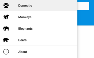
A flyout item for each Tab object within a FlyoutItem can be displayed by setting the FlyoutItem.FlyoutDisplayOptions property to AsMultipleItems:
通过将FlyoutItem.FlyoutDisplayOptions属性设置为 AsMultipleItems,可以显示 FlyoutItem 中每个 Tab 对象的浮出控件项:
 1 <Shell xmlns="http://schemas.microsoft.com/dotnet/2021/maui"
 2        xmlns:x="http://schemas.microsoft.com/winfx/2009/xaml"
 3        xmlns:controls="clr-namespace:Xaminals.Controls"
 4        xmlns:views="clr-namespace:Xaminals.Views"
 5        FlyoutHeaderBehavior="CollapseOnScroll"
 6        x:Class="Xaminals.AppShell">
 7
 8     <FlyoutItem FlyoutDisplayOptions="AsMultipleItems">
 9         <Tab Title="Domestic"
10              Icon="paw.png">
11             <ShellContent Title="Cats"
12                           Icon="cat.png"
13                           ContentTemplate="{DataTemplate views:CatsPage}" />
14             <ShellContent Title="Dogs"
15                           Icon="dog.png"
16                           ContentTemplate="{DataTemplate views:DogsPage}" />
17         </Tab>
18         <ShellContent Title="Monkeys"
19                       Icon="monkey.png"
20                       ContentTemplate="{DataTemplate views:MonkeysPage}" />
21         <ShellContent Title="Elephants"
22                       Icon="elephant.png"
23                       ContentTemplate="{DataTemplate views:ElephantsPage}" />
24         <ShellContent Title="Bears"
25                       Icon="bear.png"
26                       ContentTemplate="{DataTemplate views:BearsPage}" />
27     </FlyoutItem>
28
29     <ShellContent Title="About"
30                   Icon="info.png"
31                   ContentTemplate="{DataTemplate views:AboutPage}" />
32 </Shell>
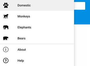
In this example, flyout items are created for the Tab object that's a child of the FlyoutItem object, and the ShellContent objects that are children of the FlyoutItem object. This occurs because each ShellContent object that's a child of the FlyoutItem object is automatically wrapped in a Tab object. In addition, a flyout item is created for the final ShellContent object, which is automatically wrapped in a Tab object, and then in a FlyoutItem object.
在此示例中,将为 Tab 对象(FlyoutItem 对象的子对象)以及 ShellContent 对象(FlyoutItem 对象的子对象)创建浮出控件项。 发生这种情况是因为作为 FlyoutItem 对象子对象的每个 ShellContent 对象自动包装在 Tab 对象中。 此外,将为最终的 ShellContent 对象创建浮出控件项,该对象自动包装在 Tab 对象中,然后包装在 FlyoutItem 对象中。
Note 备注
Tabs are displayed when a FlyoutItem contains more than one ShellContent object.
当 FlyoutItem 包含多个 ShellContent 对象时,将显示选项卡。
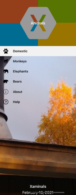
This results in the following flyout items:
这将生成以下浮出控件项:
Define FlyoutItem appearance
定义 FlyoutItem 外观
The appearance of each FlyoutItem can be customized by setting the Shell.ItemTemplate attached property to a DataTemplate:
将 Shell.ItemTemplate 附加属性设置为 DataTemplate 可自定义每个 FlyoutItem 的外观:
 1 <Shell ...>
 2     ...
 3     <Shell.ItemTemplate>
 4         <DataTemplate>
 5             <Grid ColumnDefinitions="0.2*,0.8*">
 6                 <Image Source="{Binding FlyoutIcon}"
 7                        Margin="5"
 8                        HeightRequest="45" />
 9                 <Label Grid.Column="1"
10                        Text="{Binding Title}"
11                        FontAttributes="Italic"
12                        VerticalTextAlignment="Center" />
13             </Grid>
14         </DataTemplate>
15     </Shell.ItemTemplate>
16 </Shell>
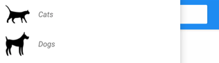
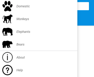
This example displays the title of each FlyoutItem object in italics:
此示例每个 FlyoutItem 对象的标题斜体显示:
Because Shell.ItemTemplate is an attached property, different templates can be attached to specific FlyoutItem objects.
Shell.ItemTemplate 是一个附加属性,因此可将不同的模板附加到特定的 FlyoutItem 对象。
Note 备注
Shell provides the Title and FlyoutIcon properties to the BindingContext of the ItemTemplate.
Shell 向 ItemTemplate 的 BindingContext 提供 Title 和 FlyoutIcon 属性。
In addition, Shell includes three style classes, which are automatically applied to FlyoutItem objects. For more information, see Style FlyoutItem and MenuItem objects.
此外,Shell 还包括三个可自动应用于 FlyoutItem 对象的样式类。 有关详细信息,请参阅样式 FlyoutItem 和 MenuItem 对象。
Default template for FlyoutItems
FlyoutItem 的默认模板
The default DataTemplate used for each FlyoutItem is shown below:
用于每个 FlyoutItem 的默认 DataTemplate 如下所示:
 1 <DataTemplate x:Key="FlyoutTemplate">
 2     <Grid x:Name="FlyoutItemLayout"
 3           HeightRequest="{OnPlatform 44, Android=50}"
 4           ColumnSpacing="{OnPlatform WinUI=0}"
 5           RowSpacing="{OnPlatform WinUI=0}">
 6         <VisualStateManager.VisualStateGroups>
 7             <VisualStateGroupList>
 8                 <VisualStateGroup x:Name="CommonStates">
 9                     <VisualState x:Name="Normal">
10                         <VisualState.Setters>
11                             <Setter Property="BackgroundColor"
12                                     Value="Transparent" />
13                         </VisualState.Setters>
14                     </VisualState>
15                     <VisualState x:Name="Selected">
16                         <VisualState.Setters>
17                             <Setter Property="BackgroundColor"
18                                     Value="{AppThemeBinding Light=Black, Dark=White}" />
19                         </VisualState.Setters>
20                     </VisualState>
21                 </VisualStateGroup>
22             </VisualStateGroupList>
23         </VisualStateManager.VisualStateGroups>
24         <Grid.ColumnDefinitions>
25             <ColumnDefinition Width="{OnPlatform Android=54, iOS=50, WinUI=Auto}" />
26             <ColumnDefinition Width="*" />
27         </Grid.ColumnDefinitions>
28         <Image x:Name="FlyoutItemImage"
29                Source="{Binding FlyoutIcon}"
30                VerticalOptions="Center"
31                HorizontalOptions="{OnPlatform Default=Center, WinUI=Start}"
32                HeightRequest="{OnPlatform Android=24, iOS=22, WinUI=16}"
33                WidthRequest="{OnPlatform Android=24, iOS=22, WinUI=16}">
34             <Image.Margin>
35                 <OnPlatform x:TypeArguments="Thickness">
36                     <OnPlatform.Platforms>
37                         <On Platform="WinUI"
38                             Value="12,0,12,0" />
39                     </OnPlatform.Platforms>
40                 </OnPlatform>
41             </Image.Margin>
42         </Image>
43         <Label x:Name="FlyoutItemLabel"
44                Grid.Column="1"
45                Text="{Binding Title}"
46                FontSize="{OnPlatform Android=14, iOS=14}"
47                FontAttributes="{OnPlatform iOS=Bold}"
48                HorizontalOptions="{OnPlatform WinUI=Start}"
49                HorizontalTextAlignment="{OnPlatform WinUI=Start}"
50                VerticalTextAlignment="Center">
51             <Label.TextColor>
52                 <OnPlatform x:TypeArguments="Color">
53                     <OnPlatform.Platforms>
54                         <On Platform="Android"
55                             Value="{AppThemeBinding Light=Black, Dark=White}" />
56                     </OnPlatform.Platforms>
57                 </OnPlatform>
58             </Label.TextColor>
59             <Label.Margin>
60                 <OnPlatform x:TypeArguments="Thickness">
61                     <OnPlatform.Platforms>
62                         <On Platform="Android"
63                             Value="20, 0, 0, 0" />
64                     </OnPlatform.Platforms>
65                 </OnPlatform>
66             </Label.Margin>
67             <Label.FontFamily>
68                 <OnPlatform x:TypeArguments="x:String">
69                     <OnPlatform.Platforms>
70                         <On Platform="Android"
71                             Value="sans-serif-medium" />
72                     </OnPlatform.Platforms>
73                 </OnPlatform>
74             </Label.FontFamily>
75         </Label>
76     </Grid>
77 </DataTemplate>
This template can be used for as a basis for making alterations to the existing flyout layout, and also shows the visual states that are implemented for flyout items.
此模板可用作对现有浮出控件布局进行更改的基础,此处还显示了为浮出控件项实现的视觉状态。
In addition, the Grid, Image, and Label elements all have x:Name values and so can be targeted with the Visual State Manager. For more information, see Set state on multiple elements.
此外,Grid、Image 和 Label 元素都具有 x:Name 值,因此它们可作为可视状态管理器的目标。 有关详细信息,请参阅设置多个元素的状态。
Note 备注
The same template can also be used for MenuItem objects.
此模板还被用于 MenuItem 对象。
Replace flyout content
替换浮出控件内容
Flyout items, which represent the flyout content, can optionally be replaced with your own content by setting the Shell.FlyoutContent bindable property to an object:
浮出项表示浮出控件内容,可以选择将其替换为你自己的内容,方法是将 Shell.FlyoutContent 可绑定属性设置为 object:
 1 <Shell ...
 2        x:Name="shell">
 3     ...
 4     <Shell.FlyoutContent>
 5         <CollectionView BindingContext="{x:Reference shell}"
 6                         IsGrouped="True"
 7                         ItemsSource="{Binding FlyoutItems}">
 8             <CollectionView.ItemTemplate>
 9                 <DataTemplate>
10                     <Label Text="{Binding Title}"
11                            TextColor="White"
12                            FontSize="18" />
13                 </DataTemplate>
14             </CollectionView.ItemTemplate>
15         </CollectionView>
16     </Shell.FlyoutContent>
17 </Shell>
In this example, the flyout content is replaced with a CollectionView that displays the title of each item in the FlyoutItems collection.
在此示例中,将浮出控件内容替换成了 CollectionView,它显示了 FlyoutItems 集合中每个项的标题。
Note 备注
The FlyoutItems property, in the Shell class, is a read-only collection of flyout items.
Shell 类中的 FlyoutItems 属性是浮出项的只读集合。
Alternatively, flyout content can be defined by setting the Shell.FlyoutContentTemplate bindable property to a DataTemplate:
此外,可以通过将 Shell.FlyoutContentTemplate 可绑定属性设置为 DataTemplate 来定义浮出控件内容:
 1 <Shell ...
 2        x:Name="shell">
 3     ...
 4     <Shell.FlyoutContentTemplate>
 5         <DataTemplate>
 6             <CollectionView BindingContext="{x:Reference shell}"
 7                             IsGrouped="True"
 8                             ItemsSource="{Binding FlyoutItems}">
 9                 <CollectionView.ItemTemplate>
10                     <DataTemplate>
11                         <Label Text="{Binding Title}"
12                                TextColor="White"
13                                FontSize="18" />
14                     </DataTemplate>
15                 </CollectionView.ItemTemplate>
16             </CollectionView>
17         </DataTemplate>
18     </Shell.FlyoutContentTemplate>
19 </Shell>
Important 重要
A flyout header can optionally be displayed above your flyout content, and a flyout footer can optionally be displayed below your flyout content. If your flyout content is scrollable, Shell will attempt to honor the scroll behavior of your flyout header.
可以选择在浮出控件内容上方显示浮出控件标头,还可以选择在浮出控件内容下方显示浮出控件页脚。 如果浮出控件内容可滚动,Shell 将尝试遵循浮出控件标头的滚动行为。
Menu items
菜单项
Menu items can be optionally added to the flyout, and each menu item is represented by a MenuItem object. The position of MenuItem objects on the flyout is dependent upon their declaration order in the Shell visual hierarchy. Therefore, any MenuItem objects declared before FlyoutItem objects will appear before the FlyoutItem objects in the flyout, and any MenuItem objects declared after FlyoutItem objects will appear after the FlyoutItem objects in the flyout.
菜单项可以选择性地添加到浮出控件,每个菜单项都由 MenuItem 对象表示。 浮出控件上的 MenuItem 对象的位置依赖于它们在 Shell 视觉层次结构中的声明顺序。 因此,FlyoutItem 对象之前声明的任何 MenuItem 对象将于 FlyoutItem 对象之前显示在浮出控件中,FlyoutItem 对象之后声明的任何 MenuItem 对象将于 FlyoutItem 对象之后显示在浮出控件中。
The MenuItem class has a Clicked event, and a Command property. Therefore, MenuItem objects enable scenarios that execute an action in response to the MenuItem being tapped.
MenuItem 类具有 Clicked 事件和 Command 属性。 因此,MenuItem 对象支持以下场景:执行一个操作以响应被点击的 MenuItem。
MenuItem objects can be added to the flyout as shown in the following example:
可将 MenuItem 对象添加到浮出控件,如下面的示例所示:
1 <Shell ...>
2     ...
3     <MenuItem Text="Help"
4               IconImageSource="help.png"
5               Command="{Binding HelpCommand}"
6               CommandParameter="https://learn.microsoft.com/dotnet/maui/fundamentals/shell" />
7 </Shell>
This example adds a MenuItem object to the flyout, beneath all the flyout items:
此示例在所有浮出控件项下方,向浮出控件添加一个 MenuItem 对象:
The MenuItem object executes an ICommand named HelpCommand, which opens the URL specified by the CommandParameter property in the system web browser.
MenuItem 对象执行名为 HelpCommand 的 ICommand,这将在系统 Web 浏览器中打开由 CommandParameter 属性指定的 URL。
Note 备注
The BindingContext of each MenuItem is inherited from the subclassed Shell object.
每个 MenuItem 的 BindingContext 都是从 Shell 子类对象继承的。
Define MenuItem appearance
定义 MenuItem 外观
The appearance of each MenuItem can be customized by setting the Shell.MenuItemTemplate attached property to a DataTemplate:
通过将 Shell.MenuItemTemplate 附加属性设置为 DataTemplate 可自定义每个 MenuItem 的外观:
 1 <Shell ...>
 2     <Shell.MenuItemTemplate>
 3         <DataTemplate>
 4             <Grid ColumnDefinitions="0.2*,0.8*">
 5                 <Image Source="{Binding Icon}"
 6                        Margin="5"
 7                        HeightRequest="45" />
 8                 <Label Grid.Column="1"
 9                        Text="{Binding Text}"
10                        FontAttributes="Italic"
11                        VerticalTextAlignment="Center" />
12             </Grid>
13         </DataTemplate>
14     </Shell.MenuItemTemplate>
15     ...
16     <MenuItem Text="Help"
17               IconImageSource="help.png"
18               Command="{Binding HelpCommand}"
19               CommandParameter="https://learn.microsoft.com/xamarin/xamarin-forms/app-fundamentals/shell" />
20 </Shell>
This example attaches the DataTemplate to each MenuItem object, displaying the title of the MenuItem object in italics:
此示例会将 DataTemplate 附加到每个 MenuItem 对象,以斜体显示 MenuItem 对象的标题:
Because Shell.MenuItemTemplate is an attached property, different templates can be attached to specific MenuItem objects.
Shell.MenuItemTemplate 是一个附加属性,因此可将不同的模板附加到特定的 MenuItem 对象。
Note 备注
Shell provides the Text and IconImageSource properties to the BindingContext of the MenuItemTemplate. You can also use Title in place of Text and Icon in place of IconImageSource which will let you reuse the same template for menu items and flyout items.
Shell 为 MenuItemTemplate 的 BindingContext 提供 Text 和 IconImageSource 属性。也可使用 Title 代替 Text 并使用 Icon 代替 IconImageSource,这样便可对菜单项和浮出控件项重复使用相同的模板。
The default template for FlyoutItem objects can also be used for MenuItem objects. For more information, see Default template for FlyoutItems.
FlyoutItem 对象的默认模板还可用于 MenuItem 对象。 有关详细信息,请参阅 FlyoutItem 的默认模板。
Style FlyoutItem and MenuItem objects
样式 FlyoutItem 和 MenuItem 对象
Shell includes three style classes, which are automatically applied to FlyoutItem and MenuItem objects. The style class names are FlyoutItemLabelStyle, FlyoutItemImageStyle, and FlyoutItemLayoutStyle.
Shell 包括三个可自动应用于 FlyoutItem 和 MenuItem 对象的样式类。它们是:FlyoutItemLabelStyle、FlyoutItemImageStyle 和 FlyoutItemLayoutStyle。
The following XAML shows an example of defining styles for these style classes:
下面的 XAML 显示了为这些样式类定义样式的示例:
 1 <Style TargetType="Label"
 2        Class="FlyoutItemLabelStyle">
 3     <Setter Property="TextColor"
 4             Value="Black" />
 5     <Setter Property="HeightRequest"
 6             Value="100" />
 7 </Style>
 8
 9 <Style TargetType="Image"
10        Class="FlyoutItemImageStyle">
11     <Setter Property="Aspect"
12             Value="Fill" />
13 </Style>
14
15 <Style TargetType="Layout"
16        Class="FlyoutItemLayoutStyle"
17        ApplyToDerivedTypes="True">
18     <Setter Property="BackgroundColor"
19             Value="Teal" />
20 </Style>
These styles will automatically be applied to FlyoutItem and MenuItem objects, without having to set their StyleClass properties to the style class names.
这些样式可自动应用于 FlyoutItem 和 MenuItem 对象,而无需将其 StyleClass 属性设置为样式类名。
In addition, custom style classes can be defined and applied to FlyoutItem and MenuItem objects. For more information about style classes, see Style classes.
此外,还可以定义自定义样式类并将其应用于 FlyoutItem 和 MenuItem 对象。 有关样式类的详细信息,请参阅 Style 类。
Flyout header
浮出控件头
The flyout header is the content that optionally appears at the top of the flyout, with its appearance being defined by an object that can be set with the Shell.FlyoutHeader bindable property:
浮出控件头是根据需要显示在浮出控件顶部的内容,可通过 Shell.FlyoutHeader 可绑定属性设置其外观:
1 <Shell ...>
2     <Shell.FlyoutHeader>
3         <controls:FlyoutHeader />
4     </Shell.FlyoutHeader>
5 </Shell>
The FlyoutHeader type is shown in the following example:
FlyoutHeader 类型如以下示例所示:
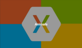
 1 <ContentView xmlns="http://schemas.microsoft.com/dotnet/2021/maui"
 2              xmlns:x="http://schemas.microsoft.com/winfx/2009/xaml"
 3              x:Class="Xaminals.Controls.FlyoutHeader"
 4              HeightRequest="200">
 5     <Grid BackgroundColor="Black">
 6         <Image Aspect="AspectFill"
 7                Source="store.jpg"
 8                Opacity="0.6" />
 9         <Label Text="Animals"
10                TextColor="White"
11                FontAttributes="Bold"
12                HorizontalTextAlignment="Center"
13                VerticalTextAlignment="Center" />
14     </Grid>
15 </ContentView>
This results in the following flyout header:
这将生成以下浮出控件头:
Alternatively, the flyout header appearance can be defined by setting the Shell.FlyoutHeaderTemplate bindable property to a DataTemplate:
还可以通过将 Shell.FlyoutHeaderTemplate 可绑定属性设置为 DataTemplate 的方式来定义浮出控件头的外观:
 1 <Shell ...>
 2     <Shell.FlyoutHeaderTemplate>
 3         <DataTemplate>
 4             <Grid BackgroundColor="Black"
 5                   HeightRequest="200">
 6                 <Image Aspect="AspectFill"
 7                        Source="store.jpg"
 8                        Opacity="0.6" />
 9                 <Label Text="Animals"
10                        TextColor="White"
11                        FontAttributes="Bold"
12                        HorizontalTextAlignment="Center"
13                        VerticalTextAlignment="Center" />
14             </Grid>
15         </DataTemplate>
16     </Shell.FlyoutHeaderTemplate>
17 </Shell>
By default, the flyout header will be fixed in the flyout while the content below will scroll if there are enough items. However, this behavior can be changed by setting the Shell.FlyoutHeaderBehavior bindable property to one of the FlyoutHeaderBehavior enumeration members:
默认情况下,在浮出控件中,浮出控件标头是固定的,在有足够的项时会滚动其下方的内容。 但是,将 Shell.FlyoutHeaderBehavior 可绑定属性设置为 FlyoutHeaderBehavior 枚举成员之一可以更改此行为:
Default– indicates that the default behavior for the platform will be used. This is the default value of theFlyoutHeaderBehaviorproperty. 指示使用平台的默认行为。 这是FlyoutHeaderBehavior属性的默认值。Fixed– indicates that the flyout header remains visible and unchanged at all times. 指示浮出控件头始终保持可见且不变。Scroll– indicates that the flyout header scrolls out of view as the user scrolls the items. 指示当用户滚动项时,浮出控件头将卷出视图外。CollapseOnScroll– indicates that the flyout header collapses to a title only, as the user scrolls the items. 指示当用户滚动项时,浮出控件头将仅折叠为标题。
The following example shows how to collapse the flyout header as the user scrolls:
以下示例演示如何在用户滚动时折叠浮出控件头:
1 <Shell ...
2        FlyoutHeaderBehavior="CollapseOnScroll">
3     ...
4 </Shell>
Flyout footer
浮出控件页脚
The flyout footer is the content that optionally appears at the bottom of the flyout, with its appearance being defined by an object that can be set with the Shell.FlyoutFooter bindable property:
浮出控件页脚是根据需要显示在浮出控件底部的内容,可通过 Shell.FlyoutFooter 可绑定属性设置其外观:
1 <Shell ...>
2     <Shell.FlyoutFooter>
3         <controls:FlyoutFooter />
4     </Shell.FlyoutFooter>
5 </Shell>
The FlyoutFooter type is shown in the following example:
FlyoutFooter 类型如以下示例所示:
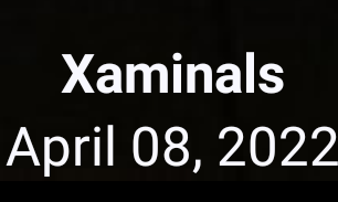
 1 <ContentView xmlns="http://schemas.microsoft.com/dotnet/2021/maui"
 2              xmlns:x="http://schemas.microsoft.com/winfx/2009/xaml"
 3              xmlns:sys="clr-namespace:System;assembly=netstandard"
 4              x:Class="Xaminals.Controls.FlyoutFooter">
 5     <StackLayout>
 6         <Label Text="Xaminals"
 7                TextColor="GhostWhite"
 8                FontAttributes="Bold"
 9                HorizontalOptions="Center" />
10         <Label Text="{Binding Source={x:Static sys:DateTime.Now}, StringFormat='{0:MMMM dd, yyyy}'}"
11                TextColor="GhostWhite"
12                HorizontalOptions="Center" />
13     </StackLayout>
14 </ContentView>
Important 重要
The previous XAML example defined a new XAML namespace named sys: xmlns:sys="clr-namespace:System;assembly=netstandard". This XAML namespace maps sys to the .NET System namespace. The mapping allows you to use the .NET types defined in that namespace, such as DateTime, in the XAML. For more information, see XAML Namespaces.
前面的 XAML 示例定义了一个名为 sys的新 XAML 命名空间:xmlns:sys="clr-namespace:System;assembly=netstandard"。 此 XAML 命名空间映射 sys 到.NET System 命名空间。 通过映射,可以使用该命名空间中定义的 .NET 类型,例如在 XAML 中使用 DateTime。 有关详细信息,请参阅 XAML 命名空间。
This results in the following flyout footer:
这将生成以下浮出控件页脚:
Alternatively, the flyout footer appearance can be defined by setting the Shell.FlyoutFooterTemplate property to a DataTemplate:
还可以通过将 Shell.FlyoutFooterTemplate 属性设置为 DataTemplate 的方式来定义浮出控件页脚的外观:
 1 <Shell ...>
 2     <Shell.FlyoutFooterTemplate>
 3         <DataTemplate>
 4             <StackLayout>
 5                 <Label Text="Xaminals"
 6                        TextColor="GhostWhite"
 7                        FontAttributes="Bold"
 8                        HorizontalOptions="Center" />
 9                 <Label Text="{Binding Source={x:Static sys:DateTime.Now}, StringFormat='{0:MMMM dd, yyyy}'}"
10                        TextColor="GhostWhite"
11                        HorizontalOptions="Center" />
12             </StackLayout>
13         </DataTemplate>
14     </Shell.FlyoutFooterTemplate>
15 </Shell>
The flyout footer is fixed to the bottom of the flyout, and can be any height. In addition, the footer never obscures any menu items.
浮出控件页脚固定在浮出控件的底部,可以是任意高度。 此外,页脚永远不会遮挡任何菜单项。
Flyout width and height
浮出控件宽度和高度
The width and height of the flyout can be customized by setting the Shell.FlyoutWidth and Shell.FlyoutHeight attached properties to double values:
可以通过将 Shell.FlyoutWidth 和 Shell.FlyoutHeight 附加属性设置为 double 值来自定义浮出控件的宽度和高度:
1 <Shell ...
2        FlyoutWidth="400"
3        FlyoutHeight="200">
4     ...
5 </Shell>
This enables scenarios such as expanding the flyout across the entire screen, or reducing the height of the flyout so that it doesn't obscure the tab bar.
这样就可以在整个屏幕上展开浮出控件,或者减小浮出控件的高度,以免遮挡选项卡栏。
Flyout icon
浮出控件图标
By default, Shell apps have a hamburger icon which, when pressed, opens the flyout. This icon can be changed by setting the Shell.FlyoutIcon bindable property, of type ImageSource, to an appropriate icon:
默认情况下,Shell 应用有一个汉堡图标,按下时会打开浮出控件。 可以通过设置类型为 ImageSource 的 Shell.FlyoutIcon 可绑定属性来更改图标:
1 <Shell ...
2        FlyoutIcon="flyouticon.png">
3     ...
4 </Shell>
Flyout background
浮出控件背景
The background color of the flyout can be set with the Shell.FlyoutBackgroundColor bindable property:
可以通过 Shell.FlyoutBackgroundColor 可绑定属性设置浮出控件的背景色:
1 <Shell ...
2        FlyoutBackgroundColor="AliceBlue">
3     ...
4 </Shell>
Note 备注
The Shell.FlyoutBackgroundColor can also be set from a Cascading Style Sheet (CSS). For more information, see .NET MAUI Shell specific properties.
还可以从级联样式表 (CSS) 设置 Shell.FlyoutBackgroundColor。 有关详细信息,请参阅 .NET MAUI Shell 特定属性。
Alternatively, the background of the flyout can be specified by setting the Shell.FlyoutBackground bindable property to a Brush:
也可以通过将 Shell.FlyoutBackground 可绑定属性设置为 Brush 来指定浮出控件的背景:
1 <Shell ...
2        FlyoutBackground="LightGray">
3     ...
4 </Shell>
In this example, the flyout background is painted with a light gray SolidColorBrush.
在此示例中,浮出控件背景是用浅灰色 SolidColorBrush 绘制的。
The following example shows setting the flyout background to a LinearGradientBrush:
以下示例演示如何将浮出控件背景设置为 LinearGradientBrush:
 1 <Shell ...>
 2     <Shell.FlyoutBackground>
 3         <LinearGradientBrush StartPoint="0,0"
 4                              EndPoint="1,1">
 5             <GradientStop Color="#8A2387"
 6                           Offset="0.1" />
 7             <GradientStop Color="#E94057"
 8                           Offset="0.6" />
 9             <GradientStop Color="#F27121"
10                           Offset="1.0" />
11         </LinearGradientBrush>
12     </Shell.FlyoutBackground>
13     ...
14 </Shell>
For more information about brushes, see .NET MAUI Brushes.
有关画笔的详细信息,请参阅 .NET MAUI 画笔。
Flyout background image
浮出控件背景图像
The flyout can have an optional background image, which appears beneath the flyout header and behind any flyout items, menu items, and the flyout footer. The background image can be specified by setting the FlyoutBackgroundImage bindable property, of type ImageSource, to a file, embedded resource, URI, or stream.
浮出控件可以有一个可选背景图像,该图像显示在浮出控件标头的下方,并且位于任何浮出控件项、菜单项和浮出控件页脚的后面。 可以通过将类型为 ImageSource 的 FlyoutBackgroundImage 可绑定属性设置为文件、嵌入的资源、URI 或流来指定背景图像。
The aspect ratio of the background image can be configured by setting the FlyoutBackgroundImageAspect bindable property, of type Aspect, to one of the Aspect enumeration members:
可以通过将 FlyoutBackgroundImageAspect 可绑定属性设置为 Aspect 枚举成员之一来配置背景图像的纵横比:
AspectFill- clips the image so that it fills the display area while preserving the aspect ratio. 剪裁图像,使其填充显示区域,同时保持纵横比。AspectFit- letterboxes the image, if required, so that the image fits into the display area, with blank space added to the top/bottom or sides depending on whether the image is wide or tall. This is the default value of theFlyoutBackgroundImageAspectproperty. 根据需要对图像上下加框,以使其适合显示区域,并根据图像的宽度或高度,将空白添加到顶部/底部或侧边。 这是FlyoutBackgroundImageAspect属性的默认值。Fill- stretches the image to completely and exactly fill the display area. This may result in image distortion. 拉伸图像,以完全、准确填充显示区域。 这可能会导致图像失真。
The following example shows setting these properties:
以下示例演示如何设置这些属性:
1 <Shell ...
2        FlyoutBackgroundImage="photo.jpg"
3        FlyoutBackgroundImageAspect="AspectFill">
4     ...
5 </Shell>
This results in a background image appearing in the flyout, below the flyout header:
这将使背景图像显示在浮出控件中,位于浮出控件头下方:
Flyout backdrop
浮出控件背景
The backdrop of the flyout, which is the appearance of the flyout overlay, can be specified by setting the Shell.FlyoutBackdrop attached property to a Brush:
通过将 Shell.FlyoutBackdrop 附加属性设置为 Brush,可以指定浮出控件的背景(即浮出控件叠加层的外观):
1 <Shell ...
2        FlyoutBackdrop="Silver">
3     ...
4 </Shell>
In this example, the flyout backdrop is painted with a silver SolidColorBrush.
在此示例中,浮出控件背景是用银色 SolidColorBrush 绘制的。
Important 重要
The FlyoutBackdrop attached property can be set on any Shell element, but will only be applied when it's set on Shell, FlyoutItem, or TabBar objects.
FlyoutBackdrop附加属性可以在任何 Shell 元素上设置,但仅在对 Shell、 FlyoutItem 或 TabBar 对象设置时才会应用。
The following example shows setting the flyout backdrop to a LinearGradientBrush:
以下示例演示了如何将浮出控件背景设置为 LinearGradientBrush:
 1 <Shell ...>
 2     <Shell.FlyoutBackdrop>
 3         <LinearGradientBrush StartPoint="0,0"
 4                              EndPoint="1,1">
 5             <GradientStop Color="#8A2387"
 6                           Offset="0.1" />
 7             <GradientStop Color="#E94057"
 8                           Offset="0.6" />
 9             <GradientStop Color="#F27121"
10                           Offset="1.0" />
11         </LinearGradientBrush>
12     </Shell.FlyoutBackdrop>
13     ...
14 </Shell>
For more information about brushes, see .NET MAUI Brushes.
有关画笔的详细信息,请参阅 .NET MAUI 画笔。
Flyout behavior
浮出控件行为
The flyout can be accessed through the hamburger icon or by swiping from the side of the screen. However, this behavior can be changed by setting the Shell.FlyoutBehavior attached property to one of the FlyoutBehavior enumeration members:
访问浮出控件的方式有两种:按汉堡图标或从屏幕一侧轻扫。 但是,将 Shell.FlyoutBehavior 附加属性设置为 FlyoutBehavior 枚举成员之一可以更改此行为:
Disabled– indicates that the flyout can't be opened by the user. 指示用户无法打开浮出控件。Flyout– indicates that the flyout can be opened and closed by the user. This is the default value for theFlyoutBehaviorproperty. 指示用户可以打开和关闭浮出控件。 这是FlyoutBehavior属性的默认值。Locked– indicates that the flyout can't be closed by the user, and that it doesn't overlap content. 指示用户无法关闭浮出控件,并且不会重叠内容。
The following example shows how to disable the flyout:
以下示例演示如何禁用浮出控件:
1 <Shell ...
2        FlyoutBehavior="Disabled">
3     ...
4 </Shell>
Note 备注
The FlyoutBehavior attached property can be set on Shell, FlyoutItem, ShellContent, and page objects, to override the default flyout behavior.
可以在 Shell、FlyoutItem、ShellContent 和页面对象上设置 FlyoutBehavior 附加属性以替代默认浮出控件行为。
Flyout vertical scroll
浮出控件垂直滚动
By default, a flyout can be scrolled vertically when the flyout items don't fit in the flyout. This behavior can be changed by setting the Shell.FlyoutVerticalScrollMode bindable property to one of the ScrollMode enumeration members:
默认情况下,当浮出控件中容纳不下浮出控件项时,可以垂直滚动浮出控件。 将 Shell.FlyoutVerticalScrollMode 可绑定属性设置为 ScrollMode 枚举成员之一可以更改此行为:
Disabled– indicates that vertical scrolling will be disabled. 指示将禁用垂直滚动。Enabled– indicates that vertical scrolling will be enabled. 指示将启用垂直滚动。Auto– indicates that vertical scrolling will be enabled if the flyout items don't fit in the flyout. This is the default value of theFlyoutVerticalScrollModeproperty. 指示当浮出控件中容纳不下浮出控件项时,将自动启用垂直滚动。 这是FlyoutVerticalScrollMode属性的默认值。
The following example shows how to disable vertical scrolling:
以下示例演示如何禁用垂直滚动:
1 <Shell ...
2        FlyoutVerticalScrollMode="Disabled">
3     ...
4 </Shell>
FlyoutItem selection
FlyoutItem 选择
When a Shell app that uses a flyout is first run, the Shell.CurrentItem property will be set to the first FlyoutItem object in the subclassed Shell object. However, the property can be set to another FlyoutItem, as shown in the following example:
首次运行使用浮出控件的 Shell 应用时,该Shell.CurrentItem属性将设置为Shell子类对象中的第一个FlyoutItem对象。 但是,此属性可以设置为另一个 FlyoutItem,如以下示例所示:
 1 <Shell ...
 2        CurrentItem="{x:Reference aboutItem}">
 3     <FlyoutItem FlyoutDisplayOptions="AsMultipleItems">
 4         ...
 5     </FlyoutItem>
 6     <ShellContent x:Name="aboutItem"
 7                   Title="About"
 8                   Icon="info.png"
 9                   ContentTemplate="{DataTemplate views:AboutPage}" />
10 </Shell>
This example sets the CurrentItem property to the ShellContent object named aboutItem, which results in it being selected and displayed. In this example, an implicit conversion is used to wrap the ShellContent object in a Tab object, which is wrapped in a FlyoutItem object.
此示例将 CurrentItem 属性设置为名为aboutItem的 ShellContent 对象,这将导致选中并显示该对象。 在此示例中,隐式转换用于将 ShellContent 对象包装在 Tab 对象中,Tab 对象包装在 FlyoutItem 对象中。
The equivalent C# code, given a ShellContent object named aboutItem, is:
假设 ShellContent 名为 aboutItem,则等效的 C# 代码为:
1 CurrentItem = aboutItem;
In this example, the CurrentItem property is set in the subclassed Shell class. Alternatively, the CurrentItem property can be set in any class through the Shell.Current static property:
在此示例中,CurrentItem 属性在Shell 子类中设置。此外,可以通过 Shell.Current静态属性在任何类中设置 CurrentItem 属性:
1 Shell.Current.CurrentItem = aboutItem;
Note 备注
An app may enter a state where selecting a flyout item is not a valid operation. In such cases, the FlyoutItem can be disabled by setting its IsEnabled property to false. This will prevent users from being able to select the flyout item.
应用程序可能会进入一个(选择浮出控件项不是有效操作的)状态。在这种情况下,可以通过将 FlyoutItem 的 IsEnabled 属性设置为 false 来对其进行禁用。 这会阻止用户选择浮出控件项。
FlyoutItem visibility
FlyoutItem 可见性
Flyout items are visible in the flyout by default. However, an item can be hidden in the flyout with the FlyoutItemIsVisible property, and removed from the flyout with the IsVisible property:
浮出项在浮出控件中默认可见。 但是,可以使用 FlyoutItemIsVisible 属性将项隐藏,并使用 IsVisible 属性将其从浮出控件中删除:
FlyoutItemIsVisible, of typebool, indicates if the item is hidden in the flyout, but is still reachable with theGoToAsyncnavigation method. The default value of this property istrue. 类型为bool的FlyoutItemIsVisible指示项是否已隐藏,但仍可以通过GoToAsync导航方法进行访问。 此属性的默认值为true。IsVisible, of typebool, indicates if the item should be removed from the visual tree and therefore not appear in the flyout. Its default value istrue. 类型为bool的IsVisible指示是否应从可视化树中移除项,从而不在浮出控件中显示。 它的默认值为true。
The following example shows hiding an item in the flyout:
以下示例演示如何在浮出控件中隐藏项:
1 <Shell ...>
2     <FlyoutItem ...
3                 FlyoutItemIsVisible="False">
4         ...
5     </FlyoutItem>
6 </Shell>
Note 备注
There's also a Shell.FlyoutItemIsVisible attached property, which can be set on FlyoutItem, MenuItem, Tab, and ShellContent objects.
还有一个Shell.FlyoutItemIsVisible附加属性,可以在 FlyoutItem、 MenuItem、 Tab 和 ShellContent 对象上设置。
Open and close the flyout programmatically
以编程方式打开和关闭浮出控件
The flyout can be programmatically opened and closed by setting the Shell.FlyoutIsPresented bindable property to a boolean value that indicates whether the flyout is currently open:
可以通过将 Shell.FlyoutIsPresented 可绑定属性设置为指示浮出控件当前是否处于打开状态的 boolean 值来以编程方式打开和关闭浮出控件:
1 <Shell ...
2        FlyoutIsPresented="{Binding IsFlyoutOpen}">
3 </Shell>
Alternatively, this can be performed in code:
也可以在代码中执行此操作:
1 Shell.Current.FlyoutIsPresented = false;


 浙公网安备 33010602011771号