

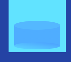
罐液位变化组件
接上篇
<template>
  <div class="jarBox">
    <!-- 罐子整体+盖 -->
    <div class="bar">
      <!-- 罐顶 -->
      <div class="barBefore"></div>
    </div>
    <!-- 里面液体整体 -->
    <div
      class="barEntity"
      :style="{
        height: number + '%',
        background:
          'linear-gradient(' + barEntityColor[0] + ',' + barEntityColor[1],
      }"
    >
      <!-- 液体顶 -->
      <div class="barEntityBefore"></div>
      <!-- 液体底 -->
      <div
        class="barEntityAfter"
        :style="{
          background:
            'linear-gradient(to bottom left,' +
            barEntityAfterColor[0] +
            ' 10%,' +
            barEntityAfterColor[1],
        }"
      ></div>
    </div>
  </div>
</template>
<script>
export default {
  name: "jarHomeBox",
  components: {},
  props: {
    number: {
      type: Number,
      default: 0,
    },
    // 液体颜色
    barEntityColor: {
      type: Array,
      default: () => {
        return ["rgba(218, 34, 255, 0.3)", "#9733EE"];
      },
    },
    // 液体底或罐底颜色
    barEntityAfterColor: {
      type: Array,
      default: () => {
        return ["rgba(218, 34, 255, 0.5)", "#9733EE"];
      },
    },
  },
  mounted() {},
};
</script>

<style scoped lang="scss">
.jarBox {
  position: absolute;
  top: 24%;
  left: 10%;
  height: 68%;
  width: 80%;
  z-index: 9;

  // 罐子整体
  .bar {
    position: relative;
    height: 100%;
    width: 100%;
    background: transparent;
    // 罐顶
    .barBefore {
      position: absolute;
      top: -10px;
      content: "";
      width: 100%;
      height: 18px;
      border-radius: 50%;
      z-index: 3;
    }
  }
  // 液体
  .barEntity {
    position: absolute;
    bottom: 0;
    width: 100%;
    height: 0;
    z-index: 2;
    transition: height 1s ease; //简简单单过度效果就可以解决,搞了那么一圈用动画,真费劲
    // 液体顶
    .barEntityBefore {
      position: absolute;
      top: -16px;
      // content: "";
      width: 100%;
      height: 30px;
      border-radius: 50%;
      //background: url("~@/assets/images/screen/barWater.png") no-repeat;
      //background-size: 100% 100%;
background: #08b9ff;
      z-index: 2;
    }
    // 罐底
    .barEntityAfter {
      position: absolute;
      bottom: -11px;
      content: "";
      width: 100%;
      height: 24px;
      border-radius: 50%;
      z-index: 1;
    }
  }
}
</style>

 浙公网安备 33010602011771号