
微信小程序开发入门学习(2):小程序的布局
概述
小程序的布局采用了和Css3中相同的 flex(弹性布局)方式,使用方法也类似(只是属性名不同而已).
水平排列
默认是从左向右水平依次放置组件,从上到下依次放置组件。
任何可视组件都需要使用样式来设置自身的属性,并完成相应的布局。
在小程序中,可以使用两种方式设置样式,一种是 class 属性,另外一种是 style 属性,跟HTML中一样。
前者需要指定在 wxss 文件中定义的样式,后者允许直接在组件中定义样式属性。
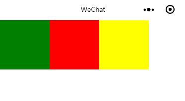
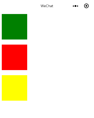
例如,如果要水平放置三个 view 组件,可以在 wxml 文件中使用下面的代码。
<!-- index.wxml -->
<view class='flex-wrp' style='flex-direction:row'>
  <view class='flex-item bc_green'></view>
  <view class='flex-item bc_red'></view>
  <view class='flex-item bc_yellow'></view>
</view>
index.wxss中使用
.flex-wrp{
  background-color: #fff;
  /* 弹性布局 */
  display: flex;
  height: 100px;
}
.flex-item{
  width: 100px;
  height: 100px;
}
.bc_green{
  background-color: green;
}
.bc_red{
  background-color: red;
}
.bc_yellow{
  background-color: yellow;
}
效果:
也可以把 flex-direction:row 放在样式中
在index.wxss中添加一个
.flex_row{
  /* 排列方式 */
  flex-direction: row;
}
index.wxml改为:
<!-- index.wxml -->
<view class='flex-wrp flex_row'>
  <view class='flex-item bc_green'></view>
  <view class='flex-item bc_red'></view>
  <view class='flex-item bc_yellow'></view>
</view>
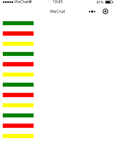
如果放置了多个 view 会怎么样呢?
从 flex-item 样式可知,每个 view 的尺寸是 100*100,单位是像素(px),如果放置过多,可能会发生如下两种情况。
1.压缩view的宽度
2.折行
第一种情况:
<!-- index.wxml -->
<view class='flex-wrp flex_row'>
  <view class='flex-item bc_green'></view>
  <view class='flex-item bc_red'></view>
  <view class='flex-item bc_yellow'></view>
  <view class='flex-item bc_green'></view>
  <view class='flex-item bc_red'></view>
  <view class='flex-item bc_yellow'></view>
  <view class='flex-item bc_green'></view>
  <view class='flex-item bc_red'></view>
  <view class='flex-item bc_yellow'></view>
</view>
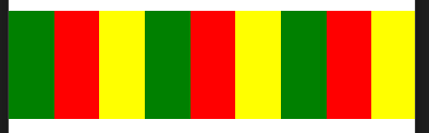
发生了宽度压缩全部挤在了一行上
为了不让它被压缩 要让它自动换行就要采用 折行
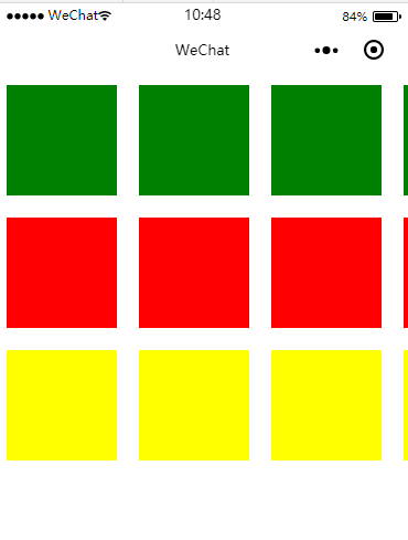
水平折行排列
要想让 view 折行,只需要加一个 flex-wrap:wrap 即可,代码如下:
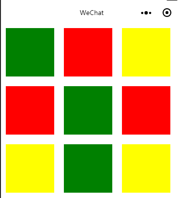
<!-- index.wxml -->
<view class='flex-wrp flex_row' style='flex-wrap:wrap'>
  <view class='flex-item bc_green'></view>
  <view class='flex-item bc_red'></view>
  <view class='flex-item bc_yellow'></view>
    <view class='flex-item bc_red'></view>
  <view class='flex-item bc_green'></view>
  <view class='flex-item bc_red'></view>
  <view class='flex-item bc_yellow'></view>
  <view class='flex-item bc_green'></view>
  <view class='flex-item bc_yellow'></view>
</view>
为了让色块显示之间不那么紧凑 改动了一下index.wxss中的样式
.flex-item{
  width: 100px;
  height: 100px;
  margin: 10px;
}
效果如下:
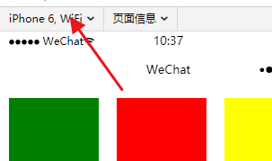
选择不同的手机模拟器(如 iPhone6 Plus、iPhone5),效果可能是不同的,因为每一行能显示的彩色方块数量是不同的。
垂直排列
只需要将 flex-direction 的属性值设为 column即可
<!-- index.wxml -->
<view class='flex-wrp flex_column'>
  <view class='flex-item bc_green'></view>
  <view class='flex-item bc_red'></view>
  <view class='flex-item bc_yellow'></view>
</view>
index.wxss做以下更改.flex-wrp{
  background-color: #fff;
  /* 弹性布局 */
  display: flex;
  height: 400px; /* 更改 */
}

.flex_column{ /* 新增 */
  flex-direction: column;
}
效果如下:
如果在垂直方向上view过多也会发生压缩:
所有的子 view 都被压缩在垂直高度 300 px 的空间内(宽度未改变).
要使其折列跟折行的方式一样 只需加上 flex-wrap:wrap; 属性
.flex_column{
  flex-direction: column;
  flex-wrap: wrap;/*新增*/
}
折列排列是在第2列、第3列从上到下依次排列的
水平排列对齐方式
默认对齐方式为从左到右
左对齐,在 style 属性中加入 justify-content: flex-start
右对齐:flex-end
居中对齐:center
代码如下:
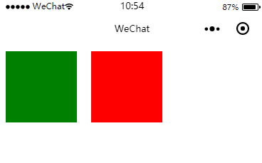
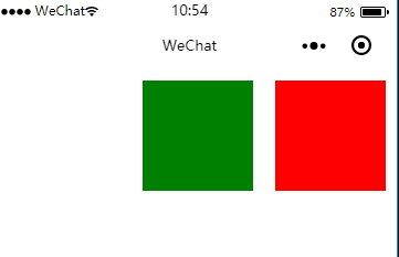
左对齐
<!-- index.wxml -->
<view class='flex-wrp flex_row' style='justify-content:flex-start;'>
  <view class='flex-item bc_green'></view>
  <view class='flex-item bc_red'></view>
</view>
效果如下:
左对齐
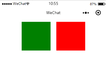
右对齐
居中对齐:
垂直排列对齐方式
\对于垂直排列来说,需要使用 align-items 属性(默认是左对齐),而不是 justify-content 属性,这两个属性的取值基本上相同。
右对齐:
<!-- index.wxml -->
<view class='flex-wrp flex_column' style='align-items:flex-end;'>
  <view class='flex-item bc_green'></view>
  <view class='flex-item bc_red'></view>
</view>

水平等间隔排列
如果想让 view 均匀地水平分别在窗口上,每两个 view 之间的间隔相同,那么就需要将 justify-content 属性的值设为 space-between,布局代码如下:
<!-- index.wxml -->
<view class='flex-wrp flex_row' style='justify-content: space-between;'>
  <view class='flex-item bc_green'></view>
  <view class='flex-item bc_red'></view>
  <view class='flex-item bc_yellow'></view>
</view>

如果子 view 过多,并且设置为折行显示.
<!-- index.wxml -->
<view class='flex-wrp flex_row' style='justify-content: space-between;'>
  <view class='flex-item bc_green'></view>
  <view class='flex-item bc_red'></view>
  <view class='flex-item bc_yellow'></view>
  <view class='flex-item bc_green'></view>
  <view class='flex-item bc_red'></view>
  <view class='flex-item bc_yellow'></view>
  <view class='flex-item bc_green'></view>
  <view class='flex-item bc_red'></view>
</view>
.flex_row{
  /* 排列方式 */
  flex-direction: row;
  /* 开启折行 */
  flex-wrap: wrap;
}

从上图所示的效果来看,不管折多少行,同一行相邻两个 view 之间的间距都是相等的.

 浙公网安备 33010602011771号