HTML5新特性——自定义滑动条(input[type="range"])
HTML 4.01 与 HTML5之间的差异
以下 input 的 type属性值是 HTML5 中新增的:
color、date、datetime、datetime-local、month、week、time、email、number、range、search、tel 和 url。
input的type属性
设置input的type="range"即可得到滑动条控件,如下:
<input id="range" type="range" value="5" onchange="changeV()">
const range = document.getElementById('range');

function changeV() {
  console.log(range.value);
}

滑动条对应属性
- max - 规定允许的最大值。
- min - 规定允许的最小值。
- step - 规定合法数字间隔。
- value - 规定默认值。
下面我们来使用一下上面的各个属性(示例:通过滑动条控制元素大小):
<input type="range" id="range" value="20" min="0" max="200" step="1" onchange="changeV()">
  <div class="box"></div>
  <script>
    const range = document.getElementById('range');
    function changeV() {
      const boxL = parseInt(range.value);
      console.log(boxL);
      const box = document.getElementsByClassName('box')[0];
      box.style.width = boxL + 'px';
      box.style.height = boxL + 'px';
  }
</script>
示例中:
- min - 0
- max - 200
- step - 1
- value - 20
对应初始样式如下:
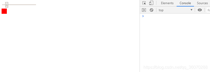
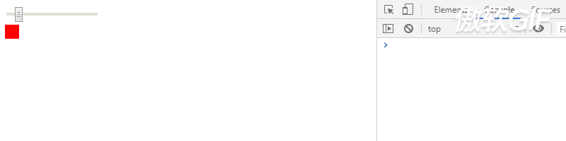
滑动滑动条后的gif图如下:
如何让滑动条控件更加好看
先看两个不同效果示例图:
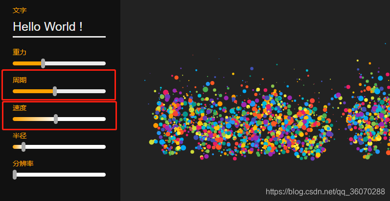
上面两个红色框中的滑动条明显比默认样式好看很多,那么它们是如何实现的呢,接下来我们讲实现过程:
两个不同样式滑动条的实现过程
这里把对应滑动条的相关代码贴出来:
<p>周期</p>
<input type="range" id="dur" value="0.50" min="0" max="1.00" step="0.01" onchange="changeV()">
<p>速度</p>
<input type="range" id="speed" value="0" min="0" max="5" step="0.01" onchange="changeV()">
/* 这里不考虑浏览器的兼容性 */
#control input[type="range"] {
    width: 100%;
    -webkit-appearance: none;
    height: 8px;
    border-radius: 4px;
    background: -webkit-linear-gradient(#ffa200, #ffa200) no-repeat white;
    background-size: 50% 100%; /* 因为周期默认value=0.50正好占50% */
}
/* -webkit-slider-thumb仅对谷歌浏览器有效 */
#control input[type="range"]::-webkit-slider-thumb {
    -webkit-appearance: none;
    background-color: #aaa;
    width: 8px;
    height: 20px;
    border-radius: 4px;
    cursor: pointer;
}

#control input[type="range"]::-webkit-slider-thumb:hover {
    background: #666;
}

/* 左侧渐变色的写法,默认滑块在最左侧所以下面white为0% */
#control #speed {
    background: linear-gradient(to right, #ffa200, white 0%, white);
    background-size: 100% 100%;
}
const duration = document.getElementById('dur');
const speed = document.getElementById('speed');
function changeV() {
    durVal = parseFloat(duration.value);
    spdVal = parseFloat(speed.value);
    const durationPercent = parseFloat(durVal, 2) * 100
    const speedPercent = parseFloat((spdVal / 5), 2) * 100
    duration.style.backgroundSize = `${durationPercent}%, 100%`
    speed.style.background = `linear-gradient(to right, #ffa200, white ${speedPercent}%, white`
};
相信大家结合代码可以清晰的掌握两种滑动条的实现方法,这里就不过多解释了
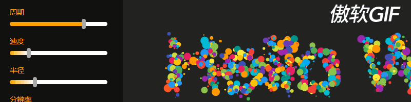
gif效果局部展示:
文章中用到的示例演示地址
写在最后
前端是一个庞大的体系,很多知识在没用到的时候也许我们根本不知道它多有用。就比如文中的滑动条,工作中很难碰到,一旦要用的时候我们还得去琢磨一番,这里通过自己的讲解相信可以让需要的人更好的使用滑动条功能,如果觉得本文对你有所帮助不妨点个赞再走吧,谢谢啦!

 浙公网安备 33010602011771号