

el-select封装(单选框、多选框、全选功能)
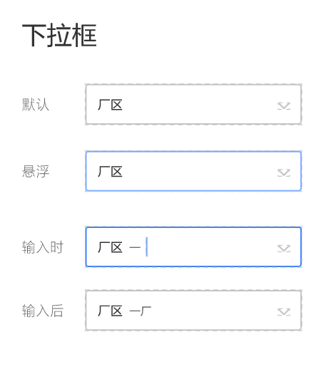
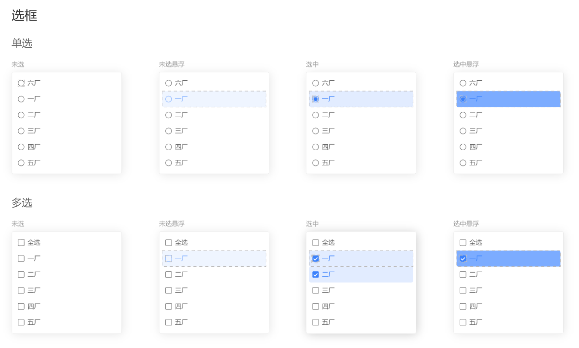
先看看设计图:
网上找了一溜,都是扯淡,样式也没个
自己动手吧,先把样式搞定
popper-class="xx-option"
所有单选框都用 :after和:before类 + 定位 实现
样式逻辑复杂点,再加上:hover、:active伪类,看不惯还要封装
就出来了
.xx-option {
  .el-select-dropdown__list .el-select-dropdown__item {
    background-color: var(--select-bg);
    color: var(--select-txt);
    font-weight: 400;
    padding-left: 40px;
    &.hover {
      background-color: var(--select-hover-bg);
      color: var(--select-hover-txt);
    }
    &.selected {
      background-color: var(--select-active-bg);
      color: var(--select-active-txt);
    }
    &.selected.hover {
      background-color: var(--select-active-hover-bg);
      color: var(--select-active-hover-txt);
    }
    &.selected::before {
      height: 10px;
      width: 10px;
      box-sizing: border-box;
      content: "";
      display: inline-block;
      position: absolute;
      left: 17px;
      top: 50%;
      transform: translateY(-50%);
      background-color: var(--select-radio-bg);
      border-radius: 50%;
      transition: 0.2s;
    }
    &::after {
      height: 16px;
      width: 16px;
      box-sizing: border-box;
      position: absolute;
      font-family: element-icons;
      content: "";
      font-size: 12px;
      font-weight: 700;
      left: 14px;
      top: 50%;
      transform: translateY(-50%);
      border: 1px solid var(--select-checkbox-border);
      border-radius: 50%;
      text-align: center;
      line-height: 16px;
      transition: 0.2s;
    }
    &.hover::after {
      border-color: var(--select-checkbox-hover-border);
      background-color: transparent;
    }
    &.selected::after {
      border-color: var(--select-checkbox-bg);
    }
  }

  &.is-multiple .el-select-dropdown__list .el-select-dropdown__item {
    &::after {
      border-radius: 0;
    }
    &.selected::after {
      content: "\E6DA";
      color: #fff;
      background-color: var(--select-checkbox-bg);
    }
    &.hover.selected::after {
      border-color: var(--select-checkbox-bg);
      background-color: var(--select-checkbox-bg);
    }
  }
}
用看的肯定是看不懂的,要不就直接拿走换颜色用,要不就动动小手自己敲一遍,再比对一番~
接下来是全选功能,先看看代码
组件
    <el-select
      ref="selector"
      popper-class="xx-option"
      v-model="selectValue"
      v-bind="$attrs"
      v-on="$listeners"
      :multiple="multiple"
      collapse-tags
    >
      <div
        v-if="multiple"
        class="el-select-dropdown__item"
        @click="onAllClick"
        @mouseenter="onAllEnter"
        @mouseleave="hoverAll = false"
        :class="{
          selected: selectedAll,
          hover: hoverAll
        }"
      >
        <span>全选</span>
      </div>
      <el-option
        v-for="(item, key) in options"
        :key="key"
        :label="item[labelKey]"
        :value="item[valueKey]"
      >
      </el-option>
    </el-select>
el-options写在了封装组件内,也是因为全选功能的局限性导致
在调用组件时,要传展示的labelKey和取值的valueKey
事件
    onAllClick() {
      this.selectedAll = !this.selectedAll;
      // 选中全选
      if (this.selectedAll) {
        if (this.selectValue.length < this.options.length) {
          this.selectValue = !this.valueKey
            ? this.options
            : this.options.map(item => item[this.valueKey]);
        }
      } else {
        this.selectValue = [];
      }
      this.$emit("change", this.selectValue);
    },
    onAllEnter() {
      this.hoverAll = true;
      const options = this.$refs.selector.options;

      this.$nextTick(() => {
        this.$refs.selector.options = options.map(item => {
          item.hover = false;
          return item;
        });
      });
      this.$refs.selector.hoverIndex = -1;
    },
用v-bind和v-on接受所有的参数和事件,这里就有点繁琐了
对比vue3 :=$attrs 属性逻辑都搞定
v-bind的参数,如果已经通过props传了过来,那就不会出现在this.$attrs里面
另外$attrs拿到的是个对象{string: string},对Boolean类型的数据不太友好
v-on就不像v-bind,可以存在同名的事件emit出去,自己组件本身和v-on的事件都能调用到(其实也是坑)
另外,要想调用自身事件的而不用组件的,需要加上修饰符.native(扯远了..)
onAllClick就是全选和反选功能,再emit一个change事件
那为什么要有onAllEnter事件呢,样式有问题
看了下源码,ele对option的鼠标移入事件添加了个hoverIndex状态来记录
需要手动处理一下,重置hoverIndex和option组件内的hover属性
功能完成,基本看得过去,处理一些数据绑定的小bug
@visible-change="onVisibleChange"
    onVisibleChange(visible) {
      // 验证多选全选
      this.selectedAll =
        visible &&
        this.multiple &&
        this.selectValue.length >= this.options.length;
    },
数据一进来,先判断是否全部选择,勾上全选按钮
每次数据change,除了绑定到外层v-model上,再加个全选判断
  computed: {
    selectValue: {
      get() {
        return this.value;
      },
      set(val) {
        this.selectedAll = this.multiple && val.length >= this.options.length;
        this.$emit("input", val);
      }
    }
  },
最后就是一些小细节,hover边框,active边框
上完整代码!!
<template>
  <div
    :class="[
      'xx-select',
      focusing && 'xx-select-focus',
      !title && 'xx-select-no-title'
    ]"
  >
    <span class="title" v-if="title">{{ title }}</span>
    <el-select
      ref="selector"
      class="select"
      popper-class="xx-option"
      v-model="selectValue"
      v-bind="$attrs"
      v-on="$listeners"
      :multiple="multiple"
      :placeholder="placeholder"
      :clearable="clearable"
      collapse-tags
      @visible-change="onVisibleChange"
      @blur="blur"
      @focus="focus"
    >
      <div
        v-if="multiple"
        class="el-select-dropdown__item"
        @click="onAllClick"
        @mouseenter="onAllEnter"
        @mouseleave="hoverAll = false"
        :class="{
          selected: selectedAll,
          hover: hoverAll
        }"
      >
        <span>全选</span>
      </div>
      <el-option
        v-for="(item, key) in options"
        :key="key"
        :label="labelKey ? item[labelKey] : item"
        :value="valueKey ? (valueKey === '$key' ? key : item[valueKey]) : item"
      >
      </el-option>
    </el-select>
  </div>
</template>

<script>
export default {
  name: "XxSelect",
  props: {
    title: {
      type: String,
      default: ""
    },
    placeholder: {
      type: String,
      default: ""
    },
    value: {
      type: [String, Number, Object, Array],
      required: true
    },
    multiple: {
      type: Boolean,
      default: false
    },
    clearable: {
      type: Boolean,
      default: true
    },
    options: {
      type: [Array, Object, Number],
      default: () => {
        return [];
      }
    },
    // valueKey
    // - 不传则为整个item赋值
    // - 传`$key` 返回index(array)或key(object)
    valueKey: {
      type: String
    },
    labelKey: {
      type: String
    }
  },
  data() {
    return {
      focusing: false,
      hoverAll: false,
      selectedAll: false
    };
  },
  computed: {
    selectValue: {
      get() {
        return this.value;
      },
      set(val) {
        this.selectedAll = this.multiple && val.length >= this.options.length;
        this.$emit("input", val);
      }
    }
  },
  methods: {
    onAllEnter() {
      this.hoverAll = true;
      const options = this.$refs.selector.options;

      this.$nextTick(() => {
        this.$refs.selector.options = options.map(item => {
          item.hover = false;
          return item;
        });
      });
      this.$refs.selector.hoverIndex = -1;
    },
    onAllClick() {
      this.selectedAll = !this.selectedAll;
      // 选中全选
      if (this.selectedAll) {
        if (this.selectValue.length < this.options.length) {
          this.selectValue = !this.valueKey
            ? this.options
            : this.options.map(item => item[this.valueKey]);
        }
      } else {
        this.selectValue = [];
      }
      this.$emit("change", this.selectValue);
    },
    onVisibleChange(visible) {
      // 验证多选全选
      this.selectedAll =
        visible &&
        this.multiple &&
        this.selectValue.length >= this.options.length;
    },
    focus() {
      this.focusing = true;
      this.$refs.selector.focus();
    },
    blur() {
      this.focusing = false;
    }
  }
};
</script>

<style lang="scss" scoped>
.xx-select {
  display: flex;
  align-items: center;
  justify-content: space-between;
  height: 100%;
  width: 24%;
  box-sizing: border-box;
  padding-left: 16px;
  border: 1px solid var(--default-border);
  border-radius: 4px;
  background-color: #fff;
  overflow: hidden;
  &:hover {
    border-color: var(--default-hover-border);
  }
  &-focus {
    border-color: var(--default-active-border) !important;
  }
  &-no-title {
    padding-left: 0px;
  }
  .title {
    flex: 2;
    font-size: 16px;
    color: #333;
  }
  .select {
    flex: 5;
    height: 100%;
    :deep(.el-select__tags) {
      margin-top: 1px;
    }
    :deep(.el-input--suffix) {
      line-height: 1;
      .el-input__inner {
        border: none;
      }
      .el-input__icon {
        line-height: 1;
      }
      .el-select__caret:not(.el-icon-circle-close) {
        transform: rotateZ(90deg);
        &::before {
          content: "\E6E1";
        }
      }
      &.is-focus {
        .el-select__caret:not(.el-icon-circle-close) {
          transform: rotateZ(0deg);
        }
      }
    }
  }
}
.xx-option {
  .el-select-dropdown__list .el-select-dropdown__item {
    background-color: var(--select-bg);
    color: var(--select-txt);
    font-weight: 400;
    padding-left: 40px;
    &.hover {
      background-color: var(--select-hover-bg);
      color: var(--select-hover-txt);
    }
    &.selected {
      background-color: var(--select-active-bg);
      color: var(--select-active-txt);
    }
    &.selected.hover {
      background-color: var(--select-active-hover-bg);
      color: var(--select-active-hover-txt);
    }
    &.selected::before {
      height: 10px;
      width: 10px;
      box-sizing: border-box;
      content: "";
      display: inline-block;
      position: absolute;
      left: 17px;
      top: 50%;
      transform: translateY(-50%);
      background-color: var(--select-radio-bg);
      border-radius: 50%;
      transition: 0.2s;
    }
    &::after {
      height: 16px;
      width: 16px;
      box-sizing: border-box;
      position: absolute;
      font-family: element-icons;
      content: "";
      font-size: 12px;
      font-weight: 700;
      left: 14px;
      top: 50%;
      transform: translateY(-50%);
      border: 1px solid var(--select-checkbox-border);
      border-radius: 50%;
      text-align: center;
      line-height: 16px;
      transition: 0.2s;
    }
    &.hover::after {
      border-color: var(--select-checkbox-hover-border);
      background-color: transparent;
    }
    &.selected::after {
      border-color: var(--select-checkbox-bg);
    }
  }

  &.is-multiple .el-select-dropdown__list .el-select-dropdown__item {
    &::after {
      border-radius: 0;
    }
    &.selected::after {
      content: "\E6DA";
      color: #fff;
      background-color: var(--select-checkbox-bg);
    }
    &.hover.selected::after {
      border-color: var(--select-checkbox-bg);
      background-color: var(--select-checkbox-bg);
    }
  }
}
</style>
options的label和value为啥这么复杂呢,主要是为了通用
支持数组、对象、数字
valueKey传$key可拿到key(对象)、index(数组、数字)
不传valueKey,则获取整个"item"
试试就明白了
给两个调用示例
<xx-select
  :ref="`productCode${index}`"
  v-model="product.productCode"
  filterable
  remote
  :remote-method="
    $event =>
      onFilterProduct(product.typeCode, 'productCode', $event)
  "
  :loading="productLoading"
  @visible-change="onProductVisibleChange($event, product.typeCode)"
  @change="onProductChange($event, 'productCode', index)"
  :options="products"
  valueKey="productCode"
  labelKey="productName"
/>
<xx-select v-model="product.priority" :options="9" />
好的。

 浙公网安备 33010602011771号