
Bootstrap进阶四:jQuery插件详解
一、模态对话框(Modal)
模态框经过了优化,更加灵活,以弹出对话框的形式出现,具有最小和最实用的功能集。
不支持同时打开多个模态框
千万不要在一个模态框上重叠另一个模态框。要想同时支持多个模态框,需要自己写额外的代码来实现。
模态框的 HTML 代码放置的位置
务必将模态框的 HTML 代码放在文档的最高层级内(也就是说,尽量作为 body 标签的直接子元素),以避免其他组件影响模态框的展现和/或功能。
对于移动设备的附加说明
这里提供了在移动设备上使用模态框有一些附加说明。请参考浏览器支持章节。
Due to how HTML5 defines its semantics, the autofocus HTML attribute has no effect in Bootstrap modals. To achieve the same effect, use some custom JavaScript:
$('#myModal').on('shown.bs.modal', function () {
  $('#myInput').focus()
})
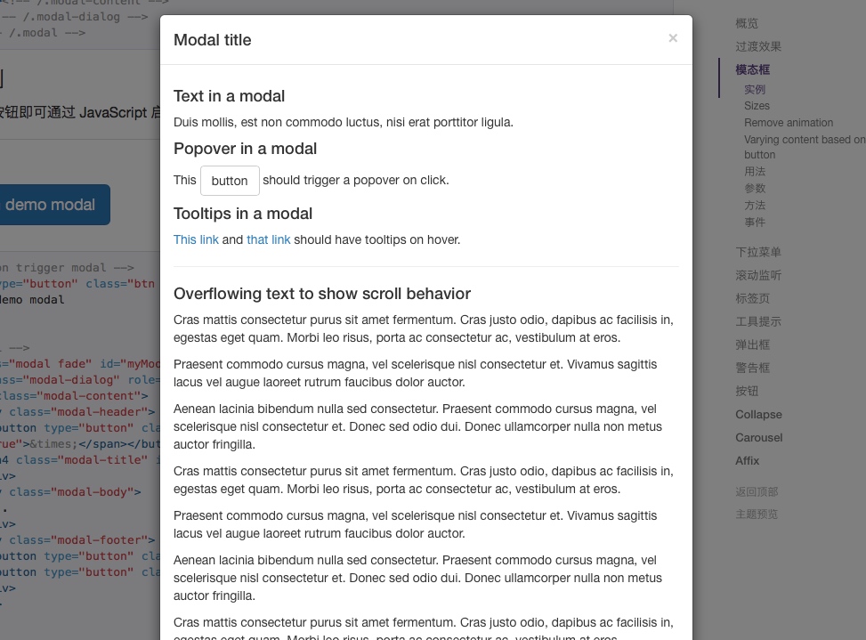
1.实例
点击下面的按钮即可通过 JavaScript 启动一个模态框。此模态框将从上到下、逐渐浮现到页面前。
<!-- Button trigger modal --> <button type="button" class="btn btn-primary btn-lg" data-toggle="modal" data-target="#myModal"> Launch demo modal </button> <!-- Modal --> <div class="modal fade" id="myModal" tabindex="-1" role="dialog" aria-labelledby="myModalLabel"> <div class="modal-dialog" role="document"> <div class="modal-content"> <div class="modal-header"> <button type="button" class="close" data-dismiss="modal" aria-label="Close"><span aria-hidden="true">×</span></button> <h4 class="modal-title" id="myModalLabel">Modal title</h4> </div> <div class="modal-body"> ... </div> <div class="modal-footer"> <button type="button" class="btn btn-default" data-dismiss="modal">Close</button> <button type="button" class="btn btn-primary">Save changes</button> </div> </div> </div> </div>


增强模态框的可访问性
务必为 .modal 添加 role="dialog" 和 aria-labelledby="..." 属性,用于指向模态框的标题栏;为 .modal-dialog 添加 aria-hidden="true" 属性。
另外,你还应该通过 aria-describedby 属性为模态框 .modal 添加描述性信息。
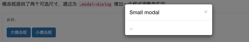
2.可选尺寸
模态框提供了两个可选尺寸,通过为 .modal-dialog 增加一个样式调整类实现。
<!-- Large modal -->
<button type="button" class="btn btn-primary" data-toggle="modal" data-target=".bs-example-modal-lg">Large modal</button>

<div class="modal fade bs-example-modal-lg" tabindex="-1" role="dialog" aria-labelledby="myLargeModalLabel">
  <div class="modal-dialog modal-lg">
    <div class="modal-content">
      ...
    </div>
  </div>
</div>

<!-- Small modal -->
<button type="button" class="btn btn-primary" data-toggle="modal" data-target=".bs-example-modal-sm">Small modal</button>

<div class="modal fade bs-example-modal-sm" tabindex="-1" role="dialog" aria-labelledby="mySmallModalLabel">
  <div class="modal-dialog modal-sm">
    <div class="modal-content">
      ...
    </div>
  </div>
</div>


3.禁止动画效果
如果你不需要模态框弹出时的动画效果(淡入淡出效果),删掉 .fade 类即可。
<div class="modal" tabindex="-1" role="dialog" aria-labelledby="...">
  ...
</div>
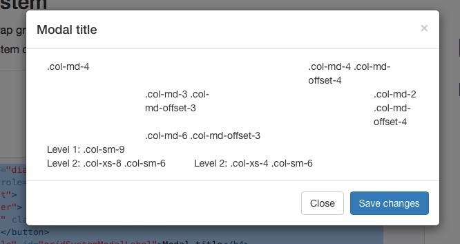
4.使用栅格系统
<div class="modal fade" role="dialog" aria-labelledby="gridSystemModalLabel"> <div class="modal-dialog" role="document"> <div class="modal-content"> <div class="modal-header"> <button type="button" class="close" data-dismiss="modal" aria-label="Close"><span aria-hidden="true">×</span></button> <h4 class="modal-title" id="gridSystemModalLabel">Modal title</h4> </div> <div class="modal-body"> <div class="container-fluid"> <div class="row"> <div class="col-md-4">.col-md-4</div> <div class="col-md-4 col-md-offset-4">.col-md-4 .col-md-offset-4</div> </div> <div class="row"> <div class="col-md-3 col-md-offset-3">.col-md-3 .col-md-offset-3</div> <div class="col-md-2 col-md-offset-4">.col-md-2 .col-md-offset-4</div> </div> <div class="row"> <div class="col-md-6 col-md-offset-3">.col-md-6 .col-md-offset-3</div> </div> <div class="row"> <div class="col-sm-9"> Level 1: .col-sm-9 <div class="row"> <div class="col-xs-8 col-sm-6"> Level 2: .col-xs-8 .col-sm-6 </div> <div class="col-xs-4 col-sm-6"> Level 2: .col-xs-4 .col-sm-6 </div> </div> </div> </div> </div> </div> <div class="modal-footer"> <button type="button" class="btn btn-default" data-dismiss="modal">Close</button> <button type="button" class="btn btn-primary">Save changes</button> </div> </div><!-- /.modal-content --> </div><!-- /.modal-dialog --> </div><!-- /.modal -->

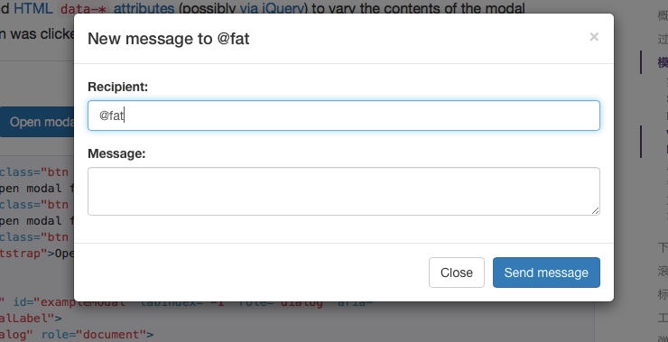
5.给模态窗动态传值
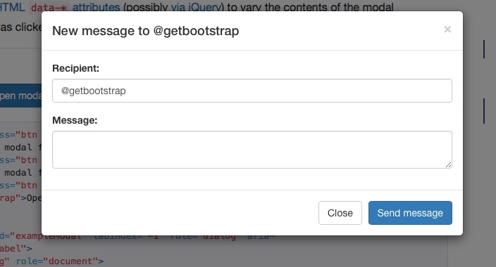
Have a bunch of buttons that all trigger the same modal, just with slightly different contents? Use event.relatedTarget and HTML data-* attributes (possibly via jQuery) to vary the contents of the modal depending on which button was clicked. See the Modal Events docs for details on relatedTarget,
<button type="button" class="btn btn-primary" data-toggle="modal" data-target="#exampleModal" data-whatever="@mdo">Open modal for @mdo</button> <button type="button" class="btn btn-primary" data-toggle="modal" data-target="#exampleModal" data-whatever="@fat">Open modal for @fat</button> <button type="button" class="btn btn-primary" data-toggle="modal" data-target="#exampleModal" data-whatever="@getbootstrap">Open modal for @getbootstrap</button> ...more buttons... <div class="modal fade" id="exampleModal" tabindex="-1" role="dialog" aria-labelledby="exampleModalLabel"> <div class="modal-dialog" role="document"> <div class="modal-content"> <div class="modal-header"> <button type="button" class="close" data-dismiss="modal" aria-label="Close"><span aria-hidden="true">×</span></button> <h4 class="modal-title" id="exampleModalLabel">New message</h4> </div> <div class="modal-body"> <form> <div class="form-group"> <label for="recipient-name" class="control-label">Recipient:</label> <input type="text" class="form-control" id="recipient-name"> </div> <div class="form-group"> <label for="message-text" class="control-label">Message:</label> <textarea class="form-control" id="message-text"></textarea> </div> </form> </div> <div class="modal-footer"> <button type="button" class="btn btn-default" data-dismiss="modal">Close</button> <button type="button" class="btn btn-primary">Send message</button> </div> </div> </div> </div> $('#exampleModal').on('show.bs.modal', function (event) { var button = $(event.relatedTarget) // Button that triggered the modal var recipient = button.data('whatever') // Extract info from data-* attributes // If necessary, you could initiate an AJAX request here (and then do the updating in a callback). // Update the modal's content. We'll use jQuery here, but you could use a data binding library or other methods instead. var modal = $(this) modal.find('.modal-title').text('New message to ' + recipient) modal.find('.modal-body input').val(recipient) })


6.用法
通过 data 属性或 JavaScript 调用模态框插件,可以根据需要动态展示隐藏的内容。模态框弹出时还会为元素添加 .modal-open 类,从而覆盖页面默认的滚动行为,并且还会自动生成一个 .modal-backdrop 元素用于提供一个可点击的区域,点击此区域就即可关闭模态框。
通过 data 属性
不需写 JavaScript 代码也可激活模态框。通过在一个起控制器作用的元素(例如:按钮)上添加 data-toggle="modal" 属性,或者 data-target="#foo" 属性,再或者 href="#foo" 属性,用于指向被控制的模态框。
<button type="button" data-toggle="modal" data-target="#myModal">Launch modal</button>
通过 JavaScript 调用
只需一行 JavaScript 代码,即可通过元素的 id myModal 调用模态框:
$('#myModal').modal(options)
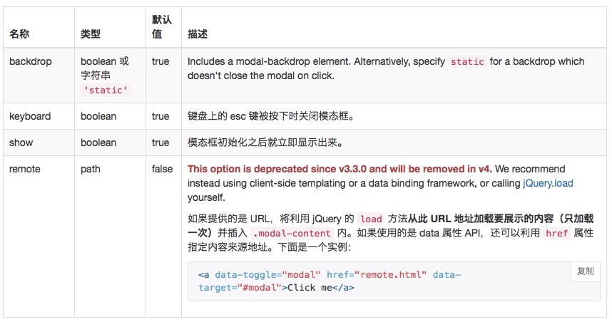
7.参数
可以将选项通过 data 属性或 JavaScript 代码传递。对于 data 属性,需要将参数名称放到 data- 之后,例如 data-backdrop=""。

8.方法
.modal(options)
将页面中的某块内容作为模态框激活。接受可选参数 object。
$('#myModal').modal({
  keyboard: false
})
.modal('toggle')
手动打开或关闭模态框。在模态框显示或隐藏之前返回到主调函数中(也就是,在触发 shown.bs.modal 或 hidden.bs.modal 事件之前)。
$('#myModal').modal('toggle')
.modal('show')
手动打开模态框。在模态框显示之前返回到主调函数中 (也就是,在触发 shown.bs.modal 事件之前)。
$('#myModal').modal('show')
.modal('hide')
手动隐藏模态框。在模态框隐藏之前返回到主调函数中 (也就是,在触发 hidden.bs.modal 事件之前)。
$('#myModal').modal('hide')
.modal('handleUpdate')
Readjusts the modal's positioning to counter a scrollbar in case one should appear, which would make the modal jump to the left.
Only needed when the height of the modal changes while it is open.
$('#myModal').modal('handleUpdate')
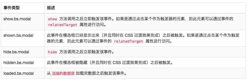
9.事件
Bootstrap 的模态框类提供了一些事件用于监听并执行你自己的代码。
All modal events are fired at the modal itself (i.e. at the <div class="modal">).

$('#myModal').on('hidden.bs.modal', function (e) {
  // do something...
})
二、下拉项(Dropdown)
实现下拉功能,如下拉菜单、下拉按钮、下拉工具条等。
1.用法
添加data-toggle="dropdown"到button或a元素
<div class="dropdown">
  <button id="dLabel" type="button" data-toggle="dropdown" aria-haspopup="true" aria-expanded="false">
    Dropdown trigger
    <span class="caret"></span>
  </button>
  <ul class="dropdown-menu" aria-labelledby="dLabel">
    ...
  </ul>
</div>
<div class="dropdown">
  <a id="dLabel" data-target="#" href="http://example.com" data-toggle="dropdown" role="button" aria-haspopup="true" aria-expanded="false">
    Dropdown trigger
    <span class="caret"></span>
  </a>

  <ul class="dropdown-menu" aria-labelledby="dLabel">
    ...
  </ul>
</div>
通过js调用
$('.dropdown-toggle').dropdown()
2.方法
$().dropdown('toggle')
3.事件
$('#myDropdown').on('show.bs.dropdown', function () {
  // do something…
})
 

三、滚动监听(Scrollspy)
实现滚动条位置的效果,如在导航中有多个标签,点击其中一个标签,滚动条会自动定位到导航中标签对应的文本位置。
滚动监听插件是用来根据滚动条所处的位置来自动更新导航项的。如下所示,滚动导航条下面的区域并关注导航项的变化。下拉菜单中的条目也会自动高亮显示。
1.用法
依赖 Bootstrap 的导航组件
滚动监听插件依赖 Bootstrap 的导航组件 用于高亮显示当前激活的链接。
Resolvable ID targets required
Navbar links must have resolvable id targets. For example, a <a href="#home">home</a> must correspond to something in the DOM like <div id="home"></div>.
Non-:visible target elements ignored
Target elements that are not :visible according to jQuery will be ignored and their corresponding nav items will never be highlighted.
需要相对定位(relative positioning)
无论何种实现方式,滚动监听都需要被监听的组件是 position: relative; 即相对定位方式。大多数时候是监听 <body> 元素。当不是监听<body>元素时, 主要要给该元素设定一个高度,并且设定 overflow-y: scroll;
通过 data-spy="scroll" 属性调用
body {
  position: relative;
}

<body data-spy="scroll" data-target="#navbar-example">
  ...
  <div id="navbar-example">
    <ul class="nav nav-tabs" role="tablist">
      ...
    </ul>
  </div>
  ...
</body>
通过 JavaScript 调用
在 CSS 中添加 position: relative; 之后,通过 JavaScript 代码启动滚动监听插件:
$('body').scrollspy({ target: '#navbar-example' })
2.方法
.scrollspy('refresh')
当使用滚动监听插件的同时在 DOM 中添加或删除元素后,你需要像下面这样调用此刷新( refresh) 方法:
$('[data-spy="scroll"]').each(function () {
  var $spy = $(this).scrollspy('refresh')
})
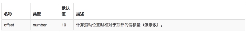
3.参数
可以通过 data 属性或 JavaScript 传递参数。对于 data 属性,其名称是将参数名附着到 data- 后面组成,例如 data-offset=""。

4.事件
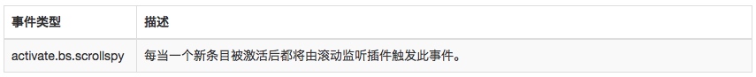
$('#myScrollspy').on('activate.bs.scrollspy', function () {
  // do something…
})

四、Tab标签页(Tab)
是对tabbed navigation组件的扩展。快速实现本地内容的切换,动态切换标签页对应的本地内容。
1.用法
采用data-toggle="tab"或data-toggle="pill"触发的例子:
<div>

  <!-- Nav tabs -->
  <ul class="nav nav-tabs" role="tablist">
    <li role="presentation" class="active"><a href="#home" aria-controls="home" role="tab" data-toggle="tab">Home</a></li>
    <li role="presentation"><a href="#profile" aria-controls="profile" role="tab" data-toggle="tab">Profile</a></li>
    <li role="presentation"><a href="#messages" aria-controls="messages" role="tab" data-toggle="tab">Messages</a></li>
    <li role="presentation"><a href="#settings" aria-controls="settings" role="tab" data-toggle="tab">Settings</a></li>
  </ul>

  <!-- Tab panes -->
  <div class="tab-content">
    <div role="tabpanel" class="tab-pane active" id="home">...</div>
    <div role="tabpanel" class="tab-pane" id="profile">...</div>
    <div role="tabpanel" class="tab-pane" id="messages">...</div>
    <div role="tabpanel" class="tab-pane" id="settings">...</div>
  </div>

</div>
以下是js调用方式的示范:
$('#myTabs a').click(function (e) {
  e.preventDefault()
  $(this).tab('show')
})
你可以以多种方式激活Tab标签:
$('#myTabs a[href="#profile"]').tab('show') // Select tab by name
$('#myTabs a:first').tab('show') // Select first tab
$('#myTabs a:last').tab('show') // Select last tab
$('#myTabs li:eq(2) a').tab('show') // Select third tab (0-indexed)
2.淡入淡出效果
为了让标签淡入,为每个.tab-pane添加.fade类。第一个选项卡窗格还必须添加.in类。
<div class="tab-content">
  <div role="tabpanel" class="tab-pane fade in active" id="home">...</div>
  <div role="tabpanel" class="tab-pane fade" id="profile">...</div>
  <div role="tabpanel" class="tab-pane fade" id="messages">...</div>
  <div role="tabpanel" class="tab-pane fade" id="settings">...</div>
</div>
3.方法
$().tab
.tab('show')
切换到某个tab标签页
$('#someTab').tab('show')
4.事件
当切换到一个新的tab标签页时,依次发生如下事件:
1 hide.bs.tab (on the current active tab)
2 show.bs.tab (on the to-be-shown tab)
3 hidden.bs.tab (on the previous active tab, the same one as for the hide.bs.tab event)
4 shown.bs.tab (on the newly-active just-shown tab, the same one as for the show.bs.tab event)
如果没有tab被激活,那么hide.bs.tab 和 hidden.bs.tab事件不会发生。
 

$('a[data-toggle="tab"]').on('shown.bs.tab', function (e) {
  e.target // newly activated tab
  e.relatedTarget // previous active tab
})
五、工具提示(ToolTip)
无需加在任何图片,采用CSS3新技术,动态显示data-attributes存储的标题信息。
1.实例


<button type="button" class="btn btn-default" data-toggle="tooltip" data-placement="left" title="Tooltip on left">Tooltip on left</button>

<button type="button" class="btn btn-default" data-toggle="tooltip" data-placement="top" title="Tooltip on top">Tooltip on top</button>

<button type="button" class="btn btn-default" data-toggle="tooltip" data-placement="bottom" title="Tooltip on bottom">Tooltip on bottom</button>

<button type="button" class="btn btn-default" data-toggle="tooltip" data-placement="right" title="Tooltip on right">Tooltip on right</button>
$(function () {
  $('[data-toggle="tooltip"]').tooltip()
})
 

2.用法
只需要添加如下html代码和js代码即可:
<a href="#" data-toggle="tooltip" title="Some tooltip text!">Hover over me</a>
$('#example').tooltip(options)
该插件自动会生成如下代码:
<!-- Generated markup by the plugin -->
<div class="tooltip top" role="tooltip">
  <div class="tooltip-arrow"></div>
  <div class="tooltip-inner">
    Some tooltip text!
  </div>
</div>
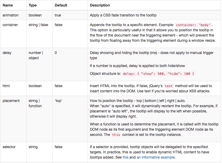
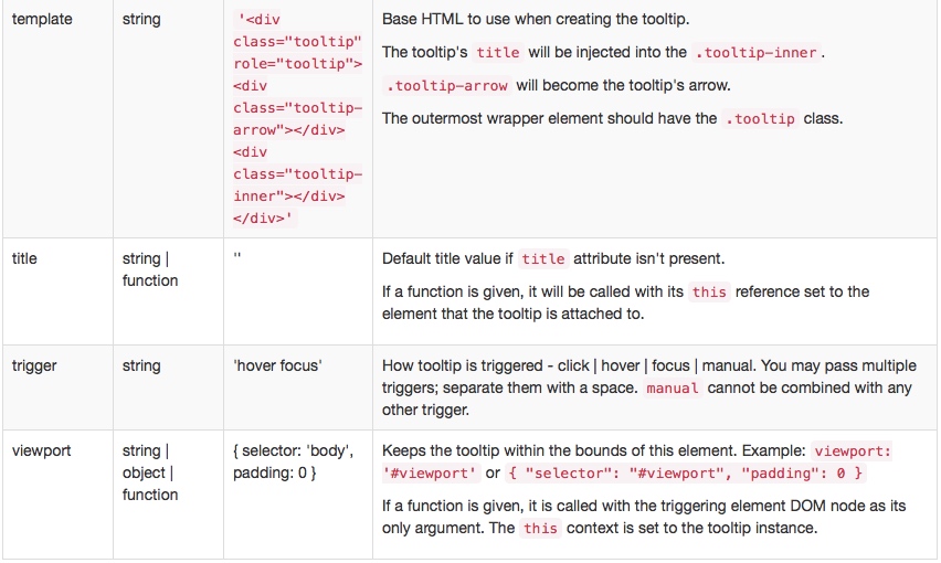
3.参数
可以通过 data 属性或 JavaScript 传递参数。对于 data 属性,将参数名附着到 data- 后面,例如 data-animation=""。


4.方法
$().tooltip(options)
Attaches a tooltip handler to an element collection.
.tooltip('show')
Reveals an element's tooltip. Returns to the caller before the tooltip has actually been shown (i.e. before the shown.bs.tooltip event occurs). This is considered a "manual" triggering of the tooltip. Tooltips with zero-length titles are never displayed.
$('#element').tooltip('show')
.tooltip('hide')
Hides an element's tooltip. Returns to the caller before the tooltip has actually been hidden (i.e. before the hidden.bs.tooltip event occurs). This is considered a "manual" triggering of the tooltip.
$('#element').tooltip('hide')
.tooltip('toggle')
Toggles an element's tooltip. Returns to the caller before the tooltip has actually been shown or hidden (i.e. before the shown.bs.tooltip or hidden.bs.tooltip event occurs). This is considered a "manual" triggering of the tooltip.
$('#element').tooltip('toggle')
.tooltip('destroy')
Hides and destroys an element's tooltip. Tooltips that use delegation (which are created using the selector option) cannot be individually destroyed on descendant trigger elements.
$('#element').tooltip('destroy')
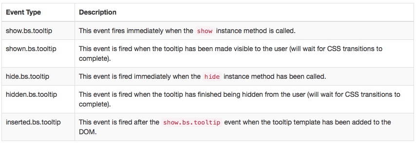
5.事件
$('#myTooltip').on('hidden.bs.tooltip', function () {
  // do something…
})

六、弹出提示(Popover)
Tooltips插件的变体!用来显示一些叠加内容的提示效果,此插件需要配合Tooltips使用。
为任意元素添加一小块浮层,就像 iPad 上一样,用于存放非主要信息。
弹出框的标题和内容的长度都是零的话将永远不会被显示出来。
插件依赖
弹出框依赖 工具提示插件 ,因此,如果你定制了 Bootstrap,一定要注意将依赖的插件编译进去。
初始化
由于性能的原因,工具提示和弹出框的 data 编程接口(data api)是必须要手动初始化的。
在一个页面上一次性初始化所有弹出框的方式是通过 data-toggle 属性选中他们。
1.实例
html代码
<button type="button" class="btn btn-lg btn-danger" data-toggle="popover" title="Popover title" data-content="And here's some amazing content. It's very engaging. Right?">点我弹出/隐藏弹出框</button>
js代码
<script> $(function () { $('[data-toggle="popover"]').popover() }) </script>
 

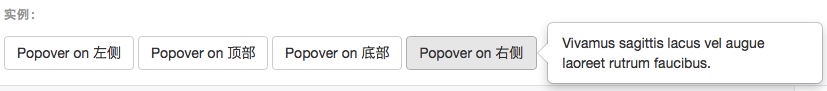
4个弹出方向
<button type="button" class="btn btn-default" data-container="body" data-toggle="popover" data-placement="left" data-content="Vivamus sagittis lacus vel augue laoreet rutrum faucibus.">
  Popover on 左侧
</button>

<button type="button" class="btn btn-default" data-container="body" data-toggle="popover" data-placement="top" data-content="Vivamus sagittis lacus vel augue laoreet rutrum faucibus.">
  Popover on 顶部
</button>

<button type="button" class="btn btn-default" data-container="body" data-toggle="popover" data-placement="bottom" data-content="Vivamus
sagittis lacus vel augue laoreet rutrum faucibus.">
  Popover on 底部
</button>

<button type="button" class="btn btn-default" data-container="body" data-toggle="popover" data-placement="right" data-content="Vivamus sagittis lacus vel augue laoreet rutrum faucibus.">
  Popover on 右侧
</button>

实现“点击并让弹出框消失”的效果需要一些额外的代码
为了更好的跨浏览器和跨平台效果,你必须使用 <a> 标签,不能使用 <button> 标签,并且,还必须包含 role="button" 和 tabindex 属性。
<a tabindex="0" class="btn btn-lg btn-danger" role="button" data-toggle="popover" data-trigger="focus" title="Dismissible popover" data-content="And here's some amazing content. It's very engaging. Right?">可消失的弹出框</a>
2.用法
通过 JavaScript 代码启动弹出框:
$('#example').popover(options)
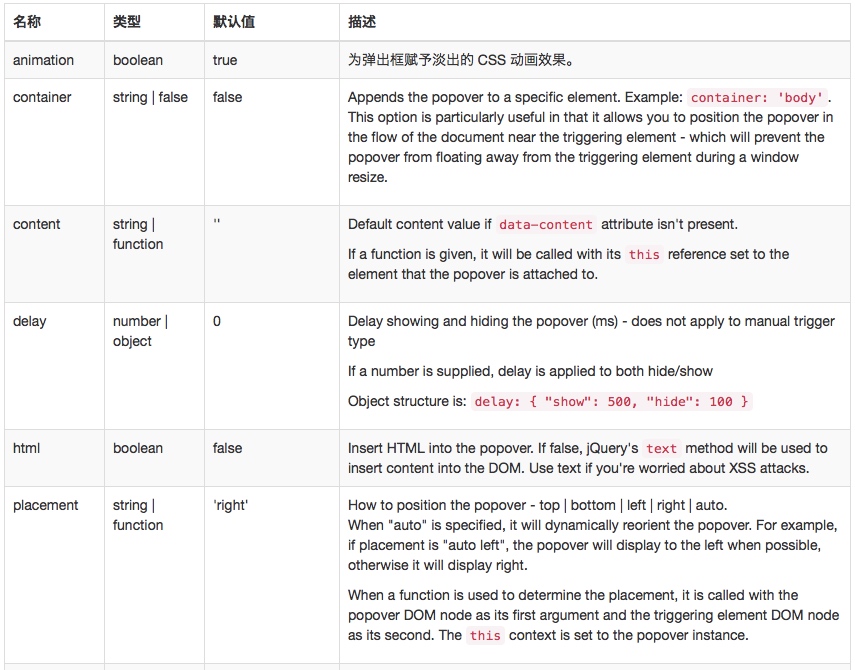
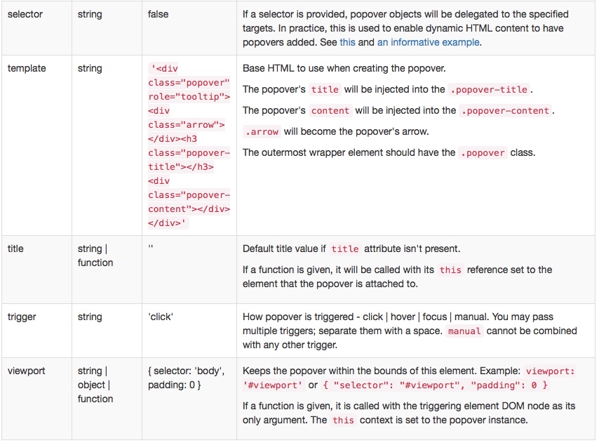
3.参数
可以通过 data 属性或 JavaScript 传递参数。对于 data 属性,将参数名附着到 data- 后面,例如 data-animation=""。


4.方法
$().popover(options)
Initializes popovers for an element collection.
.popover('show')
Reveals an element's popover. Returns to the caller before the popover has actually been shown (i.e. before the shown.bs.popover event occurs). This is considered a "manual" triggering of the popover. Popovers whose both title and content are zero-length are never displayed.
$('#element').popover('show')
.popover('hide')
Hides an element's popover. Returns to the caller before the popover has actually been hidden (i.e. before the hidden.bs.popover event occurs). This is considered a "manual" triggering of the popover.
$('#element').popover('hide')
.popover('toggle')
Toggles an element's popover. Returns to the caller before the popover has actually been shown or hidden (i.e. before the shown.bs.popover or hidden.bs.popover event occurs). This is considered a "manual" triggering of the popover.
$('#element').popover('toggle')
.popover('destroy')
Hides and destroys an element's popover. Popovers that use delegation (which are created using the selector option) cannot be individually destroyed on descendant trigger elements.
$('#element').popover('destroy')
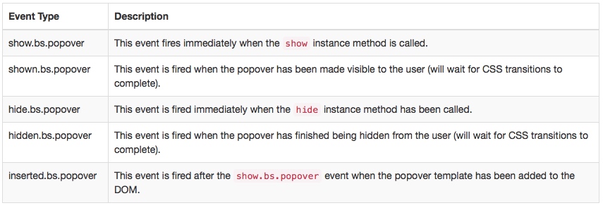
5.事件
$('#myPopover').on('hidden.bs.popover', function () {
  // do something…
})

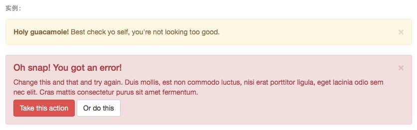
七、警告框(Alert)
用来关闭警告信息块。
1.实例
通过此插件可以为警告信息添加点击并消失的功能。
当使用 .close 按钮时,它必须是 .alert-dismissible 的第一个子元素,并且在它之前不能有任何文本内容。

2.用法
为关闭按钮添加 data-dismiss="alert" 属性就可以使其自动为警告框赋予关闭功能。关闭警告框也就是将其从 DOM 中删除。
<button type="button" class="close" data-dismiss="alert" aria-label="Close"> <span aria-hidden="true">×</span> </button>
为了让警告框在关闭时表现出动画效果,请确保为其添加了 .fade 和 .in 类。
3.方法
$().alert()
让警告框监听具有 data-dismiss="alert" 属性的后裔元素的点击(click)事件。(如果是通过 data 属性进行的初始化则无需使用)
$().alert('close')
关闭警告框并从 DOM 中将其删除。如果警告框被赋予了 .fade 和 .in 类,那么,警告框在淡出之后才会被删除。
4.事件
Bootstrap 的警告框插件对外暴露了一些可以被监听的事件。
$('#myAlert').on('closed.bs.alert', function () {
  // do something…
})
 

八、按钮(Button)
用来控制按钮状态或更多组件功能,如复选框、单选按钮,以及载入状态条等。
跨浏览器兼容性
在页面多次加载之间,Firefox 仍然保持表单控件的状态(禁用状态和选择状态)。一个解决办法是设置 autocomplete="off"。参见 Mozilla bug #654072。
1.控制按钮状态的基本用法
<button type="button" class="btn btn-primary" data-toggle="button" aria-pressed="false" autocomplete="off">
  Single toggle
</button>


2.按钮外形的单选框和复选框状态
<div class="btn-group" data-toggle="buttons">
  <label class="btn btn-primary active">
    <input type="checkbox" autocomplete="off" checked> Checkbox 1 (pre-checked)
  </label>
  <label class="btn btn-primary">
    <input type="checkbox" autocomplete="off"> Checkbox 2
  </label>
  <label class="btn btn-primary">
    <input type="checkbox" autocomplete="off"> Checkbox 3
  </label>
</div>
设置第一个复选框为激活:
 

点击第三个多选框:
 

<div class="btn-group" data-toggle="buttons">
  <label class="btn btn-primary active">
    <input type="radio" name="options" id="option1" autocomplete="off" checked> Radio 1 (preselected)
  </label>
  <label class="btn btn-primary">
    <input type="radio" name="options" id="option2" autocomplete="off"> Radio 2
  </label>
  <label class="btn btn-primary">
    <input type="radio" name="options" id="option3" autocomplete="off"> Radio 3
  </label>
</div>
 

点击第三个单选框后:
 

3.方法
$().button('toggle')
Toggles push state. Gives the button the appearance that it has been activated.
$().button('reset')
重置按钮状态 - 将按钮上的文本还原回原始的内容。此为异步方法,此方法在内容被重置完成之前即返回。
$().button(string)
Swaps text to any data defined text state.
<button type="button" id="myStateButton" data-complete-text="finished!" class="btn btn-primary" autocomplete="off">
  ...
</button>

<script>
  $('#myStateButton').on('click', function () {
    $(this).button('complete') // button text will be "finished!"
  })
</script>
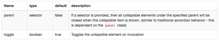
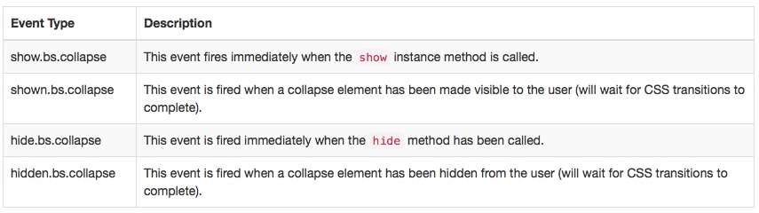
九、折叠(Collapse)
手风琴效果,用来制作折叠面板或菜单等效果。
Click the buttons below to show and hide another element via class changes:
• .collapse hides content
• .collapsing is applied during transitions
• .collapse.in shows content
You can use a link with the href attribute, or a button with the data-target attribute. In both cases, the data-toggle="collapse" is required.
1.实例
<a class="btn btn-primary" role="button" data-toggle="collapse" href="#collapseExample" aria-expanded="false" aria-controls="collapseExample">
  Link with href
</a>
<button class="btn btn-primary" type="button" data-toggle="collapse" data-target="#collapseExample" aria-expanded="false" aria-controls="collapseExample">
  Button with data-target
</button>
<div class="collapse" id="collapseExample">
  <div class="well">
    ...
  </div>
</div>
 

点击后:
 

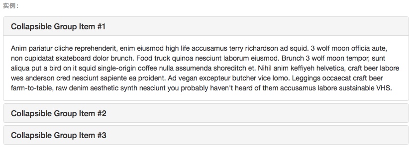
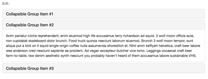
2.Accordion example
Extend the default collapse behavior to create an accordion with the panel component.
<div class="panel-group" id="accordion" role="tablist" aria-multiselectable="true">
  <div class="panel panel-default">
    <div class="panel-heading" role="tab" id="headingOne">
      <h4 class="panel-title">
        <a role="button" data-toggle="collapse" data-parent="#accordion" href="#collapseOne" aria-expanded="true" aria-controls="collapseOne">
          Collapsible Group Item #1
        </a>
      </h4>
    </div>
    <div id="collapseOne" class="panel-collapse collapse in" role="tabpanel" aria-labelledby="headingOne">
      <div class="panel-body">
        Anim pariatur cliche reprehenderit, enim eiusmod high life accusamus terry richardson ad squid. 3 wolf moon officia aute, non cupidatat skateboard dolor brunch. Food truck quinoa nesciunt laborum eiusmod. Brunch 3 wolf moon tempor, sunt aliqua put a bird on it squid single-origin coffee nulla assumenda shoreditch et. Nihil anim keffiyeh helvetica, craft beer labore wes anderson cred nesciunt sapiente ea proident. Ad vegan excepteur butcher vice lomo. Leggings occaecat craft beer farm-to-table, raw denim aesthetic synth nesciunt you probably haven't heard of them accusamus labore sustainable VHS.
      </div>
    </div>
  </div>
  <div class="panel panel-default">
    <div class="panel-heading" role="tab" id="headingTwo">
      <h4 class="panel-title">
        <a class="collapsed" role="button" data-toggle="collapse" data-parent="#accordion" href="#collapseTwo" aria-expanded="false" aria-controls="collapseTwo">
          Collapsible Group Item #2
        </a>
      </h4>
    </div>
    <div id="collapseTwo" class="panel-collapse collapse" role="tabpanel" aria-labelledby="headingTwo">
      <div class="panel-body">
        Anim pariatur cliche reprehenderit, enim eiusmod high life accusamus terry richardson ad squid. 3 wolf moon officia aute, non cupidatat skateboard dolor brunch. Food truck quinoa nesciunt laborum eiusmod. Brunch 3 wolf moon tempor, sunt aliqua put a bird on it squid single-origin coffee nulla assumenda shoreditch et. Nihil anim keffiyeh helvetica, craft beer labore wes anderson cred nesciunt sapiente ea proident. Ad vegan excepteur butcher vice lomo. Leggings occaecat craft beer farm-to-table, raw denim aesthetic synth nesciunt you probably haven't heard of them accusamus labore sustainable VHS.
      </div>
    </div>
  </div>
  <div class="panel panel-default">
    <div class="panel-heading" role="tab" id="headingThree">
      <h4 class="panel-title">
        <a class="collapsed" role="button" data-toggle="collapse" data-parent="#accordion" href="#collapseThree" aria-expanded="false" aria-controls="collapseThree">
          Collapsible Group Item #3
        </a>
      </h4>
    </div>
    <div id="collapseThree" class="panel-collapse collapse" role="tabpanel" aria-labelledby="headingThree">
      <div class="panel-body">
        Anim pariatur cliche reprehenderit, enim eiusmod high life accusamus terry richardson ad squid. 3 wolf moon officia aute, non cupidatat skateboard dolor brunch. Food truck quinoa nesciunt laborum eiusmod. Brunch 3 wolf moon tempor, sunt aliqua put a bird on it squid single-origin coffee nulla assumenda shoreditch et. Nihil anim keffiyeh helvetica, craft beer labore wes anderson cred nesciunt sapiente ea proident. Ad vegan excepteur butcher vice lomo. Leggings occaecat craft beer farm-to-table, raw denim aesthetic synth nesciunt you probably haven't heard of them accusamus labore sustainable VHS.
      </div>
    </div>
  </div>
</div>


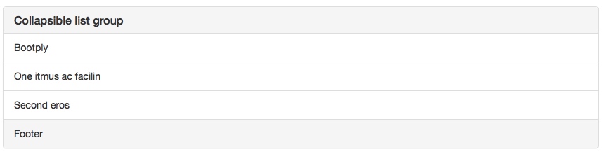
用.list-group替换.panel-body

3.用法
The collapse plugin utilizes a few classes to handle the heavy lifting:
• .collapse hides the content
• .collapse.in shows the content
• .collapsing is added when the transition starts, and removed when it finishes
These classes can be found in component-animations.less.
Via data attributes
Just add data-toggle="collapse" and a data-target to the element to automatically assign control of a collapsible element. The data-target attribute accepts a CSS selector to apply the collapse to. Be sure to add the class collapse to the collapsible element. If you'd like it to default open, add the additional class in.
To add accordion-like group management to a collapsible control, add the data attribute data-parent="#selector". Refer to the demo to see this in action.
Via JavaScript
Enable manually with:
$('.collapse').collapse()
4.参数
Options can be passed via data attributes or JavaScript. For data attributes, append the option name to data-, as in data-parent="".

5.方法
.collapse(options)
Activates your content as a collapsible element. Accepts an optional options object.
$('#myCollapsible').collapse({
  toggle: false
})
.collapse('toggle')
Toggles a collapsible element to shown or hidden.
.collapse('show')
Shows a collapsible element.
.collapse('hide')
Hides a collapsible element.
6.事件
$('#myCollapsible').on('hidden.bs.collapse', function () {
  // do something…
})

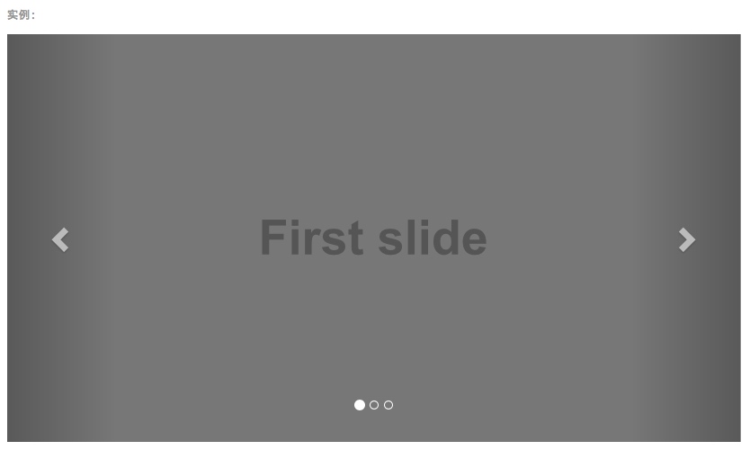
十、轮播(Carousel)
实现图片播放功能。
1.实例
<div id="carousel-example-generic" class="carousel slide" data-ride="carousel">
  <!-- Indicators -->
  <ol class="carousel-indicators">
    <li data-target="#carousel-example-generic" data-slide-to="0" class="active"></li>
    <li data-target="#carousel-example-generic" data-slide-to="1"></li>
    <li data-target="#carousel-example-generic" data-slide-to="2"></li>
  </ol>

  <!-- Wrapper for slides -->
  <div class="carousel-inner" role="listbox">
    <div class="item active">
      <img src="..." alt="...">
      <div class="carousel-caption">
        ...
      </div>
    </div>
    <div class="item">
      <img src="..." alt="...">
      <div class="carousel-caption">
        ...
      </div>
    </div>
    ...
  </div>

  <!-- Controls -->
  <a class="left carousel-control" href="#carousel-example-generic" role="button" data-slide="prev">
    <span class="glyphicon glyphicon-chevron-left" aria-hidden="true"></span>
    <span class="sr-only">Previous</span>
  </a>
  <a class="right carousel-control" href="#carousel-example-generic" role="button" data-slide="next">
    <span class="glyphicon glyphicon-chevron-right" aria-hidden="true"></span>
    <span class="sr-only">Next</span>
  </a>
</div>

Optional captions
Add captions to your slides easily with the .carousel-caption element within any .item. Place just about any optional HTML within there and it will be automatically aligned and formatted.
<div class="item">
  <img src="..." alt="...">
  <div class="carousel-caption">
    <h3>...</h3>
    <p>...</p>
  </div>
</div>
2.用法
Multiple carousels
Carousels require the use of an id on the outermost container (the .carousel) for carousel controls to function properly. When adding multiple carousels, or when changing a carousel's id, be sure to update the relevant controls.
Via data attributes
Use data attributes to easily control the position of the carousel. data-slide accepts the keywords prev or next, which alters the slide position relative to its current position. Alternatively, use data-slide-to to pass a raw slide index to the carousel data-slide-to="2", which shifts the slide position to a particular index beginning with 0.
The data-ride="carousel" attribute is used to mark a carousel as animating starting at page load. It cannot be used in combination with (redundant and unnecessary) explicit JavaScript initialization of the same carousel.
Via JavaScript
Call carousel manually with:
$('.carousel').carousel()
3.参数
Options can be passed via data attributes or JavaScript. For data attributes, append the option name to data-, as in data-interval="".
 

4.方法
.carousel(options)
Initializes the carousel with an optional options object and starts cycling through items.
$('.carousel').carousel({
  interval: 2000
})
.carousel('cycle')
Cycles through the carousel items from left to right.
.carousel('pause')
Stops the carousel from cycling through items.
.carousel(number)
Cycles the carousel to a particular frame (0 based, similar to an array).
.carousel('prev')
Cycles to the previous item.
.carousel('next')
Cycles to the next item.
5.事件
Bootstrap's carousel class exposes two events for hooking into carousel functionality.
Both events have the following additional properties:
• direction: The direction in which the carousel is sliding (either "left" or "right").
• relatedTarget: The DOM element that is being slid into place as the active item.
All carousel events are fired at the carousel itself (i.e. at the <div class="carousel">).
$('#myCarousel').on('slide.bs.carousel', function () {
  // do something…
})
 

十一、输入提示(Typeahead)
可以记住文本框输入的文本,下次输入时可以及时自动补全。
十二、过渡效果(Transition)
为一些动画效果增加过渡。
关于过渡效果
对于简单的过渡效果,只需将 transition.js 和其它 JS 文件一起引入即可。如果你使用的是编译(或压缩)版的 bootstrap.js 文件,就无需再单独将其引入了。
包含的内容
Transition.js 是针对 transitionEnd 事件的一个基本辅助工具,也是对 CSS 过渡效果的模拟。它被其它插件用来检测当前浏览器对是否支持 CSS 的过渡效果。
禁用过度效果
通过下面的 JavaScript 代码可以在全局范围禁用过渡效果,并且必须将此代码放在 transition.js (或 bootstrap.js 或 bootstrap.min.js)后面,确保在 js 文件加载完毕后再执行下面的代码:
$.support.transition = false
专注App快速开发,欢迎关注微信公众号"App快速开发"。

 浙公网安备 33010602011771号