


鸿蒙应用开发从入门到实战(十一):ArkUI组件Text&TextInput - 程序员潘Sir - 博客园
大家好,我是潘Sir,持续分享IT技术,帮你少走弯路。《鸿蒙应用开发从入门到项目实战》系列文章持续更新中,陆续更新AI+编程、企业级项目实战等原创内容、欢迎关注!
ArkUI提供了丰富的系统组件,用于制作鸿蒙原生应用APP的UI,本文主要讲解文本组件Text和TextInput的使用。
一、文本Text
1.1 概述
Text为文本组件,用于显示文字内容。
1.2 参数
Text组件的参数类型为string | Resource,下面分别对两个参数类型进行介绍:
- string类型
Text('我是一段文本')
- Resource 类型
Resource类型的参数用于引用 resources/*/element目录中定义的字符串,同样需要使用$r()引用。
例如resources/base/element目录中有一个string.json文件,内容如下
{
  "string": [
    {
      "name": "greeting",
      "value": "你好"
    }
  ]
}
此时我们便可通过如下方式引用并显示greeting的内容。
Text($r('app.string.greeting'))
示例代码:
1、分别在resources下的base、en_US、zh_CN目录下的element下的string.json中添加对应的配置
在base和zh_CN下的element下的string.json中添加
 {
      "name": "greeting",
      "value": "你好,鸿蒙"
    }
在en_US目录下的element下的string.json中添加
{
      "name": "greeting",
      "value": "hello,harmony"
    }
2、component目录下新建text目录,新建TextParameterPage.ets文件
@Entry
@Component
// text组件
struct TextParameterPage {
  build() {
    Column({ space: 50 }) {
      // text组件参数
      //1、字符串类型
      Text('你好,鸿蒙')
        .fontSize(50)

      //2、Resource类型
      Text($r('app.string.greeting'))
        .fontSize(50)
    }.width('100%')
    .height('100%')
    .justifyContent(FlexAlign.Center)
  }
}
1.3 常用属性
1.3.1 字体大小
字体大小可通过fontSize()方法进行设置,该方法的参数类型为string | number| Resource,下面逐一介绍
- string类型
string类型的参数可用于指定字体大小的具体单位,例如fontSize('100px'),字体大小的单位支持px、fp。其中fp(font pixel)与vp类似,具体大小也会随屏幕的像素密度变化而变化。
- number类型
number类型的参数,默认以fp作为单位。
- Resource类型
Resource类型参数用于引用resources下的element目录中定义的数值。
示例代码:
在component/text目录下新建FontSizePage.ets文件
@Entry
@Component
// text属性:字体大小
struct FontSizePage {
  build() {
      Column({ space: 50 }) {
        // 1、参数为string类型
        Text('你好,鸿蒙')
          .fontSize('150px')

        Text('你好,鸿蒙')
          .fontSize('50fp')

        // 2、参数为number类型
        Text('你好,鸿蒙')
          .fontSize(50)
      }.width('100%')
      .height('100%')
      .justifyContent(FlexAlign.Center)
  }
}
1.3.2 字体粗细
字体粗细可通过fontWeight()方法进行设置,该方法参数类型为number | FontWeight | string,下面逐一介绍
- number类型
number类型的取值范围是[100,900],取值间隔为100,默认为400,取值越大,字体越粗。
- FontWeight类型
FontWeight为枚举类型,可选枚举值如下
| 名称 | 描述 |
|---|---|
FontWeight.Lighter |
字体较细。 |
FontWeight.Normal |
字体粗细正常。 |
FontWeight.Regular |
字体粗细正常。 |
FontWeight.Medium |
字体粗细适中。 |
FontWeight.Bold |
字体较粗。 |
FontWeight.Bolder |
字体非常粗。 |
- string类型
string类型的参数仅支持number类型和FontWeight类型参数的字符串形式,例如例如'100'和bold。
示例代码:
在component/text下新建FontWeightPage.ets文件
@Entry
@Component
// 字体粗细
struct FontWeightPage {

  build() {
    Column({ space: 50 }) {

      //默认效果
      Text('你好,鸿蒙')
        .fontSize(50)

      // 1、number类型
      Text('你好,鸿蒙')
        .fontSize(50)
        .fontWeight(666)

      // 2、FontWeight类型
      Text('你好,鸿蒙')
        .fontSize(50)
        .fontWeight(FontWeight.Lighter)

      // 3、string类型
      Text('你好,鸿蒙')
        .fontSize(50)
        .fontWeight('800')

    }.width('100%')
    .height('100%')
    .justifyContent(FlexAlign.Center)
  }
}
1.3.3 字体颜色
字体颜色可通过fontColor()方法进行设置,该方法参数类型为Color | string | number | Resource,下面逐一介绍
-
Color类型
Color为枚举类型,其中包含了多种常用颜色,例如Color.Green
-
string类型
string类型的参数可用于设置 rgb 格式的颜色,具体写法可以为'rgb(0, 128, 0)'或者'#008000'
-
number类型
number类型的参数用于使用16进制的数字设置 rgb 格式的颜色,具体写法为0x008000
-
Resource类型
Resource类型的参数用于应用resources下的element目录中定义的值。
示例代码:
在component/text目录下新建FontColorPage.ets文件
@Entry
@Component
// 字体颜色
struct FontColorPage {

  build() {
    Column({ space: 50 }) {
      // 1、Color类型
      Text('Color.Green')
        .fontSize(40)
        .fontWeight(FontWeight.Bold)
        .fontColor(Color.Green)

      // 2、string类型
      Text('rgb(0, 128, 0)')
        .fontSize(40)
        .fontWeight(FontWeight.Bold)
        .fontColor('rgba(59, 171, 59, 0.33)')

      Text('#008000')
        .fontSize(40)
        .fontWeight(FontWeight.Bold)
        .fontColor('#a4008000')

      // 3、number类型
      Text('0x008000')
        .fontSize(40)
        .fontWeight(FontWeight.Bold)
        .fontColor(0xa4008000)

    }.width('100%')
    .height('100%')
    .justifyContent(FlexAlign.Center)
  }
}
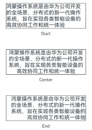
1.3.4 文本对齐
文本对齐方向可通过textAlign()方法进行设置,该方法的参数为枚举类型TextAlign,可选的枚举值如下
| 名称 | 描述 |
|---|---|
TextAlign.Start |
首部对齐 |
TextAlign.Center |
居中对齐 |
TextAlign.End |
尾部对齐 |
各选项效果如下
示例代码:
text目录下新建TextAlignPage.ets文件
@Entry
@Component
// 文本对齐
struct TextAlignPage {

  build() {
    Row() {
      Column({ space: 50 }) {
        Column({ space: 10 }) {
          // 1、TextAlign.Start
          Text('鸿蒙操作系统是由华为公司开发的全场景、分布式的新一代操作系统,旨在实现各类智能设备的高效协同工作和统一体验')
            .fontSize(20)
            .width(300)
            .borderWidth(1)
            .textAlign(TextAlign.Start)
          Text('Start')
        }

        Column({ space: 10 }) {
          // 2、TextAlign.Center
          Text('鸿蒙操作系统是由华为公司开发的全场景、分布式的新一代操作系统,旨在实现各类智能设备的高效协同工作和统一体验')
            .fontSize(20)
            .width(300)
            .borderWidth(1)
            .textAlign(TextAlign.Center)
          Text('Center')
        }

        Column({ space: 10 }) {
          // 3、TextAlign.End
          Text('鸿蒙操作系统是由华为公司开发的全场景、分布式的新一代操作系统,旨在实现各类智能设备的高效协同工作和统一体验')
            .fontSize(20)
            .width(300)
            .borderWidth(1)
            .textAlign(TextAlign.End)
          Text('End')
        }

      }.width('100%')
      .height('100%')
      .justifyContent(FlexAlign.Center)
    }
  }
}
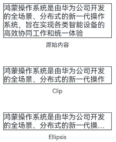
1.3.5 最大行数和超长处理
可使用maxLines()方法控制文本的最大行数,当内容超出最大行数时,可使用textOverflow()方法处理超出部分,该方法的参数类型为{ overflow: TextOverflow },其中TextOverflow为枚举类型,可用枚举值有
| 名称 | 描述 |
|---|---|
TextOverflow.Clip |
文本超长时,进行裁剪显示。 |
TextOverflow.Ellipsis |
文本超长时,显示不下的文本用省略号代替。 |
各选项效果如下
示例代码:
在component/text目录下新建TextOverFlowPage.ets文件
@Entry
@Component
// 最大行数和超长处理
struct TextOverFlowPage {

  build() {
    Column({ space: 50 }) {
      Column({ space: 10 }) {
        Text('鸿蒙操作系统是由华为公司开发的全场景、分布式的新一代操作系统,旨在实现各类智能设备的高效协同工作和统一体验')
          .fontSize(20)
          .width(300)
          .borderWidth(1)
        Text('原始内容')
      }

      // 1、TextOverflow.Clip 文本超长时,进行裁剪显示
      Column({ space: 10 }) {
        Text('鸿蒙操作系统是由华为公司开发的全场景、分布式的新一代操作系统,旨在实现各类智能设备的高效协同工作和统一体验')
          .fontSize(20)
          .width(300)
          .borderWidth(1)
          .maxLines(2)
          .textOverflow({ overflow: TextOverflow.Clip })
        Text('Clip')
      }

      // 2、TextOverflow.Ellipsis 文本超长时,显示不下的文本用省略号代替
      Column({space:10}) {
        Text('鸿蒙操作系统是由华为公司开发的全场景、分布式的新一代操作系统,旨在实现各类智能设备的高效协同工作和统一体验')
          .fontSize(20)
          .width(300)
          .borderWidth(1)
          .maxLines(2)
          .textOverflow({ overflow: TextOverflow.Ellipsis })
        Text('Ellipsis')
      }

    }.width('100%')
    .height('100%')
    .justifyContent(FlexAlign.Center)
  }
}
二、文本输入TextInput
2.1 概述
TextInput为文本输入组件,用于接收用户输入的文本内容。
2.2 参数
TextInput组件的参数定义如下
TextInput(value?:{placeholder?: string|Resource , text?: string|Resource})
- placeholder
placeholder属性用于设置无输入时的提示文本,效果如下

- text
text用于设置输入框当前的文本内容,效果如下

示例代码:
component目录下新建input目录,新建TextInputParameter.ets文件
@Entry
@Component
// 文本输入参数
struct TextInputParameter {

  build() {
    Column({ space: 50 }) {
      TextInput()
        .width('70%')

      // 1、placeholder参数
      TextInput({ placeholder: '请输入用户名' })
        .width('70%')

      // 2、text参数
      TextInput({ text: '当前内容' })
        .width('70%')

    }.width('100%')
    .height('100%')
    .justifyContent(FlexAlign.Center)
  }
}
2.3 常用属性
2.3.1 输入框类型
可通过type()方法设置输入框的类型,该方法的参数为InputType枚举类型,可选的枚举值有
| 名称 | 描述 |
|---|---|
InputType.Normal |
基本输入模式 |
InputType.Password |
密码输入模式 |
InputType.Number |
纯数字输入模式 |
2.3.2 光标样式
可通过caretColor()方法设置光标的颜色,效果如下

2.3.3 placeholder样式
可通过placeholderFont()和placeholderColor()方法设置 placeholder 的样式,其中placeholderFont()用于设置字体,包括字体大小、字体粗细等,placeholderColor()用于设置字体颜色,效果如下

2.3.4 文本样式
输入文本的样式可通过fontSize()、fontWeight()、fontColor()等通用属性方法进行设置。
示例代码:
在input目录下新建TextInputAttributePage.ets文件
@Entry
@Component
// TextInput属性
struct TextInputAttributePage {

  build() {
    Column({ space: 50 }) {

      // 1、输入框类型 type()设置类型, InputType
      Column({ space: 10 }) {
        Text('输入框类型')
        TextInput({ placeholder: '请输入任意内容' })
          .width('70%')
          .type(InputType.Normal)
        TextInput({ placeholder: '请输入数字' })
          .width('70%')
          .type(InputType.Number)
        TextInput({ placeholder: '请输入密码' })
          .width('70%')
          .type(InputType.Password)
      }

      // 2、光标样式 caretColor()设置光标的颜色
      Column({ space: 10 }) {
        Text('光标样式')
        TextInput()
          .width('70%')
          .caretColor(Color.Red)
      }

      // 3、placeholder样式 placeholderFont、placeholderColor
      Column({ space: 10 }) {
        Text('placeholder样式')
        TextInput({ placeholder: '请输入用户名' })
          .width('70%')
          .placeholderFont({ weight: 800 ,style:FontStyle.Italic})
          .placeholderColor('#66008000')
      }

    }.width('100%')
    .height('100%')
    .justifyContent(FlexAlign.Center)
  }
}
2.4 常用事件
2.4.1 change事件
每当输入的内容发生变化,就会触发 change 事件,开发者可使用onChange()方法为TextInput组件绑定 change 事件,该方法的参数定义如下
onChange(callback: (value: string) => void)
其中value为最新内容。
2.4.2 焦点事件
焦点事件包括获得焦点和失去焦点两个事件,当输入框获得焦点时,会触发 focus 事件,失去焦点时,会触发 blur 事件,开发者可使用onFocus()和onBlur()方法为 TextInput 组件绑定相关事件,两个方法的参数定义如下
onFocus(event: () => void)
onBlur(event: () => void)
示例代码:
在input目录下新建TextInputEvent.ets文件
@Entry
@Component
// TextInput事件
struct TextInputEvent {

  build() {
    Column({ space: 50 }) {
      TextInput({ placeholder: '请输入用户名' })
        .width('70%')
        .type(InputType.Normal)
        // 1、change事件
        .onChange((value) => {
          console.log(`用户名:${value}`)
        })
        // 2、获得焦点
        .onFocus(() => {
          console.log('用户名输入框获得焦点')
        })
        // 3、失去焦点
        .onBlur(() => {
          console.log('用户名输入框失去焦点')
        })

      TextInput({ placeholder: '请输入密码' })
        .width('70%')
        .type(InputType.Password)
        .onChange((value) => {
          console.log(`密码:${value}`)
        })
        .onFocus(() => {
          console.log('密码输入框获得焦点')
        })
        .onBlur(() => {
          console.log('密码输入框失去焦点')
        })
    }.width('100%')
    .height('100%')
    .justifyContent(FlexAlign.Center)
  }
}
《鸿蒙应用开发从入门到项目实战》系列文章持续更新中,陆续更新AI+编程、企业级项目实战等原创内容,防止迷路,欢迎关注!


 浙公网安备 33010602011771号