


HTML-★★★格式与布局fixed/absolute/relative/z-index/float★★★

很多网页都存在一个悬浮的操作条或者广告区,无论如何上下滚动网页,操作条或广告区都不会动,这个就是div制作,位置锁定在屏幕指定位置,现在我们就学习下网页的格式与布局。
position 位置,来给div定位
1、position:fixed;锁定位置(相当于浏览器窗口的位置),默认层数最高。例如有些网站的右下角弹窗。
练习:在右下角做一个弹窗,锁定位置,不随网页滚动而滚动。
步骤:
一、先做一个文字的弹窗


<head>
<meta http-equiv="Content-Type" content="text/html; charset=utf-8" />
<title>格式与布局</title>
<style type="text/css">
.wtc
{
    width:200px; height:150px; background-color:#F00;
    border:yellow solid 6px;
    line-height:150px; text-align:center;
}
</style>
</head>

<body>
<div class="wtc"><b><u>Welcom To China!</u></b></div>
</body>
</html>

二、将弹窗放置在屏幕右下角并锁定位置(插入空行加长页面来已显示滚动条)——若不写position:fixed;代码,弹窗设置的位置无法确定相对于谁的位置
<head>
<meta http-equiv="Content-Type" content="text/html; charset=utf-8" />
<title>格式与布局</title>
<style type="text/css">
.wtc
{
    width:200px; height:150px; background-color:#F00;
    border:yellow solid 6px;
    line-height:150px; text-align:center;
}
</style>
</head>

<body>
<div class="wtc" style="right:30px; bottom:30px; position:fixed;"><b><u>Welcom To China!</u></b></div><br />
<br />
<br />
<br />
<br />
<br />
<br />
<br />
<br />
<br />
<br />
<br />
<br />
<br />
<br />
<br />
<br />
<br />
<br />
<br />
<br />
<br />
<br />
<br />
<br />
<br />
<br />
<br />
<br />
<br />
<br />
<br />
<br />
<br />
<br />
<br />
<br />
<br />
<br />
<br />
<br />
<br />
<br />
<br />
<br />
<br />
<br />
<br />
<br />
<br />
<br />
<br />
<br />
<br />
<br />
<br />
<br />
<br />
<br />
<br />
<br />

</body>
</html>

2、position:absolute 绝对位置
外层没有position:absolute(或relative);那么div相对于浏览器定位,外层有position:absolute(或relative);那么div相对于外层边框定位
练习:a、指定一个div,蓝色边框背景白色,内部再指定一个div,红色背景有文字,外部div不指定position,两个div都不指定position
<head>
<meta http-equiv="Content-Type" content="text/html; charset=utf-8" />
<title>格式与布局</title>
<style type="text/css">
.wtc
{
    width:200px; height:150px; background-color:#F00;
    border:yellow solid 6px;
    line-height:150px; text-align:center;
}
</style>
</head>

<body>
<div style="border:10px blue solid; width:500px; height:400px;"><div class="wtc"><b><u>Welcom To China!</u></b></div></div>

</body>

b、上述div,外部div指定一个position:absolute;后,外部div会带着内部div移动,且随着滚动条会移动位置,是相对于整个网页锁定了位置
absolute绝对位置,会跟随网页滚动而改变在窗口的位置,相对于整个网页位置不变
<head>
<meta http-equiv="Content-Type" content="text/html; charset=utf-8" />
<title>格式与布局</title>
<style type="text/css">
.wtc
{
    width:200px; height:150px; background-color:#F00;
    border:yellow solid 6px;
    line-height:150px; text-align:center;
}
</style>
</head>

<body>
<div style="border:10px blue solid; width:500px; height:400px; position:absolute; right:250px; top:100px;"><div class="wtc"><b><u>Welcom To China!</u></b></div></div><br />
<br />
<br />
<br />
<br />
<br />
<br />
<br />
<br />
<br />
<br />
<br />
<br />
<br />
<br />
<br />
<br />
<br />
<br />
<br />
<br />
<br />
<br />
<br />
<br />
<br />
<br />
<br />
<br />
<br />
<br />
<br />
<br />
<br />
<br />
<br />
<br />
<br />
<br />
<br />
<br />
<br />
<br />
<br />
<br />
<br />
<br />
<br />
<br />
<br />
<br />
<br />
<br />
<br />
<br />
<br />
<br />
<br />
</body>

c、上述div,外部div不指定position,内部div指定一个position:absolute;后,外部div没有改变位置,内部div相对于整个网页改变了位置
<head>
<meta http-equiv="Content-Type" content="text/html; charset=utf-8" />
<title>格式与布局</title>
<style type="text/css">
.wtc
{
    width:200px; height:150px; background-color:#F00;
    border:yellow solid 6px;
    line-height:150px; text-align:center;
}
</style>
</head>

<body>
<div style="border:10px blue solid; width:500px; height:400px;"><div class="wtc" style="position:absolute; right:25px; top:10px;"><b><u>Welcom To China!</u></b></div></div><br />
</body>

d、上述div,同时设置内外div的position,此时,外部div相对于网页确定位置,内部div相对于外边框(外部div)确定位置
<head>
<meta http-equiv="Content-Type" content="text/html; charset=utf-8" />
<title>格式与布局</title>
<style type="text/css">
.wtc
{
    width:200px; height:150px; background-color:#F00;
    border:yellow solid 6px;
    line-height:150px; text-align:center;
}
</style>
</head>

<body>
<div style="border:10px blue solid; width:500px; height:400px; position:absolute; right:250px; top:100px;"><div class="wtc" style="position:absolute; right:25px; top:10px;"><b><u>Welcom To China!</u></b></div></div>
</body>

3、position:relative;相对位置
a、输入三个div,仅指定长宽和背景颜色
<body>
<div style="background-color:#F00; width:200px; height:100px;"></div>
<div style="background-color:#CF0; width:200px; height:100px;"></div>
<div style="background-color:#0F0; width:200px; height:100px;"></div>
</body>

b、在a的基础上,设置第二个div黄色区域向下、向右移动,position用absolute定位,黄色区域相对于浏览器窗口定位,而绿色区域向上紧跟红色区域
<body>
<div style="background-color:#F00; width:200px; height:100px;"></div>
<div style="background-color:#CF0; width:200px; height:100px; top:50px; left:100px; position:absolute;"></div>
<div style="background-color:#0F0; width:200px; height:100px;"></div>
</body>

c、在a的基础上,设置第二个div黄色区域向下、向右移动,position用relative定位,黄色区域相对于原有位置定位,而绿色区域还在原黄色位置下方
<body>
<div style="background-color:#F00; width:200px; height:100px;"></div>
<div style="background-color:#CF0; width:200px; height:100px; top:50px; left:100px; position:relative;"></div>
<div style="background-color:#0F0; width:200px; height:100px;"></div>
</body>

结合b和c,说明absolute绝对位置是相对于浏览器页面位置定位,此时div不占有实际位置,所以绿色区域紧跟红色区域;relative相对位置是相对于div原有位置定位,此时div是实际占有位置的,所以绿色区域保持在原来黄色区域下方。
4、分层(z-index)
屏幕显示窗口虽然是在二维页面上显示,但实际是三维显示,因为窗口是重叠的,有上下层之分,上层总是覆盖下层,就像是一摞纸。
在上述c中,黄色区域覆盖了绿色区域,如何让绿色区域覆盖黄色区域?在绿色区域div-style中添加代码“z-index:2; position:relative;”即可
<body>
<div style="background-color:#F00; width:200px; height:100px;"></div>
<div style="background-color:#CF0; width:200px; height:100px; top:50px; left:100px; position:relative;;"></div>
<div style="background-color:#0F0; width:200px; height:100px; position:relative; z-index:2;"></div>
</body>

5、float:left;(right)流式布局
left、right时不需要规定位置(top、right),直接相对于浏览器,若外部被包裹,相对于外部div的位置的左上或右上显示。
a、在新建的html中输入两个div,分别指定float:left;和float:right;
<body>
<div style="background-color:#0F0; width:100px; height:300px; float:left;"></div>
<div style="background-color:#FF0; width:100px; height:300px; float:right;"></div>
</body>

b、用一个div包裹这两个div,并居中,这种样式就像网站中悬浮的广告框
<body>
<div style="border:#F00 solid 5px; width:700px; height:500px; margin:0px auto;">
<div style="background-color:#0F0; width:100px; height:300px; float:left;"></div>
<div style="background-color:#FF0; width:100px; height:300px; float:right;"></div>
</div>
</body>

c、在a的基础上,我们用边框代替背景色,复制粘贴多个float,发现,div是从左至右、从右至左的顺序进行排列
<body>
<div style="border:#F00 solid 5px; width:700px; height:500px; margin:0px auto;">
<div style="border:#0F0 solid 3px; width:100px; height:300px; float:left;">a</div>
<div style="border:#0F0 solid 3px; width:100px; height:300px; float:left;">b</div>
<div style="border:#0F0 solid 3px; width:100px; height:300px; float:left;">c</div>
<div style="border:#FF0 solid 3px; width:100px; height:300px; float:right;">d</div>
<div style="border:#FF0 solid 3px; width:100px; height:300px; float:right;">e</div>
<div style="border:#FF0 solid 3px; width:100px; height:300px; float:right;">f</div>
</div>
</body>

d、将多个div放在网页中,设置float
<body>
<div style="border:#0F0 solid 3px; width:100px; height:300px; float:left;">a</div>
<div style="border:#0F0 solid 3px; width:100px; height:300px; float:left;">b</div>
<div style="border:#0F0 solid 3px; width:100px; height:300px; float:left;">c</div>
<div style="border:#0F0 solid 3px; width:100px; height:300px; float:left;">d</div>
<div style="border:#0F0 solid 3px; width:100px; height:300px; float:left;">e</div>
<div style="border:#0F0 solid 3px; width:100px; height:300px; float:left;">f</div>
<div style="border:#FF0 solid 3px; width:100px; height:300px; float:right;">aa</div>
<div style="border:#FF0 solid 3px; width:100px; height:300px; float:right;">bb</div>
<div style="border:#FF0 solid 3px; width:100px; height:300px; float:right;">cc</div>
<div style="border:#FF0 solid 3px; width:100px; height:300px; float:right;">dd</div>
<div style="border:#FF0 solid 3px; width:100px; height:300px; float:right;">ee</div>
<div style="border:#FF0 solid 3px; width:100px; height:300px; float:right;">ff</div>
</body>
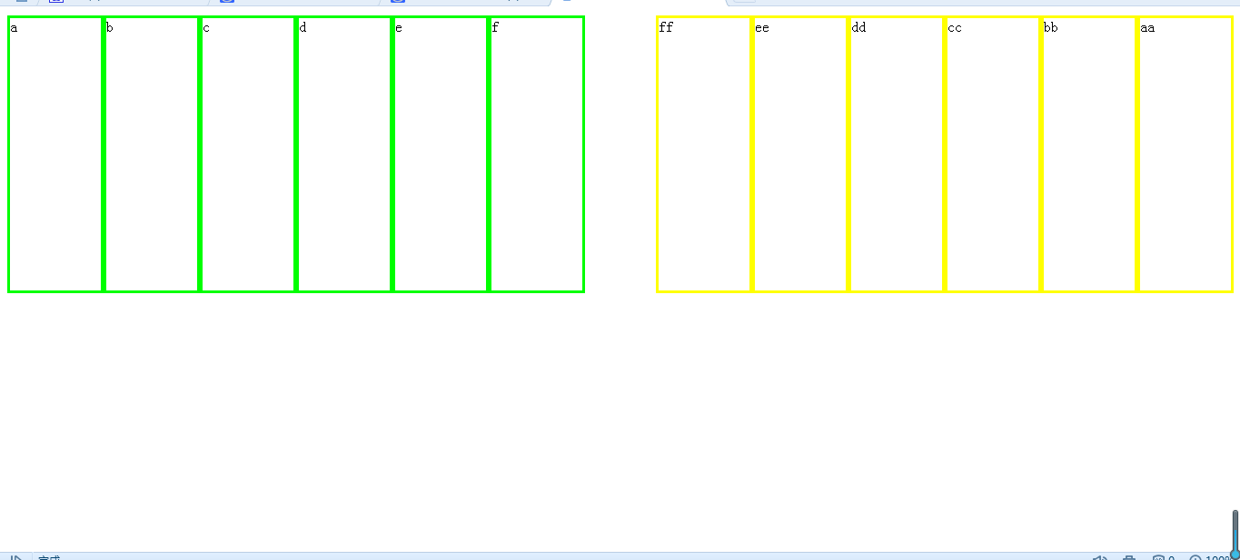
此时,缩小浏览器会发现,所有div像流水一样排列

e、练习
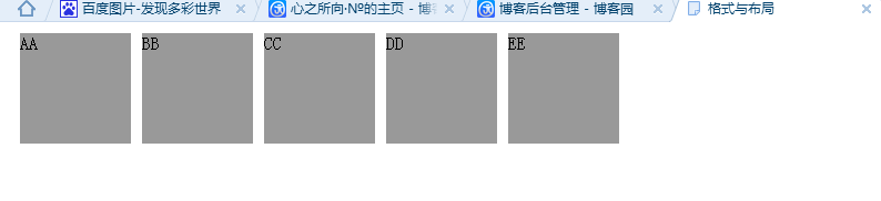
第一步:用float:left;排5个灰色区域
<head>
<meta http-equiv="Content-Type" content="text/html; charset=utf-8" />
<title>格式与布局</title>
<style type="text/css">
.a
{
background-color:#999; width:100px; height:100px; margin:10px;    float:left;
}
</style>
</head>

<body>
<div class="a">AA</div>
<div class="a">BB</div>
<div class="a">CC</div>
<div class="a">DD</div>
<div class="a">EE</div>
</body>
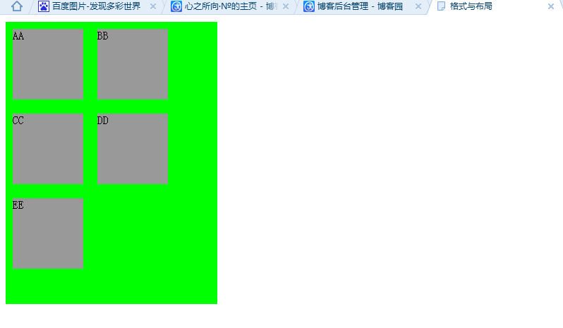
第二步:用一个div包含他们
<head>
<meta http-equiv="Content-Type" content="text/html; charset=utf-8" />
<title>格式与布局</title>
<style type="text/css">
.a
{
background-color:#999; width:100px; height:100px; margin:10px;    float:left;
}
</style>
</head>

<body>
<div style="background-color:#0F0; width:300px; height:400px;">
<div class="a">AA</div>
<div class="a">BB</div>
<div class="a">CC</div>
<div class="a">DD</div>
<div class="a">EE</div>
</div>
</body>

 浙公网安备 33010602011771号