
WPF新教程(补充1)
WPF新教程补充
- 查看新建项目的目录
// wpfApp1.csproj

<Project Sdk="Microsoft.NET.Sdk">

  <PropertyGroup>
  	<!--声明输出的文件类型,框架等待信息-->
    <OutputType>WinExe</OutputType>
    <TargetFramework>net8.0-windows</TargetFramework>
    <Nullable>enable</Nullable>
    <ImplicitUsings>enable</ImplicitUsings>
    <UseWPF>true</UseWPF>
  </PropertyGroup>

</Project>
// AssemblyInfo.cs: 定义程序集(项目)的描述信息
- 快捷键
- 按住"Ctrl"键可以放大窗体
- 按住"空格键"可以拖放窗体
- 知识点补充
- C#中的"命名空间",就是"目录",存放一个个"名称空间",而一个"名称空间"(文件)里面,放着多个"类"
- 基础示例: 给
Button添加通用自定义样式
// App.xaml

				<!--指定App类-->
<Application x:Class="WpfApp1.App"
             ......
             <!--指定主窗体-->
             StartupUri="MainWindow.xaml">
    <Application.Resources>
    	<!--通过字典资源,自定义按钮样式-->
        <ResourceDictionary>
            <Style TargetType="Button" x:Key="ButtonStyle">
                <Setter Property="Foreground" Value="Red" />
            </Style>
        </ResourceDictionary>

    </Application.Resources>
</Application>

// MainWindow.xaml

<Window x:Class="WpfApp1.MainWindow"
        ......
        Title="MainWindow" Height="450" Width="800">
    <Grid>
    	<!--引入样式-->
        <Button Content="ClickMe" Width="200" Height="40" Style="{StaticResource ButtonStyle}" />
    </Grid>
</Window>
Application的生命周期- 可以把
App理解为一个容器,可以存放很多的窗体
- 可以把
using System.Configuration;
using System.Data;
using System.Windows;

namespace WpfApp1
{
    /// <summary>
    /// Interaction logic for App.xaml
    /// </summary>
    public partial class App : Application
    {


        protected override void OnStartup(StartupEventArgs e)
        {
            base.OnStartup(e);
            Console.WriteLine("App OnStartup");
        }


        protected override void OnActivated(EventArgs e)
        {
            base.OnActivated(e);
            Console.WriteLine("App OnActivated");
        }

        protected override void OnDeactivated(EventArgs e)
        {
            base.OnDeactivated(e);
            Console.WriteLine("App OnDeactivated");

        }
        protected override void OnExit(ExitEventArgs e)
        {
            base.OnExit(e);
            Console.WriteLine("App OnExit");

        }


    }

}
窗体的生命周期
......

namespace WpfApp1
{

    public partial class MainWindow : Window
    {
        public MainWindow()
        {
            InitializeComponent();
			<!--窗体初始化-->
            this.SourceInitialized += (o, e) => { Console.WriteLine("SourceInitialized"); };
            <!--窗体被激活-->
            this.Activated += (o, e) => { Console.WriteLine("Activated"); };
            <!--窗体加载-->
            this.Loaded += (o, e) => { Console.WriteLine("Loaded"); };
             <!--窗体所有控件加载完毕(相当于mounted())-->
            this.ContentRendered += (o, e) => { Console.WriteLine("ContentRendered"); };
            <!--窗体失去焦点-->
            this.Deactivated += (o, e) => { Console.WriteLine("Deactivated"); };
            <!--窗体正在关闭-->
            this.Closing += (o, e) => { Console.WriteLine("Closing"); };
            <!--窗体已经关闭-->
            this.Closed += (o, e) => { Console.WriteLine("Closed"); };
             <!--窗体被卸载-->
            this.Unloaded += (o, e) => { Console.WriteLine("Unloaded"); };

        }
    }
}
- 二者结合起来,运行结果如下
// 启动项目
App OnStartup
SourceInitialized
App OnActivated
Activated
Loaded
ContentRendered

// 当窗体失去焦点时
Deactivated
App OnDeactivated

// 当窗体重新获得焦点时
App OnActivated
Activated

// 当关闭窗体的时候
Closing
Deactivated
App OnDeactivated
Closed
App OnExit
常用属性介绍
Icon属性: 设置窗体图标
- 项目目录下,新建"images"目录,把"xxx.ico"拷贝进去
	- 右键"xxx.ico"属性,在"生成操作"那边,选择"内容",较新则复制

- 代码应用
	<Window x:Class="WpfApp1.Window1"
        ......
        <!--应用图标-->
        Icon="images/myIco.ico"
        mc:Ignorable="d"
        Title="测试窗口" Height="450" Width="800">
WindowStyle: 设置窗体的边框样式
<Window x:Class="WpfApp1.Window1"
       ......
        WindowStyle="ThreeDBorderWindow"
       ......
        Title="测试窗口" Height="450" Width="800">
ResizeMode: 设置窗体是否可以被调整窗体大小
 <!--不可被调整-->
 ResizeMode="NoResize"
Topmost: 设置窗体是否永远在最前面(在所有程序的前面)
Topmost="True"
WindowStartupLocation: 决定窗体启动时,在屏幕当中的位置
<!--位于屏幕中间-->
WindowStartupLocation="CenterScreen"
程序退出的几种方式
ShutdownMode: 有三种取值
- OnMainWindowClose(最常用): 主窗体关闭以后,程序就关闭
- OnLastWindowClose: 最后一个窗体关闭时,程序关闭
- OnExplicitShutdown: 调用方法,实现程序关闭
// App.xaml
<Application x:Class="WpfApp1.App"
           ......
           <!--随着主窗体关闭,程序退出-->
             ShutdownMode="OnMainWindowClose"
             StartupUri="MainWindow.xaml">
    <Application.Resources>
        ......
    </Application.Resources>
</Application>
Application.Current.Shutdown()[常用]: 直到所有的后台线程全部关闭以后,程序才会关闭- 以下实例效果: 当点击
退出按钮以后,窗体立即消失,但vs编辑器的程序还在跑,因为此时后台线程还没有结束,等过一会儿,vs编辑器程序才自动停止- 要等到
后台线程结束以后,程序才会退出
- 要等到
- 以下实例效果: 当点击
// MainWindow.xaml
......
<StackPanel>
    <Button Content="ClickMe" Width="200" Height="40" Style="{StaticResource ButtonStyle}" Click="Button_Click" />
    <Button Content="Quit" Width="200" Height="40" Click="Button_Click_1"  />
    <Button Content="Threading" Width="200" Height="40" Click="Button_Click_2"  />
</StackPanel>

// cs
......

namespace WpfApp1
{

    public partial class MainWindow : Window
    {
        public MainWindow()
        {
            InitializeComponent();

           ......
        }

		// 展示第二个窗体
        private void Button_Click(object sender, RoutedEventArgs e)
        {
            Window1 window1 = new Window1();
            window1.ShowDialog();
        }

		// 程序退出
        private void Button_Click_1(object sender, RoutedEventArgs e)
        {
            Application.Current.Shutdown();
        }

		// 前台 && 后台 线程创建
        private void Button_Click_2(object sender, RoutedEventArgs e)
        {

			// 创建前台线程
            Thread th2 = new Thread(() =>
            {
                Thread.Sleep(10000);
            });
            th2.IsBackground = false;
            th2.Start();


			// 创建后台线程
            Thread th = new Thread(() =>
            {
                Thread.Sleep(10000);
            });
            th.IsBackground = true;
            th.Start();


        }
    }
}
Environment.Exit(0)[常用];强行退出
private void Button_Click_1(object sender, RoutedEventArgs e)
{
    // Application.Current.Shutdown();
    // 程序不会等待后台线程结束,立即退出
    Environment.Exit(0);
}
Process.GetCurrentProcess().Kill()[最好不要用]: 野蛮强行退出
private void Button_Click_1(object sender, RoutedEventArgs e)
{
    // Application.Current.Shutdown();
   // Environment.Exit(0);
   var currentProcess = Process.GetCurrentProcess();
    currentProcess.Kill();
}
Environment.FailFast("非正常退出"): 退出程序时,会抛出异常
private void Button_Click_1(object sender, RoutedEventArgs e)
{
    // Application.Current.Shutdown();
    // Environment.Exit(0);
    //var currentProcess = Process.GetCurrentProcess();
    // currentProcess.Kill();
    Environment.FailFast("非正常退出");
}
Panel控件介绍
- Panel.ZIndex:它的数值 决定哪个控件在上面(数值大的在上面)
<Grid>
	<!--两个重叠的按钮,这里"111"按钮在上方,因为ZIndex值比较大-->
    <Button Content="111" Width="200" Height="30" Panel.ZIndex="1" />
    <Button Content="222" Width="200" Height="30" Panel.ZIndex="0" />
</Grid>
- 注意事项: 这里的
Panel.ZIndex称为附加属性(不是Button天生自带的属性) 小坑: 当我们声明容器点击事件的时候,必须加上背景色属性,否则只有当点击按钮的时候,才会触发容器点击事件
<!--声明容器点击事件,此时只有点击按钮的时候,才会触发容器点击事件-->
<Grid PreviewMouseUp="Grid_PreviewMouseUp">
    <Button Content="111" Width="200" Height="30" />
</Grid>

// cs


namespace WpfApp2
{

    public partial class MainWindow : Window
    {
        public MainWindow()
        {
            InitializeComponent();
        }

        private void Grid_PreviewMouseUp(object sender, MouseButtonEventArgs e)
        {
            MessageBox.Show("666");
        }
    }
}

- 修改一下,加上"背景色属性"以后,点击容器就触发了"容器点击事件"

<!--添加背景色属性-->
<Grid Background="Red" PreviewMouseUp="Grid_PreviewMouseUp">
    <Button Content="111" Width="200" Height="30" />
</Grid>

- "鱼与熊掌兼得"的办法,把背景色设置为透明
<Grid Background="Transparent" PreviewMouseUp="Grid_PreviewMouseUp">
    ......
</Grid>
Grid布局
表格布局: 功能最强大(兼容性最好),可以实现市场上的的任何布局- 性能较低,所以作
简单布局的时候,尽量不要用(或者能用其他布局就用其他布局) - 基础示例如下
- 性能较低,所以作
<Grid>
	<!--三行两列,居中对齐-->
    <Grid.RowDefinitions>
        <RowDefinition />
        <RowDefinition />
        <RowDefinition />
    </Grid.RowDefinitions>

    <Grid.ColumnDefinitions>
        <ColumnDefinition />
        <ColumnDefinition />

    </Grid.ColumnDefinitions>

    <TextBlock Text="123"  FontSize="40" VerticalAlignment="Center" HorizontalAlignment="Center"/>
    <TextBlock Text="456"  Grid.Column="1" FontSize="40" VerticalAlignment="Center" HorizontalAlignment="Center" />
    <TextBlock Text="789" Grid.Row="1" Grid.Column="0" FontSize="40" VerticalAlignment="Center" HorizontalAlignment="Center" />
    <TextBlock Text="666" Grid.Row="1" Grid.Column="1" FontSize="40" VerticalAlignment="Center" HorizontalAlignment="Center" />
    <TextBlock Text="777" Grid.Row="2" Grid.Column="0" FontSize="40" VerticalAlignment="Center" HorizontalAlignment="Center" />
    <TextBlock Text="888" Grid.Row="2" Grid.Column="1" FontSize="40" VerticalAlignment="Center" HorizontalAlignment="Center" />

</Grid>
行与行与列与列之间的合并
<!--展示网格线-->
<Grid ShowGridLines="True">
    <Grid.RowDefinitions>
        <RowDefinition />
        <RowDefinition />
        <RowDefinition />
    </Grid.RowDefinitions>

    <Grid.ColumnDefinitions>
        <ColumnDefinition />
        <ColumnDefinition />
    </Grid.ColumnDefinitions>

	<!--合并两行-->
    <TextBlock Text="123"  Grid.RowSpan="2" FontSize="40" VerticalAlignment="Center" HorizontalAlignment="Center"/>
    <TextBlock Text="456"  Grid.Column="1" FontSize="40" VerticalAlignment="Center" HorizontalAlignment="Center" />
    <!--<TextBlock Text="789" Grid.Row="1" Grid.Column="0" FontSize="40" VerticalAlignment="Center" HorizontalAlignment="Center" />-->
    <TextBlock Text="666" Grid.Row="1" Grid.Column="1" FontSize="40" VerticalAlignment="Center" HorizontalAlignment="Center" />
    <!--合并两列-->
    <TextBlock Text="777" Grid.ColumnSpan="2" Grid.Row="2" Grid.Column="0" FontSize="40" VerticalAlignment="Center" HorizontalAlignment="Center" />
    <!--<TextBlock Text="888" Grid.Row="2" Grid.Column="1" FontSize="40" VerticalAlignment="Center" HorizontalAlignment="Center" />-->

</Grid>
uniform布局
- 作用: 均匀布局,在卡片类的布局用得多,效率高
- 自适应大小,响应式
- 实例,快速生成一个
3*3均分布局的表格
<!--定义3行3列-->
<UniformGrid Rows="3" Columns="3" >
    <Button Content="111"  Margin="10" />
    <Button Content="222"  Margin="10" />
    <Button Content="333"  Margin="10" />
    <Button Content="444"  Margin="10" />
    <Button Content="555"  Margin="10" />
    <Button Content="666"  Margin="10" />
    <Button Content="777"  Margin="10" />
    <Button Content="888"  Margin="10" />
    <Button Content="999"  Margin="10" />
</UniformGrid>
-
FirstColumn属性- 作用: 用于指定第一行中子元素开始填充的列索引。默认情况下,子元素从第一行的第 0 列(最左侧)开始依次填充。通过设置
FirstColumn,可以改变子元素的起始位置
<!--偏移1列--> <UniformGrid Rows="3" Columns="3" FirstColumn="1" > <Button Content="111" Margin="10" /> <Button Content="222" Margin="10" /> <Button Content="333" Margin="10" /> <Button Content="444" Margin="10" /> <Button Content="555" Margin="10" /> <Button Content="666" Margin="10" /> <Button Content="777" Margin="10" /> <Button Content="888" Margin="10" /> <Button Content="999" Margin="10" /> </UniformGrid> - 注意事项: 当FirstColumn="3"或者以上时,是没有效果的 - 布局引擎会通过取模运算将值自动调整到有效范围 - 设置 FirstColumn="3",实际计算时会执行 3 % 3 = 0(即 3 除以 3 余 0) - 结果:FirstColumn 会被自动调整为 0,等同于没有偏移StackPanel堆积面板 - 作用: 用于指定第一行中子元素开始填充的列索引。默认情况下,子元素从第一行的第 0 列(最左侧)开始依次填充。通过设置
-
作用: 使
控件呈现水平或垂直排列(默认垂直排列) -
注意事项: 当控件的大小超过窗体时,超出部分不可见
<!--超出部分不可见-->
<StackPanel Orientation="Horizontal">
    <Button Content="111" Width="200" Height="30" Margin="10"/>
    <Button Content="111" Width="200" Height="30" Margin="10" />
    <Button Content="111" Width="200" Height="30" Margin="10" />
    <Button Content="111" Width="200" Height="30" Margin="10" />
    <Button Content="111" Width="200" Height="30" Margin="10" />
</StackPanel>
WrapPanel换行面板
- 作用: 使
控件呈现水平或垂直排列(默认水平排列) - 注意事项: 当控件的大小超过窗体时自动换行
<!--默认水平排列-->
<WrapPanel>
    <Button Content="111" Width="200" Height="30" Margin="10"/>
    <Button Content="111" Width="200" Height="30" Margin="10" />
    <Button Content="111" Width="200" Height="30" Margin="10" />
    <Button Content="111" Width="200" Height="30" Margin="10" />
    <Button Content="111" Width="200" Height="30" Margin="10" />
</WrapPanel>
DockPanel停靠面板
- 作用: 使
控件快速实现上,下,左,右的结构
<DockPanel>
	<!--规定上下左右控件的位置,所以第五个控件默认填充中间部分-->
	<!--如果第五个控件不想被默认填充,可以设置DockPanel LastChildFill="False"-->
    <Button Content="111" DockPanel.Dock="Top" />
    <Button Content="222" DockPanel.Dock="Left" />
    <Button Content="333" DockPanel.Dock="Right" />
    <Button Content="444" DockPanel.Dock="Bottom" />
    <Button Content="center"  />
</DockPanel>
Canvas画布面板
- 作用: 用于展示表格 || 动画数据
<Canvas>
    <Button Content="111" Canvas.Left="0" Width="200" Height="30" />
    <Button Content="222" Canvas.Right="0" Width="200" Height="30" />
    <Button Content="333" Canvas.Bottom="0" Width="200" Height="30" />
    <Button Content="444" Canvas.Bottom="0" Canvas.Right="0" Width="200" Height="30" />
    <Button Content="555"   Width="200" Height="30" Canvas.Left="299" Canvas.Top="202" HorizontalAlignment="Left" VerticalAlignment="Center" />
</Canvas>
Border边框
- 边框里面可以包裹控件,示例如下
<Canvas>
	<!--普通样式-->
    <Border Canvas.Left="20" Canvas.Top="20" Width="200" Height="40" BorderThickness="5" BorderBrush="Red">
        <TextBlock Text="XXXXX" VerticalAlignment="Center" HorizontalAlignment="Center" />
    </Border>


	<!--圆角-->
    <Border Canvas.Left="20" Canvas.Top="80" Width="200" Height="40" BorderThickness="2" BorderBrush="Blue" CornerRadius="10" Background="GreenYellow">
        <TextBlock Text="YYYY" VerticalAlignment="Center" HorizontalAlignment="Center" />
    </Border>

	<!--圆形-->
    <Border Canvas.Left="20" Canvas.Top="150" Width="200" Height="200" BorderThickness="2" BorderBrush="Blue" CornerRadius="100" Background="Black">
        <TextBlock Text="YYYY" VerticalAlignment="Center" HorizontalAlignment="Center" />
    </Border>


</Canvas>
GridSplit分割窗口
- 作用: 实现内容与内容之间,分隔线的效果
<Grid>
	<!--定义三列-->
    <Grid.ColumnDefinitions>
        <ColumnDefinition />
        <!--分隔列的宽度设置为auto-->
        <ColumnDefinition Width="auto" />
        <ColumnDefinition />
    </Grid.ColumnDefinitions>

	<!--第一列的内容,文本自动换行-->
    <Border Background="Green">
        <TextBlock Text="11111111111111111" TextWrapping="Wrap" />
    </Border>

	<!--分隔线有预览效果-->
    <GridSplitter Grid.Column="1" Width="5" HorizontalAlignment="Center" ShowsPreview="True" />

	<!--第三列的内容,文本自动换行-->
    <Border Background="Red" Grid.Column="2">
        <TextBlock Text="2222222222222222" TextWrapping="Wrap"/>
    </Border>


</Grid>
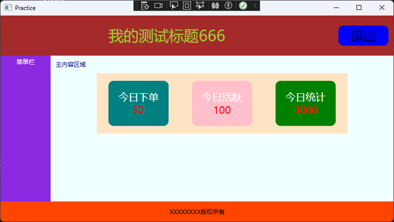
实战练习示例
<Window x:Class="WpfGridApp3.Practice"
        xmlns="http://schemas.microsoft.com/winfx/2006/xaml/presentation"
        xmlns:x="http://schemas.microsoft.com/winfx/2006/xaml"
        xmlns:d="http://schemas.microsoft.com/expression/blend/2008"
        xmlns:mc="http://schemas.openxmlformats.org/markup-compatibility/2006"
        xmlns:local="clr-namespace:WpfGridApp3"
        mc:Ignorable="d"
        Title="Practice" Height="450" Width="800">
    <DockPanel>


        <Grid Height="80" DockPanel.Dock="Top" Background="Brown">
            <Grid.ColumnDefinitions>
                <ColumnDefinition />
                <ColumnDefinition Width="auto" />
            </Grid.ColumnDefinitions>

            <TextBlock Text="我的测试标题666" FontSize="30" Foreground="YellowGreen" VerticalAlignment="Center" HorizontalAlignment="Center" />
            <Border Grid.Column="1" Width="100" Height="40" Background="Blue" CornerRadius="10" HorizontalAlignment="Right" Margin="10">
                <TextBlock Text="退出" Margin="3" VerticalAlignment="Center" FontSize="25" HorizontalAlignment="Center" />
            </Border>


        </Grid>

        <!--文字垂直居中的问题,TextBlock的垂直属性不生效-->
        <!--<StackPanel Height="40" DockPanel.Dock="Bottom" Background="OrangeRed">
            <TextBlock Text="XXXXXXXX版权所有"  HorizontalAlignment="Center" Margin="0 13" />
        </StackPanel>-->

        <!--StackPanel不再指定Height,而是嵌套Border指定Height,此时TextBlock的水平和垂直属性可以生效-->
        <StackPanel  DockPanel.Dock="Bottom" Background="OrangeRed">
            <Border Height="40">
                <TextBlock Text="XXXXXXXX版权所有"  HorizontalAlignment="Center" VerticalAlignment="Center" />
            </Border>

        </StackPanel>

        <StackPanel Width="100" DockPanel.Dock="Left" Background="BlueViolet">
            <TextBlock Text="菜单栏" Foreground="White" HorizontalAlignment="Center"  Margin="5" />
        </StackPanel>

        <StackPanel Background="Azure">
            <TextBlock Text="主内容区域" Foreground="DarkBlue" Margin="10" />
            <UniformGrid Columns="3" Background="Bisque" Width="500" Height="120">
                <Border Width="120" Height="90" CornerRadius="10" Background="Teal">
                    <StackPanel VerticalAlignment="Center">
                        <TextBlock Text="今日下单" HorizontalAlignment="Center" Foreground="White" FontSize="20" />
                        <TextBlock Text="30" HorizontalAlignment="Center"  Foreground="Red" FontSize="20" />
                    </StackPanel>
                </Border>

                <Border Width="120" Height="90" CornerRadius="10" Background="Pink">

                    <StackPanel VerticalAlignment="Center">
                        <TextBlock Text="今日活跃" HorizontalAlignment="Center" Foreground="White" FontSize="20" />
                        <TextBlock Text="100" HorizontalAlignment="Center"  Foreground="Red" FontSize="20" />
                    </StackPanel>

                </Border>

                <Border Width="120" Height="90" CornerRadius="10" Background="Green">
                    <StackPanel VerticalAlignment="Center">
                        <TextBlock Text="今日统计" HorizontalAlignment="Center" Foreground="White" FontSize="20" />
                        <TextBlock Text="3000" HorizontalAlignment="Center"  Foreground="Red" FontSize="20" />
                    </StackPanel>
                </Border>
            </UniformGrid>
        </StackPanel>

    </DockPanel>
</Window>
Control自定义控件模板
- 作用:自定义控件外观,便于引入其他窗口
- 实例演示: 自定义一个圆形控件模板
<Window x:Class="WpfApp3Control.MainWindow"
       ......
        Title="MainWindow" Height="450" Width="800">

    <!--创建基础控件-->
    <Control>
    	<!--通过Control.Template属性完全重写控件的视觉模板-->
        <Control.Template>
        	<!--指定模板适用于所有Control类型控件-->
            <ControlTemplate TargetType="Control">
            	<!--自定义想要的控件模板效果-->
                <Border Width="200" Height="200" Background="Red" CornerRadius="100">
                    <TextBlock Text="Control控件" VerticalAlignment="Center" HorizontalAlignment="Center" FontSize="20" Foreground="White" />
                </Border>
            </ControlTemplate>
        </Control.Template>
    </Control>
</Window>
Button按钮
- 按钮控件很熟悉了,直接实例
<Window x:Class="WpfApp3Control.ButtonControl"
       ......
        Title="ButtonControl" Height="450" Width="800">
    <Canvas>
    	<!--按钮文本内容可以使用Content,也可以不用Content实现-->
    	<!--IsDefault指明程序开始的时候,鼠标焦点的默认按钮-->
        <Button Width="120" Height="20" Content="Hello1" Click="Button1_Click" IsDefault="True" />
        <Button Width="120" Height="20" Canvas.Top="100" Click="Button2_Click" IsCancel="True" >Hello2</Button>
    </Canvas>
</Window>
Button里面嵌套TextBlock实例
<Window x:Class="WpfApp3Control.ButtonControl"
      ......
        Title="ButtonControl" Height="450" Width="800">
    <Canvas>
        <Button Canvas.Top="200" >
            <Border >
                <StackPanel Orientation="Horizontal"  >
                    <TextBlock Text="111"  FontSize="25" />
                    <TextBlock Text="222"  FontSize="25" />
                    <TextBlock Text="333"  FontSize="25" />
                </StackPanel>
            </Border>
        </Button>
    </Canvas>
</Window>
- 带图标的
Button实例
<Window x:Class="WpfApp3Control.ButtonControl"
     ......
        Title="ButtonControl" Height="450" Width="800">
    <Canvas>

		<!--Button里面定义了两列,一列放图标,另外一列放文本-->
        <Button Canvas.Left="50" Canvas.Top="50" Width="50" Height="auto">
            <Grid>
                <Grid.ColumnDefinitions>
                    <ColumnDefinition />
                    <ColumnDefinition />
                </Grid.ColumnDefinitions>

                <Image Source="images/知乎.ico" />
                <TextBlock Text="666" Grid.Column="1" VerticalAlignment="Center" HorizontalAlignment="Center" Margin="2"/>

            </Grid>
        </Button>
    </Canvas>
</Window>
- 自定义
圆角按钮实例
<Window x:Class="WpfApp3Control.ButtonControl"
       ......
        Title="ButtonControl" Height="450" Width="800">
    <Canvas>


		<!--自定义按钮-->
        <Button Canvas.Left="100" Canvas.Top="30" Width="120" Height="30" Content="圆角按钮">
            <Button.Template>
            	<!--覆盖按钮的默认样式-->
                <ControlTemplate TargetType="{x:Type Button}">
                	<!--实现圆角效果-->
                	<!--BorderBrush: 绑定到按钮的原始边框颜色-->
                    <Border CornerRadius="10" BorderThickness="1" BorderBrush="{TemplateBinding Button.BorderBrush}">
                    	<!--显示按钮的内容-->
                        <ContentPresenter VerticalAlignment="Center" HorizontalAlignment="Center" />
                    </Border>

                </ControlTemplate>
            </Button.Template>
        </Button>
    </Canvas>
</Window>


- 若要生成带图标的按钮,加入控件布局即可实现

<Canvas>


    <Button Canvas.Left="100" Canvas.Top="30" Width="120" Height="30" Content="圆角按钮" FontSize="15">
        <Button.Template>
            <ControlTemplate TargetType="{x:Type Button}">
                <Border CornerRadius="10" BorderThickness="1" BorderBrush="{TemplateBinding Button.BorderBrush}">
                	<!--新增之处-->
                    <StackPanel Orientation="Horizontal">
                        <Image Source="images/知乎.ico" />
                        <ContentPresenter VerticalAlignment="Center" HorizontalAlignment="Center"  Margin="15 0 0 0" />
                    </StackPanel>

                </Border>


            </ControlTemplate>
        </Button.Template>
    </Button>
</Canvas>
CheckBox控件(多选框)
- 实例演示: 点击
Button以后,弹出被选中的内容(限制: 最多只能选择3个)
// xaml

<Window x:Class="WpfApp3Control.CheckBoxDemo"
       ......
        Title="CheckBoxDemo" Height="450" Width="800">

    <StackPanel x:Name="myPanel">
        <TextBlock Text="你的梦想是什么(最多选择3个)" Margin="10" />
        <!--绑定checked事件-->
        <CheckBox Content="111" Margin="5" Checked="CheckBox_Checked" />
        <CheckBox Content="222" Margin="5" Checked="CheckBox_Checked" />
        <CheckBox Content="333" Margin="5" Checked="CheckBox_Checked" />
        <CheckBox Content="444" Margin="5" Checked="CheckBox_Checked" />
        <CheckBox Content="555" Margin="5" Checked="CheckBox_Checked" />
        <!--绑定点击事件-->
        <Button Content="查看梦想" Width="100" Height="20" HorizontalAlignment="Left" Click="Button_Click" Margin="5 0 0 0" />
    </StackPanel>


</Window>
// cs

......

namespace WpfApp3Control
{

    public partial class CheckBoxDemo : Window
    {
        ......

        private void Button_Click(object sender, RoutedEventArgs e)
        {

            // 以下为"简写" : StringBuilder dream = new StringBuilder();
            // dream是一个可以存储字符串的空字典对象
            StringBuilder dream = new();
            // 收集所有选中项
            foreach (var item in myPanel.Children)
            {
                if (item is CheckBox cbx && cbx.IsChecked == true)
                {
                    dream.Append(cbx.Content + ",");
                }
            }

            // 删除末尾的逗号
            dream = dream.Remove(dream.Length - 1, 1);

			// 弹窗
            if (dream.Length > 0) {
                MessageBox.Show(dream.ToString());
            }

        }

        private void CheckBox_Checked(object sender, RoutedEventArgs e)
        {
            int total = 0;
            foreach (var item in myPanel.Children)
            {
                if (item is CheckBox cbx)
                {
                    if (cbx.IsChecked == true)
                    {
                        total++;
                    }
                }
            }

            if (total > 3) {

                var currentCbx = sender as CheckBox;
                currentCbx.IsChecked = false;  // 强制取消当前选择
                MessageBox.Show("最多选择3个");
            }

        }
    }
}
as 转换的特点:安全且友好
as 关键字进行的是安全转换。它的工作方式是:
- 如果转换成功:
sender确实是一个CheckBox,那么currentCbx就成了一个可以正常使用CheckBox所有功能的引用。 - 如果转换失败:
sender不是CheckBox(虽然在这个特定场景下几乎不可能发生),那么currentCbx的值会是null,而不会抛出异常导致程序崩溃。
这比另一种显式强制转换((CheckBox)sender)更安全。强制转换如果失败,会直接抛出 InvalidCastException 异常,使程序中断。
RadioButton单选按钮
- 作用: 只能选一个
- 实例逻辑和
CheckBox;类似
// xaml

<Window x:Class="WpfApp3Control.RadioDemo"
       ......
        Title="RadioDemo" Height="450" Width="800">
    <StackPanel>
    	<!--面板取名-->
        <StackPanel Orientation="Horizontal" x:Name="sexPanel">
            <TextBlock Text="性别:" Margin="10" />
            <!--GroupName指明分组(必参)-->
            <RadioButton Content="男"  GroupName="sex" Margin="12"/>
            <RadioButton Content="女" GroupName="sex" Margin="12"/>
        </StackPanel>

		<!--面板取名-->
        <StackPanel Orientation="Horizontal" x:Name="dreamPanel">
            <TextBlock Text="梦想:" Margin="10" />
            <!--GroupName指明分组(必参)-->
            <RadioButton Content="111"  GroupName="dream" Margin="12"/>
            <RadioButton Content="222" GroupName="dream" Margin="12"/>
            <RadioButton Content="222" GroupName="dream" Margin="12"/>
            <RadioButton Content="222" GroupName="dream" Margin="12"/>
            <RadioButton Content="222" GroupName="dream" Margin="12"/>
        </StackPanel>

        <Button Content="查看" Click="Button_Click" Width="120" Height="30" HorizontalAlignment="Left" Margin="10 0 0 0" />

    </StackPanel>
</Window>


// cs

......

namespace WpfApp3Control
{

    public partial class RadioDemo : Window
    {
        public RadioDemo()
        {
            InitializeComponent();
        }

        private void Button_Click(object sender, RoutedEventArgs e)
        {

            StringBuilder content = new();
            // 分别收集sexPanel和dreamPanel被选中的内容,加到content
            foreach (var sex in sexPanel.Children)
            {
                if (sex is RadioButton rbx && rbx.IsChecked == true)
                {
                    content.Append(rbx.Content + ",");
                }
            }

            foreach (var dream in dreamPanel.Children)
            {
                if (dream is RadioButton rbx && rbx.IsChecked == true)
                {
                    content.Append(rbx.Content + ",");
                }
            }

            // 删除末尾的逗号
            content = content.Remove(content.Length - 1, 1);

            if (content.Length > 0)
            {
                MessageBox.Show(content.ToString());
            }
        }
    }
}
RepeatButton重复按钮
- 作用: 当鼠标点击该按钮而不松开的时候,重复执行点击事件
- 关键的两个参数
	- Delay="3000": 当鼠标点击的时候,等待3秒以后,再执行"点击事件"
    - Interval="1000": "点击事件"重复执行的间隔次数
- 应用场景
- 调大音量的时候,一直按着
- 玩游戏的时候,一直点着
- 实例如下
// xaml

<Window x:Class="WpfApp3Control.RepeatButtonDemo"
        ......
        Title="RepeatButtonDemo" Height="450" Width="800">
    <Grid>
        <!--关键参数 Delay和Interval-->
        <RepeatButton Delay="3000" Interval="1000" Width="120" Height="40" Content="重复执行" Click="RepeatButton_Click" />
    </Grid>
</Window>

// cs

......

namespace WpfApp3Control
{

    public partial class RepeatButtonDemo : Window
    {
        ......

		// 点击次数
        private int count;

        private void RepeatButton_Click(object sender, RoutedEventArgs e)
        {
            Console.WriteLine($"重复点击{++count}次,现在的时间是: {DateTime.Now}");
        }
    }
}

- 运行结果:

重复点击1次,现在的时间是: 2025/5/29 11:10:58 // 3秒以后开始执行
重复点击2次,现在的时间是: 2025/5/29 11:11:01 // 每隔1秒执行一次
重复点击3次,现在的时间是: 2025/5/29 11:11:02
重复点击4次,现在的时间是: 2025/5/29 11:11:03
重复点击5次,现在的时间是: 2025/5/29 11:11:04
重复点击6次,现在的时间是: 2025/5/29 11:11:05
重复点击7次,现在的时间是: 2025/5/29 11:11:06
Label控件
- 作用
- 实例演示: 和
TextBox配合,实现快捷键访问控件
<Window x:Class="WpfApp3Control.LabelDemo"
        ......
        Title="LabelDemo" Height="450" Width="800">
    <StackPanel>
        <StackPanel>
        	<!--通过"_"+"字符串"的方式实现快捷键: 比如 Alt+N,鼠标焦点快速跳转到TextBox-->
            <Label Content="_Name" Target="{Binding ElementName=txtName}" />
            <TextBox x:Name="txtName" Margin="15 0" />
        </StackPanel>

        <StackPanel>
        	<!--Alt+E-->
            <Label Content="_Email" Target="{Binding ElementName=txtEmail}" />
            <TextBox x:Name="txtEmail" Margin="15 0" />
        </StackPanel>

        <StackPanel>
        	<!--Alt+A-->
            <Label Content="_Address" Target="{Binding ElementName=txtAddress}" />
            <TextBox x:Name="txtAddress" Margin="15 0" />
        </StackPanel>
    </StackPanel>
</Window>
- 实例: 插入图片并实现
快捷键
<Window x:Class="WpfApp3Control.LabelDemo"
       ......
        Title="LabelDemo" Height="450" Width="800">

    <StackPanel Margin="10">

        <Label Target="{Binding ElementName=txtName}">
            <StackPanel Orientation="Horizontal">
            	<!--显示带访问键的文本(下划线表示访问键)-->
                <Image Source="images/知乎.ico" />
                <AccessText Text="_Name:"  />

            </StackPanel>
        </Label>
        <TextBox x:Name="txtName" />

		<!--雷同-->
        <Label Target="{Binding ElementName=txtMail}">

            <StackPanel Orientation="Horizontal">
                <Image Source="images/知乎.ico" />
                <AccessText Text="_Mail:"  />

            </StackPanel>
        </Label>

        <TextBox x:Name="txtMail" />

    </StackPanel>


</Window>
计算机实例
- 布局: 六行四列
	- 第一行设置5倍的高度,即 Height="5*"
<Window x:Class="WpfApp1.MainWindow"
       ......
        Title="MainWindow" Height="500" Width="260" ResizeMode="CanMinimize" WindowStartupLocation="CenterScreen">


	<!--自定义通用按钮样式-->
    <Window.Resources>
        <Style TargetType="Button" x:Key="ButtonStyle">
            <Setter Property="Background" Value="LightGray" />
            <Setter Property="Margin" Value="5" />
            <Setter Property="Template">
                <Setter.Value>
                    <ControlTemplate TargetType="{x:Type Button}">
                        <Border CornerRadius="5" Background="{TemplateBinding Button.Background}">
                            <ContentPresenter HorizontalAlignment="Center" VerticalAlignment="Center" />
                        </Border>
                    </ControlTemplate>
                </Setter.Value>
            </Setter>
        </Style>
    </Window.Resources>

    <Grid>
    	<!--六行四列-->
        <Grid.ColumnDefinitions>
            <ColumnDefinition />
            <ColumnDefinition />
            <ColumnDefinition />
            <ColumnDefinition />
        </Grid.ColumnDefinitions>

        <Grid.RowDefinitions>
        	<!--第一行5倍行高-->
            <RowDefinition Height="5*" />
            <RowDefinition />
            <RowDefinition />
            <RowDefinition />
            <RowDefinition />
            <RowDefinition />
        </Grid.RowDefinitions>

		<!--文本展示框-->
        <TextBox IsReadOnly="True" x:Name="txtDisplay" Grid.ColumnSpan="4" FontSize="23" BorderThickness="0 0 0 1"  VerticalContentAlignment="Bottom"/>

        <!--清空按钮-->
        <Button Grid.Row="1"  Click="Button_Clear_Click" Content="AC" Style="{StaticResource ButtonStyle}">
            <!--<Button.Template>
                <ControlTemplate TargetType="{x:Type Button}">
                    <Border CornerRadius="5" Background="{TemplateBinding Button.Background}">
                        <ContentPresenter HorizontalAlignment="Center" VerticalAlignment="Center" />
                    </Border>
                </ControlTemplate>
            </Button.Template>-->
        </Button>


        <Button Grid.Row="1" Grid.Column="1" Content="X" Style="{StaticResource ButtonStyle}" />


        <Button Grid.Row="1" Click="Button_Number_Click" Grid.Column="2" Content="%" Style="{StaticResource ButtonStyle}" />


        <Button Grid.Row="1" Click="Button_Number_Click" Grid.Column="3" Content="/" Style="{StaticResource ButtonStyle}" />


        <!--第二行-->

        <Button Grid.Row="2" Click="Button_Number_Click"  Content="7" Style="{StaticResource ButtonStyle}" />


        <Button Grid.Row="2" Click="Button_Number_Click"  Grid.Column="1" Content="8" Style="{StaticResource ButtonStyle}" />


        <Button Grid.Row="2" Click="Button_Number_Click"  Grid.Column="2" Content="9" Style="{StaticResource ButtonStyle}" />


        <Button Grid.Row="2" Click="Button_Number_Click"  Grid.Column="3" Content="*" Style="{StaticResource ButtonStyle}" />


        <!--第三行-->

        <Button Grid.Row="3" Click="Button_Number_Click"  Content="4" Style="{StaticResource ButtonStyle}" />


        <Button Grid.Row="3" Click="Button_Number_Click"  Grid.Column="1" Content="5" Style="{StaticResource ButtonStyle}" />


        <Button Grid.Row="3" Click="Button_Number_Click"  Grid.Column="2" Content="6" Style="{StaticResource ButtonStyle}" />


        <Button Grid.Row="3" Click="Button_Number_Click"  Grid.Column="3" Content="-" Style="{StaticResource ButtonStyle}" />


        <!--第四行-->

        <Button Grid.Row="4" Click="Button_Number_Click" Content="1" Style="{StaticResource ButtonStyle}" />


        <Button Grid.Row="4" Click="Button_Number_Click"  Grid.Column="1" Content="2" Style="{StaticResource ButtonStyle}" />


        <Button Grid.Row="4" Click="Button_Number_Click"  Grid.Column="2" Content="3" Style="{StaticResource ButtonStyle}" />


        <Button Grid.Row="4" Click="Button_Number_Click"  Grid.Column="3" Content="+" Style="{StaticResource ButtonStyle}" />


        <!--第五行-->


        <Button Grid.Row="5" Click="Button_Number_Click"  Grid.Column="1" Content="0" Style="{StaticResource ButtonStyle}" />


        <Button Grid.Row="5" Click="Button_Number_Click"  Grid.Column="2" Content="." Style="{StaticResource ButtonStyle}" />


        <Button Grid.Row="5"  Click="Button_Equal_Click"  Grid.Column="3" Content="=" Style="{StaticResource ButtonStyle}" />


    </Grid>
</Window>
using System.Text;
......
using NCalc; // 安装第三方库(作计算用)

namespace WpfApp1
{

    public partial class MainWindow : Window
    {
        public MainWindow()
        {
            InitializeComponent();
        }

		// 清空
        private void Button_Clear_Click(object sender, RoutedEventArgs e)
        {
            txtDisplay.Text = "";
        }

		// 等于计算
        private void Button_Equal_Click(object sender, RoutedEventArgs e)
        {
            NCalc.Expression exp = new NCalc.Expression(txtDisplay.Text);
            var res = exp.Evaluate();
            txtDisplay.Text += (sender as Button).Content + res.ToString();
        }

		// 点击数字
        private void Button_Number_Click(object sender, RoutedEventArgs e)
        {
            txtDisplay.Text += (sender as Button).Content;
        }
    }
}
PasswordBox密码框
- 就是
密码框,实例演示
<Grid>
    <StackPanel Margin="10">
    	<!--指定加密的字符和密码文本改变事件(密码文本增加||删除都会触发该事件)-->
        <PasswordBox Height="30" Width="200" PasswordChar="$" PasswordChanged="PasswordBox_PasswordChanged" />
    </StackPanel>
</Grid>

......

namespace WpfApp1
{
    public partial class MainWindow : Window
    {
        ......
        private void PasswordBox_PasswordChanged(object sender, RoutedEventArgs e)
        {
        	// 文本改变触发弹窗
            MessageBox.Show("666");
        }
    }
}
RichTextBox富文本控件
- 实例: 四个段落文本并自适应窗体
<Grid>

    <RichTextBox x:Name="richTextBox" AcceptsTab="True" Grid.Row="1" BorderThickness="1" BorderBrush="LightBlue" Margin="2" Padding="2" ScrollViewer.CanContentScroll="True" ScrollViewer.VerticalScrollBarVisibility="Auto">
        <RichTextBox.Document>
            <FlowDocument>
                <Paragraph>
                    I am a sunny boy. My name is xxxx. I am from xxxx Primary School. I am over 1.5 meters old when I just turned 12. Alas, I may be a little fat because of eating too much sugar. A pair of pretty big eyes are inlaid under the dark hair and curved eyebrows. There is also a thin mouth.
                </Paragraph>
                <Paragraph>
                    I like to play computer games. I play online whenever I have time, and my mother scolds me all day. I also like reading. Once, when I went to the library to read, I was fascinated by it. I was immersed in the ocean of knowledge and didn't remember to go home for dinner. I didn't want to leave until the library closed. I also like to play basketball. Every Saturday and Sunday, I will invite some friends to play basketball for a few hours.
                </Paragraph>
                <Paragraph>
                    My advantage is that I love to move. Every morning I go outside to exercise, run, play the horizontal bar, etc. My math scores are also very good, but my Chinese and English scores are average, so my face is always filled with joy. My shortcoming is that I can't play table tennis, and I don't know what is going on. I just don't like it. This is me. If your hobbies are the same as mine, you can find me.
                </Paragraph>
                <Paragraph>
                    thank you.
                </Paragraph>
            </FlowDocument>
        </RichTextBox.Document>
    </RichTextBox>

</Grid>


- 关键点解释

<RichTextBox
    x:Name="richTextBox"       <!-- 控件名称,用于代码中引用 -->
    AcceptsTab="True"           <!-- 允许输入Tab键(而不是切换焦点)-->
    Grid.Row="1"                <!-- 在Grid布局中位于第2行 -->
    BorderThickness="1"         <!-- 边框厚度1像素 -->
    BorderBrush="LightBlue"     <!-- 边框颜色为浅蓝色 -->
    Margin="2"                  <!-- 控件外间距2像素 -->
    Padding="2"                 <!-- 文本内边距2像素 -->
    ScrollViewer.CanContentScroll="True"      <!-- 启用内容滚动 -->
    ScrollViewer.VerticalScrollBarVisibility="Auto" <!-- 自动显示垂直滚动条 -->
>
ToolTip提示工具
- 不能独立存在,必须依附在
其他控件上面
// 鼠标移动到按钮上面,就有效果
<Button Height="40" Width="200" Content="确定" ToolTip="点击确定获取内容" />
- 自定义提示框实例
<Button Height="40" Width="200" Content="确定" >
    <Button.ToolTip>
        <StackPanel>
            <TextBlock Text="提示信息" Foreground="Purple" />
            <Image Source="Images/logo.jpg" />
        </StackPanel>
    </Button.ToolTip>
</Button>
popup弹出框
- 作用: 当用户点击某个
控件时,弹出选择框 - 实例如下: 当用户点击
文本框控件时,弹出选择框
<Window x:Class="ControlPanelDemo.MainWindow"
       ......
        Title="MainWindow" Height="350" Width="600">

   <StackPanel Orientation="Horizontal" Margin="20" Height="40">
        <TextBlock Margin="10" Text="今晚吃啥" VerticalAlignment="Center" />
        <!--分别绑定"获得焦点"和"失去焦点"事件-->
        <TextBox x:Name="TextMenu" GotFocus="TextMenuGotFocus" LostFocus="TextMenuLostFocus" Width="200" Height="35" VerticalAlignment="Center" />
        <Button Content="确定" Width="80" Height="auto" Margin="10" />

        <Popup x:Name="myPopup"
        	   PlacementTarget="{Binding ElementName=TextMenu}"
        	   <!--动画效果-->
               PopupAnimation="Slide"
               <!--宽度保持和textBox宽度一致-->
               Width="{Binding ElementName=TextMenu,Path=ActualWidth}"
               <!-指定弹窗的位置-->
               Placement="Bottom" >

            <!--<TextBlock Text="Cake" Foreground="Red" FontSize="25" />-->
            <!--绑定事件-->
            <ListBox x:Name="myList" SelectionChanged="ListBox_SelectionChanged">
                <ListBoxItem Content="红薯" />
                <ListBoxItem Content="苦瓜" />
                <ListBoxItem Content="莲藕" />
                <ListBoxItem Content="空心菜" />
            </ListBox>
        </Popup>

    </StackPanel>

</Window>

// cs
using System.Text;
using System.Windows;
using System.Windows.Controls;
using System.Windows.Data;
using System.Windows.Documents;
using System.Windows.Input;
using System.Windows.Media;
using System.Windows.Media.Imaging;
using System.Windows.Navigation;
using System.Windows.Shapes;

namespace ControlPanelDemo
{

    public partial class MainWindow : Window
    {
        public MainWindow()
        {
            InitializeComponent();
        }


		<!--展示弹窗或者隐藏-->
        private void TextMenuGotFocus(object sender, RoutedEventArgs e)
        {
            myPopup.IsOpen = true;
        }

        private void TextMenuLostFocus(object sender, RoutedEventArgs e)
        {
            myPopup.IsOpen = false;
        }

		<!--当用户选中哪项时,文本框获取被选中的内容-->
        private void ListBox_SelectionChanged(object sender, SelectionChangedEventArgs e)
        {
            TextMenu.Text = (myList.SelectedItem as ListBoxItem).Content.ToString();
        }
    }
}
Images图片控件
- 作用: 插入图片
- 实例如下
<Window x:Class="ControlPanelDemo.ImageDemo"
        ......
        Title="ImageDemo" Height="450" Width="800">

    <WrapPanel>
        <!--<Image Source="Images/pretty.jpg" Stretch="Fill" />-->
        <Border Width="150" Height="150" >
            <!--Uniform表示等比例缩放-->
            <Image Source="Images/pretty.jpg" Stretch="Uniform" />
        </Border>

        <!--把图片裁剪成圆形-->
        <Ellipse Width="200" Height="200" Margin="20">
            <Ellipse.Fill>
                <ImageBrush ImageSource="Images/pretty.jpg" />
            </Ellipse.Fill>
        </Ellipse>
    </WrapPanel>
</Window>
GroupBox分组容器控件
- 作用: 对一部分控件进行分组,视觉看上去更加清晰和明朗
- 基础示例
<Window x:Class="ControlPanelDemo.GroupBoxDemo"
       ......
        Title="GroupBoxDemo" Height="450" Width="800">


    <Grid Margin="10">

        <!-- 基础 GroupBox 示例 -->
        <GroupBox Header="用户信息" BorderBrush="Gray" Margin="0,0,0,120">
            <StackPanel Margin="10">
                <TextBox Name="txtName" Width="200" Margin="0,5"
                         Text="请输入姓名"/>
                <CheckBox Name="chkSubscribe" Margin="0,10,0,5"
                          Content="订阅新闻邮件"/>
            </StackPanel>
        </GroupBox>

        <!-- 带单选按钮的 GroupBox -->
        <GroupBox Header="选择支付方式" Margin="0,120,0,0">
            <StackPanel>
                <RadioButton GroupName="Payment" Content="信用卡" Margin="5"
                             IsChecked="True"/>
                <RadioButton GroupName="Payment" Content="PayPal" Margin="5"/>
                <RadioButton GroupName="Payment" Content="银行转账" Margin="5"/>
            </StackPanel>
        </GroupBox>

    </Grid>
</Window>
- 经过
CSS样式美化以后,示例如下
<Window x:Class="WpfApp.MainWindow"
        xmlns="http://schemas.microsoft.com/winfx/2006/xaml/presentation"
        xmlns:x="http://schemas.microsoft.com/winfx/2006/xaml"
        Title="美化 GroupBox 示例" Height="400" Width="500"
        Background="#F5F7FB">
    <Window.Resources>
        <!-- 自定义GroupBox样式 -->
        <Style x:Key="ModernGroupBoxStyle" TargetType="{x:Type GroupBox}">
            <Setter Property="BorderThickness" Value="0"/>
            <Setter Property="Margin" Value="10"/>
            <Setter Property="Padding" Value="0"/>
            <Setter Property="Template">
                <Setter.Value>
                    <ControlTemplate TargetType="{x:Type GroupBox}">
                        <Border Background="{TemplateBinding Background}"
                                CornerRadius="8"
                                BorderThickness="1"
                                BorderBrush="#E0E0E0"
                                Effect="{StaticResource ShadowEffect}">
                            <Grid>
                                <Grid.RowDefinitions>
                                    <RowDefinition Height="Auto"/>
                                    <RowDefinition Height="*"/>
                                </Grid.RowDefinitions>

                                <!-- 标题区域 -->
                                <Border Background="{StaticResource HeaderBrush}"
                                        CornerRadius="8,8,0,0"
                                        Height="35"
                                        Grid.Row="0">
                                    <TextBlock Text="{TemplateBinding Header}"
                                               VerticalAlignment="Center"
                                               Margin="15,0"
                                               FontWeight="SemiBold"
                                               Foreground="White"
                                               FontSize="14"/>
                                </Border>

                                <!-- 内容区域 -->
                                <Border Grid.Row="1"
                                        Background="White"
                                        CornerRadius="0,0,8,8"
                                        Padding="15">
                                    <ContentPresenter/>
                                </Border>
                            </Grid>
                        </Border>
                    </ControlTemplate>
                </Setter.Value>
            </Setter>
        </Style>

        <!-- 渐变标题笔刷 -->
        <LinearGradientBrush x:Key="HeaderBrush" StartPoint="0,0" EndPoint="1,0">
            <GradientStop Color="#4A90E2" Offset="0"/>
            <GradientStop Color="#5E60CE" Offset="1"/>
        </LinearGradientBrush>

        <!-- 阴影效果 -->
        <DropShadowEffect x:Key="ShadowEffect"
                          BlurRadius="10"
                          ShadowDepth="2"
                          Color="#40000000"/>

        <!-- 单选按钮样式 -->
        <Style TargetType="RadioButton">
            <Setter Property="Margin" Value="5,8"/>
            <Setter Property="FontSize" Value="14"/>
            <Setter Property="Foreground" Value="#333333"/>
        </Style>

        <!-- 文本框样式 -->
        <Style TargetType="TextBox">
            <Setter Property="Margin" Value="0,5"/>
            <Setter Property="Padding" Value="8,6"/>
            <Setter Property="BorderBrush" Value="#DDDDDD"/>
            <Setter Property="BorderThickness" Value="1"/>
            <Setter Property="Background" Value="White"/>
        </Style>

        <!-- 复选框样式 -->
        <Style TargetType="CheckBox">
            <Setter Property="Margin" Value="0,10,0,5"/>
            <Setter Property="FontSize" Value="14"/>
            <Setter Property="Foreground" Value="#333333"/>
        </Style>
    </Window.Resources>

    <Grid Margin="15">
        <Grid.RowDefinitions>
            <RowDefinition Height="*"/>
            <RowDefinition Height="*"/>
        </Grid.RowDefinitions>

        <!-- 用户信息 GroupBox -->
        <GroupBox Header="用户信息"
                  Style="{StaticResource ModernGroupBoxStyle}"
                  Background="Transparent"
                  Grid.Row="0">
            <StackPanel>
                <TextBlock Text="姓名" Margin="0,0,0,2" Foreground="#666666"/>
                <TextBox Name="txtName" Text="张三"/>

                <TextBlock Text="电子邮箱" Margin="0,15,0,2" Foreground="#666666"/>
                <TextBox Name="txtEmail" Text="example@domain.com"/>

                <CheckBox Name="chkSubscribe" Content="订阅每周精选" Margin="0,20,0,0"/>
            </StackPanel>
        </GroupBox>

        <!-- 支付方式 GroupBox -->
        <GroupBox Header="支付方式"
                  Style="{StaticResource ModernGroupBoxStyle}"
                  Background="Transparent"
                  Grid.Row="1">
            <StackPanel>
                <RadioButton GroupName="Payment" Content="信用卡支付" IsChecked="True"/>
                <RadioButton GroupName="Payment" Content="PayPal 电子钱包"/>
                <RadioButton GroupName="Payment" Content="银行转账"/>
                <RadioButton GroupName="Payment" Content="微信支付"/>

                <Button Content="确认支付"
                        Margin="0,20,0,0"
                        HorizontalAlignment="Right"
                        Padding="20,8"
                        Background="#4A90E2"
                        Foreground="White"
                        FontWeight="Bold"
                        BorderThickness="0"
                        Cursor="Hand"/>
            </StackPanel>
        </GroupBox>
    </Grid>
</Window>
ScrollViewer滚动器
- 作用: 当容器内的控件数量过多的时候,需添加
滚动条来展示控件 - 基础实例
<Window x:Class="ControlPanelDemo.GroupBoxDemo"
      ......
        Title="GroupBoxDemo" Height="450" Width="800">

    <Grid Margin="10">
        <GroupBox Header="选择支付方式" Margin="0,120,0,0">

        	<!--包裹布局控件即可-->
            <ScrollViewer>
                <StackPanel>
                	<!--有意设置巨大的高度-->
                    <RadioButton GroupName="Payment" Height="100" Content="信用卡" Margin="5"
                 IsChecked="True"/>
                    <RadioButton GroupName="Payment" Height="100" Content="PayPal" Margin="5"/>
                    <RadioButton GroupName="Payment" Height="100" Content="银行转账" Margin="5"/>
                    <RadioButton GroupName="Payment" Height="100" Content="支付宝" Margin="5"/>
                </StackPanel>
            </ScrollViewer>

        </GroupBox>

    </Grid>
</Window>
- 常用属性
- 是否根据控件数量自动展示滚动条
	- HorizontalScrollBarVisibility="Auto"
	- VerticalScrollBarVisibility="Auto"
......
<GroupBox Header="选择支付方式" Margin="0,120,0,0">
	<!-- 根据控件数量实际情况来决定是否展示滚动条 -->
    <ScrollViewer HorizontalScrollBarVisibility="Auto" VerticalScrollBarVisibility="Auto">
        <StackPanel>
            <RadioButton GroupName="Payment"  Content="信用卡" Margin="5"
         IsChecked="True"/>
            <RadioButton GroupName="Payment"  Content="PayPal" Margin="5"/>
            <RadioButton GroupName="Payment"  Content="银行转账" Margin="5"/>
            <RadioButton GroupName="Payment" Height="100" Content="支付宝" Margin="5"/>
        </StackPanel>
    </ScrollViewer>

</GroupBox>
Slider滑块
- 作用: 控制
控件某些数值的大小(比如音量调节) - 基础实例如下: 控制图片的不透明度,实现图片的淡入和淡出效果
<Grid>
    <Grid.RowDefinitions>
        <RowDefinition />
        <RowDefinition Height="Auto" />
    </Grid.RowDefinitions>

	<!--将滑块和图片进行绑定,并指定绑定值-->
    <Image Source="Images/pretty.jpg" Height="400" Width="400"
           Opacity="{Binding ElementName=mySlider,Path=Value}" />
    <Slider x:Name="mySlider" Grid.Row="1" Value="0.3" Maximum="1" Orientation="Horizontal" />

</Grid>
- 可以把上述实例改造一下,变成通过滑块来改变图片的宽度和高度
<Grid>
    <Grid.RowDefinitions>
        <RowDefinition />
        <RowDefinition Height="Auto" />
    </Grid.RowDefinitions>

    <Image Source="Images/pretty.jpg" Height="{Binding ElementName=mySlider,Path=Value}" Width="{Binding ElementName=mySlider,Path=Value}"  />
    <Slider x:Name="mySlider" Grid.Row="1" Value="200" Maximum="600" Minimum="100" Orientation="Horizontal" />


</Grid>
Processbar进度条
- 基础实例: 窗体底部进度条效果的样式实现
<Grid>

    <Grid.RowDefinitions>
        <RowDefinition />
        <!--底部位置的关键设置-->
        <RowDefinition Height="Auto" />
    </Grid.RowDefinitions>

    <StackPanel VerticalAlignment="Center">
        <ProgressBar x:Name="myProcessbar" Maximum="100" Minimum="0" Margin="10" Value="80" Height="10" />
        <TextBlock x:Name="myTextBlock" Text="0%" HorizontalAlignment="Center" />
    </StackPanel>

    <ProgressBar Grid.Row="1" x:Name="myProcessbarBottom" Maximum="100" Minimum="0" Value="50" Margin="10" />

</Grid>
- 进度条动态效果实例
<Grid>

    <Grid.RowDefinitions>
        <RowDefinition />
        <RowDefinition Height="Auto" />
    </Grid.RowDefinitions>

    <StackPanel VerticalAlignment="Center">
        <ProgressBar x:Name="myProcessbar" Maximum="100" Minimum="0" Margin="10"  Height="10" />
        <TextBlock x:Name="myTextBlock" Text="0%" HorizontalAlignment="Center" />
    </StackPanel>

    <!--<ProgressBar Grid.Row="1" x:Name="myProcessbarBottom" Maximum="100" Minimum="0" Value="50" Margin="10" />-->

</Grid>

// cs

using System;
using System.Collections.Generic;
using System.Linq;
using System.Text;
using System.Threading.Tasks;
using System.Windows;
using System.Windows.Controls;
using System.Windows.Data;
using System.Windows.Documents;
using System.Windows.Input;
using System.Windows.Media;
using System.Windows.Media.Imaging;
using System.Windows.Shapes;

namespace ControlPanelDemo
{

    public partial class ProcessbarDemo : Window
    {
        public ProcessbarDemo()
        {
            InitializeComponent();

            this.Loaded += (o, e) =>
            {

                Task.Run(async () => {

                    var rand = new Random();

                    for (int i = 0; i <= 100; i++)
                    {
                        _ = this.Dispatcher.InvokeAsync(() =>
                        {
                            myProcessbar.Value = i;
                            myTextBlock.Text = i.ToString() + "%";
                        });

                       // await Task.Delay(100);
                       await Task.Delay(rand.Next(50,300));

                    }
                });

            };
        }
    }
}
Calendar日历控件
- 作用: 展示日历,实战中用的比较(用的是
时间控件)
<Grid>
    <Grid.RowDefinitions>
        <RowDefinition />
        <RowDefinition Height="Auto" />
    </Grid.RowDefinitions>

    <!--DisplayDateEnd="2025-06-30"-->
    <Calendar x:Name="myCalendar" DisplayDateStart="2025-06-01"
              DisplayMode="Month"
              SelectionMode="MultipleRange"/>

    <Button Grid.Row="1" Content="查询日期" Click="Button_Click" />

</Grid>

// cs

namespace ControlPanelDemo
{
    public partial class CalendarDemo : Window
    {
        public CalendarDemo()
        {
            InitializeComponent();
        }

        private void Button_Click(object sender, RoutedEventArgs e)
        {
            var list = myCalendar.SelectedDates;
            MessageBox.Show($"选择了{list.Count}个日期,选择的时间是{myCalendar.SelectedDate}");
        }
    }
}
DatePicker时间控件
<Grid>
    <Grid.RowDefinitions>
        <RowDefinition />
        <RowDefinition Height="Auto" />
    </Grid.RowDefinitions>

    <StackPanel Orientation="Horizontal" Height="100">
        <TextBlock Text="选择日期" Margin="5" />
        <DatePicker x:Name="myDatePicker"
                    SelectedDateFormat="Long"
                    FirstDayOfWeek="Monday" />
    </StackPanel>

</Grid>
播放器练习
- 外观代码
<Window x:Class="ControlPanelDemo.VideoPlayerDemo"
        xmlns="http://schemas.microsoft.com/winfx/2006/xaml/presentation"
        xmlns:x="http://schemas.microsoft.com/winfx/2006/xaml"
        xmlns:d="http://schemas.microsoft.com/expression/blend/2008"
        xmlns:mc="http://schemas.openxmlformats.org/markup-compatibility/2006"
        xmlns:local="clr-namespace:ControlPanelDemo"
        mc:Ignorable="d"
        Title="VideoPlayerDemo" Height="450" Width="800">


    <Grid>
        <Grid.RowDefinitions>
        	<!--视频播放区域,播放控制面板,进度条三分天下-->
            <RowDefinition />
            <RowDefinition Height="Auto" />
            <RowDefinition Height="Auto" />
        </Grid.RowDefinitions>

        <!--播放器核心组件,手动控制播放状态,把音量绑定到MySlider-->
        <MediaElement LoadedBehavior="Manual" x:Name="MyMediaPlayer" Volume="{Binding ElementName=MySlider,Path=Value}" />

        <!--覆盖层,初始化播放图标,点击触发"文件选择框"-->
        <Border Background="Black" x:Name="MyBorder">
            <Image MouseDown="Image_SelectMedia" Source="Images/play.png" Width="48" />
        </Border>

        <Grid Grid.Row="1">


            <Grid.ColumnDefinitions>
            	<!--后退,播放,前进,音量,音量大小-->
                <ColumnDefinition Width="5*" />
                <ColumnDefinition />
                <ColumnDefinition Width="3*" />
                <ColumnDefinition />
                <ColumnDefinition Width="2*" />

            </Grid.ColumnDefinitions>

            <Image MouseUp="Image_QuickBackWard" Source="Images/backward.png" HorizontalAlignment="Right" Width="24" Margin="5 10" />
            <Image x:Name="ImagePlay" Grid.Column="1" MouseUp="Image_PlayAndPause" Source="Images/play.png" Width="24" Margin="5 10" />
            <Image MouseUp="Image_QuickFrontWard" Grid.Column="2" HorizontalAlignment="Left" Source="Images/front.png" Width="24" Margin="5 10" />
            <Image Grid.Column="3" Source="Images/sound.png" Width="24" Margin="5 10" />

            <Slider x:Name="MySlider" Grid.Column="4"  Margin="0 0 10 0" VerticalAlignment="Center" Maximum="1" Minimum="0" Value="0.5" />

        </Grid>

		<!--进度条用来显示播放进度-->
        <ProgressBar x:Name="MyProcessBar" Grid.Row="2" />

    </Grid>
</Window>
- 后端代码
......

namespace ControlPanelDemo
{

    public partial class VideoPlayerDemo : Window
    {

        private bool isPlay = false;
        public VideoPlayerDemo()
        {
            InitializeComponent();

		   <!--创建每秒触发一次的定时器,更新进度条值为当前播放位置(毫秒)-->
            DispatcherTimer timer = new()
            {
                Interval = TimeSpan.FromSeconds(1)
            };

            timer.Tick += (o, e) =>
            {
                MyProcessBar.Value = MyMediaPlayer.Position.TotalMilliseconds;
            };

            timer.Start();
        }

        private void Image_PlayAndPause(object sender, MouseButtonEventArgs e)
        {
            // 播放
            isPlay = !isPlay;
            var dir = Environment.CurrentDirectory;
            if (isPlay)
            {
                var imgPath = System.IO.Path.Combine(dir, "Resources/pause.png");
                ImagePlay.Source = new BitmapImage(new Uri(imgPath));

                if(MyMediaPlayer.Source is not null)
                {
                    MyMediaPlayer.Play();
                    // 隐藏覆盖层
                    MyBorder.Visibility = Visibility.Collapsed;
                }
            }
            // 暂停
            else {
                var imgPath = System.IO.Path.Combine(dir, "Resources/play.png");
                ImagePlay.Source = new BitmapImage(new Uri(imgPath));

                MyMediaPlayer.Pause();
                // 显示覆盖层
                // MyBorder.Visibility = Visibility.Visible;
                // 隐藏覆盖层
                MyBorder.Visibility = Visibility.Collapsed;
            }
        }


		// 文件选择功能
        private void Image_SelectMedia(object sender, MouseButtonEventArgs e)
        {
            OpenFileDialog openFileDialog = new()
            {
                Filter = "视频文件(.mp4)|*.mp4"
            };
            if(openFileDialog.ShowDialog() == true)
            {
                MyMediaPlayer.Source = new Uri(openFileDialog.FileName);
				// 设置媒体加载完成事件
                MyMediaPlayer.MediaOpened -= MyMediaPlayer_MediaOpened;
                MyMediaPlayer.MediaOpened += MyMediaPlayer_MediaOpened;

            }
        }

        private void MyMediaPlayer_MediaOpened(object sender, RoutedEventArgs e) {

            if (MyMediaPlayer.NaturalDuration.HasTimeSpan)
            {
            	// 设置进度条最大值为视频总时长
                MyProcessBar.Maximum = MyMediaPlayer.NaturalDuration.TimeSpan.TotalMilliseconds;
            }


        }


		// 设置快进和快退功能
        private void Image_QuickBackWard(object sender, MouseButtonEventArgs e)
        {
            MyMediaPlayer.Position -= TimeSpan.FromSeconds(10);
        }

        private void Image_QuickFrontWard(object sender, MouseButtonEventArgs e)
        {
            MyMediaPlayer.Position += TimeSpan.FromSeconds(10);
        }


    }
}
Expander折叠控件
- 使用起来比较简单,实例如下
    <StackPanel>

        <Expander Header="显示或隐藏内容">
            <TextBlock TextWrapping="Wrap">
         cdp协议是思科专属协议(华为叫"LLDP"),用来发现本机和相邻设备的连接情况(与IP地址无关)
- 注意事项: 这个协议,只能发现邻居,只能发现相邻的.比如隔一台设备,就发现不了
         cdp协议是思科专属协议(华为叫"LLDP"),用来发现本机和相邻设备的连接情况(与IP地址无关)
- 注意事项: 这个协议,只能发现邻居,只能发现相邻的.比如隔一台设备,就发现不了
         cdp协议是思科专属协议(华为叫"LLDP"),用来发现本机和相邻设备的连接情况(与IP地址无关)
- 注意事项: 这个协议,只能发现邻居,只能发现相邻的.比如隔一台设备,就发现不了
         cdp协议是思科专属协议(华为叫"LLDP"),用来发现本机和相邻设备的连接情况(与IP地址无关)
- 注意事项: 这个协议,只能发现邻居,只能发现相邻的.比如隔一台设备,就发现不了
            </TextBlock>
        </Expander>


    </StackPanel>

 浙公网安备 33010602011771号