
WPF新教程
布局容器
- 参考网址
- https://www.cnblogs.com/zh7791/p/11369020.html
-
常用的布局容器如下
-
StackPanel(栈式布局): 水平或垂直排列元素、Orientation属性分别: Horizontal / Vertical
- 在容器的可用尺寸内放置有限个元素,元素的
尺寸总和(长/高)不允许超过StackPanel的尺寸, 否则超出的部分不可见
<!--三个按钮呈水平排列--> <!--<StackPanel Orientation="Horizontal"> <Button Width="100" Height="40" /> <Button Width="100" Height="40" /> <Button Width="100" Height="40" /> </StackPanel>--> <!--三个按钮呈垂直(竖直)排列--> <StackPanel Orientation="Vertical"> <Button Width="100" Height="40" /> <Button Width="100" Height="40" /> <Button Width="100" Height="40" /> </StackPanel> - 在容器的可用尺寸内放置有限个元素,元素的
-
WrapPanel(自动换行) : 水平或垂直排列元素、针对剩余空间不足会进行换行或换列进行排列
- 默认排列方向与StackPanel相反、WrapPanel的Orientation默认为Horizontal。
WrapPanel具备StackPanel的功能基础上具备在尺寸变更后自动适应容器的宽高进行换行换列处理
<!--水平排列-->
<WrapPanel>
    <Button Width="100" Height="40" />
    <Button Width="100" Height="40" />
    <Button Width="100" Height="40" />
</WrapPanel>

<!--<WrapPanel Orientation="Vertical">
    <Button Width="100" Height="40" />
    <Button Width="100" Height="40" />
    <Button Width="100" Height="40" />
</WrapPanel>-->
- 默认排列方向与StackPanel相反、WrapPanel的Orientation默认为Horizontal。
-
- 注意事项: WrapPanel一定比StackPanel强?没有这种说法,看场景需求...
- StackPanel 是“死板的线性思维”,而 WrapPanel 是“灵活流式的思维”。根据你想要的布局行为来选择它们
-
DockPanel(停靠布局) : 根据容器的边界、元素进行Dock.Top、Left、Right、Bottom设置
-
它非常适合
上下左右这种分工明确的布局,并且适合子控件的停靠 -
默认DockPanel中的元素具备DockPanel.Dock属性, 该属性为枚举具备: Top、Left、Right、Bottom。
默认情况下, DockPanel中的元素不添加DockPanel.Dock属性, 则系统则会默认添加 Left。
DockPanel有一个LastChildFill属性, 该属性默认为true, 该属性作用为, 当容器中的最后一个元素时, 默认该元素填充DockPanel所有空间
<!--按钮在中间位置,呈现上,下,左,右的排列--> <DockPanel LastChildFill="False" > <Button DockPanel.Dock="Top" Width="100" Height="40" /> <Button DockPanel.Dock="Left" Width="100" Height="40" /> <Button DockPanel.Dock="Right" Width="100" Height="40" /> <Button DockPanel.Dock="Bottom" Width="100" Height="40" /> </DockPanel> -
-
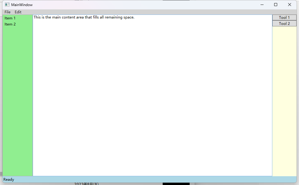
实例: 模拟一个标准的窗口布局
<DockPanel>
    <!-- 菜单栏,停靠在顶部 -->
    <Menu DockPanel.Dock="Top" Background="LightGray">
        <MenuItem Header="File"/>
        <MenuItem Header="Edit"/>
    </Menu>

    <!-- 状态栏,停靠在底部 -->
    <StatusBar DockPanel.Dock="Bottom" Background="LightBlue">
        <StatusBarItem>Ready</StatusBarItem>
    </StatusBar>

    <!-- 左侧导航栏 -->
    <ListBox DockPanel.Dock="Left" Width="100" Background="LightGreen">
        <ListBoxItem>Item 1</ListBoxItem>
        <ListBoxItem>Item 2</ListBoxItem>
    </ListBox>

    <!-- 右侧工具箱 -->
    <StackPanel DockPanel.Dock="Right" Width="80" Background="LightYellow">
        <Button Content="Tool 1"/>
        <Button Content="Tool 2"/>
    </StackPanel>

    <!-- 主内容区域(最后一个子元素,自动填满剩余空间) -->
    <TextBox AcceptsReturn="True" Background="White" Text="This is the main content area that fills all remaining space."/>
</DockPanel>
-
Grid(网格布局) : 类似table表格、可灵活设置行列并放置控件元素、比较常用
- RowDefinitions / ColumnDefinitions 用于给Grid分配行与列。
ColumnSpan / RowSpan 则用于设置空间元素的 跨列与跨行
<Grid>

    <!--声明两行两列-->
    <Grid.RowDefinitions>
        <RowDefinition />
        <RowDefinition />
    </Grid.RowDefinitions>

    <Grid.ColumnDefinitions>
        <ColumnDefinition />
        <ColumnDefinition />
    </Grid.ColumnDefinitions>

	<!--第一行第一列-->
    <Border Margin="3" Background="LightBlue" />
    <!--第一行第二列-->
    <Border Margin="3" Background="LightGoldenrodYellow" Grid.Column="1" />
    <!--第二行第一列-->
    <Border Margin="3" Background="LightGreen" Grid.Row="1" />
    <!--第二行第二列-->
    <Border Margin="3" Background="LightPink" Grid.Row="1" Grid.Column="1" />

	<!--在第二行中,在两列中间打印文本并居中(垂直居中和水平居中)显示-->
    <TextBlock Text="Microsoft" FontSize="30" Grid.Row="2" Grid.ColumnSpan="2" HorizontalAlignment="Center" VerticalAlignment="Center" />

</Grid>
- RowDefinitions / ColumnDefinitions 用于给Grid分配行与列。
-
UniformGrid(均匀网格布局) : 指定行和列的数量, 均分有限的容器空间
- 它均匀地分配子元素的行和列,每个单元格大小相同
<UniformGrid Background="Honeydew"  Margin="10" VerticalAlignment="Stretch">
    <!-- 自动根据子元素数量计算行列 -->
    <Button Content="🐱" FontSize="24" ToolTip="猫咪"/>
    <Button Content="🐶" FontSize="24" ToolTip="小狗"/>
    <Button Content="🐼" FontSize="24" ToolTip="熊猫"/>
    <Button Content="🐯" FontSize="24" ToolTip="老虎"/>
</UniformGrid>

Canvas布局(画布): 精确的坐标定位,不会为控件自动添加任何行为
<Canvas Width="300" Height="200" Background="LightGray" ClipToBounds="True">
    <!-- 一个位于 (50,30) 的按钮 -->
    <Button Canvas.Left="50" Canvas.Top="30" Content="Button 1"/>

    <!-- 一个位于 (120,80) 的椭圆 -->
    <Ellipse Canvas.Left="120" Canvas.Top="80"
             Width="100" Height="60" Fill="LightBlue" Stroke="Black"/>

    <!-- 一个使用 Right 和 Bottom 定位的文本框 -->
    <!-- 它的右下角将距离 Canvas 的右下角 10 像素 -->
    <TextBox Canvas.Right="10" Canvas.Bottom="10"
             Width="100" Text="Bottom Right"/>
</Canvas>

-
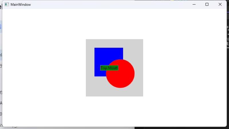
ZIndex 控制层次
<Canvas Width="200" Height="200" Background="LightGray">
    <!-- 蓝色矩形,默认在底层 (ZIndex = 0) -->
    <Rectangle Canvas.Left="30" Canvas.Top="30"
               Width="100" Height="100" Fill="Blue"/>

    <!-- 红色椭圆,后声明,所以覆盖在蓝色矩形之上 (ZIndex = 1) -->
    <Ellipse Canvas.Left="70" Canvas.Top="70"
             Width="100" Height="100" Fill="Red"/>

    <!-- 绿色按钮,通过设置更高的 ZIndex,显示在最顶层 -->
    <Button Canvas.Left="50" Canvas.Top="90" Canvas.ZIndex="99"
            Content="Top Most!" Background="Green"/>
</Canvas>
优缺点与适用场景
- 优点:
- 完全控制:像素级的精准定位,非常适合需要精确控制元素位置的场景。
- 高性能:由于布局过程非常简单(几乎没有计算),
Canvas通常是性能最高的布局容器。 - 适用于动态内容:非常适合在运行时动态添加、移动和删除元素。
- 重叠元素:轻松实现元素的叠加和层次控制。
- 缺点:
- 不灵活:布局是固定的,无法响应容器尺寸的变化而自动调整(不具备流式布局或自适应能力)。如果窗口大小改变,元素可能错位或被裁剪。
- 本地化困难:如果界面需要支持多种语言(文本长度变化很大),绝对定位会变得非常难以维护。
- 不适合数据驱动UI:几乎不用于显示列表或表格数据。
- 适用场景:
- 图形应用程序:如流程图设计器、图表控件、图像编辑器。
- 游戏开发:游戏界面(HUD)、小游戏中的精灵(Sprites)放置。
- 自定义装饰和效果:需要精确重叠的装饰性元素。
- 科学可视化:需要在特定坐标绘制数据点的图表。
- 模拟器:控件的位置代表物理世界中的实际坐标。
总结
Canvas 是 WPF 布局系统中的一个特化工具。它放弃了自动布局的便利性,换来了对子元素位置的绝对和精确控制。
使用准则:
- 当您需要像素级精准定位或元素自由重叠时,请选择
Canvas。 - 当您在构建数据输入表单、应用程序框架或任何需要自适应和流式布局的界面时,应避免使用
Canvas,而应选择Grid、StackPanel、DockPanel等。
简单来说,Canvas 是为图形和艺术而生的布局容器,而不是为商业软件UI而生的。
WPF布局基础
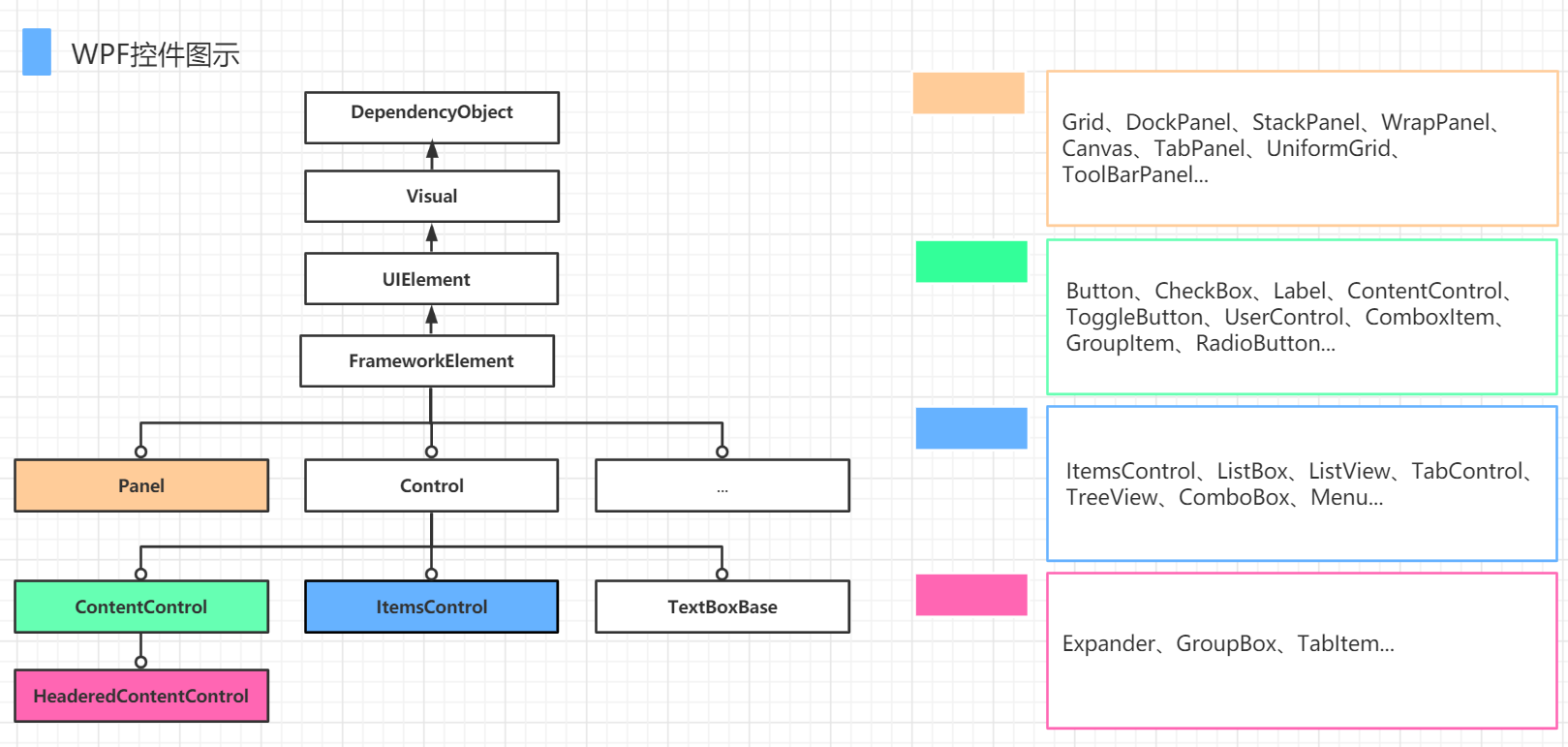
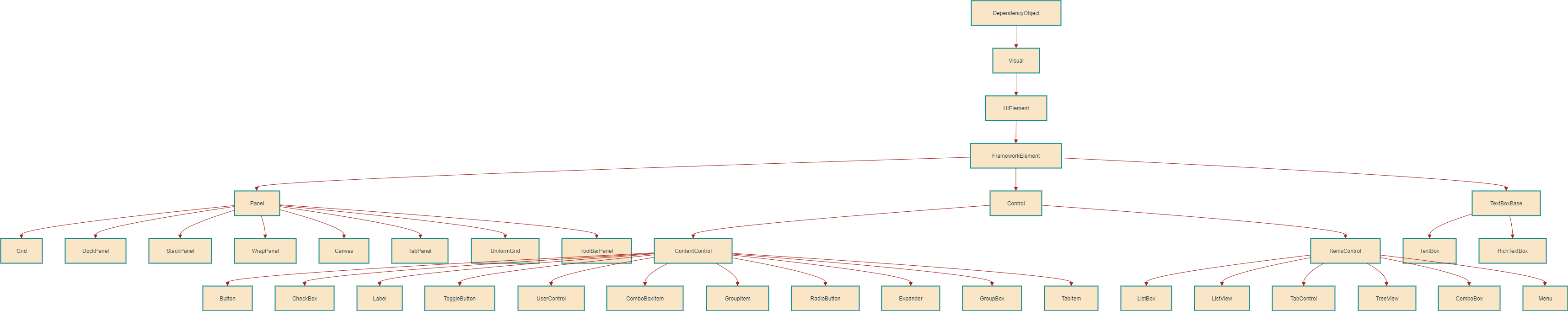
1. 基础类继承链
DependencyObject
WPF 中所有支持依赖属性的基类,包含以下关键子类:Visual:提供基础的渲染支持。UIElement:添加布局、输入、事件等功能。FrameworkElement:扩展UIElement,支持数据绑定、样式等高级功能。
2. 布局控件(Panel 类)
- 功能:用于子元素的排列和布局。
- 常见控件:
Grid:网格布局。DockPanel:停靠布局。StackPanel:栈式布局。Canvas:绝对坐标布局。WrapPanel:自动换行布局。UniformGrid:均匀网格布局。TabPanel、ToolBarPanel等专用布局容器。
3. 内容控件(Control 类)
- 功能:显示单一内容或实现用户交互。
- 常见控件:
- 基础控件:
Button、CheckBox、Label、RadioButton。 - 容器控件:
ContentControl、UserControl、GroupBox、Expander。 - 复合控件:
ToggleButton、ComboBoxItem、TabItem。
- 基础控件:
4. 集合控件(ItemsControl 类)
- 功能:管理动态项目集合。
- 常见控件:
ListBox:列表显示。ListView:表格视图。TreeView:树形结构。Menu、TabControl、ComboBox等。
5. 其他分类
TextBoxBase:文本输入控件的基类(如TextBox、RichTextBox)。ItemsControl与Control是独立分支,分别处理集合内容和单一内容。
注意点
- 图中的潜在问题:
Panel本应继承自FrameworkElement,而非与Control、ItemsControl等并列。部分分类可能存在排版混淆(如TextBoxBase应属于Control的子类)。 - 核心用途:
该图帮助开发者理解 WPF 控件的继承关系和适用场景,便于选择合适的控件进行界面设计。
简单来说,这张图告诉你:
当你需要一个
Button,你知道它是一个Control,所以它可以被样式化和模板化,同时它也是一个ContentControl,所以它的内容可以是任何东西。而因为它最终继承自FrameworkElement和UIElement,所以它可以参与布局、响应事件,并支持数据绑定。
理解这张图,对你合理选择和组合使用 WPF 控件至关重要
各种控件详解
ContentControl类: 设置内容属性为Content
<Button Content="ClickMe" Width="100" Height="20" />

- 注意事项: 控件目录下只允许设置一次Content, 如下演示给按钮添加一个Image和一个文本显示Label, 错误如下
	 <Grid>
         <Button Content="ClickMe" Width="100" Height="20" >
         	 <!--这里会报错,和 Button 的 Content重复了,只能设置一次-->
             <Label Content="11111111" />
         </Button>

     </Grid>

- 解决方式: 引入布局容器

	<Grid>
		<!--这里的Button不能再加Content属性了,否则就和下面的Label控件冲突了-->
        <Button  Width="100" Height="60" >
            <StackPanel>
                <Label Content="11111111" />
                <Label Content="5555555" />
            </StackPanel>
        </Button>

    </Grid>
-
HeaderedContentControl 类: 即可设置
Content, 还有带标题的Header- 常见的分组控件
GroupBox、TabControl子元素TabItem、它们都是具备标题和内容的控件
<Grid> <!--<GroupBox Header="测试标题"> <TextBlock /> </GroupBox>--> <TabControl> <TabItem Header="测试页码1号" Content="111" /> <TabItem Header="测试页码2号" Content="222" /> <TabItem Header="测试页码3号" Content="333" /> </TabControl> </Grid> - 注意事项: 控件目录下只允许设置一次Content - 常见的分组控件
-
ItemsControl 类: 显示列表类的数据、设置数据源的方式一般通过ItemSource设置
<Grid>

    <TabControl ItemsSource="" />
    <Menu ItemsSource="" />
    <ListBox ItemsSource="" />
    <ItemsControl ItemsSource="" />

</Grid>
详细控件介绍
-
TextBlock和TextBox文本控件-
TextBlock: 用于显示文本, 不允许编辑的静态文本 -
TextBox: 用于输入/编辑内容的控件、作用与winform中TextBox类似 -
如果要标签的文本有快捷键功能,就用 Label 并设置 Target 属性;否则,对于其他所有纯文本显示需求,优先使用更高效的 TextBlock
<Grid>

	<!--声明两行两列-->
    <Grid.RowDefinitions>
        <RowDefinition />
        <RowDefinition />
    </Grid.RowDefinitions>

    <Grid.ColumnDefinitions>
        <ColumnDefinition />
        <ColumnDefinition />
    </Grid.ColumnDefinitions>

    <TextBlock Text="Hello" Grid.Row="0" Grid.Column="0" />
    <TextBox Text="666" Grid.Row="0" Grid.Column="1" />


</Grid>
-
-
Button: 按钮很常用,简单介绍一下
<Button Content="ClickMe" Click="Button_Click" />
ComboBox: 下拉框控件,ItemSource设置下拉列表的数据源, 也可以显示设置
<ComboBox>
    <TextBlock Text="1" />
    <TextBlock Text="2" />
    <TextBlock Text="3" />
</ComboBox>
样式介绍
- WPF中的各类
控件元素, 都可以自由的设置其样式- 字体(FontFamily)
- 字体大小(FontSize)
- 背景颜色(Background)
- 字体颜色(Foreground)
- 边距(Margin)
- 水平位置(HorizontalAlignment)
- 垂直位置(VerticalAlignment) 等等
- 注意事项: 它类似于
CSS样式,然而, WPF样式的功能更加强大, 如控件的行为。WPF的样式还支持触发器 - 基础示例
<StackPanel HorizontalAlignment="Center" VerticalAlignment="Center">
    <TextBlock Text="111" FontFamily="宋体" FontSize="18" Foreground="Red" FontWeight="Bold" />
    <TextBlock Text="222" FontFamily="宋体" FontSize="18" Foreground="Red" FontWeight="Bold" />
    <TextBlock Text="333" FontFamily="宋体" FontSize="18" Foreground="Red" FontWeight="Bold" />
    <TextBlock Text="444" FontFamily="宋体" FontSize="18" Foreground="Red" FontWeight="Bold" />
</StackPanel>
- 优化实例: 在
Resources属性下自定义一个TextBlockStyle的样式,让控件引用即可
<Window.Resources>
	<!--自定义样式,key相当于css中的id-->
    <Style x:Key="TextBlockStyle" TargetType="{x:Type TextBlock}">
        <Setter Property="FontFamily" Value="宋体" />
        <Setter Property="FontSize" Value="18" />
        <Setter Property="Foreground" Value="Red" />
        <Setter Property="FontWeight" Value="Bold" />
    </Style>
</Window.Resources>

<Grid>
    <StackPanel HorizontalAlignment="Center" VerticalAlignment="Center">
    	<!--引用自定义样式来渲染控件-->
        <TextBlock Text="111"  Style="{StaticResource TextBlockStyle}"/>
        <TextBlock Text="222"  Style="{StaticResource TextBlockStyle}" />
        <TextBlock Text="333"  Style="{StaticResource TextBlockStyle}" />
        <TextBlock Text="444"  Style="{StaticResource TextBlockStyle}" />
    </StackPanel>
</Grid>

- 注意: 当控件引用了某个样式, 在控件本身并没有定义该属性的情况下,优先使用样式中的定义,否则优先控件本身的定义(优先级)

<Grid>
    <StackPanel HorizontalAlignment="Center" VerticalAlignment="Center">
    	<!--优先显示"蓝色"-->
        <TextBlock Text="111"  Foreground="Blue" Style="{StaticResource TextBlockStyle}"/>
        <TextBlock Text="222"  Style="{StaticResource TextBlockStyle}" />
        ......
    </StackPanel>
</Grid>
触发器
- 作用: 当达到了触发的条件, 那么就执行预期内的响应, 可以是样式、数据变化、动画等
- 解释说明:
触发器通过Style.Triggers集合连接到样式中, 每个样式都可以有任意多个触发器, 并且每个触发器都是System.Windows.TriggerBase的派生类实例Trigger: 监测依赖属性的变化、触发器生效MultiTrigger: 通过多个条件的设置、达到满足条件、触发器生效DataTrigger: 通过数据的变化、触发器生效MultiDataTrigger: 多个数据条件的触发器EventTrigger: 事件触发器, 触发了某类事件时, 触发器生效。
Trigger实例演示: 以Border为例, 当鼠标进入Border的范围, 改变Border的背景颜色和边框颜色, 当鼠标离开Border的范围, 还原Border的颜色
<Window.Resources>
    <Style x:Key="BorderStyle" TargetType="{x:Type Border}">
        <!-- 基础属性设置 -->
        <Setter Property="BorderThickness" Value="5" />

        <!-- 触发器定义 -->
        <Style.Triggers>
            <!-- 鼠标悬停时的效果 -->
            <Trigger Property="IsMouseOver" Value="True">
                <Setter Property="Background" Value="Blue" />
                <Setter Property="BorderBrush" Value="Red" />
            </Trigger>
            <!-- 鼠标离开时的效果 -->
            <Trigger Property="IsMouseOver" Value="False">
                <Setter Property="Background" Value="Red" />
                <Setter Property="BorderBrush" Value="Blue" />
            </Trigger>
        </Style.Triggers>
    </Style>
</Window.Resources>

<Grid>
	<!--定义壳,然后应用样式-->
    <Border Width="100" Height="100" Style="{DynamicResource BorderStyle}" />
</Grid>
-
MultiTrigger多条件触发器: 可以设置多个条件满足时, 触发- 下面以
TextBox为例, 做一个简单的Demo
当鼠标进入文本框的范围, 并且光标设置到TextBox上, 则把TextBox的背景颜色改变成Red
<Window.Resources> <Style x:Key="TextStyle" TargetType="{x:Type TextBox}"> <Setter Property="BorderThickness" Value="1" /> <Style.Triggers> <!--多条件触发器:当 TextBox 同时满足以下条件时(鼠标悬停&&获得焦点),背景变为红色--> <MultiTrigger> <MultiTrigger.Conditions> <Condition Property="IsMouseOver" Value="True" /> <Condition Property="IsFocused" Value="True" /> </MultiTrigger.Conditions> <MultiTrigger.Setters> <Setter Property="Background" Value="Red" /> </MultiTrigger.Setters> </MultiTrigger> </Style.Triggers> </Style> </Window.Resources> <Grid> <StackPanel VerticalAlignment="Center"> <TextBox Width="100" Height="30" Style="{DynamicResource TextStyle}" /> <TextBox Width="100" Height="30" Margin="0 10 0 0"/> </StackPanel> </Grid> - 下面以
-
EventTrigger事件触发器: 当触发了某类事件,触发器执行响应- 实例演示(添加了动画效果): 当鼠标进入按钮的范围中, 在0.02秒内, 把按钮的字体变成18号
当鼠标离开按钮的范围时, 在0.02秒内, 把按钮的字体变成13号
<Window.Resources> <Style x:Key="ButtonStyle" TargetType="{x:Type Button}"> <Setter Property="BorderThickness" Value="1" /> <Style.Triggers> <!--鼠标进来,字体变大--> <EventTrigger RoutedEvent="MouseMove"> <EventTrigger.Actions> <BeginStoryboard> <Storyboard> <DoubleAnimation Duration="0:0:0.02" Storyboard.TargetProperty="FontSize" To="18" /> </Storyboard> </BeginStoryboard> </EventTrigger.Actions> </EventTrigger> <!--鼠标离开,字体变小--> <EventTrigger RoutedEvent="MouseLeave"> <EventTrigger.Actions> <BeginStoryboard> <Storyboard> <DoubleAnimation Duration="0:0:0.02" Storyboard.TargetProperty="FontSize" To="13" /> </Storyboard> </BeginStoryboard> </EventTrigger.Actions> </EventTrigger> </Style.Triggers> </Style> </Window.Resources> <Grid> <StackPanel VerticalAlignment="Center"> <Button Width="100" Height="30" Content="Hello" FontSize="13" Style="{DynamicResource ButtonStyle}" /> </StackPanel> </Grid> - 实例演示(添加了动画效果): 当鼠标进入按钮的范围中, 在0.02秒内, 把按钮的字体变成18号
WPF绑定(Binding)
- 基础说明实例(
元素绑定): 创建一个滑块控件, 并且希望在滑动的过程中, 把值更新到另外一个静态文本上
<Grid>
    <StackPanel VerticalAlignment="Center" HorizontalAlignment="Center">
        <Slider Name="slider" Width="200" />
        <!--Text属性将通过"绑定的方式"关联到元素名'slider'的"value"属性上-->
        <TextBlock Text="{Binding ElementName=slider,Path=Value}" HorizontalAlignment="Center" />
    </StackPanel>
</Grid>
-
在
WPF中,一共有5种绑定模式-
OneWay(单向绑定): 当源属性发生变化更新目标属性, 类似上面的例子中,滑动变化更新文本的数据.- 通俗理解: 前者只能打你,被打者不能还手
-
TwoWay(双向绑定): 当源属性发生变化更新目标属性,目标属性发生变化也更新源属性.- 你敢打我一巴掌,我也能回你一巴掌
<Grid> <StackPanel VerticalAlignment="Center" HorizontalAlignment="Center"> <Slider Name="slider" Width="200" /> <!--互相影响,输入文本框的值,滑块会滑动,反过来也行--> <TextBox Width="200" Text="{Binding ElementName=slider,Path=Value,Mode=TwoWay}" HorizontalAlignment="Center" /> </StackPanel> </Grid> -
OneTime(单次模式): 根据第一次源属性设置目标属性, 在此之后所有改变都无效- 通俗理解: 只有第一次生效,剩余次数均不起作用
<Grid> <StackPanel VerticalAlignment="Center" HorizontalAlignment="Center"> <Slider Name="slider" Width="200" /> <!--指定OneTime模式--> <TextBox Width="200" Text="{Binding ElementName=slider,Path=Value,Mode=OneTime}" HorizontalAlignment="Center" /> </StackPanel> </Grid>OneWayToSource: 和OneWay类似,只不过整个过程倒置- 通俗理解:
目标属性影响源属性,反过来不行
<Grid> <StackPanel VerticalAlignment="Center" HorizontalAlignment="Center"> <Slider Name="slider" Width="200" /> <!--TextBox文件值可以影响滑块,但是滑块滑动以后,TextBox文件值不受影响--> <TextBox Width="200" Text="{Binding ElementName=slider,Path=Value,Mode=OneWayToSource}" HorizontalAlignment="Center" /> </StackPanel> </Grid>Default(默认模式): 和OneWay类似,只不过整个过程倒置- 通俗理解: 既可以是
双向,也可以是单项, 除非明确表明某种模式
-
-
绑定到
非元素对象的几种方式- 使用
Source指向一个数据源
<Window.Resources> <TextBox x:Key="txt1">ABC</TextBox> </Window.Resources> <Grid> <TextBox Text="{Binding Source={StaticResource txt1},Path=Text}" /> </Grid>-
RelativeSource: 使用一个名为RelativeSource的对象来根据不同的模式查找源对象- 示例: 使用
RelativeSource的FindAncestor模式, 查找父元素为StackPanel的Width值
<Grid> <StackPanel Width="200"> <StackPanel Width="300"> <!--Text值指向父元素StackPanel,这里为300--> <TextBlock Text="{Binding Path=Width, RelativeSource={RelativeSource Mode=FindAncestor, AncestorType={x:Type StackPanel}}}"/> </StackPanel> </StackPanel> </Grid> - 示例: 使用
-
DataContext: 设置数据源
// cs namespace WpfApp1 { public partial class MainWindow : Window { public MainWindow() { InitializeComponent(); // 把数据源设置为 Test类实例 this.DataContext = new Test() { Name = "小明" }; } } public class Test { public string Name { get; set; } } } // xaml <Grid> <!--绑定引擎会从当前控件的DataContext开始查找, 继承链:TextBlock -> Grid -> Window.DataContext--> <!--简写: Text="{Binding Name}"--> <TextBlock Text="{Binding Path=Name}" /> </Grid>DataContext又一实例---表格形式展示班级信息
// cs namespace WpfApp1 { public partial class MainWindow : Window { public MainWindow() { InitializeComponent(); PageModel page = new PageModel(); page.ClassName = "高二三班"; page.Students = new List<Student>(); page.Students.Add(new Student() { Name="张三",Age="18",Sex="男" }); page.Students.Add(new Student() { Name="李四",Age="20",Sex="男" }); page.Students.Add(new Student() { Name="王五",Age="22",Sex="女" }); // 设置数据源为page列表 this.DataContext = page; } } public class PageModel { public string ClassName { get; set; } public List<Student> Students { get; set; } } public class Student { public string Name { get; set; } public string Age { get; set; } public string Sex { get; set; } } } // xaml <Grid> <Grid.RowDefinitions> <!-- 固定高度标题行 --> <RowDefinition Height="20" /> <!-- 自动填充数据区域 --> <RowDefinition /> </Grid.RowDefinitions> <StackPanel Orientation="Horizontal" HorizontalAlignment="Right"> <TextBlock Margin="15 0 0 0" Text="班级名称" /> <!--映射ClassName属性值--> <TextBlock Margin="15 0 0 0" Text="{Binding ClassName}" /> </StackPanel> <!--映射Students属性值--> <DataGrid Grid.Row="1" ItemsSource="{Binding Students}" AutoGenerateColumns="False" > <DataGrid.Columns> <!--映射Students属性列表的具体值--> <DataGridTextColumn Binding="{Binding Name}" Header="名称" /> <DataGridTextColumn Binding="{Binding Age}" Header="年龄" /> <DataGridTextColumn Binding="{Binding Sex}" Header="性别" /> </DataGrid.Columns> </DataGrid> </Grid> - 使用
数据模板
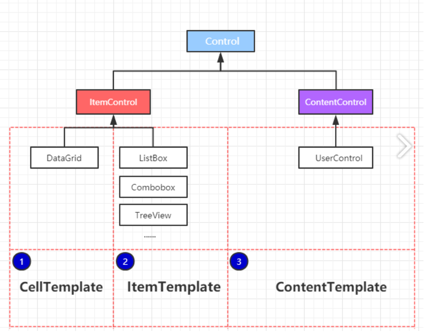
- 常用在以下3种类型的
控件中ItemControlDataGridCellTemplate(单元格)
ListBoxItemTemplate(列表类型)
ComboboxItemTemplate
TreeViewItemTemplate
ContentControlUserControlContentTemplate
- 针对
DateGrid控件,以CellTemplate模板为例子,建立一个模型数据类并渲染数据
// cs

......
namespace WpfApp5
{
    public partial class MainWindow : Window
    {
        public MainWindow()
        {
            InitializeComponent();
			// 初始化
            List<Student> students = new List<Student>();
            students.Add(new Student() { UserName = "小王", ClassName = "高二三班", Address = "广州市" });
            students.Add(new Student() { UserName = "小李", ClassName = "高三六班", Address = "清远市" });
            students.Add(new Student() { UserName = "小张", ClassName = "高一一班", Address = "深圳市" });
            students.Add(new Student() { UserName = "小黑", ClassName = "高一三班", Address = "赣州市" });
            // gd对应图形界面的自定义名称
            gd.ItemsSource = students;

        }
    }

	// 模型类
    public class Student
    {
        public string UserName { get; set; }
        public string ClassName { get; set; }
        public string Address { get; set; }
    }

}

// xaml

<Window x:Class="WpfApp5.MainWindow"
        xmlns="http://schemas.microsoft.com/winfx/2006/xaml/presentation"
        xmlns:x="http://schemas.microsoft.com/winfx/2006/xaml"
        xmlns:d="http://schemas.microsoft.com/expression/blend/2008"
        xmlns:mc="http://schemas.openxmlformats.org/markup-compatibility/2006"
        xmlns:local="clr-namespace:WpfApp5"
        mc:Ignorable="d"
        Title="MainWindow" Height="450" Width="800">

    <Grid>

		<!--gd对应cs代码中gd-->
        <DataGrid Name="gd" AutoGenerateColumns="False" CanUserSortColumns="True"  CanUserAddRows="False">
            <DataGrid.Columns>
                <DataGridTextColumn Binding="{Binding UserName}" Width="100" Header="学生姓名"/>
                <DataGridTextColumn Binding="{Binding ClassName}" Width="100" Header="班级名称"/>
                <DataGridTextColumn Binding="{Binding Address}" Width="200" Header="地址"/>
                <DataGridTemplateColumn Header="操作" Width="100" >
                    <DataGridTemplateColumn.CellTemplate>
                        <DataTemplate>
                            <StackPanel Orientation="Horizontal" VerticalAlignment="Center" HorizontalAlignment="Left">
                                <Button Content="编辑"/>
                                <Button Margin="8 0 0 0" Content="删除" />
                            </StackPanel>
                        </DataTemplate>
                    </DataGridTemplateColumn.CellTemplate>
                </DataGridTemplateColumn>
            </DataGrid.Columns>
        </DataGrid>

    </Grid>
</Window>
- 针对
ListBox和Combobox控件,以ItemTemplate模板为例子,建立一个模型数据类并渲染数据
// cs

......

namespace WpfApp5
{
    /// <summary>
    /// MainWindow.xaml 的交互逻辑
    /// </summary>
    public partial class MainWindow : Window
    {
        public MainWindow()
        {
            InitializeComponent();

            List<Color> ColorList = new List<Color>();
            ColorList.Add(new Color() { Code = "#FF8C00" });
            ColorList.Add(new Color() { Code = "#FF7F50" });
            ColorList.Add(new Color() { Code = "#FF6EB4" });
            ColorList.Add(new Color() { Code = "#FF4500" });
            ColorList.Add(new Color() { Code = "#FF3030" });
            ColorList.Add(new Color() { Code = "#CD5B45" });

			<!--对应xaml中相应的Name属性,渲染"下拉控件"和"列表控件"的数据源-->
            cob.ItemsSource = ColorList;
            lib.ItemsSource = ColorList;

        }
    }


    public class Color
    {
        public string Code { get; set; }
    }
}

// xaml

<Window x:Class="WpfApp5.MainWindow"
        xmlns="http://schemas.microsoft.com/winfx/2006/xaml/presentation"
        xmlns:x="http://schemas.microsoft.com/winfx/2006/xaml"
        xmlns:d="http://schemas.microsoft.com/expression/blend/2008"
        xmlns:mc="http://schemas.openxmlformats.org/markup-compatibility/2006"
        xmlns:local="clr-namespace:WpfApp5"
        mc:Ignorable="d"
        Title="MainWindow" Height="450" Width="800">


    <Window.Resources>
        <DataTemplate x:Key="comTemplate">
            <StackPanel Orientation="Horizontal" Margin="5,0">
            	<!--两个控件分别渲染Code数据-->
                <Border Width="10" Height="10" Background="{Binding Code}"/>
                <TextBlock Text="{Binding Code}" Margin="5,0"/>
            </StackPanel>
        </DataTemplate>
    </Window.Resources>

    <Grid>
        <StackPanel Orientation="Horizontal" HorizontalAlignment="Center">
        	<!--关注Name和ItemTemplate,下同-->
            <ComboBox Name="cob" Width="120" Height="30" ItemTemplate="{StaticResource comTemplate}"/>
            <ListBox Name="lib" Width="120" Height="100" Margin="5,0"  ItemTemplate="{StaticResource comTemplate}"/>
        </StackPanel>
    </Grid>


</Window>
ItemsControl示例
// cs

......

namespace WpfApp5
{

    public partial class MainWindow : Window
    {
        public MainWindow()
        {
            InitializeComponent();

            List<Test> tests = new List<Test>();
            tests.Add(new Test() { Code = "1" });
            tests.Add(new Test() { Code = "2" });
            tests.Add(new Test() { Code = "3" });
            tests.Add(new Test() { Code = "4" });
            tests.Add(new Test() { Code = "6" });
            ic.ItemsSource = tests;
        }
    }

    public class Test
    {
        public string Code { get; set; }
    }


}

// xaml

<Grid>

    <ItemsControl Name="ic">
        <ItemsControl.ItemsPanel>
            <ItemsPanelTemplate>
                <WrapPanel Orientation="Horizontal"/>
            </ItemsPanelTemplate>
        </ItemsControl.ItemsPanel>

        <ItemsControl.ItemTemplate>
            <DataTemplate>
                <Button Width="50" Height="50" Content="{Binding Code}"/>
            </DataTemplate>
        </ItemsControl.ItemTemplate>
    </ItemsControl>

</Grid>

 浙公网安备 33010602011771号