[WPF] 轮播效果,滚动块、滚动文字
控件已封装在自己写的控件库:https://github.com/LowPlayer/PP.Wpf
RunningText:滚动文字,支持一下属性:
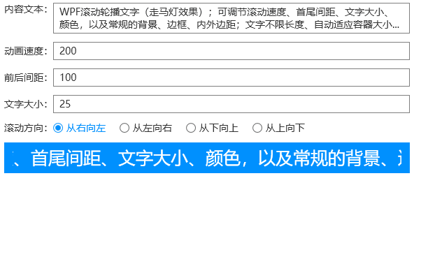
Text:显示的文本;
Space:首尾间距,负值或NaN时,首尾间距为整个容器宽度;
Speed:滚动速度;
Direction:滚动方向,支持四个方向;
示范代码:
<pp:RunningText x:Name="rt" Margin="6" Padding="12 6" Background="{DynamicResource PP.Brushes.Themes}" Foreground="{DynamicResource PP.Brushes.Themes.Foreground}"
          Text="WPF滚动轮播文字(走马灯效果);可调节滚动速度、首尾间距、文字大小、颜色,以及常规的背景、边框、内外边距;文字不限长度、自动适应容器大小...">
    <pp:RunningText.Style>
        <Style TargetType="{x:Type pp:RunningText}">
            <Setter Property="VerticalAlignment" Value="Top" />
            <Style.Triggers>
                <Trigger Property="Direction" Value="BottomToTop">
                    <Setter Property="VerticalAlignment" Value="Stretch" />
                    <Setter Property="HorizontalAlignment" Value="Left" />
                </Trigger>
                <Trigger Property="Direction" Value="TopToBottom">
                    <Setter Property="VerticalAlignment" Value="Stretch" />
                    <Setter Property="HorizontalAlignment" Value="Left" />
                </Trigger>
            </Style.Triggers>
        </Style>
    </pp:RunningText.Style>
</pp:RunningText>
效果动图:
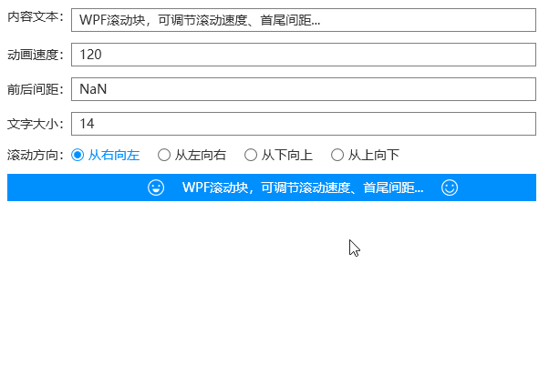
RunningBlock:滚动块,继承自ContentControl,支持放任何内容,继承RunningText除了Text之外的其他属性;
示范代码:
<pp:RunningBlock x:Name="rb" Margin="6" Padding="12 6" Background="{DynamicResource PP.Brushes.Themes}" Foreground="{DynamicResource PP.Brushes.Themes.Foreground}">
    <pp:RunningBlock.Style>
        <Style TargetType="{x:Type pp:RunningBlock}">
            <Setter Property="VerticalAlignment" Value="Top" />
            <Style.Triggers>
                <Trigger Property="Direction" Value="BottomToTop">
                    <Setter Property="VerticalAlignment" Value="Stretch" />
                    <Setter Property="HorizontalAlignment" Value="Left" />
                </Trigger>
                <Trigger Property="Direction" Value="TopToBottom">
                    <Setter Property="VerticalAlignment" Value="Stretch" />
                    <Setter Property="HorizontalAlignment" Value="Left" />
                </Trigger>
            </Style.Triggers>
        </Style>
    </pp:RunningBlock.Style>
    <StackPanel Orientation="Horizontal">
        <Path Data="{StaticResource path1}" Fill="White" Stretch="Uniform" Height="{Binding ActualHeight,ElementName=txt}" />
        <TextBlock VerticalAlignment="Center" x:Name="txt" Margin="20 0 0 0">WPF滚动块,可调节滚动速度、首尾间距...</TextBlock>
        <Path Data="{StaticResource path2}" Fill="White" Stretch="Uniform" Margin="20 0 0 0" Height="{Binding ActualHeight,ElementName=txt}" />
    </StackPanel>
</pp:RunningBlock>
效果动图:
下面展示一个外包项目--医院门诊叫号系统,展示更多的轮播滚动效果
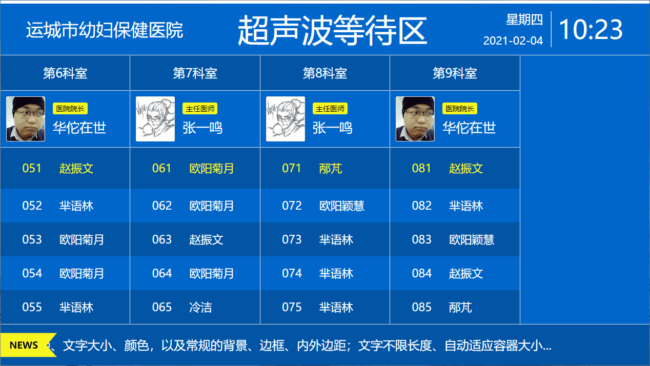
这里用到了另外一个自定义控件--叫号队列,贴一下简短的代码:
<DockPanel>
    <Border DockPanel.Dock="Top" Height="100" Background="{StaticResource Brushes.Theme}" TextElement.Foreground="{StaticResource Brushes.IdealForeground}">
        <DockPanel>
            <TextBlock FontSize="34" VerticalAlignment="Center" Margin="50 0" Text="{Binding HospitalName}" />
            <!--时钟-->
            <ctrls:Clock DockPanel.Dock="Right" Margin="50 0" VerticalAlignment="Center" />
            <TextBlock FontSize="62" VerticalAlignment="Center" TextAlignment="Center" Text="{Binding Title}" />
        </DockPanel>
    </Border>
    <Border DockPanel.Dock="Bottom" Height="80" Background="{StaticResource Brushes.Theme.Hightlight}">
        <DockPanel>
            <Grid Panel.ZIndex="1">
                <Path Data="M0 0 H110 L90 24 L110 47 H0 Z" Fill="{StaticResource Brushes.Warning}" VerticalAlignment="Center" />
                <TextBlock FontSize="18" FontWeight="Bold" Foreground="Black" VerticalAlignment="Center" HorizontalAlignment="Center" Margin="-20 0 0 0">NEWS</TextBlock>
            </Grid>
            <!--滚动的文字-->
            <ctrls:CarouselText FontSize="24" Foreground="{StaticResource Brushes.IdealForeground}" Space="200" Speed="100" Margin="-20 0 0 0" Text="{Binding CarouselText}" />
        </DockPanel>
    </Border>
    <!--叫号队列-->
    <ctrls:CallTable Style="{StaticResource Styles.CallTable}" ItemsSource="{Binding CallQueueDatas}" HeadRowHeight="80" Interval="5000" />
</DockPanel>
注:接外包项目,评论区留言联系我

 浙公网安备 33010602011771号