
Qt界面美化
1.http://www.developer.nokia.com/Community/Wiki/Glossy_Qt_stylesheet
代码:


QFrame#GlossyFrame {
 border: 1px solid white;
 border-radius: 3px;
 background: qradialgradient(
   cx: 0.5, cy: -1.8,
   fx: 0.5, fy: 0,
   radius: 2,
   stop: 0 #9aa9be,
   stop: 1 #293859);
  font: bold;
}

#GlossyFrame QLabel#Title {
 background: transparent;
 color: white;
}

#GlossyFrame QPushButton {
 color: #white;
 border: 1px solid black;
 border-radius: 3px;
 padding: 1px;
 background: qlineargradient(
   x1:0, y1:0, x2:0, y2:1,
   stop:0 #bec1d2,
   stop: 0.4 #717990,
   stop: 0.5 #5c637d
   stop:1 #68778e
 );
 min-height: 36px;
}

#GlossyFrame QPushButton:pressed {
background: qlineargradient(
  x1:0, y1:0, x2:0, y2:1,
  stop:0 #68778e,
  stop: 0.4 #5c637d
  stop: 0.5 #717990,
  stop:1 #bec1d2
 );
 color: black;
}

#GlossyFrame QLineEdit {
 background: qlineargradient(
  x1:0, y1:0, x2:0, y2:1,
  stop:0 gray,
  stop: 0.2 white
  stop:1 white
 );
 border-radius: 1px;
 border: 1px solid black;
 min-height: 24px;
 color: black;
}

#GlossyFrame QCheckBox {
     color:  white;
 }

#GlossyFrame QCheckBox::indicator {
     position: absolute;
     height: 27px;
     width: 64px;
 }

#GlossyFrame QCheckBox::indicator:checked {
     image: url(:/checkbox_on.png);
 }

#GlossyFrame QCheckBox::indicator:unchecked {
      image: url(:/checkbox_off.png);
 }
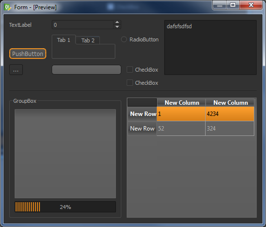
界面效果:

2.http://tech-artists.org/forum/archive/index.php?t-2359.html
代码:
QToolTip
{
     border: 1px solid black;
     background-color: #ffa02f;
     padding: 1px;
     border-radius: 3px;
     opacity: 100;
}

QWidget
{
    color: #b1b1b1;
    background-color: #323232;
}

QWidget:item:hover
{
    background-color: QLinearGradient( x1: 0, y1: 0, x2: 0, y2: 1, stop: 0 #ffa02f, stop: 1 #ca0619);
    color: #000000;
}

QWidget:item:selected
{
    background-color: QLinearGradient( x1: 0, y1: 0, x2: 0, y2: 1, stop: 0 #ffa02f, stop: 1 #d7801a);
}

QMenuBar::item
{
    background: transparent;
}

QMenuBar::item:selected
{
    background: transparent;
    border: 1px solid #ffaa00;
}

QMenuBar::item:pressed
{
    background: #444;
    border: 1px solid #000;
    background-color: QLinearGradient(
        x1:0, y1:0,
        x2:0, y2:1,
        stop:1 #212121,
        stop:0.4 #343434/*,
        stop:0.2 #343434,
        stop:0.1 #ffaa00*/
    );
    margin-bottom:-1px;
    padding-bottom:1px;
}

QMenu
{
    border: 1px solid #000;
}

QMenu::item
{
    padding: 2px 20px 2px 20px;
}

QMenu::item:selected
{
    color: #000000;
}

QWidget:disabled
{
    color: #404040;
    background-color: #323232;
}

QAbstractItemView
{
    background-color: QLinearGradient( x1: 0, y1: 0, x2: 0, y2: 1, stop: 0 #4d4d4d, stop: 0.1 #646464, stop: 1 #5d5d5d);
}

QWidget:focus
{
    /*border: 2px solid QLinearGradient( x1: 0, y1: 0, x2: 0, y2: 1, stop: 0 #ffa02f, stop: 1 #d7801a);*/
}

QLineEdit
{
    background-color: QLinearGradient( x1: 0, y1: 0, x2: 0, y2: 1, stop: 0 #4d4d4d, stop: 0 #646464, stop: 1 #5d5d5d);
    padding: 1px;
    border-style: solid;
    border: 1px solid #1e1e1e;
    border-radius: 5;
}

QPushButton
{
    color: #b1b1b1;
    background-color: QLinearGradient( x1: 0, y1: 0, x2: 0, y2: 1, stop: 0 #565656, stop: 0.1 #525252, stop: 0.5 #4e4e4e, stop: 0.9 #4a4a4a, stop: 1 #464646);
    border-width: 1px;
    border-color: #1e1e1e;
    border-style: solid;
    border-radius: 6;
    padding: 3px;
    font-size: 12px;
    padding-left: 5px;
    padding-right: 5px;
}

QPushButton:pressed
{
    background-color: QLinearGradient( x1: 0, y1: 0, x2: 0, y2: 1, stop: 0 #2d2d2d, stop: 0.1 #2b2b2b, stop: 0.5 #292929, stop: 0.9 #282828, stop: 1 #252525);
}

QComboBox
{
    selection-background-color: #ffaa00;
    background-color: QLinearGradient( x1: 0, y1: 0, x2: 0, y2: 1, stop: 0 #565656, stop: 0.1 #525252, stop: 0.5 #4e4e4e, stop: 0.9 #4a4a4a, stop: 1 #464646);
    border-style: solid;
    border: 1px solid #1e1e1e;
    border-radius: 5;
}

QComboBox:hover,QPushButton:hover
{
    border: 2px solid QLinearGradient( x1: 0, y1: 0, x2: 0, y2: 1, stop: 0 #ffa02f, stop: 1 #d7801a);
}


QComboBox:on
{
    padding-top: 3px;
    padding-left: 4px;
    background-color: QLinearGradient( x1: 0, y1: 0, x2: 0, y2: 1, stop: 0 #2d2d2d, stop: 0.1 #2b2b2b, stop: 0.5 #292929, stop: 0.9 #282828, stop: 1 #252525);
    selection-background-color: #ffaa00;
}

QComboBox QAbstractItemView
{
    border: 2px solid darkgray;
    selection-background-color: QLinearGradient( x1: 0, y1: 0, x2: 0, y2: 1, stop: 0 #ffa02f, stop: 1 #d7801a);
}

QComboBox::drop-down
{
     subcontrol-origin: padding;
     subcontrol-position: top right;
     width: 15px;

     border-left-width: 0px;
     border-left-color: darkgray;
     border-left-style: solid; /* just a single line */
     border-top-right-radius: 3px; /* same radius as the QComboBox */
     border-bottom-right-radius: 3px;
 }

QComboBox::down-arrow
{
     image: url(:/down_arrow.png);
}

QGroupBox:focus
{
border: 2px solid QLinearGradient( x1: 0, y1: 0, x2: 0, y2: 1, stop: 0 #ffa02f, stop: 1 #d7801a);
}

QTextEdit:focus
{
    border: 2px solid QLinearGradient( x1: 0, y1: 0, x2: 0, y2: 1, stop: 0 #ffa02f, stop: 1 #d7801a);
}

QScrollBar:horizontal {
     border: 1px solid #222222;
     background: QLinearGradient( x1: 0, y1: 0, x2: 0, y2: 1, stop: 0.0 #121212, stop: 0.2 #282828, stop: 1 #484848);
     height: 7px;
     margin: 0px 16px 0 16px;
}

QScrollBar::handle:horizontal
{
      background: QLinearGradient( x1: 0, y1: 0, x2: 1, y2: 0, stop: 0 #ffa02f, stop: 0.5 #d7801a, stop: 1 #ffa02f);
      min-height: 20px;
      border-radius: 2px;
}

QScrollBar::add-line:horizontal {
      border: 1px solid #1b1b19;
      border-radius: 2px;
      background: QLinearGradient( x1: 0, y1: 0, x2: 1, y2: 0, stop: 0 #ffa02f, stop: 1 #d7801a);
      width: 14px;
      subcontrol-position: right;
      subcontrol-origin: margin;
}

QScrollBar::sub-line:horizontal {
      border: 1px solid #1b1b19;
      border-radius: 2px;
      background: QLinearGradient( x1: 0, y1: 0, x2: 1, y2: 0, stop: 0 #ffa02f, stop: 1 #d7801a);
      width: 14px;
     subcontrol-position: left;
     subcontrol-origin: margin;
}

QScrollBar::right-arrow:horizontal, QScrollBar::left-arrow:horizontal
{
      border: 1px solid black;
      width: 1px;
      height: 1px;
      background: white;
}

QScrollBar::add-page:horizontal, QScrollBar::sub-page:horizontal
{
      background: none;
}

QScrollBar:vertical
{
      background: QLinearGradient( x1: 0, y1: 0, x2: 1, y2: 0, stop: 0.0 #121212, stop: 0.2 #282828, stop: 1 #484848);
      width: 7px;
      margin: 16px 0 16px 0;
      border: 1px solid #222222;
}

QScrollBar::handle:vertical
{
      background: QLinearGradient( x1: 0, y1: 0, x2: 0, y2: 1, stop: 0 #ffa02f, stop: 0.5 #d7801a, stop: 1 #ffa02f);
      min-height: 20px;
      border-radius: 2px;
}

QScrollBar::add-line:vertical
{
      border: 1px solid #1b1b19;
      border-radius: 2px;
      background: QLinearGradient( x1: 0, y1: 0, x2: 0, y2: 1, stop: 0 #ffa02f, stop: 1 #d7801a);
      height: 14px;
      subcontrol-position: bottom;
      subcontrol-origin: margin;
}

QScrollBar::sub-line:vertical
{
      border: 1px solid #1b1b19;
      border-radius: 2px;
      background: QLinearGradient( x1: 0, y1: 0, x2: 0, y2: 1, stop: 0 #d7801a, stop: 1 #ffa02f);
      height: 14px;
      subcontrol-position: top;
      subcontrol-origin: margin;
}

QScrollBar::up-arrow:vertical, QScrollBar::down-arrow:vertical
{
      border: 1px solid black;
      width: 1px;
      height: 1px;
      background: white;
}


QScrollBar::add-page:vertical, QScrollBar::sub-page:vertical
{
      background: none;
}

QTextEdit
{
    background-color: #242424;
}

QPlainTextEdit
{
    background-color: #242424;
}

QHeaderView::section
{
    background-color: QLinearGradient(x1:0, y1:0, x2:0, y2:1, stop:0 #616161, stop: 0.5 #505050, stop: 0.6 #434343, stop:1 #656565);
    color: white;
    padding-left: 4px;
    border: 1px solid #6c6c6c;
}

QCheckBox:disabled
{
color: #414141;
}

QDockWidget::title
{
    text-align: center;
    spacing: 3px; /* spacing between items in the tool bar */
    background-color: QLinearGradient(x1:0, y1:0, x2:0, y2:1, stop:0 #323232, stop: 0.5 #242424, stop:1 #323232);
}

QDockWidget::close-button, QDockWidget::float-button
{
    text-align: center;
    spacing: 1px; /* spacing between items in the tool bar */
    background-color: QLinearGradient(x1:0, y1:0, x2:0, y2:1, stop:0 #323232, stop: 0.5 #242424, stop:1 #323232);
}

QDockWidget::close-button:hover, QDockWidget::float-button:hover
{
    background: #242424;
}

QDockWidget::close-button:pressed, QDockWidget::float-button:pressed
{
    padding: 1px -1px -1px 1px;
}

QMainWindow::separator
{
    background-color: QLinearGradient(x1:0, y1:0, x2:0, y2:1, stop:0 #161616, stop: 0.5 #151515, stop: 0.6 #212121, stop:1 #343434);
    color: white;
    padding-left: 4px;
    border: 1px solid #4c4c4c;
    spacing: 3px; /* spacing between items in the tool bar */
}

QMainWindow::separator:hover
{

    background-color: QLinearGradient(x1:0, y1:0, x2:0, y2:1, stop:0 #d7801a, stop:0.5 #b56c17 stop:1 #ffa02f);
    color: white;
    padding-left: 4px;
    border: 1px solid #6c6c6c;
    spacing: 3px; /* spacing between items in the tool bar */
}

QToolBar::handle
{
     spacing: 3px; /* spacing between items in the tool bar */
     background: url(:/images/handle.png);
}

QMenu::separator
{
    height: 2px;
    background-color: QLinearGradient(x1:0, y1:0, x2:0, y2:1, stop:0 #161616, stop: 0.5 #151515, stop: 0.6 #212121, stop:1 #343434);
    color: white;
    padding-left: 4px;
    margin-left: 10px;
    margin-right: 5px;
}

QProgressBar
{
    border: 2px solid grey;
    border-radius: 5px;
    text-align: center;
}

QProgressBar::chunk
{
    background-color: #d7801a;
    width: 2.15px;
    margin: 0.5px;
}

QTabBar::tab {
    color: #b1b1b1;
    border: 1px solid #444;
    border-bottom-style: none;
    background-color: #323232;
    padding-left: 10px;
    padding-right: 10px;
    padding-top: 3px;
    padding-bottom: 2px;
    margin-right: -1px;
}

QTabWidget::pane {
    border: 1px solid #444;
    top: 1px;
}

QTabBar::tab:last
{
    margin-right: 0; /* the last selected tab has nothing to overlap with on the right */
    border-top-right-radius: 3px;
}

QTabBar::tab:first:!selected
{
 margin-left: 0px; /* the last selected tab has nothing to overlap with on the right */


    border-top-left-radius: 3px;
}

QTabBar::tab:!selected
{
    color: #b1b1b1;
    border-bottom-style: solid;
    margin-top: 3px;
    background-color: QLinearGradient(x1:0, y1:0, x2:0, y2:1, stop:1 #212121, stop:.4 #343434);
}

QTabBar::tab:selected
{
    border-top-left-radius: 3px;
    border-top-right-radius: 3px;
    margin-bottom: 0px;
}

QTabBar::tab:!selected:hover
{
    /*border-top: 2px solid #ffaa00;
    padding-bottom: 3px;*/
    border-top-left-radius: 3px;
    border-top-right-radius: 3px;
    background-color: QLinearGradient(x1:0, y1:0, x2:0, y2:1, stop:1 #212121, stop:0.4 #343434, stop:0.2 #343434, stop:0.1 #ffaa00);
}

QRadioButton::indicator:checked, QRadioButton::indicator:unchecked{
    color: #b1b1b1;
    background-color: #323232;
    border: 1px solid #b1b1b1;
    border-radius: 6px;
}

QRadioButton::indicator:checked
{
    background-color: qradialgradient(
        cx: 0.5, cy: 0.5,
        fx: 0.5, fy: 0.5,
        radius: 1.0,
        stop: 0.25 #ffaa00,
        stop: 0.3 #323232
    );
}

QCheckBox::indicator{
    color: #b1b1b1;
    background-color: #323232;
    border: 1px solid #b1b1b1;
    width: 9px;
    height: 9px;
}

QRadioButton::indicator
{
    border-radius: 6px;
}

QRadioButton::indicator:hover, QCheckBox::indicator:hover
{
    border: 1px solid #ffaa00;
}

QCheckBox::indicator:checked
{
    image:url(:/images/checkbox.png);
}

QCheckBox::indicator:disabled, QRadioButton::indicator:disabled
{
    border: 1px solid #444;
}
界面效果:
3.http://thesmithfam.org/blog/2009/09/17/qt-stylesheets-button-bar-tutorial/
代码:
#topFrame {
border: none;
background: qlineargradient(x1: 0, y1: 0, x2: 0, y2: 1,
stop: 0 #a6a6a6, stop: 0.08 #7f7f7f,
stop: 0.39999 #717171, stop: 0.4 #626262,
stop: 0.9 #4c4c4c, stop: 1 #333333);
}

#bottomFrame {
border: none;
background: white;
}

#topFrame QPushButton {
color: #333;
border: 2px solid #555;
border-radius: 11px;
padding: 5px;
background: qradialgradient(cx: 0.3, cy: -0.4,
fx: 0.3, fy: -0.4,
radius: 1.35, stop: 0 #fff, stop: 1 #888);
min-width: 80px;
}

#topFrame QPushButton:hover {
background: qradialgradient(cx: 0.3, cy: -0.4,
fx: 0.3, fy: -0.4,
radius: 1.35, stop: 0 #fff, stop: 1 #bbb);
}

#topFrame QPushButton:pressed {
background: qradialgradient(cx: 0.4, cy: -0.1,
fx: 0.4, fy: -0.1,
radius: 1.35, stop: 0 #fff, stop: 1 #ddd);
}
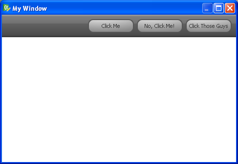
界面效果:
4.http://www.prog.org.ru/topic_19695_0.html
代码:
#include <QApplication>
#include <QStyle>
#include <QToolButton>
#include <QTabWidget>
#include <QTabBar>

class TabWidget : public QTabWidget
{
public:
    QTabBar* tabBar() { return QTabWidget::tabBar(); }
};

#define Count(arr)        ((unsigned int) (sizeof(arr) / sizeof(arr[0])))

int main( int argc, char** argv )
{
    QApplication app( argc, argv );
    TabWidget tw;
    QWidget w;

    QStyle::StandardPixmap tab_icons[] = {
        QStyle::SP_MediaSkipBackward,
        QStyle::SP_MediaPlay,
        QStyle::SP_MediaStop,
        QStyle::SP_MediaSkipForward
    };
    QString tab_names[] = {
        "Rewind",
        "Play",
        "Stop",
        "Fast Forward"
    };

    tw.setTabPosition( QTabWidget::West );

    for( int i = 0; i < Count( tab_icons ); i++ )
    {
        tw.addTab( new QWidget(), QString() );

        QToolButton* tb = new QToolButton;
        tb->setStyleSheet( "background-color: none; border: 0px;" );
        tb->setAttribute( Qt::WA_TransparentForMouseEvents );
        tb->setIcon( app.style()->standardIcon( tab_icons[i] ) );
        tb->setText( tab_names[i] );
        tb->setToolButtonStyle( Qt::ToolButtonTextUnderIcon );

        tw.tabBar()->setTabButton( i, QTabBar::LeftSide, tb );
    }

    tw.show();

    return app.exec();
}
界面效果:

5.几种风格的QPushButton
5.1 http://blog.ufna.ru/2010/04/21/qt-stylesheets-qss-button
代码:
QPushButton {
    border: 1px solid #000000;
    border-radius: 5px;
    background-color: qlineargradient(x1: 0, y1: 0, x2: 0, y2: 1,
                                   stop: 0 #dedede, stop: 0.5 #434343,
                                   stop: 0.51 #000000, stop: 1 #656a6d);
    color: #FFFFFF;
    font: bold 14px;
    min-width: 80px;
}

QPushButton:pressed {
    background-color: qlineargradient(x1: 0, y1: 0, x2: 0, y2: 1,
                                   stop: 0 #cfcccc, stop: 0.5 #333232,
                                   stop: 0.51 #000000, stop: 1 #585c5f);
    color: #00CC00;
}

QPushButton:flat {
    border: none;
}
界面效果:


代码:
QPushButton {
    /* Let's make the size of the button 1,5 times of font size. */
    min-height: 1.5em;
    /* Font size just 1.*/
    font: 1em;
    /* Margins so that we get a little space on the left and right. */
    margin: 0 1px 0 1px;
    /* The font color */
    color: white;
    /* Here's the background gradient with start point, end point,
       stop "percentage" and color, stop percentage and color. */
    background-color: qlineargradient(x1: 0, y1: 0, x2: 0, y2: 1,
                                      stop: 0 #2198c0, stop: 1 #0d5ca6);
    /* We'll round the borders. */
    border-style: outset;
    /* Round radius will be 3px */
    border-radius: 3px;
    /* Border is only one pixel */
    border-width: 1px;
    /* Border color is now set */
    border-color: #0c457e;
}

/* This is style when button is pressed */
QPushButton:pressed {
    /* We'll just invert the gradient by changing the colors around. */
    background-color: qlineargradient(x1: 0, y1: 0, x2: 0, y2: 1,
                                      stop: 0 #0d5ca6, stop: 1 #2198c0);
}
界面效果:


 浙公网安备 33010602011771号