Matplotlib可视化
1.导入相关库
import pandas as pd
import numpy as np
from faker import Faker
import matplotlib.pyplot as plt
import matplotlib as mpl
mpl.__version__
'3.3.4'
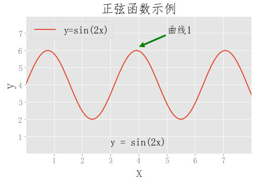
2.plot
#设置字体
plt.rcParams['font.sans-serif'] = ['Fangsong']

#设置图例属性
fontlegend = {'size':20,
'family':'Fangsong',
'weight':'normal'}

#设置标题属性
fonttitle = {'size':25,
'family':'Fangsong',
'weight':'normal'}

#设置坐标轴标签属性
fontlabel = {'size':28,
'family':'Fangsong',
'weight':'normal'}

# make data
x = np.linspace(0, 10, 100)
y = 4 + 2 * np.sin(2 * x)

#设置样式
plt.style.use('ggplot')

# plot
fig, ax = plt.subplots(figsize=(8,5))


ax.plot(x, y, linewidth=2.0)

ax.set(xlim=(0, 8), xticks=np.arange(1, 8),
       ylim=(0, 8), yticks=np.arange(1, 8))

#设置坐标轴属性
ax.tick_params(axis='x', colors='#777777', labelsize=16)
ax.tick_params(axis='y', colors='#777777', labelsize=16)


#添加标题;size:更改字体大小
plt.title('正弦函数示例',fonttitle)

#add text
plt.text(3,0.5,'y = sin(2x)',size=20)

#add annotate;xy:表示箭头位置;xytext:文字位置;headwidth:箭头宽度;facecolor:颜色
plt.annotate('曲线1',xy=(4,6.2),xytext=(5,7),arrowprops={'headwidth':12,'facecolor':'g'},size=20)

#设置坐标轴名称
plt.xlabel('x',fontlabel)
plt.ylabel('y',fontlabel)

#添加图例
plt.legend(['y=sin(2x)'],prop=fontlegend,loc='upper left')

plt.show()
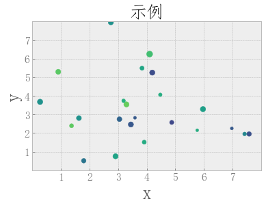
3.Scatter
#设置字体
plt.rcParams['font.sans-serif'] = ['Fangsong']
#设置样式
plt.style.use('bmh')

#设置图例属性
fontlegend = {'size':20,
'family':'Fangsong',
'weight':'normal'}

#设置标题属性
fonttitle = {'size':25,
'family':'Fangsong',
'weight':'normal'}

#设置坐标轴标签属性
fontlabel = {'size':28,
'family':'Fangsong',
'weight':'normal'}


# make the data
np.random.seed(3)
x = 4 + np.random.normal(0, 2, 24)
y = 4 + np.random.normal(0, 2, len(x))
# size and color:
sizes = np.random.uniform(15, 80, len(x))
colors = np.random.uniform(15, 80, len(x))

# plot
fig, ax = plt.subplots()

ax.scatter(x, y, s=sizes, c=colors, vmin=0, vmax=100)

ax.set(xlim=(0, 8), xticks=np.arange(1, 8),
       ylim=(0, 8), yticks=np.arange(1, 8))


#设置坐标轴属性
ax.tick_params(axis='x', colors='#777777', labelsize=16)
ax.tick_params(axis='y', colors='#777777', labelsize=16)

#设置坐标轴名称
plt.xlabel('x',fontlabel)
plt.ylabel('y',fontlabel)


#添加标题;size:更改字体大小
plt.title('示例',fonttitle)
plt.show()
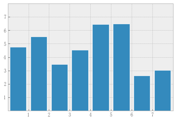
4.bar
# make data:
np.random.seed(3)
x = 0.5 + np.arange(8)
y = np.random.uniform(2, 7, len(x))

# plot
fig, ax = plt.subplots()

#edgecolor:设置柱形边缘的颜色;linewidth:设置边框宽度;width:设置柱子的宽度

ax.bar(x, y, width=0.8, edgecolor="white", linewidth=0.7,)

ax.set(xlim=(0, 8), xticks=np.arange(1, 8),
       ylim=(0, 8), yticks=np.arange(1, 8))

plt.show()
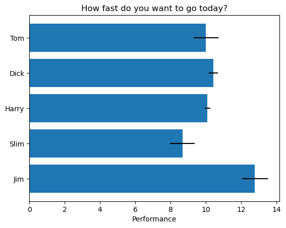
5.barh
# Fixing random state for reproducibility
np.random.seed(19680801)


plt.rcdefaults()
fig, ax = plt.subplots()

# Example data
people = ('Tom', 'Dick', 'Harry', 'Slim', 'Jim')
y_pos = np.arange(len(people))
performance = 3 + 10 * np.random.rand(len(people))
error = np.random.rand(len(people))

ax.barh(y_pos, performance, xerr=error, align='center')

#yticks:设置y轴刻度与标签
plt.yticks(y_pos,labels=people)
ax.invert_yaxis()  # labels read top-to-bottom
ax.set_xlabel('Performance')
ax.set_title('How fast do you want to go today?')

plt.show()
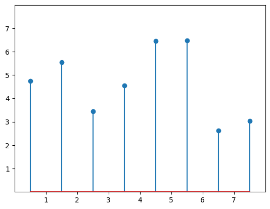
6.stem
# make data
np.random.seed(3)
x = 0.5 + np.arange(8)
y = np.random.uniform(2, 7, len(x))

# plot
fig, ax = plt.subplots()

ax.stem(x, y)

ax.set(xlim=(0, 8), xticks=np.arange(1, 8),
       ylim=(0, 8), yticks=np.arange(1, 8))

plt.show()
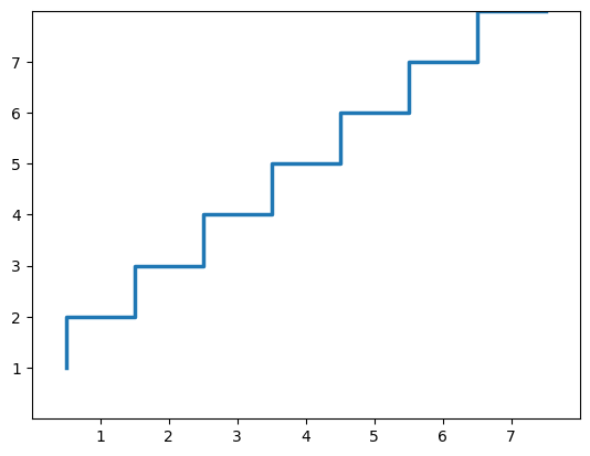
7.step
# make data
np.random.seed(3)
x = 0.5 + np.arange(8)
y = np.arange(1,9)

# plot
fig, ax = plt.subplots()

ax.step(x, y, linewidth=2.5)

ax.set(xlim=(0, 8), xticks=np.arange(1, 8),
       ylim=(0, 8), yticks=np.arange(1, 8))

plt.show()
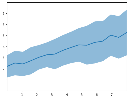
8.fill_between
# make data
np.random.seed(1)
x = np.linspace(0, 8, 16)
y1 = 3 + 4*x/8 + np.random.uniform(0.0, 0.5, len(x))
y2 = 1 + 2*x/8 + np.random.uniform(0.0, 0.5, len(x))

# plot
fig, ax = plt.subplots()

ax.fill_between(x, y1, y2, alpha=.5, linewidth=0)
ax.plot(x, (y1 + y2)/2, linewidth=2)

ax.set(xlim=(0, 8), xticks=np.arange(1, 8),
       ylim=(0, 8), yticks=np.arange(1, 8))

plt.show()
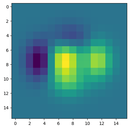
9.imshow
# make data
X, Y = np.meshgrid(np.linspace(-3, 3, 16), np.linspace(-3, 3, 16))
Z = (1 - X/2 + X**5 + Y**3) * np.exp(-X**2 - Y**2)

# plot
fig, ax = plt.subplots()

ax.imshow(Z)

plt.show()
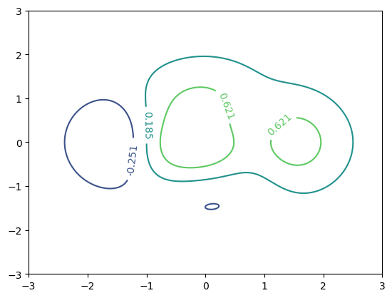
10.contour
# make data
X, Y = np.meshgrid(np.linspace(-3, 3, 256), np.linspace(-3, 3, 256))
Z = (1 - X/2 + X**5 + Y**3) * np.exp(-X**2 - Y**2)
levels = np.linspace(np.min(Z), np.max(Z), 5)

# plot
fig, ax = plt.subplots()

cs = ax.contour(X, Y, Z, levels=levels)

ax.clabel(cs, inline=1, fontsize=10)
plt.show()
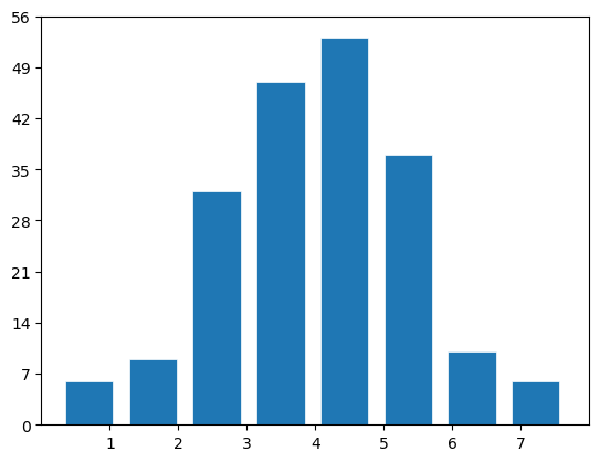
11.hist
# make data
np.random.seed(1)
x = 4 + np.random.normal(0, 1.5, 200)

# plot:
fig, ax = plt.subplots()

ax.hist(x, width = 0.7,bins=8, linewidth=0.5, edgecolor="white")

ax.set(xlim=(0, 8), xticks=np.arange(1, 8),
       ylim=(0, 56), yticks=np.linspace(0, 56, 9))

plt.show()
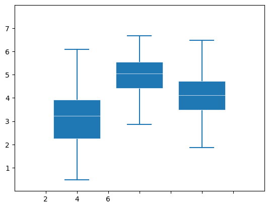
12.boxplot
# make data:
np.random.seed(10)
#生成100行3列的二维数据,3,4,5分别代表1,2,3列的均值,1.25,1.00,1.25分别代表1,2,3列的标准差;
D = np.random.normal((3, 5, 4), (1.25, 1.00, 1.25), (100, 3))

# plot
fig, ax = plt.subplots()
VP = ax.boxplot(D, positions=[2, 4, 6], widths=1.5, patch_artist=True,
                showmeans=False, showfliers=False,
                #设置矩形中间线段的宽度
                medianprops={"color": "white", "linewidth": 0.5},
                #设置中间矩形与上下两段线的距离
                boxprops={"facecolor": "C0", "edgecolor": "white",
                          "linewidth": 0.5},
                #设置竖线的宽度
                whiskerprops={"color": "C0", "linewidth": 1.5},
                #设置两端线的宽度
                capprops={"color": "C0", "linewidth": 1.5})

ax.set(xlim=(0, 8), xticks=np.arange(1, 8),
       ylim=(0, 8), yticks=np.arange(1, 8))

plt.show()
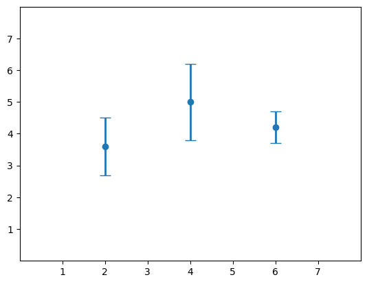
13.errorbar
# make data:
np.random.seed(1)
x = [2, 4, 6]
y = [3.6, 5, 4.2]
yerr = [0.9, 1.2, 0.5]

# plot:
fig, ax = plt.subplots()
#capsize:两端线的宽度
ax.errorbar(x, y, yerr, fmt='o', linewidth=2, capsize=6)

ax.set(xlim=(0, 8), xticks=np.arange(1, 8),
       ylim=(0, 8), yticks=np.arange(1, 8))

plt.show()
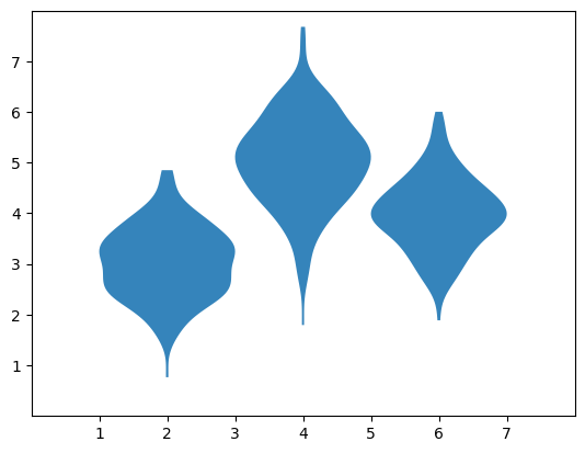
14.violinplot
# make data:
np.random.seed(10)
D = np.random.normal((3, 5, 4), (0.75, 1.00, 0.75), (200, 3))

# plot:
fig, ax = plt.subplots()

vp = ax.violinplot(D, [2, 4, 6], widths=2,
                   showmeans=False, showmedians=False, showextrema=False)
# styling:
for body in vp['bodies']:
    body.set_alpha(0.9)
ax.set(xlim=(0, 8), xticks=np.arange(1, 8),
       ylim=(0, 8), yticks=np.arange(1, 8))

plt.show()
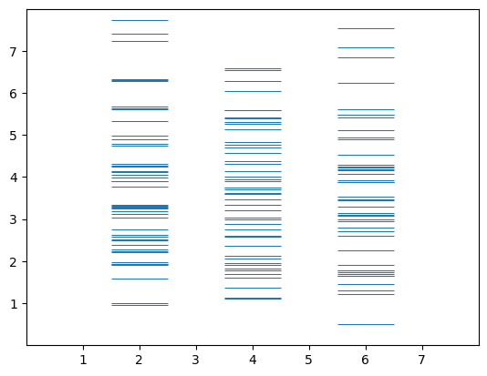
15.eventplot
# make data:
np.random.seed(1)
x = [2, 4, 6]
D = np.random.gamma(4, size=(3, 50))

# plot:
fig, ax = plt.subplots()

ax.eventplot(D, orientation="vertical", lineoffsets=x, linewidth=0.75)

ax.set(xlim=(0, 8), xticks=np.arange(1, 8),
       ylim=(0, 8), yticks=np.arange(1, 8))

plt.show()
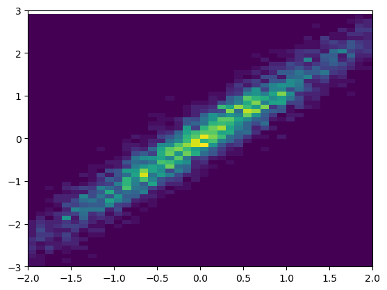
16.hist2d
# make data: correlated + noise
np.random.seed(1)
x = np.random.randn(5000)
y = 1.2 * x + np.random.randn(5000) / 3

# plot:
fig, ax = plt.subplots()

ax.hist2d(x, y, bins=(np.arange(-3, 3, 0.1), np.arange(-3, 3, 0.1)))

ax.set(xlim=(-2, 2), ylim=(-3, 3))

plt.show()
17.hexbin
# make data: correlated + noise
np.random.seed(1)
x = np.random.randn(5000)
y = 1.2 * x + np.random.randn(5000) / 3

# plot:
fig, ax = plt.subplots()

ax.hexbin(x, y, gridsize=20)

ax.set(xlim=(-2, 2), ylim=(-3, 3))

plt.show()

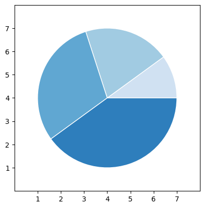
18.pie
# make data
x = [1, 2, 3, 4]
colors = plt.get_cmap('Blues')(np.linspace(0.2, 0.7, len(x)))

# plot
fig, ax = plt.subplots()
ax.pie(x, colors=colors, radius=3, center=(4, 4),
       wedgeprops={"linewidth": 1, "edgecolor": "white"}, frame=True)

ax.set(xlim=(0, 8), xticks=np.arange(1, 8),
       ylim=(0, 8), yticks=np.arange(1, 8))

plt.show()
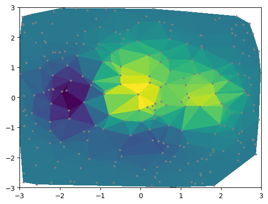
19.tripcolor
# make data:
np.random.seed(1)
x = np.random.uniform(-3, 3, 256)
y = np.random.uniform(-3, 3, 256)
z = (1 - x/2 + x**5 + y**3) * np.exp(-x**2 - y**2)

# plot:
fig, ax = plt.subplots()
#marksize:点的大小
ax.plot(x, y, 'o', markersize=2, color='grey')
ax.tripcolor(x, y, z)

ax.set(xlim=(-3, 3), ylim=(-3, 3))

plt.show()

 浙公网安备 33010602011771号