常见bug及解决方案
1.外边距叠加
一.发生在一个div内


<!DOCTYPE>
<html>
<head>
<meta http-equiv=Content-Type content="text/html; charset=utf-8"/>
<style type="text/css">
*{
    padding: 0;
    margin: 0;
}
#box{
    margin: 10px;
    background-color: #d5d5d5;
}
#box p{
    margin: 20px;
    padding: 1px;
    background-color: #6699ff;
}
</style>
</head>
<body>
    <div id="box">
        <p>This is a pages</p>
    </div>
</body>
</html>
p中的margin20px覆盖div中的margin10px,使div的顶外边距和底外边距的margin为20px而内部p的顶外边距和底外边距的margin为0px
解决方案:设置一个padding值或背景颜色相同的边框。
二.发生在俩个div
<!DOCTYPE html>
<html>
<head>
<meta charset="utf-8" />
<title></title>
<style type="text/css">
*{
    padding: 0;
    margin: 0;
}
#div1{
    width: 1000px;
    height: 100px;
    border: 10px solid;
    padding: 50px;
    margin: 15px;
}
#div2{
    width: 1000px;
    height: 100px;
    border: 10px solid;
    padding: 50px;
    margin: 10px;
}
</style>
</head>
<body>
<div id="div1"></div>
<div id="div2"></div>
</body>
</html>
只发生在普通文档流中,浮动与定位不会叠加。
2.当一个浮动元素与一个非浮动元素相连时就会出现IE6 3像素BUG
<!DOCTYPE html PUBLIC "-//W3C//DTD XHTML 1.0 Transitional//EN" "http://www.w3.org/TR/xhtml1/DTD/xhtml1-transitional.dtd">
<html xmlns="http://www.w3.org/1999/xhtml">
<head>
    <meta http-equiv="Content-Type" content="text/html;  charset=utf-8">
    <style type="text/css">
    *{margin: 0;padding: 0;}
    .bd{width: 400px;height: 400px;}
    .side{float: left;width: 100px;height: 200px;background: #333333;_margin-right: -3px;}
    .main{width: 200px;height: 100px;background: #555555;}
    </style>
    <title>解决3像素Bug</title>
</head>
<body>
    <div class="bd">
        <div class="side">
        </div>
        <div class="main">
        </div>
    </div>
</body>
</html>
在IE67中,当一个一个浮动元素与一个非浮动元素相连时,浮动的元素不会覆盖非浮动的元素。而在其他浏览器中会覆盖。
解决方案:1._margin-right: -3px(只解决IE6中3px的bug);2.float:left(可以使所有浏览器的布局相同);推荐2
3.双外边距叠加
<!DOCTYPE html PUBLIC "-//W3C//DTD XHTML 1.0 Transitional//EN" "http://www.w3.org/TR/xhtml1/DTD/xhtml1-transitional.dtd">
<html xmlns="http://www.w3.org/1999/xhtml">
<head>
    <meta http-equiv="Content-Type" content="text/html;  charset=utf-8">
    <style type="text/css">
    *{margin: 0;padding: 0;}
    .parent{width: 500px;height: 500px;border: 1px solid #999999;}
    .child{float: right;margin-right: 10px;width: 300px;height: 300px;border: 1px solid #888888;display: inline;}
    </style>
    <title>解决双边距问题</title>
</head>
<body>
    <div class="parent">
        <div class="child">
        </div>
    </div>
</body>
</html>
满足以下两个条件会产生双边距问题:1、块级元素 2、同时对块级元素添加float: left margin-left或float: right margin-right样式。
此时margin-right(left)的值为原来的俩倍。
解决方案: 只要为块级元素添加display: inline转变为内联元素;
4.DOM元素的定位
<!DOCTYPE html PUBLIC "-//W3C//DTD XHTML 1.0 Transitional//EN" "http://www.w3.org/TR/xhtml1/DTD/xhtml1-transitional.dtd">
<html xmlns="http://www.w3.org/1999/xhtml">
<head>
    <meta http-equiv="Content-Type" content="text/html;  charset=utf-8">
    <style type="text/css">
    *{margin: 0; padding: 0;}
    .pic{width: 300px;height: 300px;}
    .fix{position: fixed;right: 30px;bottom: 30px;*position: absolute;_right: 29px;_bottom: 29px;}
    .img01{width: 300px;height: 300px;}
    </style>
    <title>DOM元素固定于屏幕某处</title>
</head>
<body>
    <div class="pic fix">
        <img class="img01" src="resource/Koala.jpg">
    </div>
</body>
</html>
IE6会把position: fixed看成是position: static(正常);
解决方案: 所以要重设position,_为IE6专用
5.文字溢出
<!DOCTYPE html PUBLIC "-//W3C//DTD XHTML 1.0 Transitional//EN" "http://www.w3.org/TR/xhtml1/DTD/xhtml1-transitional.dtd">
<html xmlns="http://www.w3.org/1999/xhtml">
<head>
    <meta http-equiv="Content-Type" content="text/html;  charset=utf-8">
    <style type="text/css">
    .container01{width: 400px}
    .container02{float: left;}
    .container03{float: left;width: 398px;height: 50px;}
    </style>
    <title>解决IE6下文字溢出的问题</title>
</head>
<body>
    <div class="container01">
        <!--这是注释-->
        <div class="container02"></div>

        <div class="container03">↓这就是多出来的那个字</div>
    </div>
</body>
</html>
<!--在以下情况会产生文字溢出bug:
(1)一个容器里包含2个具有“float”样式的容器
(2)第二个容器的宽度大于父容器的宽度或父容器与第二个容器宽度之差小于3
(3)在第二个容器前存在注释
注释 从class="container03"前放在class="container02"前-->
在以下情况会产生文字溢出bug:
(1)一个容器里包含2个具有“float”样式的容器
(2)第二个容器的宽度大于父容器的宽度或父容器与第二个容器宽度之差小于3
(3)在第二个容器前存在注释
解决方案:注释 从class="container03"前放在class="container02"前
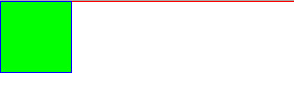
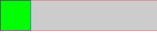
6.清除浮动
<!DOCTYPE>
<html>
<head>
<meta http-equiv=Content-Type content="text/html; charset=utf-8"/>
<style type="text/css">
    *{
        padding: 0;
        margin: 0;
    }
    #nofloatbox {
        border: 1px solid #FF0000;
        background: #CCC;
        overflow: hidden;
        zoom:1;
    }
    #floatbox {
        float: left;
        width: 100px;
        height: 100px;
        border: 1px solid #0000FF;
        background: #00FF00;
    }
</style>
</head>
<body>
    <div id="nofloatbox">
        <div id="floatbox"></div>
    </div>
</body>
</html>
当子元素为浮动时,无法撑开父元素,结果显示为
在父元素中添加overflow:hidden;IE6中添加zoom:1;
7.hasLayout:
很多情况下,我们把 hasLayout的状态改成true 就可以解决很大部分ie下显示的bug。
如通过zoom:1;将hasLayout设置为true;然后他就可以对自己和可能的子孙元素进行尺寸计算和定位。
8.img下方有3px的间隔
<!DOCTYPE html>
<html>
<head>
<meta charset="utf-8" />
<title></title>
<style type="text/css">
    #div1{
        width: 100px;
        height: 100px;
        background-color: yellow;
    }
    img {
        display: block;
    }
</style>
</head>
<body>
<img src="1.jpg" width="100" height="100" />
<div id="div1"></div>
</body>
</html>
将img设置display:block;

 浙公网安备 33010602011771号